Category: Websites
-
RSS creator on Bluesky & AT Proto
Bluesky can’t abandon the developers who made a bet on AT Proto, so they should give the protocol to a standards body while catching up on UX.—Dave Winer
-
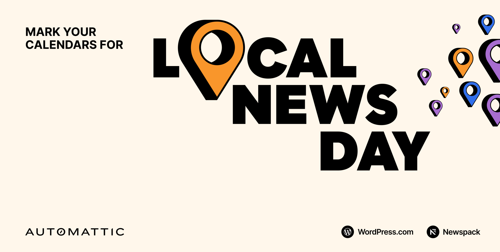
Mark your calendar: Local News Day is 9 April
It’s no secret that newspapers across the country exist in a fragile ecosystem. Automattic has long supported journalism and local media with investments in publications and platforms like Longreads, The Atavist, and Newspack. We believe that local news…
-
Cold Storage
Good UX is what companies do when they have to. A company that has your stuff locked away doesn’t have to.
-

Forever
The first website my colleagues and I created was for “Batman Forever” (1995, d. Joel Schumacher), starring Val Kilmer. That website changed my life and career. I never saw “Top Gun,” but Val Kilmer made…
-

My weekend project
By controlling what I listen to, and the order in which I listen, I’m slowly designing an infinite collage of my evolving musical tastes.
-

Valediction.
What a ride that was.
-
Domain harvesting and the Twitter long game in retrospect
Tricking people into seeing unexpected content and converting some of them into customers is a tale as old as the web. It was the perfect model for the takeover.
-
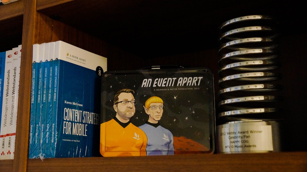
Of Books and Conferences Past
Of books and conferences past: A maker looks back on things well-made but no longer with us.
-
A List Apart contributors list on Bluesky
I’ve started a Bluesky list featuring some of the brilliant writers, designers, coders, editors, and others who’ve contributed to A List Apart “for people who make websites.”
-
Web Design Inspiration
If you’re finding today a bit stressful for some reason, grab a respite by sinking into any of these web design inspiration websites.
-

This Web of Ours, Revisited
Why did leading designers in 2000 look down their nose at the web? And are things any better today?
-

In search of a digital town square
Ever since an infantile fascist billionaire (hereafter, the IFB) decided to turn Twitter over to the racially hostile anti-science set, folks who previously used that network daily to discuss and amplify topics they cared about…
-
The Next Generation of Web Layouts
Who will design the next generation of readable, writerly web layouts? Layouts for sites that are mostly writing. Designed by people who love writing. Where text can be engaging even if it isn’t offset by…
-
He Built This City: The Return of Glenn Davis
You may not know his name, but he played a huge part in creating the web you take for granted today. And he’s back—kind of.