Categories
A List Apart art direction Design Standards State of the Web Web Design Web Design History Web Standards webfonts Websites webtype

The Next Generation of Web Layouts

Who will design the next generation of readable, writerly web layouts?

Layouts for sites that are mostly writing. Designed by people who love writing. Where text can be engaging even if it isn’t offset by art or photography. Where text is the point.

With well considered flexible typesettingmodular scaling, and readable measures across a full range of proportions and devices. With optional small details that make reading screens of text a pleasure instead of a chore. With type sizes that are easy to read without needing to zoom in. And with a range of interesting sans and serif fonts (including variable fonts) that support reading and encourage creative exploration where headlines are concerned.

Well? How did we get here?

The web has come along way since design meant crafting UIs in Photoshop and exporting them as sliced GIFs. Flash. SiFR. Table layout. Rebellion and rethinking. Liquid layout. Semantic HTML and CSS layout. Adaptive layout. Responsive layout. Intrinsic layout. Web fonts. Big type and super lightweight UX emphasizing readability was new (and controversial!) in 2012. We’ve long since accepted and improved upon it. Today’s news, magazine, and blog pages are more flexible, readable, and refined than ever before.

So what comes next? For writers, one hopes that what’s next is a fresh crop of small, innovative advancements. Improvements that are felt by readers, even when they aren’t always consciously noticed. Layouts that are not merely legible, but actually feel inevitable, at all sizes and in all contexts.

Beyond outside the box

Services like Typetura may point the way. A marriage of type and tech, Typetura is different from other typesetting methods. An intrinsic typography technology, it “enables you to design with more flexibility, while dramatically reducing code.” Disclaimer: I’m friends with, and have long admired the work of, Typetura founder Scott Kellum. Designing With Web Standards readers will recognize his name from the Kellum Image Replacement days of the early 2000s, but that ain’t the half of what he has done for web design, e.g. inventing dynamic typographic systemshigh impact ad formatsnew parallax techniques, and fluid typesetting technology. Scott was also the coder, along with Filipe Fortes, of Roger Black’s late, lamented Treesaver technology. But I digress.

The tech is not the pointexcept in so far as it improves our ability to think beyond our current understanding of what design and layout means. Just as Gutenberg’s printing press was not the point, but it was the point of departure. Initially, the invention of movable type reproduced the writing we already knew (i.e. the King James Bible). But ultimately, by freeing writing and reading from narrow elite circles and bringing it to more (and more diverse) minds, Gutenberg’s invention transformed what writing was and could be—from the invention of newspapers to the fiction of Virginia Woolf to multimedia experiences, and perhaps even to the web.

Let us all to play with Jen Simmons’s intrinsic web layout ideas and Scott Kellum and partners’s Typetura. While we also sketch in pencil and spend time looking at well designed books —printed, bound ones as well as digital publications in various devices. And specifically, not just fabulous coffee table books, but books that you’ve reread over and over, to understand what, beyond the text itself, encourages that reading response. So that, together, we may take the experiences of both reading and writing to the next level.

Appendix: Resources

If you’re new to the interplay between design and code on the open web, or if you just want a refresher, here are some evergreen links for your further learning and pleasure:


Categories
Advocacy Archiving Browsers Community Design glamorous HTML industry javascript launches links Off My Lawn! people Publications Responsive Web Design Standards State of the Web Stories The Profession W3C Web Design Web Design History Web Standards Websites

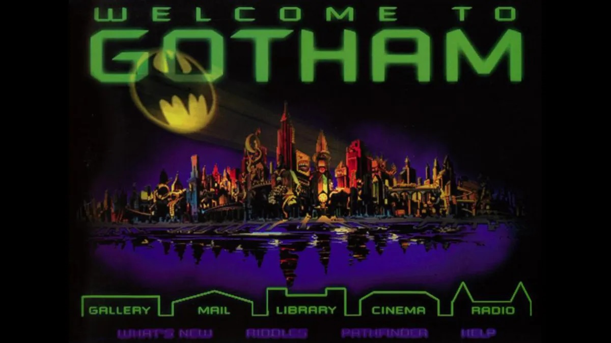
He Built This City: The Return of Glenn Davis

You may not know his name, but he played a huge part in creating the web you take for granted today. 

As the first person to realize, way back in 1994, that the emerging web could be a playground, he created Cool Site of the Day as a single-focused blog dedicated to surfacing interesting sites, thereby demonstrating the web’s potential while creating its first viral content. (As an example, traffic from his followers, or, as we called them back then, readers, brought NASA’s web server to its knees.)

He co-founded The Web Standards Project, which succeeded in bringing standards to our browsers at a time when browser makers saw the web as a software market to be dominated, and not a precious commons to be nurtured.

He anticipated responsive web design by more than 20 years with his formulation of Liquid, Ice, and Jello as the three possible ways a designer could negotiate the need for meaningful layout vis-a-vis the unknowns of the user’s browsing environment.

He taught the web DHTML through his educational Project Cool Site. 

And then, like a handful of other vital contributors to the early web (e.g. Todd Fahrner and Dean Allen), he vanished from the scene he’d played so large a role in creating.

He’s ba-ack

Glenn Davis wasn’t always missed. Like many other creators of culture, he is autistic and can be abrasive and socially unclueful without realizing it. Before he was diagnosed, some people said Glenn was an a**hole—and some no doubt still will say that. I think of him as too big for any room that would have him. And I’m talking about him here because he is talking about himself (and the history of the early web) on his new website, Verevolf.

If you go there, start with the introduction, and, if it speaks to you, read his stories and consider sharing your own. That’s how we did it in the early days, and it’s still a fine way to do it—maybe even the best way.

I knew Glenn, I worked with him and a lot of other talented people on The Web Standards Project (you’re welcome!), and it’s my opinion that—if you’re interested in how the web got to be the web, or if you were around at the time and are curious about a fellow survivor—you might enjoy yourself.

Categories
art art direction creativity Design Designers experience Illustration industry New York City NYC people Portfolios Startups Stories Web Design

Looking Back, Looking Ahead: artist Dan Licht

Illustration by Dan Licht: a scary cowboy smoking a stogie and sloshing his drink. His eyes are red and he looks like he's itching for a fight.
Illustration by Dan Licht
Illustration by Dan Licht.

In 1999, I had the good fortune to work alongside Dan Licht at an NYC digital startup called SenseNet, RIP. Back then, although still in his early 20s, Dan was already an accomplished art director and digital designer. Today he’s a fantastic comics illustrator, artist, and creative director. Check his recent art on Instagram and his client work at Daniel V. Licht dot com.

A heroic letter carrier is pictured sending letters on their way in this illustration by Dan Licht. The picture has a great deal of energy, and the action is all flying toward you, the viewer.
“Protect the U.S. Postal Service,” a 2020 illustration by Dan Licht.
Categories
Advocacy automattic Blogs and Blogging Brands Community Design industry Own your content software Standards Web Design Web Standards wordpress

Enabling Folks to Express Themselves on the Web: State of the Word 2021

Screenshot of slide highlighting the four phases of WordPress Gutenberg.

Not only are we enabling folks to express themselves uniquely on the web, unlike the cookie cutter looks that all the social sites try to put you into. We’re doing it in a way which is standards-based, interoperable, based on open source, and increases the amount of freedom on the web.

—Matt Mullenweg, State of the Word 

In a live address, Automattic’s Matt Mullenweg

  • Introduces Openverse (an opt-in content commons);
  • Announces that WordPress’s beginner-friendly Learn.Wordpress.org is now available in 21 languages;
  • Philosophizes about Web3 and the “decentralized web” —which, despite big company colonization attempts, is really what the web has always been;
  • Extols the virtues of Open Source;
  • And more. 

Watch the 2021 #StateoftheWord annual keynote address on YouTube. It’s two hours long, so bring popcorn.

Selected Additional Reactions & Commentary

Hat tips to Chenda Ngak, Reyes Martínez, and Josepha Haden.

Categories
Accessibility Best practices Blue Beanie Day Design W3C Web Design Web Standards

Blue Beanie Day 2021

Photo of astronaut David Bowman from Stanley Kubrick’s 2001 wearing a blue beanie in support of web standards.

Blue Beanie Day in support of web standards is celebrated around the world on November 30. Hey, that’s today.

So how can you help? Glad you asked! Take a self-portrait wearing a blue beanie (toque, tuque, cap) and post it to your website and social media channels with the hashtag #BlueBeanieDay.

And for that extra extra, slap a blue beanie on your web and social media avatars, as well.

Do this on November 30 as a reminder to design accessible, web-standards-based websites 365 days a year. Thank you. Love you.

Categories
An Event Apart Appearances art direction better-know-a-speaker books Career conferences Design Designers Education events Genius glamorous Illustration industry Interviews New York City NYC Off My Lawn! speaking Stories Surviving Teaching The Profession UX Web Design Web Design History work

My Night With Essl

Mike Essl and I discuss his portfolio.
Mike Essl and I discuss his portfolio on Night 2 of An Event Apart Online Together Fall Summit.

Herewith, a scene from last night’s interview with legendary web & book designer (and Dean of The Cooper Union School of Art) Mike Essl, who shared his portfolio, career highlights, early web design history, and more. Fun!

If you get a chance to meet, work with, or learn from Mike, take it. He’s brilliant, hilarious, warmly human, and one of the most creative people you’ll ever have the good fortune to know. 

Mike Essl

So ended Day 2 of An Event Apart Online Together Fall Summit 2021. Day 3 begins in less than two hours. You can still join us … or watch later On Demand.

Categories
Designers Ideas industry Interviews links people podcasts User Experience UX Web Design work

Amplifying voices

Some of the interviewees of the Technically Speaking podcast.

New episodes of Harrison Wheeler’s Technically Speaking podcast are coming, and Technically Speaking will run live interviews at San Francisco Design Week June 7–13. 

The podcast amplifies voices of underrepresented leaders who want to inspire the next generation of black and brown designers through authentic, thought-provoking, and immersive storytelling. 

Learn more on the podcast’s homepage, listen to past episodes, and sign up for the newsletter to be notified about upcoming content. 

Categories
Best practices Browsers Code Design development Future-Friendly HTML Ideas industry Internship IXD Layout links Multi-Device Responsive Web Design software Standards State of the Web User Experience UX Web Design Web Design History Web Standards Websites

Saving Your Web Workflows with Prototyping

Our static tools and linear workflows aren’t the right fit for the flexible, diverse reality of today’s Web. Making prototyping a central element of your workflows will radically change how you approach problem solution and save you a lot of headaches – and money. But most importantly, you will be creating the right products and features in a way that resonates with the true nature of the Web. A discourse on processes, flexibility, the Web as a material, and how we build things.

Saving Your Web Workflows with Prototyping – Matthias Ott
Categories
A List Apart Code Design Web Design

Service Worker With A Smile

Jeremy Wagner’s “Now THAT’S What I Call Service Worker!” provides innovative techniques to harness the power of Progressive Web Apps with smaller HTML payloads and better performance for repeat visitors.

Categories
Advocacy art direction Design Designers Ideas industry interface IXD Jason Santa Maria links Off My Lawn! Redesigns Responsive Web Design State of the Web Tech The Profession User Experience UX Web Design Web Design History webfonts

The Web We Lost: Luke Dorny Redesign

Like 90s hip-hop, The Web We Lost™ retains a near-mystical hold on the hearts and minds of those who were lucky enough to be part of it. Luke Dorny’s recent, lovingly hand-carved redesign of his personal site encompasses several generations of that pioneering creative web. As such, it will repay your curiosity.

Details, details.

Check Luke’s article page for textural, typographic, and interactive hat tips to great old sites from the likes of k10k, Cameron Moll, Jason Santa Maria, and more. 

And don’t stop there; each section of the updated lukedorny.com offers its own little bonus delights. Like the floating titles (on first load) and touchable, complex thumbnail highlights on the “observer” (AKA home) page. 

And by home page, I don’t mean the home page that loads when you first hit the site: that’s a narrow, fixed-width design that’s both a tribute and a goof.

No, I mean the home page that replaces that narrow initial home page once the cookies kick in. Want to see the initial, fixed-width home page again? I’m not sure that you can. Weird detail. Cool detail. Who thinks of such things? Some of us used to.

And don’t miss the subtle thrills of the silken pull threads (complete with shadows) and winking logo pull tab in the site’s footer. I could play with that all day.

Multiply animated elements, paths, and shadows bring life to the footer of Luke Dorny’s newly redesigned website.

Now, no site exactly needs those loving details. But danged if they don’t encourage you to spend time on the site and actually peruse its content

There was a time when we thought about things like that. We knew people had a big choice in which websites they chose to visit. (Because people did have a big choice back in them days before social media consolidation.) And we worked to be worthy of their time and attention.

Days of future past

We can still strive to be worthy by sweating details and staying alive to the creative possibilities of the page. Not on every project, of course. But certainly on our personal sites. And we don’t have to limit our creative love and attention only to our personal sites. We pushed ourselves, back then; we can do it again.

In our products, we can remember to add delight as we subtract friction.

And just as an unexpected bouquet can brighten the day for someone we love, in the sites we design for partners, we can be on the lookout for opportunities to pleasantly surprise with unexpected, little, loving details.

Crafted with care doesn’t have to mean bespoke. But it’s remarkable what can happen when, in the early planning stage of a new project, we act as if we’re going to have to create each page from scratch.

In calling Luke Dorny’s site to your attention, I must disclaim a few things:

  • I haven’t run accessibility tests on lukedorny.com or even tried to navigate it with images off, or via the keyboard.
  • Using pixel fonts for body copy, headlines, labels, and so on—while entirely appropriate to the period Luke’s celebrating and conceptually necessary for the design to work as it should—isn’t the most readable choice and may cause difficulty for some readers.
  • I haven’t tested the site in every browser and on every known device. I haven’t checked its optimization. For all I know, the site may pass such tests with flying colors, but I tend to think all this beauty comes at a price in terms of assets and bandwidth. 

Nevertheless, I do commend this fine website to your loving attention. Maybe spend time on it instead of Twitter next time you take a break?

I’ll be back soon with more examples of sites trying harder.


Simulcast on Automattic Design

Categories
business Career client management client services clients Design experience glamorous industry IXD Microblogging Own your content project management The Essentials The Profession twitter UX Web Design Wit and Wisdom work

Design Kickoff Meetings

Posted here for posterity:

Design kickoff meetings are like first dates that prepare you for an exciting relationship with a person who doesn’t exist.

Categories
glamorous Usability User Experience UX Web Design

Healthcare in America

I’m one of the lucky ones. I have a great doctor and good health insurance.

A boring generic healthcare company bought my longterm doctor’s group practice a few months ago. First thing they did was screw up the online patient portal, changing it from the poorly designed, barely usable mess I’d learned to navigate to a slightly more polished but somehow blander portal that instantly got hacked. In consequence, they seem to have hired an Internet security firm that advised them to make changes they apparently didn’t understand how to execute. Thus, sign-in was broken for two months. Doctors kept sending patient results to the site, but patients couldn’t access them, and nobody told the doctors. You’d try to explain the problem to a phone receptionist, but if it ever got to the doctor, it was likely phrased as “Another one complaining about the website.”

The site’s makers apparently weren’t informed of the problem for some time, and there was no way to find out who they were to contact them, since there was no contact information available until you signed in, which no one could. Healthcare in America, 2019.

Anyway, they seem to have fixed a couple of the nonfunctioning loops that would prompt you to create a new password and then not recognize that you had done so and prompt you to create a new password and then not recognize that you had done so and prompt you to create a new password and then not recognize that you had done so and…

So today I was able to create a password, almost get 2FA to work, and reorder medication I’d been doing without. Yay!

Designing usable websites is an undervalued art.

Categories
Bandwidth Best practices business Content First content strategy Content-First Design UX Web Design

Beyond Engagement: the content performance quotient

Recently, Josh Clark, Gerry McGovern and I have been questioning our industry’s pursuit of “engagement.” Engagement is what all our clients want all the time. It’s the ? 1 goal cited in kickoff meetings, the data point that determines if a project succeeded or sucked wind. When our clients muse over their Analytics, they’re almost always eyeing engagement, charting its tiny variances with the jittery, obsessive focus of overanxious parents taking a sick child’s temperature.

Engagement is our cri de coeur. Our products, websites, and applications live and die by it. But should they?

For many of our products, websites, and applications, duration of page visit, number of our pages clicked through, and similar signs of engagement as it is traditionally understood may actually be marks of failure. If a customer spends 30 minutes on her insurance company’s site, was she engaged … or frustrated by bad information architecture?

For these products, websites, and applications, we need a new metric, a  new and different ? 1 goal. Think of it as speed of usefulness; and call it content performance quotient—or CPQ if acronyms make you feel all business-y and tingly inside.

The content performance quotient is an index of how quickly you get the right answer to the individual customer, allowing her to act on it or depart and get on with her day. It is a measurement of your value to the customer. For many apps, sites, and products, the content performance quotient offers a new goal to iterate against, a new way to deliver value, and a new way to evaluate success.

For many sites, engagement is still a valid goal

To be fair as well as explicit, spending extra seconds on a web page, and browsing from one page to another and another, remains a desirable thing on deep content sites like A List Apart and The Washington Post?—?sites that encourage slow, thoughtful reading.

A List Apart isn’t a place to grab code and get back to your web development project; it’s a place to ponder new and better ways of designing, developing, and strategizing web content. And pondering means slowly digesting what you have read. The Washington Post isn’t a purveyor of ten-second talking points and memorable but shallow headlines—it’s a place for detailed news and news analysis. That kind of reading takes time, so it makes sense if the owners and managers of those publications peruse their Analytics seeking signs of engagement. For everyone else, there’s the CPQ. Or will be, once someone reading this figures out how to measure it.

There’s also a new design paradigm that goes hand-in-hand with this new goal: shrinking your architecture and relentlessly slashing your content. It’s an approach we’ve begun practicing in my design studio.

But first things first. What exactly is the CPQ?

The content performance quotient (CPQ) is the time it takes your customer to get the information she sought, and here, less is more—or better. From the organization’s point of view, CPQ can be the time it takes to for a specific customer to find, receive, and absorb your most important content.

Come to where the messaging is


Consider the Marlboro Man (kids, check the Wikipedia entry), a silent visual spokesman for Marlboro cigarettes, created by the Leo Burnett agency for an era when Americans expressed their optimism by driving two-ton be-finned convertibles along the new highways that bypassed the old cities and the old urban way of life.

It was a time when Americans looked back on their historical westward expansion un-ironically and without shame. Cowboys were heroes on TV. Cowboys were freedom, the car and the highway were freedom, smoking the right cigarette was freedom.

On TV back then, when commercials had a full 60 seconds to convey their messaging, and nearly all were heavy on dialog and narration, Marlboro TV commercials were practically wordless. They showed a cowboy riding a horse. You saw him in closeup. You saw him in long shot. There were slow dissolves. There was music. There were no words at all, until the very end, when a suitably gravel-voiced announcer advised you to “Come to where the flavor is. Come to Marlboro Country.”

But it was in billboards along the highway and at urban entrance points where the campaign really lived. There was a beautiful shot of the cowboy doing cowboy stuff in the distance. There were four words: “Come to Marlboro Country.” One of them barely counts as a word, and you didn’t have to read any of them to get the message.

The billboards had one or two seconds to tell you everything, and they worked. At a glance, and from repeated glances over time, you knew that Marlboro was the filtered tobacco cigarette of the independent man who loved liberty. It was not the smoke of the neurotic urban dwelling subway rider (even if, in reality, that was the customer). Marlboro was for the libertarian in chaps. For the macho individualist with no crushing mortgage to pay off, no wife and kids to infringe on his horse-loving freedom. You got it all, without even knowing you got it. That’s performance.

Targeting convertibles on the information superhighway

In hindsight, it sounds ridiculous, but the super-fast storytelling worked: when I was growing up, Marlboro was what every child in my middle school smoked.

Remove the cancer and the other ethical problems from this story and hold fast to the idea of conveying information as close to instantaneously as possible. The geniuses behind the Marlboro Man achieved it by reducing their messaging to only what was needed—only what could be conveyed to a person passing a billboard at 60 MPH.

Your customer is not speeding past your messaging in a 1954 convertible, but she is speeding past it, and if you don’t optimize, she will miss it. For her to get your message, you have to work as hard as those evil ad wizards did. You must focus relentlessly on messaging (as well as design and site performance—but we’ll get into all that soon enough). Just as Leo Burnett cut their TV messaging to ten words, and their billboard to four, you must be willing to think twice about every word, every page. Mobile First taught us to focus above all else on the content the customer actually seeks. A better CPQ is what you get when you do that—particularly when you combine it with good design and optimal technical performance. 

Most business websites contain dozens of pages that were made to satisfy some long-ago stakeholder. They are pages that nobody visits. Pages that do nothing to help the customer or advance the business’s agenda. Putting all that junk online may have made for smooth meetings ten years ago, but it isn’t helping your business or your customer. Our sites, apps, and products must do both.

Content performance quotient: the secret sauce

Lately in my design practice I’ve been persuading clients to create sites that might superficially appear less effective if you’re going by engagement metrics alone, but which are actually far more successful because they are more instantly persuasive. At my urging, our clients have allowed us to relentlessly cut copy and chop sections nobody looks at, replacing them with a few pages that are there to do a job. We are lucky to have smart clients who are willing to jettison hundreds of hours worth of old work in favor of a streamlined experience that delivers value. Not every client has the courage to do so. But more will as this idea catches on. 

(By the way, don’t look for these projects on our studio’s website just yet; they are still in development.)

Serving only the content the customers actually need; streamlining and testing and fine-tuning the interaction to get the right customer to the right content precisely when they want it; wrapping the experience in an engagingly readable but also quickly scannable user interface; and doing everything in our power to ensure that the underlying web experience is as performant as possible—this, I believe, is the secret to increasing CPQ.

CPQ: the story so far

Designer Fred Gates, kicking it in Central Park, NYC.


The idea of delivering much less (but much better) first occurred to me while I was looking over a fellow designer’s shoulder. My friend Fred Gates of Fred Gates Design is working on a project for a client in the nonprofit education space. The client’s initial budget was not large, so, to be fair, they suggested Fred only update their homepage. But Fred being Fred, if he was only going to design a single page, he was determined to deliver tremendous value on it.

By focusing relentlessly on the objectives of the entire site, he was able to bring all the principal interactions and messages into a single performant homepage, essentially reducing a big site to a lean, fast, and more effective one.

Far from getting less, his client (and their customers) got much more than they expected.

Inspired by what my friend had achieved, I then proposed exactly the same approach to a client of ours. Not because their budget was a problem, but because streamlining was clearly the right approach … and a redesign is the perfect opportunity to rethink. When you repaint your living room, it gives you a chance to rethink your couch and divan. You’re most likely to consider changing your diet when you’ve begun a new exercise program. Clients are people, and people are most receptive to one form of change when they are already engaged in another.

Positioning CPQ as an aspect of technical performance is another way to overcome stakeholder skepticism. Lara Hogan has more on persuading peers and stakeholders to care about technical performance optimization.

We are a few weeks away from launching what we and the client are calling Phase I, a lean, performant, relentlessly message-focused web experience. But if we’ve done this right, we won’t have much to do in Phase II—because the “mini-site” we’re delivering in Phase I will do more for the company and its customers than a big site ever did.

I’ll be back with updates when we launch, and (more importantly) when we have data to share. Follow @DesignCPQ to stay on top of CPQ thinking.


Also published at Medium.

studio.zeldman is open for business. Follow me @zeldman.

Categories
Archiving blogger Blogs and Blogging Web Design Web Design History work writing Zeldman zeldman.com

Look back in anchor tags

NEW YEARS bring thoughts of old years, and, to a designer and veteran “blogger,” thoughts of old work. My personal site, begun in 1994, was many things: an interview zine (my first web client, Donald Buckley, named it: 15 Minutes), a newfangled GIF animation playground, a freeware icon factory, an Advertising Graveyard, and more. But eventually, before it was forgotten entirely, it became best known as a blog.

Inspired by Dori Smith’s recent Facebook post about old-school blogging and the possibility of a “20th Anniversary of Blogging” unconference/relaxacon, I thought it might be fun to poke through the old blog a bit with you, gentle reader. My blog began in 1995, but, for now, you can only page through the entries as far back as August, 1997, as I seem to have neglected to build “previous” page links before that, and may also have overwritten my earliest entries (not realizing, at the time, that you and I might ever want to look back at any of this).

Below, I begin the retrospective in 2004 and work backwards to 1997. (After 2004, I stopped hand-coding each entry and began using WordPress, resulting in this sort of thing. Also after 2004, I stopped redesigning the site every few months, partly, but not exclusively, because I got busier designing other people’s sites. I also stopped redesigning the site every few months because I had become more strategic about design—more interested in design as problem solving, less as making pretty pages. Say, remember when we designed “pages”? But I digress.)

Here, for your pleasure, are some pages from the past:


Silence and Noise?—?“Now that some of us have helped bring standards into the mainstream, wouldn’t it be best to keep them there?”?—?12 August 2004 (the iconic green design) http://www.zeldman.com/daily/0804b.shtml

Typical blog entries?—?on web performance and “the new Samaritans” (designers who recode other people’s sites to be standards-compliant)?—?28 July 2004 (the iconic green design) http://www.zeldman.com/daily/0704e.shtml

CSS Validator is Broken?—?5 February 2004 (the creme design) http://www.zeldman.com/daily/0204b.shtml

Don’t Design on Spec?—?26 January 2004 (the creme design) http://www.zeldman.com/daily/0104h.shtml

Chip Kidd & Alfred Hitchcock?—?20 January 2004 (the creme design) http://www.zeldman.com/daily/0104f.shtml

Tears for Istanbul?—?26 November 2003 (rooster design) http://www.zeldman.com/daily/1103a.shtml

Ladies and gentlemen, A List Apart 3.0–22 October 2003 (rooster design) http://www.zeldman.com/daily/1003a.shtml

“Jeffrey Zeldman is good enough for me.” 2 November 2002 (teal swap design) http://www.zeldman.com/daily/1002d.shtml

Typical blog entries?—?16 October2002 (the iconic red design) http://www.zeldman.com/daily/1002a.html

Typical blog entries?—?super secret Charlotte Gray style guide (now offline)?—?26 August 2002 (HTML fist, red design) http://www.zeldman.com/daily/0802c.html

Typical blog entries?—?in the middle of writing Designing With Web Standards, then titled Forward Compatibility?—?30 July 2002 (the iconic red design) http://www.zeldman.com/daily/0802a.html

“The heartbreak of sizing small text with ems”?—?21 May 2002 http://www.zeldman.com/daily/0502c.html

Typical blog entries, 25 January 2002 (the iconic red design?—?liquid variant) http://www.zeldman.com/daily/0102d.html

Daily Report 31 August 1999, liquid orange design (unfinished) http://www.zeldman.com/com0899.html

Daily Report 14 October 1998, liquid orange design (unfinished) with Web Standards Project banner ad at the top of the page http://www.zeldman.com/com1098.html

“Previous Reports” 31 August 1997, ugly yellow bacon strip style, http://www.zeldman.com/came2.html


Also published in Medium.

studio.zeldman is open for business. Follow me @zeldman.

Categories
A List Apart Advertising art direction Best practices Brands conferences Content First Content-First Deck, the Fonts Ideas industry Medium Platforms Publications Publishing reportage Standards State of the Web studio.zeldman The Essentials The Profession Themes and Templates Usability User Experience UX Web Design Zeldman

Authoritative, Readable, Branded: Report from Poynter Design Challenge, Part 2

Poynter style guide

THIS year’s Poynter Digital Newspaper Design Challenge was an attempt by several designers and pundits, working and thinking in parallel, to save real news via design. In Part 1 of my report from Poynter, I discussed the questions driving the challenge, and talked about the design work done in response to it by my colleagues Kat Downs Mulder, Mike Swartz, Lucie Lacava, and Jared Cocken. Here in Part 2, I’ll discuss my own work and the approach we took at my studio. But we begin with a quick look back at the past designs that brought us to this point:

Experiment 1: The Deck

During the past decade and a half, as both a publication designer and a publisher, I watched in horror as our publications became reader-hostile minefields of intrusive ads, overlays, and popups. The first thing I tried to do about this (besides removing the web equivalent of chart junk from my magazine) was to offer an alternative approach to advertising via The Deck, an ad network I cofounded with Jim Coudal of coudal.com and Jason Fried of Basecamp (formerly 37signals). The Deck permitted only one appropriately targeted ad per each page of content viewed. As primary instigator Jim Coudal put it:

A buy in The Deck reaches the creative community on the web in an uncluttered, controlled environment, far more valuable than a standard banner or a single text ad among dozens of others.

Jim, Jason, and I hoped that our cost-per-influence model would replace the CPM race to the bottom, and that our quasi-religious use of whitespace would be widely imitated by the smartest publications online.

But that didn’t happen. Advertising just got more intrusive. The Deck succeeded as a small business supporting a network of interesting small publications, but not at all as a primary influencer on the direction taken by advertising that supports web content.

Experiment 2: Readability

Then about seven years ago, my friend Rich Ziade and his engineers created Readability, an app that sat between you and the ugly site you were trying to read, the way screen readers sit between visual websites and blind web users. Readability grabbed an article page’s primary content, removed the junk, and replaced the cluttered and illegible layout with a clean, readable page inspired by the clarity of iBooks and Kindle, which were just taking off at the time.

Rich released Readability 1.0 as open source; Apple immediately absorbed it into the Safari browser, where it continues to provide Safari’s built-in “reader” mode. (Safari’s “reader” mode was Apple’s first step in decluttering the web and returning it to the people who use it; “content blocking” would be the second step.)

Moreover, Readability 2.0, released by Rich’s then-company Arc90 the following year, added automatic payment for content creators slash publishers, as I explained at the time to anyone who would listen. Had Readability been allowed to continue the experiment, content monetization might have been less of a problem than it is today, and publication brands (the notion that it matters who publishes what we read) would be in exactly the same pickle they’re in anyway—except that readers would get their news in Readability’s attractive and customizable format, instead of from Apple News, Facebook, and the like.

I used to go around the world on lecture tours, warning my fellow designers that if we didn’t figure out how to declutter and compellingly brand sites, apps like Readability would do it for us. I still go around on lecture tours, but I’ve moved on to other issues. As for Readability, it was killed by a digital lynch mob after one powerful blogger, misunderstanding the motivation behind it, issued the digerati equivalent of a fatw?. But that’s another story.

Experiment 3: Big Type Revolution

In 2012, inspired by Readability and frustrated by the industry’s determination to make ever less legible, ever more cluttered sites full of tracking and popups and everything except what readers need, I bet big on large type:

This redesign is a response to ebooks, to web type, to mobile, and to wonderful applications like Instapaper and Readability that address the problem of most websites’ pointlessly cluttered interfaces and content-hostile text layouts by actually removing the designer from the equation. (That’s not all these apps do, but it’s one benefit of using them, and it indicates how pathetic much of our web design is when our visitors increasingly turn to third party applications simply to read our sites’ content. It also suggests that those who don’t design for readers might soon not be designing for anyone.)

Writing in Forbes, Anthony Wing Kosner saw the future in my initially crude experiment:

If you want to know where the web is going, one clue is to look at the personal sites of top-tier web designers. And one trend that just bubbled to the surface is large body type—the kind you don’t have to command-plus to read.

Jeffrey Zeldman…made a particularly strong point about it in his “Web Design Manifesto 2012,” that he published yesterday.

Large Type: One Web Designer Puts Content First in a Big Way

Not to brag (okay, too late), but he wasn’t wrong. It was the future.

(Also, I’m fairly sure I wasn’t the only designer at the time who reacted against tiny type and cluttered anti-user layouts by stripping pages down to only their most necessary elements, and boosting the type size to enforce a more relaxed reading posture. The idea was in the air.)

The experiment becomes the norm

In any case, soon enough, readable (big type and plenty of whitespace) layouts starting popping up everywhere. At medium.com. In Mike Pick’s redesign of A List Apart. In article pages for The New York Times, Washington Post, Vox, Newsweek, The New Yorker, and, eventually, many other publications.

An uncluttered page focused on the reading experience (reminder: big type and plenty of whitespace) is now the default at several leading news publications. But many smaller publications, struggling just to survive, have not kept up. And so we have a perfect crisis:

Publications that do not encourage reading, loyalty, or repeat visits are struggling to survive at the very moment real news is under attack from an authoritarian president. What to do?


A two-up from the Poynter challenge

My response to the Poynter Design Challenge

There are many ways to respond to an existential crisis like the one facing most news publications. You can rethink the relationship between reader and publication. Rethink the job of the publication. Make news work more like a lifestyle app. Make it more immersive. My colleagues followed those paths out brilliantly (as described in Part 1).

But I went for the low-hanging fruit. The thing any publisher, no matter how cash-strapped, could do. The thing I had seen working since I started yelling about big type in 2012. I went for a clean, uncluttered, authoritative, branded page. Authoritative because this isn’t fake news. Branded because the source matters.

The easiest, fastest, most readily attainable path to clean, uncluttered, authoritative, branded design is through typography.


Sample reader layout from the Poynter challenge

Any publication can be readable

Any newspaper, however poor, can afford better typography. Any newspaper with a designer on staff can attain it, if the paper stops treating design as a lackey of marketing or editorial or advertising, and sets designers free to create great reading experiences.

In my work, which is still underway (and will continue for some time), I focused on creating what I call “reader” layouts (and probably other designers call them that too; but I just don’t know). Layouts that are branded, authoritative, clean, uncluttered, and easy to read.

I played with type hierarchies and created simple style guides. Most of my little pages began as Typecast templates that I customized. And then Noël Jackson from my studio cleaned up the HTML and CSS to make it more portable. We put the stuff up on GitHub for whoever wants to play with it.

These are only starting points. Any designer can create these kinds of layouts. There’s nothing special about what I did. You can do the same for your paper. (And if you can’t, you can hire us.)

The work I share here is the start of a project that will continue at our studio for a long time. #realnews for the win!

Additional reading

%d bloggers like this: