Categories
Advocacy Archiving Browsers Community Design glamorous HTML industry javascript launches links Off My Lawn! people Publications Responsive Web Design Standards State of the Web Stories The Profession W3C Web Design Web Design History Web Standards Websites

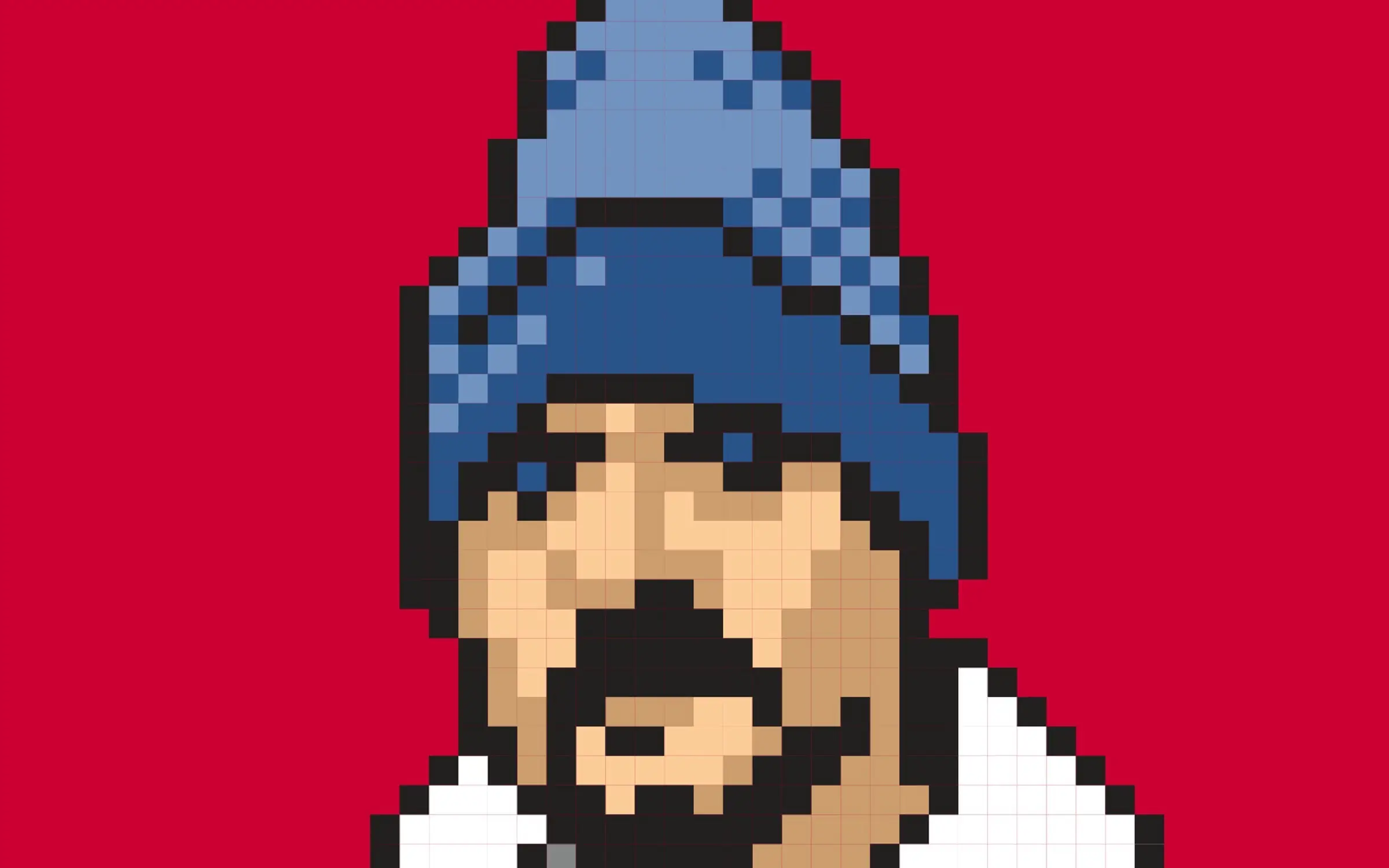
He Built This City: The Return of Glenn Davis

You may not know his name, but he played a huge part in creating the web you take for granted today. 

As the first person to realize, way back in 1994, that the emerging web could be a playground, he created Cool Site of the Day as a single-focused blog dedicated to surfacing interesting sites, thereby demonstrating the web’s potential while creating its first viral content. (As an example, traffic from his followers, or, as we called them back then, readers, brought NASA’s web server to its knees.)

He co-founded The Web Standards Project, which succeeded in bringing standards to our browsers at a time when browser makers saw the web as a software market to be dominated, and not a precious commons to be nurtured.

He anticipated responsive web design by more than 20 years with his formulation of Liquid, Ice, and Jello as the three possible ways a designer could negotiate the need for meaningful layout vis-a-vis the unknowns of the user’s browsing environment.

He taught the web DHTML through his educational Project Cool Site. 

And then, like a handful of other vital contributors to the early web (e.g. Todd Fahrner and Dean Allen), he vanished from the scene he’d played so large a role in creating.

He’s ba-ack

Glenn Davis wasn’t always missed. Like many other creators of culture, he is autistic and can be abrasive and socially unclueful without realizing it. Before he was diagnosed, some people said Glenn was an a**hole—and some no doubt still will say that. I think of him as too big for any room that would have him. And I’m talking about him here because he is talking about himself (and the history of the early web) on his new website, Verevolf.

If you go there, start with the introduction, and, if it speaks to you, read his stories and consider sharing your own. That’s how we did it in the early days, and it’s still a fine way to do it—maybe even the best way.

I knew Glenn, I worked with him and a lot of other talented people on The Web Standards Project (you’re welcome!), and it’s my opinion that—if you’re interested in how the web got to be the web, or if you were around at the time and are curious about a fellow survivor—you might enjoy yourself.

Categories
An Event Apart Appearances art direction better-know-a-speaker books Career conferences Design Designers Education events Genius glamorous Illustration industry Interviews New York City NYC Off My Lawn! speaking Stories Surviving Teaching The Profession UX Web Design Web Design History work

My Night With Essl

Mike Essl and I discuss his portfolio.
Mike Essl and I discuss his portfolio on Night 2 of An Event Apart Online Together Fall Summit.

Herewith, a scene from last night’s interview with legendary web & book designer (and Dean of The Cooper Union School of Art) Mike Essl, who shared his portfolio, career highlights, early web design history, and more. Fun!

If you get a chance to meet, work with, or learn from Mike, take it. He’s brilliant, hilarious, warmly human, and one of the most creative people you’ll ever have the good fortune to know. 

Mike Essl

So ended Day 2 of An Event Apart Online Together Fall Summit 2021. Day 3 begins in less than two hours. You can still join us … or watch later On Demand.

Categories
Advocacy art direction Design Designers Ideas industry interface IXD Jason Santa Maria links Off My Lawn! Redesigns Responsive Web Design State of the Web Tech The Profession User Experience UX Web Design Web Design History webfonts

The Web We Lost: Luke Dorny Redesign

Like 90s hip-hop, The Web We Lost™ retains a near-mystical hold on the hearts and minds of those who were lucky enough to be part of it. Luke Dorny’s recent, lovingly hand-carved redesign of his personal site encompasses several generations of that pioneering creative web. As such, it will repay your curiosity.

Details, details.

Check Luke’s article page for textural, typographic, and interactive hat tips to great old sites from the likes of k10k, Cameron Moll, Jason Santa Maria, and more. 

And don’t stop there; each section of the updated lukedorny.com offers its own little bonus delights. Like the floating titles (on first load) and touchable, complex thumbnail highlights on the “observer” (AKA home) page. 

And by home page, I don’t mean the home page that loads when you first hit the site: that’s a narrow, fixed-width design that’s both a tribute and a goof.

No, I mean the home page that replaces that narrow initial home page once the cookies kick in. Want to see the initial, fixed-width home page again? I’m not sure that you can. Weird detail. Cool detail. Who thinks of such things? Some of us used to.

And don’t miss the subtle thrills of the silken pull threads (complete with shadows) and winking logo pull tab in the site’s footer. I could play with that all day.

Multiply animated elements, paths, and shadows bring life to the footer of Luke Dorny’s newly redesigned website.

Now, no site exactly needs those loving details. But danged if they don’t encourage you to spend time on the site and actually peruse its content

There was a time when we thought about things like that. We knew people had a big choice in which websites they chose to visit. (Because people did have a big choice back in them days before social media consolidation.) And we worked to be worthy of their time and attention.

Days of future past

We can still strive to be worthy by sweating details and staying alive to the creative possibilities of the page. Not on every project, of course. But certainly on our personal sites. And we don’t have to limit our creative love and attention only to our personal sites. We pushed ourselves, back then; we can do it again.

In our products, we can remember to add delight as we subtract friction.

And just as an unexpected bouquet can brighten the day for someone we love, in the sites we design for partners, we can be on the lookout for opportunities to pleasantly surprise with unexpected, little, loving details.

Crafted with care doesn’t have to mean bespoke. But it’s remarkable what can happen when, in the early planning stage of a new project, we act as if we’re going to have to create each page from scratch.

In calling Luke Dorny’s site to your attention, I must disclaim a few things:

  • I haven’t run accessibility tests on lukedorny.com or even tried to navigate it with images off, or via the keyboard.
  • Using pixel fonts for body copy, headlines, labels, and so on—while entirely appropriate to the period Luke’s celebrating and conceptually necessary for the design to work as it should—isn’t the most readable choice and may cause difficulty for some readers.
  • I haven’t tested the site in every browser and on every known device. I haven’t checked its optimization. For all I know, the site may pass such tests with flying colors, but I tend to think all this beauty comes at a price in terms of assets and bandwidth. 

Nevertheless, I do commend this fine website to your loving attention. Maybe spend time on it instead of Twitter next time you take a break?

I’ll be back soon with more examples of sites trying harder.


Simulcast on Automattic Design

Categories
business Career client management client services clients Design experience glamorous industry IXD Microblogging Own your content project management The Essentials The Profession twitter UX Web Design Wit and Wisdom work

Design Kickoff Meetings

Posted here for posterity:

Design kickoff meetings are like first dates that prepare you for an exciting relationship with a person who doesn’t exist.

Categories
business Career Design Designers SVA Teaching The Essentials The Profession

On Teaching (plus Monday links)

TEACHING is a great way to find out what you know, and to connect with other human beings around a shared passion. It’s an energy exchange as well as an information one, and the energy and information flow both ways.

I’ve been a faculty member in the MFA in Interaction Design program at New York’s School of Visual Arts since my colleague Liz Danzico cofounded the program with Steven Heller in 2009. As with all programs and departments at School of Visual Arts, the MFA IXD  program is run by a faculty of busy, working professionals who teach one three-hour class per week, one semester per year.  It’s the kind of gig that doesn’t interfere with your full-time job, and even makes you better at it.

(Fun facts: In 1988, I moved back to New York, the city of my birth, specifically so my then-girlfriend could study computer graphics at SVA; the highlight of my advertising career, which preceded my ascension into web and UX design, was spent working for top SVA advertising instructor Sal DeVito; and I subsequently enjoyed a long romantic relationship with an artist who’d moved to New York to study painting at SVA. So you could say that my eventually  teaching at the place was overdetermined. When Liz told me of her new program and invited me to teach in it, it was as if half the prior events in my life had been whispers from the future. But I digress.)

Helping students have better careers

Since the program began, I’ve taught a class called “Selling Design,” which helps students completing their Masters thesis  decide what kind of work they’d like to do when they leave with their MFA, a few months after the class begins. There are so many opportunities now for people who design experiences, digital or otherwise. What should they do? Where will they be happiest? Inside a big company or a small one? A product company or an agency/studio? Should they start their own business?

And there are so many kinds of workplaces. In some, it’s your work that matters most. In others, it’s politics. How can you tell the difference before taking a job? We illuminate the right questions to ask and the clues in a student’s own personality that can lead to a great career or a blocked one.

The main teaching method is discursive: I invite designers who’ve had interesting and varied careers to come into the studio and have a conversation in front of the class. Mainly I ask questions and the guest speaker answers; then the class asks questions. Over time the speakers’ experiences and the takeaways I synthesize from them for the class create a picture of everything from how to tell if someone’s lying to you in a job interview to the signs that you’ve come to the right place.

A blaze of glory

Photo of Alexis Lloyd. Head shot, dark background.

This Thursday, May 2nd, at 10:00 AM, I teach my last class of the year, and I’m thrilled that my guest speaker will be Alexis Lloyd, Head of Design Innovation at Automattic, and previously Chief Design Officer at Axios, and Creative Director of The New York Times R&D Lab. In my initial months at Automattic, I’ve reached out to Alexis many times for help and insight, and she’s always generous, patient, and illuminating. It will be an honor and a pleasure to end my teaching year in what will surely be a great conversation with this experienced design leader.

For more about the MFA IXD program at School of Visual Arts, follow @svaixd on Twitter and visit https://interactiondesign.sva.edu/ . And for those who don’t yet know Alexis, here are some points of reference:

And now for something completely different

This being Monday, here are some additional links for your pleasure, having nothing to do with the above:

Yeah, but can you dance to it?

Animators, find the musical beats for your animation. A Twitter mini-tutorial, with some usefully illuminating comments. (Hat tip: Val Head’s UI Animation Newsletter. Subscribe here: https://uianimationnewsletter.com/.)

From the same source, this cute Earth Day animation

Accessibility Insights

The “Top 5 Questions Asked in Accessibility Trainings,” by Carie Fisher of Deque, is a wonderful, inclusively written introduction to digital accessibility. From “what’s WCAG, even?” to why the “first rule of ARIA is: do not use ARIA” (use supported HTML elements instead), answers to just about all your questions may be found here. (Hat tip: David A Kennedy.)

And if you like that, Deque has plenty of other great accessibility articles, including a whole series by the great Glenda Sims.

Solve the Right Problem: Derek Featherstone on Designing for Extremes” is a two-minute read that tells the famous “map for the blind” story—one of my favorite UX parables ever (not to mention a great #a11y insight). Thanks to Michelle Langston for reminding me about this 2016 post.

A man cradles his newborn.

Everything means something to me

Every once in a while, life gifts you with a genuine moment. “>Here’s my friend designer/author Justin Dauer and his newborn, exchanging important information during, of all things, a business conference call. (By the way, Justin is now hard at work on the second edition of his book, Cultivating a Creative Culture, which I recommend for anyone leading a team: www.the-culturebook.com/.)

For your viewing pleasure…

Jen Simmons giving a lecture.

We’re standing at the threshold of an entirely new era in digital design—one in which, rather than hacking layouts together, we can actually describe layouts directly. The benefits will touch everything from prototyping to custom art direction to responsive design. In this visionary talk, rooted in years of practical experience, Jen Simmons shows you how to understand what’s different, learn to think through multiple stages of flexibility, and let go of pixel constraints forever.

Everything You Know About Web Design Just Changed” by Jen Simmons (60-minute video, captioned).

Categories
A List Apart Advertising art direction Best practices Brands conferences Content First Content-First Deck, the Fonts Ideas industry Medium Platforms Publications Publishing reportage Standards State of the Web studio.zeldman The Essentials The Profession Themes and Templates Usability User Experience UX Web Design Zeldman

Authoritative, Readable, Branded: Report from Poynter Design Challenge, Part 2

Poynter style guide

THIS year’s Poynter Digital Newspaper Design Challenge was an attempt by several designers and pundits, working and thinking in parallel, to save real news via design. In Part 1 of my report from Poynter, I discussed the questions driving the challenge, and talked about the design work done in response to it by my colleagues Kat Downs Mulder, Mike Swartz, Lucie Lacava, and Jared Cocken. Here in Part 2, I’ll discuss my own work and the approach we took at my studio. But we begin with a quick look back at the past designs that brought us to this point:

Experiment 1: The Deck

During the past decade and a half, as both a publication designer and a publisher, I watched in horror as our publications became reader-hostile minefields of intrusive ads, overlays, and popups. The first thing I tried to do about this (besides removing the web equivalent of chart junk from my magazine) was to offer an alternative approach to advertising via The Deck, an ad network I cofounded with Jim Coudal of coudal.com and Jason Fried of Basecamp (formerly 37signals). The Deck permitted only one appropriately targeted ad per each page of content viewed. As primary instigator Jim Coudal put it:

A buy in The Deck reaches the creative community on the web in an uncluttered, controlled environment, far more valuable than a standard banner or a single text ad among dozens of others.

Jim, Jason, and I hoped that our cost-per-influence model would replace the CPM race to the bottom, and that our quasi-religious use of whitespace would be widely imitated by the smartest publications online.

But that didn’t happen. Advertising just got more intrusive. The Deck succeeded as a small business supporting a network of interesting small publications, but not at all as a primary influencer on the direction taken by advertising that supports web content.

Experiment 2: Readability

Then about seven years ago, my friend Rich Ziade and his engineers created Readability, an app that sat between you and the ugly site you were trying to read, the way screen readers sit between visual websites and blind web users. Readability grabbed an article page’s primary content, removed the junk, and replaced the cluttered and illegible layout with a clean, readable page inspired by the clarity of iBooks and Kindle, which were just taking off at the time.

Rich released Readability 1.0 as open source; Apple immediately absorbed it into the Safari browser, where it continues to provide Safari’s built-in “reader” mode. (Safari’s “reader” mode was Apple’s first step in decluttering the web and returning it to the people who use it; “content blocking” would be the second step.)

Moreover, Readability 2.0, released by Rich’s then-company Arc90 the following year, added automatic payment for content creators slash publishers, as I explained at the time to anyone who would listen. Had Readability been allowed to continue the experiment, content monetization might have been less of a problem than it is today, and publication brands (the notion that it matters who publishes what we read) would be in exactly the same pickle they’re in anyway—except that readers would get their news in Readability’s attractive and customizable format, instead of from Apple News, Facebook, and the like.

I used to go around the world on lecture tours, warning my fellow designers that if we didn’t figure out how to declutter and compellingly brand sites, apps like Readability would do it for us. I still go around on lecture tours, but I’ve moved on to other issues. As for Readability, it was killed by a digital lynch mob after one powerful blogger, misunderstanding the motivation behind it, issued the digerati equivalent of a fatw?. But that’s another story.

Experiment 3: Big Type Revolution

In 2012, inspired by Readability and frustrated by the industry’s determination to make ever less legible, ever more cluttered sites full of tracking and popups and everything except what readers need, I bet big on large type:

This redesign is a response to ebooks, to web type, to mobile, and to wonderful applications like Instapaper and Readability that address the problem of most websites’ pointlessly cluttered interfaces and content-hostile text layouts by actually removing the designer from the equation. (That’s not all these apps do, but it’s one benefit of using them, and it indicates how pathetic much of our web design is when our visitors increasingly turn to third party applications simply to read our sites’ content. It also suggests that those who don’t design for readers might soon not be designing for anyone.)

Writing in Forbes, Anthony Wing Kosner saw the future in my initially crude experiment:

If you want to know where the web is going, one clue is to look at the personal sites of top-tier web designers. And one trend that just bubbled to the surface is large body type—the kind you don’t have to command-plus to read.

Jeffrey Zeldman…made a particularly strong point about it in his “Web Design Manifesto 2012,” that he published yesterday.

Large Type: One Web Designer Puts Content First in a Big Way

Not to brag (okay, too late), but he wasn’t wrong. It was the future.

(Also, I’m fairly sure I wasn’t the only designer at the time who reacted against tiny type and cluttered anti-user layouts by stripping pages down to only their most necessary elements, and boosting the type size to enforce a more relaxed reading posture. The idea was in the air.)

The experiment becomes the norm

In any case, soon enough, readable (big type and plenty of whitespace) layouts starting popping up everywhere. At medium.com. In Mike Pick’s redesign of A List Apart. In article pages for The New York Times, Washington Post, Vox, Newsweek, The New Yorker, and, eventually, many other publications.

An uncluttered page focused on the reading experience (reminder: big type and plenty of whitespace) is now the default at several leading news publications. But many smaller publications, struggling just to survive, have not kept up. And so we have a perfect crisis:

Publications that do not encourage reading, loyalty, or repeat visits are struggling to survive at the very moment real news is under attack from an authoritarian president. What to do?


A two-up from the Poynter challenge

My response to the Poynter Design Challenge

There are many ways to respond to an existential crisis like the one facing most news publications. You can rethink the relationship between reader and publication. Rethink the job of the publication. Make news work more like a lifestyle app. Make it more immersive. My colleagues followed those paths out brilliantly (as described in Part 1).

But I went for the low-hanging fruit. The thing any publisher, no matter how cash-strapped, could do. The thing I had seen working since I started yelling about big type in 2012. I went for a clean, uncluttered, authoritative, branded page. Authoritative because this isn’t fake news. Branded because the source matters.

The easiest, fastest, most readily attainable path to clean, uncluttered, authoritative, branded design is through typography.


Sample reader layout from the Poynter challenge

Any publication can be readable

Any newspaper, however poor, can afford better typography. Any newspaper with a designer on staff can attain it, if the paper stops treating design as a lackey of marketing or editorial or advertising, and sets designers free to create great reading experiences.

In my work, which is still underway (and will continue for some time), I focused on creating what I call “reader” layouts (and probably other designers call them that too; but I just don’t know). Layouts that are branded, authoritative, clean, uncluttered, and easy to read.

I played with type hierarchies and created simple style guides. Most of my little pages began as Typecast templates that I customized. And then Noël Jackson from my studio cleaned up the HTML and CSS to make it more portable. We put the stuff up on GitHub for whoever wants to play with it.

These are only starting points. Any designer can create these kinds of layouts. There’s nothing special about what I did. You can do the same for your paper. (And if you can’t, you can hire us.)

The work I share here is the start of a project that will continue at our studio for a long time. #realnews for the win!

Additional reading

Categories
Best practices CSS HTML industry Markup Off My Lawn! Responsibility Standards State of the Web The Essentials The Profession

Kiss My Classname

SORRY. I disagree. Nonsemantic classnames that refer to visual styles will always be a bad idea.

I’m sure you’re a good coder. Probably much better than I am these days. I know most of you weren’t around for the standards wars and don’t know how much damage non-semantic HTML and CSS did to the web.

I’ve worked on big sites and I understand how bloated and non-reusable code can get when a dozen people who don’t talk to each other work on it over a period of years. I don’t believe the problem is the principle of semantic markup or the cascade in CSS. I believe the problem is a dozen people working on something without talking to each other.

Slapping a visually named class on every item in your markup may indeed make your HTML easier to understand for a future developer who takes over without talking to you, especially if you don’t document your work and create a style guide. But making things easier for yourself and other developers is not your job. And if you want to make things easier for yourself and other developers, talk to them, and create a style guide or pattern library.

The codebase on big sites isn’t impenetrable because developers slavishly followed arbitrary best practices. The codebase is broken because developers don’t talk to each other and don’t make style guides or pattern libraries. And they don’t do those things because the people who hire them force them to work faster instead of better. It starts at the top.

Employers who value quality in CSS and markup will insist that their employees communicate, think through long-term implications, and document their work. Employers who see developers and designers as interchangable commodities will hurry their workers along, resulting in bloated codebases that lead intelligent people to blame best practices instead of work processes.

The present is always compromised, always rushed. We muddle through with half the information we need, praised for our speed and faulted when we stop to contemplate or even breathe. Frameworks built on newish worst practices seem like the way out, but they end up teaching and permanently ingraining bad habits in a generation of web makers. Semantics, accessibility, and clarity matter. Reusability is not out of reach. All it takes is clarity and communication.

Categories
Best practices better-know-a-speaker client services Content First Design Designers development industry Interviews Publications Publishing State of the Web The Big Web Show The Profession Web Design Web Design History Web Standards writing

Big Web Show ? 150: Giant Paradigm Shifts and Other Delights With Brad Frost

Brad Frost, photographed at An Event Apart by Jeffrey Zeldman.

BOY, was this show overdue. For the first time ever on The Big Web Show, I chat with my friend, front-end developer extraordinaire Brad Frost, author of the spanking new book, Atomic Design.

We have fun. We go way over time. We kept talking after the show stopped. There was just so much to discuss—including Pattern Lab and style guides, being there for the iPad launch, working with big brands, how to say no and make the client happy you said it, avoiding antipatterns, mobile versus “the real web” (or the way we saw things in 2009), dressing for success, contributing to open source projects, building a community, the early days of Brad’s career, and that new book of his.

Listen to Episode ? 150 on the 5by5 network, or subscribe via iTunes. And pick up Brad’s book before they sell out!

Sponsored by Braintree and Incapsula.

Brad Frost URLS

@brad_frost
http://bradfrost.com
http://patternlab.io/
http://bradfrost.com/blog/
http://bradfrost.github.com/this-is-responsive/
http://wtfmobileweb.com/
http://deathtobullshit.com/
http://wtfqrcodes.com/
http://bradfrost.com/music
http://bradfrost.com/art

Categories
A List Apart glamorous New York City people poverty Self-Employment software Startups The Essentials The Mind The Profession

From climate change to Swedish hip hop

Peyo AlmqvistI SPENT yesterday with my Swedish friend Pär (“Peyo”) Almqvist, who returned from LA Sunday morning and headed home to Sweden Sunday night. We met in Stockholm in 1999, when Peyo was 19, and have been close ever since. In 2000, Peyo wrote “Fragments of Time” for A List Apart. Reading it, you can see how thoughtful he is as a creative person.

A few years ago, Peyo cofounded OMC Power, a start-up that brought affordable solar power to rural villages in India—profoundly poor villages where, until that time, folks had relied on dirty gasoline-powered generators to get what little electricity they could.

National Geographic TV covered OMC’s work just this week in their special, “Years of Living Dangerously;” in the video clip on their site, you can watch David Letterman interview one of Peyo’s co-founders about what they’ve accomplished so far, and why it matters.

Letterman went to India to cover the threat of climate change and what’s being done to fight it. OMC Power is providing clean energy and a model for India to electrify itself without adding to the pollution that contributes to climate change. OMC started in India because folks in India needed the power and therefore welcomed them; and also because, by working with small rural villages, they encountered less violent opposition from the oil companies than they would have if they had attempted the experiment in Europe or North America. When the power grid fails in the west, folks in India will still have power—an irony of developed nations’ dependence on dirty fossil fuels.

In a time when so many of us feel helpless about climate change, and others, at the behest of corporate masters, cynically deny that it exists, it is good to know people who are making a difference and earning a living in doing so.

While Peyo remains an advisor to OMC Power, he has since co-founded a music startup, which I can’t talk about yet, but which I believe will meet real a need in music and may even change how some music gets made. (Like me, Peyo has a musical background, although, unlike me, as a producer and composer he has had hits in Sweden.)

It was his new music start-up music business that brought Peyo to New York and LA during the past week. I missed the chance to spend the week with him as I was in San Francisco doing the final AEA conference of 2016. It was great to spend a day together in New York, talking about our families, our businesses, and the world.

Also published in Medium.


Categories
A Book Apart A List Apart Advertising Advocacy An Event Apart architecture automattic Blogs and Blogging business Career client services clients climate change Code Community conferences content Coudal Partners creativity CSS Design Designers development DWWS engagement eric meyer Future-Friendly glamorous HTML Ideas industry Jason Santa Maria launches Ma.gnolia My Back Pages Off My Lawn! parenting peachpit Publications Publisher's Note Publishing Redesigns Self-Employment software Standards Startups State of the Web Stories studio.zeldman The Essentials The Profession Usability User Experience UX Web Design Web Design History Web Standards Websites wordpress Working writing Zeldman zeldman.com

Ten Years Ago on the Web

2006 DOESN’T seem forever ago until I remember that we were tracking IE7 bugsworrying about the RSS feed validator, and viewing Drupal as an accessibility-and-web-standards-positive platform, at the time. Pundits were claiming bad design was good for the web (just as some still do). Joe Clark was critiquing WCAG 2. “An Inconvenient Truth” was playing in theaters, and many folks were surprised to learn that climate change was a thing.

I was writing the second edition of Designing With Web Standards. My daughter, who is about to turn twelve, was about to turn two. My dad suffered a heart attack. (Relax! Ten years later, he is still around and healthy.) A List Apart had just added a job board. “The revolution will be salaried,” we trumpeted.

Preparing for An Event Apart Atlanta, An Event Apart NYC, and An Event Apart Chicago (sponsored by Jewelboxing! RIP) consumed much of my time and energy. Attendees told us these were good shows, and they were, but you would not recognize them as AEA events today—they were much more homespun. “Hey, kids, let’s put on a show!” we used to joke. “My mom will sew the costumes and my dad will build the sets.” (It’s a quotation from a 1940s Andy Hardy movie, not a reflection of our personal views about gender roles.)

Jim Coudal, Jason Fried and I had just launched The Deck, an experiment in unobtrusive, discreet web advertising. Over the next ten years, the ad industry pointedly ignored our experiment, in favor of user tracking, popups, and other anti-patterns. Not entirely coincidentally, my studio had just redesigned the website of Advertising Age, the leading journal of the advertising profession.

Other sites we designed that year included Dictionary.com and Gnu Foods. We also worked on Ma.gnolia, a social bookmarking tool with well-thought-out features like Saved Copies (so you never lost a web page, even if it moved or went offline), Bookmark Ratings, Bookmark Privacy, and Groups. We designed the product for our client and developed many of its features. Rest in peace.

I was reading Adam Greenfield’s Everyware: The Dawning Age of Ubiquitous Computing, a delightfully written text that anticipated and suggested design rules and thinking for our present Internet of Things. It’s a fine book, and one I helped Adam bring to a good publisher. (Clearly, I was itching to break into publishing myself, which I would do with two partners a year or two afterwards.)

In short, it was a year like any other on this wonderful web of ours—full of sound and fury, true, but also rife with innovation and delight.


As part of An Event Apart’s A Decade Apart celebration—commemorating our first ten years as a design and development conference—we asked people we know and love what they were doing professionally ten years ago, in 2006. If you missed parts onetwothree, or four, have a look back.


Categories
Best practices Code Compatibility Content First content strategy Content-First Design Free Advice HTML Illustration Images IXD maturity mobile Mobile Multi-Device Off My Lawn! Performance photography Responsibility Responsive Web Design Standards State of the Web The Essentials The Profession Told you so tweets Usability User Experience UX Web Design Web Design History Web Standards Websites

The Year in Design

  • Mobile is today’s first screen. So design responsively, focusing on content and structure first.
  • Websites and apps alike should remove distractions and let people interact as directly as possible with content.
  • 90 percent of design is typography. And the other 90 percent is whitespace.
  • Boost usability and pleasure with progressive disclosure: menus and functions that appear only when needed.
  • One illustration or original photo beats 100 stock images.
  • Design your system to serve your content, not the other way around.
  • Remove each detail from your design until it breaks.
  • Style is the servant of brand and content. Style without purpose is noise.
  • Nobody waits. Speed is to today’s design what ornament was to yesterday’s.
  • Don’t design to prove you’re clever. Design to make the user think she is.

Also published in Medium

Translated into German (also here) by Mark Sargent

Translated into French by Jean-Baptiste Sachsé

Translated into Turkish by omerbalyali.

Translated into Spanish by Tam Lopez Breit.

Categories
A Book Apart content content strategy Design New York City NYC Publications Publisher's Note Publishing Responsive Web Design The Essentials The Profession Web Design Web Design History Web Standards

Responsive times two: essential new books from Ethan Marcotte & Karen McGrane

Responsive Design times two! New books from the geniuses, Ethan Marcotte and Karen McGrane.

IT WAS the early 2000s. The smoke from 9/11 was still poisoning my New York.

Karen McGrane was a brilliant young consultant who had built the IA practice at Razorfish while still in her early 20s, and was collaborating with my (now ex-)wife on some large, exciting projects for The New York Public Library. Ethan Marcotte was a Dreadlocks-hat-sporting kid I’d met in Cambridge through Dan Cederholm, with whom he sometimes collaborated on tricky, standards-based site designs. The first edition of my Designing With Web Standards was in the can. I figured that, like my previous book, it would sell about 10,000 copies and then vanish along with all the other forgotten web design books.

Nothing happened as I expected it to. The only thing I got right besides web standards was the desire to some day work with Karen, Ethan, and Dan—three dreams that, in different ways, eventually all came true. But nothing, not even the incredible experience of working with these luminaries, could have prepared me for the effect Ethan and Karen and Dan would have on our industry. Even less could I have guessed back then the announcement it’s my pleasure to make today:

Ethan Marcotte’s Responsive Design: Patterns and Principles and Karen McGrane’s Going Responsive are now available in our A Book Apart store.

It was thrilling to bring you Ethan and Karen’s first industry-changing A Book Apart books. Being allowed to bring you a second set of absolutely essential works on responsive design from these two great minds is a gift no publisher deserves, and for which I am truly grateful.

Building on the concepts in his groundbreaking Responsive Web Design, Ethan now guides you through developing and using design patterns so you can let your responsive layout reach more devices (and people) than ever before.

Karen McGrane effortlessly defined the principles of Content Strategy for Mobile. She’s helped dozens of teams effectively navigate responsive projects, from making the case to successful launch. Now, she pulls it all together to help you go responsive—wherever you are in the process.

Ebooks are available immediately and paperbacks ship next week. Buy Responsive Design: Patterns and Principles and Going Responsive together and save 15%! (Learn more.)

Categories
Adobe Design Platforms software The Profession Web Design Web Design History Zeldman zeldman.com

Save “Save For Web”

TWENTY years or so ago, Adobe Photoshop was, as its name suggests, primarily a tool for professional commercial photographers. Strange though it may seem for a company that now sells its software via a “Cloud” subscription service, the web was not at all on Adobe’s radar in those days. “Save For Web” was not even a widely held concept, let alone a Photoshop menu option.

This vacuum created an opportunity for independent developers and designers. Which is how the very talented Craig Hockenberry of Iconfactory and I came to release Furbo Filters, an indie shareware product that let designers prepare images for the web. It did a few other things as well, such as offering garish, psychedelic treatments you could apply to any image—not unlike the far more expensive (and also far, far more developed) Kai’s Power Tools. (And you know what they say: if you’re old enough to remember Kai’s Power Tools, there’s a Drop Shadow in your closet. But I digress.) Some of you may have used DeBabelizer to manage your web color palettes in those days when Adobe and Photoshop ignored the web. Some may even have used Furbo Filters.

Then Adobe created a “Save For Web” option (in Photoshop 5.5), and Furbo Filters’s beautiful market was gone in a moment. All that remains as a memento of that time and that product is the domain name furbo.org, which is where Craig keeps his blog.

I was reminded of this during a workplace discussion about the seeming disappearance of “Save For Web” from modern Photoshop.

To be clear, “Save For Web” still exists in Photoshop CC 2015. But it has been rather awkwardly deprecated, as revealed through both UX (“Save For Web” no longer appears in the part of the interface where we’ve been trained to look for it for the past twenty years) and language: when we stumble onto “Save For Web” hiding under Export, after not finding it where we expect it, we’re presented with the words “Save For Web (Legacy),” clearly indicating that the feature is no longer a recommended part of today’s workflow.

Adobe explains: “Because Save for Web is built on the former ImageReady product (now discontinued), the code is too antiquated to maintain and develop new features.” (If Furbo Filters and DeBabelizer didn’t resurrect dead brain cells for some of you, I bet “ImageReady” did. Remember that one? Also, how scary is it for me that half the tools I’ve used in my career only exist today as Wikipedia entries?)

Instead of Save For Web, we’re to use Export: Export As…, which Adobe has built on its Generator platform. Stephen Nielson, writing on Jeff Tranberry’s blog for Adobe, explains:

Adobe Generator is a new, modern, and more efficient platform for exporting image assets from Photoshop. We have been building new capabilities on top of this platform for the past two years, including the new Export As and Device Preview features. The Generator platform allows us to build new, streamlined workflows and incorporate more efficient compression algorithms like PNGQuant into Photoshop.

The new Export As workflows are a complete redesign of how you export assets out of Photoshop. Export As has new capabilities like adding padding to an image and exporting shapes and paths to SVG. We also introduced the Quick Export option, which allows you to export an entire document or selected layers very quickly with no dialog.

Going forward, we will no longer develop new features in Save for Web, which is why it now is labeled as “Legacy”. Don’t worry; no features have been removed from it and we know there are critical workflows that still require Save for Web. However, Save for Web does not support, for example, new Artboard documents.

—Jeff Tranberry’s Digital Imaging Crawlspace, “Save for Web in Photoshop CC 2015

While I believe the Export As function is built on newer code, and I get that Adobe is committed to it, after months of use, I still spend a tremendous amount of time searching for Save For Web whenever I use Photoshop. And when I make myself use Export As, I still don’t feel that I’m getting the speed, power, and options I loved and came to depend on in Save For Web. This is a subjective reaction, of course, and “users hate change” is not a truth to which designers are immune—but I’ve yet to meet a designer who prefers the new tool and doesn’t feel confused, frustrated, and bummed out about the switch.

What I’m saying is, Craig, let’s talk.

Categories
A Book Apart books Mobile The Profession Touchscreen writing

Designing For Touch

Designing For Touch, by Josh Clark, new from A Book Apart

DESIGN’S future is in your hands. Designing For Touch by Josh Clark (foreword by Brad Frost) guides you through the new frontier in design.

I’ve been a fan of Josh Clark’s since before he was “Josh Clark”—back when he invented Couch to 5K, and gave it away with no strings (or copyrights or trademarks or patents, Lord help us) attached. And I’ve followed Josh’s career as an interaction design consultant, public speaker, and author. Guy’s got it all: intelligence, perspective, and the ability to not just communicate, but persuade. He’s a down-to-earth futurist with old-fashioned showmanship. And all that Josh Clark goodness has found its way into his new book.

Josh genuinely wants designers to not only keep up with the touchscreen but also to reimagine it. Designing For Touch will teach novice and seasoned designers alike about ergonomic demands (and rules of thumb), layout and sizing for all gadgets, an emerging gestural toolkit, and tactics to speed up interactions and keep gestures discoverable. You’ll get the know-how to design for interfaces that let your users touch—stretch, crumple, drag, flick—information itself. And the inspiration to take touch to the next level.

Our little publishing company proudly presents Designing For Touch by Mister Josh Clark. Go get your hands on it.

Categories
Bandwidth Best practices Design Designers development DOM Ethan Marcotte HTML industry Markup Medium Off My Lawn! people Performance Responsive Web Design Standards State of the Web Tech The Essentials The Profession Usability UX Web Design Web Design History Web Standards XHTML

You’re welcome: cutting the mustard then and now.

EVERY TIME I hear a young web developer cite the BBC’s forward-thinking practice of “cutting the mustard,” by which they mean testing a receiving web device for certain capabilities before serving content, I remember when my team and I at The Web Standards Project invented that very idea. It’s a million web years ago, by which I mean fourteenish human years ago, so nobody remembers but me and some other long toothed grayhairs, plus a few readers of the first edition of Designing With Web Standards. But I like you, so I will tell you the story.

Back then in those dark times, it was common practice for web developers to create four or more versions of the same website—one for each browser then in wide use. It was also a typical (and complementary) practice to send server-side queries to figure out which browser was about to access a site’s content, and then send the person using that browser to the site version that was configured for her browser’s particular quirks, proprietary tags, and standards compliance failings.

The practice was called “browser detection.” Nobody but some accessibility advocates had ever questioned it—and the go-go dot-com era had no time or care for those folks.

But we at The Web Standards Project turned everything on its head. We said browsers should support the same standards instead of competing to invent new tags and scripting languages. We said designers, developers, and content folks should create one site that was accessible to everyone. In a world like that, you wouldn’t need browser detection, because every browser and device that could read HTML would be able to feast on the meat of your site. (And you’d have more meat to share, because you’d spend your time creating content instead of crafting multiple versions of the same site.)

To hasten that world’s arrival, in 2001 we launched a browser upgrade campaign. Those who participated (example participant here) employed our code and content to send their users the message that relatively standards-compliant browsers were available for every platform, and inviting them to try one. Because if more people used relatively standards-compliant browsers, then we could urge more designers and developers to create their sites with standards (instead of quirks). And as more designers and developers did that, they’d bump against still-unsolved standards compliance conundrums, enabling us to persuade browser makers to improve their standards compliance in those specific areas. Bit by bit, stone by stone, this edifice we could, and would, erect.

The code core of the 2001 browser upgrade campaign was the first instance of capability detection in place of browser detection. Here’s how it worked. After creating a valid web page, you’d insert this script in the head of your document or somewhere in your global JavaScript file:

if (!document.getElementById) {
window.location =
"http://www.webstandards.org/upgrade/"
}

We even provided details for various flavors of markup. In HTML 4 or XHTML 1 Transitional documents, it looked like this:

<script type="text/javascript" language="javascript">
<!-- //
if (!document.getElementById) {
window.location =
"http://www.webstandards.org/upgrade/"
}
// -->
</script>

In STRICT documents, you’d either use a global .js file, or insert this:

<script type="text/javascript">
<!-- //
if (!document.getElementById) {
window.location =
"http://www.webstandards.org/upgrade/"
}
// -->

You could also just as easily send visitors to an upgrade page on your own site:

if (!document.getElementById) {
window.location =
"http://www.yourdomain.com/yourpage.html"
}

Non-WaSP members (at the time) J. David Eisenberg, Tantek Çelik, and Jim Heid contributed technical advice and moral support to the effort. WaSP sysadmin Steven Champeon, the inventor of progressive enhancement, made it all work—under protest, bless him. (Steve correctly believed that all web content should always be available to all people and devices; therefore, in principle, he disliked the upgrade campaign, even though its double purpose was to hasten the arrival of truly standards-compliant browsers and to change front-end design and development from a disrespected world of hacks to a sustainable and professional craft. ((See what I did there? I’m still respectfully arguing with Steve in my head.)))

Discovering rudimentary DOM awareness or its absence in this fashion was the first time web developers had tested for capabilities instead of chasing the dragon in a perpetual and futile attempt to test for every possible browser flavor and version number. It was the grandparent, if you will, of today’s “cutting the mustard.” And it is analogous as well to the sensible responsive design practice of setting breakpoints for the content, instead of trying to set appropriate breakpoints for every possible device out there (including all the ones that haven’t been invented yet).

Which reminds us that the whole point of web standards was and is forward compatibility—to create content that will work not only in yesterday’s and today’s browsers and devices, but in all the wonderful devices that have yet to be invented, and for all the people of the world. You’re welcome.

—CHICAGO, Westin Chicago River Hotel, 1 September 2015


Hat tip: John Morrison

%d bloggers like this: