Category: Real type on the web
-

Web typography: a refresher and history
A refreshing dip into what we’ve learned about web typography over the past 20+ years.
-

This Web of Ours, Revisited
Why did leading designers in 2000 look down their nose at the web? And are things any better today?
-
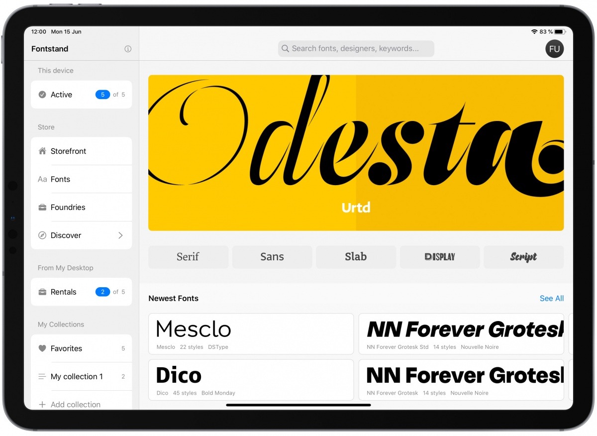
Pro Fonts for iPad
Designer fonts for your iPad (and iPad products).
-
Web Performance Today
Front-end design/development then and now. As web design becomes more complicated, so do performance solutions. Enjoy a nostalgic look back at yesterday’s best practices, and dive into great resources for optimizing today’s complex websites and…
-
A Helvetica For Readers
A Helvetica For Readers: behind the site design for Robert Slimbach’s new Acumin type family—fresh at zeldman.com.
-
Leo Laporte interviews JZ
IN EPISODE 63 of Triangulation, Leo Laporte, a gracious and knowledgeable podcaster/broadcaster straight outta Petaluma, CA, interviews Your Humble Narrator about web standards history, responsive web design, content first, the state of standards in a…
-
Readlists: behind the scenes
FROM THE HOME PAGE of today’s newly announced, totally disruptive, completely free product powered by Readability: “What’s a Readlist? A group of web pages—articles, recipes, course materials, anything—bundled into an e-book you can send to…
-
Web Type Will Save Us (Or, Who’s Afraid of the Big, Bad Retina Display?)
WITH RETINA DISPLAY technology on the verge of ubiquity and some of today’s best web design minds rightfully fretting about it (see PPK, Stephanie Rieger, Brad Frost, and Stuntbox if you’ve missed this latest Topic…
-
An Event Apart: On Web Typography
IN HIS TALK at An Event Apart in Atlanta, GA 2011, Jason Santa Maria outlined the current state of web fonts and how to approach typography online. Here’s my notes from his talk: LukeW | An…
-
An Event Apart Atlanta 2011
YOU FIND ME ENSCONCED in the fabulous Buckhead, Atlanta Intercontinental Hotel, preparing to unleash An Event Apart Atlanta 2011, three days of design, code, and content strategy for people who make websites. Eric Meyer and…
-
HTML5, CSS3, UX, Design: Links from An Event Apart Boston 2011
Meeting of the Minds: Ethan Marcotte and AEA attendee discuss the wonders of CSS3. Photo by the incomparable Jim Heid. THE SHOW IS OVER, but the memories, write-ups, demos, and links remain. Enjoy! An Event…
-
Questions, Please: Jeffrey Zeldman’s Awesome Internet Design Panel today at SXSW Interactive
HEY, YOU WITH THE STARS in your eyes. Yes, you, the all too necessary SXSW Interactive attendee. Got questions about the present and future of web design and publishing for me or the illustrious panelists…
-
2010: The Year in Web Standards
WHAT A YEAR 2010 has been. It was the year HTML5 and CSS3 broke wide; the year the iPad, iPhone, and Android led designers down the contradictory paths of proprietary application design and standards-based mobile…
-
Episode 32: Mandy Brown on publishing, Typekit, and more
MANDY BROWN (@aworkinglibrary) is our guest today, Thursday December 23, 2010 in Episode No. 32 of The Big Web Show, co-hosted by Dan Benjamin and recorded at 1:00 PM Eastern before a live internet audience.…
-
The future of web standards
“Cheap, complex devices such as the iPhone and the Droid have come along at precisely the moment when HTML5, CSS3 and web fonts are ready for action; when standards-based web development is no longer relegated…