Category: Platforms
-

Valediction.
What a ride that was.
-

The More Things Change… (or: What’s in a Job Title?)
I’m designing for the web. The infinitely flexible web.
-
CAPTCHA excludes disabled web users
The W3C explains how CAPTCHA excludes disabled users, and suggests alternatives that may be kinder and more reliable.
-

In search of a digital town square
Ever since an infantile fascist billionaire (hereafter, the IFB) decided to turn Twitter over to the racially hostile anti-science set, folks who previously used that network daily to discuss and amplify topics they cared about…
-
Algorithm & Blues
Examining last week’s Verge-vs-Sullivan “Google ruined the web” debate, author Elizabeth Tai writes: I don’t know any class of user more abused by SEO and Google search than the writer. Whether they’re working for their…
-
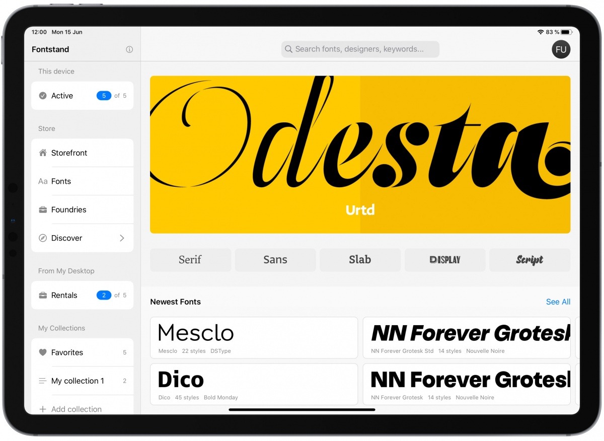
Pro Fonts for iPad
Designer fonts for your iPad (and iPad products).
-

To Save Real News
IN a world where newspapers are dying and half the public believes fake news, what online news experiences need is design that is branded, authoritative, and above all, readable: Branded, because we need to convert…
-
? 139: Every Time We Touch—Josh Clark, author of “Designing For Touch”
Designer Jeffrey Zeldman discussed the ins and outs of touch-based design with Josh Clark, author of “Designing For Touch.” Why game designers are some of our most talented and inspiring interaction designers; the economy of…
-
Save “Save For Web”
Software is politics: or, the seeming disappearance of Save For Web from Adobe Photoshop.
-
Who’s Afraid of the Big Bad Medium?
Why are independent content creators afraid of Medium.com?
-
This is a Website
LAST NIGHT at dinner, my friend Tantek Çelik (and if you don’t know who he is, learn the history of your craft) lamented that there was no longer any innovation in blogging—and hadn’t been for…
-
Big Web Show: Squarespace
SQUARESPACE CEO and founder Anthony Casalena is my guest in Episode 87 of The Big Web Show (“everything web that matters”). We discuss the platform’s capabilities and the three markets it serves (consumer, designer, developer);…
-
Readlists: behind the scenes
FROM THE HOME PAGE of today’s newly announced, totally disruptive, completely free product powered by Readability: “What’s a Readlist? A group of web pages—articles, recipes, course materials, anything—bundled into an e-book you can send to…
-
CSS & Mobile To The Future | Embrace Users, Constrain Design | An Event Apart Seattle 2012 Day II
TUESDAY, 3 APRIL 2012, was Day II of An Event Apart Seattle, a sold-out, three-day event for people who make websites. If you couldn’t be among us, never fear. The amazing Luke Wroblewski (who leads…
-
Say No to SOPA!
A LIST APART strongly opposes USHR 3261 AKA the Stop Online Piracy Act (SOPA), an ill-conceived lobbyist-driven piece of legislation that is technically impossible to enforce, cripplingly burdensome to support, and would, without hyperbole, destroy…