Category: links
Outside reading. Visual and textual fun for boys and girls.
-
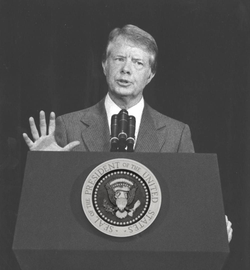
Jimmy Carter was right
What Carter did in his speech was something rare in the annals of democratic government: he confronted the people with the truth—about his own failings, about the reality of the world around them, and most…
-

We named them after the humans they were replacing.
“The word ‘computer’ only really slid over to mean ‘a machine’ in the late 19th and early 20th centuries, once we started building mechanical and then electronic devices to do that work instead [of people].…
-

My weekend project
By controlling what I listen to, and the order in which I listen, I’m slowly designing an infinite collage of my evolving musical tastes.
-
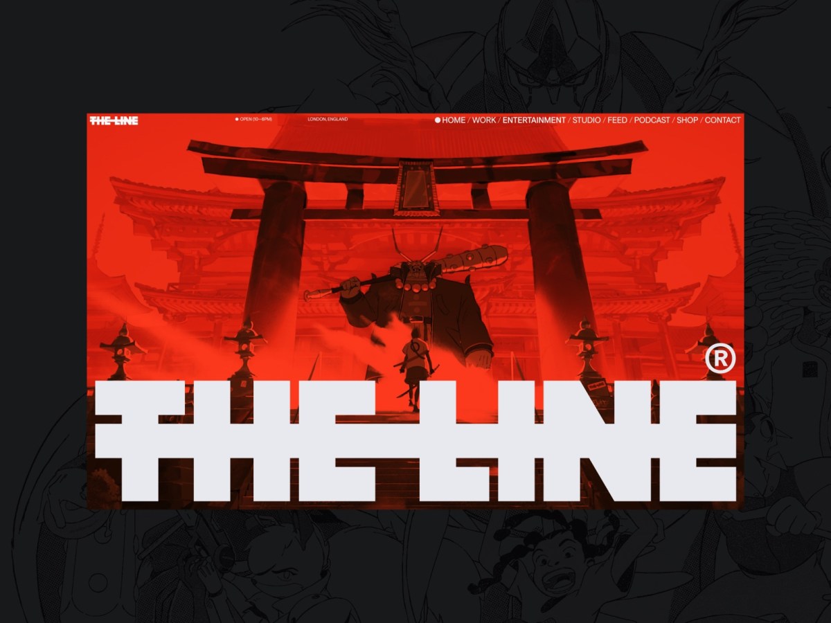
Web Design Inspiration
If you’re finding today a bit stressful for some reason, grab a respite by sinking into any of these web design inspiration websites.
-
Both Sides, No
Even when it’s ugly—especially when it’s ugly—journalists owe readers the truth.
-

The More Things Change… (or: What’s in a Job Title?)
I’m designing for the web. The infinitely flexible web.
-
Our Lady of Perpetual Profit
A business world with deeply misguided priorities—exemplified by horror stories from the worlds of tech, gaming, and entertainment—accounts for much worker unhappiness and customer frustration.
-

“Where the people are”
Fortunately, on that day, I allowed a strong, simple idea to penetrate my big, beautiful wall of assumptions.
-

In search of a digital town square
Ever since an infantile fascist billionaire (hereafter, the IFB) decided to turn Twitter over to the racially hostile anti-science set, folks who previously used that network daily to discuss and amplify topics they cared about…
-

Operation Paperclip (and other crimes)
Evil is rarely a solo project. Horrors and atrocities of the past may provide context for the horrors and atrocities happening right now in Gaza and the Congo. United States war crimes: Gosh, where to…
-

Fly, my designers, fly!
Designers can either become drivers of business within their organizations, or they can create the businesses they want to drive. We’re entering an era of design entrepreneurship, in which some designers are realizing that they’re…
-
Algorithm & Blues
Examining last week’s Verge-vs-Sullivan “Google ruined the web” debate, author Elizabeth Tai writes: I don’t know any class of user more abused by SEO and Google search than the writer. Whether they’re working for their…
-
He Built This City: The Return of Glenn Davis
You may not know his name, but he played a huge part in creating the web you take for granted today. And he’s back—kind of.
-

Rediscovering music
If Spotify exposes you to new music, Last.fm helps remind you of great music in your existing collection that may have slipped your mind.
-
Amplifying voices
To inspire the next generation of black and brown designers…