Category: industry
This web business: culture and concepts.
-
RSS creator on Bluesky & AT Proto
Bluesky can’t abandon the developers who made a bet on AT Proto, so they should give the protocol to a standards body while catching up on UX.—Dave Winer
-

The salad bar theory of UX professionalism
Less, but better? Not this week.
-

We named them after the humans they were replacing.
“The word ‘computer’ only really slid over to mean ‘a machine’ in the late 19th and early 20th centuries, once we started building mechanical and then electronic devices to do that work instead [of people].…
-
Cold Storage
Good UX is what companies do when they have to. A company that has your stuff locked away doesn’t have to.
-

My weekend project
By controlling what I listen to, and the order in which I listen, I’m slowly designing an infinite collage of my evolving musical tastes.
-
Valediction.
What a ride that was.
-
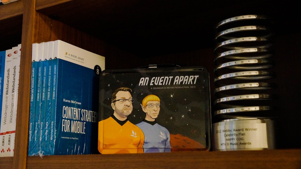
Of Books and Conferences Past
Of books and conferences past: A maker looks back on things well-made but no longer with us.
-

This Web of Ours, Revisited
Why did leading designers in 2000 look down their nose at the web? And are things any better today?
-

The More Things Change… (or: What’s in a Job Title?)
I’m designing for the web. The infinitely flexible web.
-
Our Lady of Perpetual Profit
A business world with deeply misguided priorities—exemplified by horror stories from the worlds of tech, gaming, and entertainment—accounts for much worker unhappiness and customer frustration.
-
CAPTCHA excludes disabled web users
The W3C explains how CAPTCHA excludes disabled users, and suggests alternatives that may be kinder and more reliable.
-

“Where the people are”
Fortunately, on that day, I allowed a strong, simple idea to penetrate my big, beautiful wall of assumptions.
-
Get it right.
“Led” is the past tense of “lead.” L.E.D. Not L.E.A.D. Example: “Fran, who leads the group, led the meeting.” When professional publications get the small stuff wrong, it makes us less trusting about the big…
-

In search of a digital town square
Ever since an infantile fascist billionaire (hereafter, the IFB) decided to turn Twitter over to the racially hostile anti-science set, folks who previously used that network daily to discuss and amplify topics they cared about…