Category: Free Advice
-
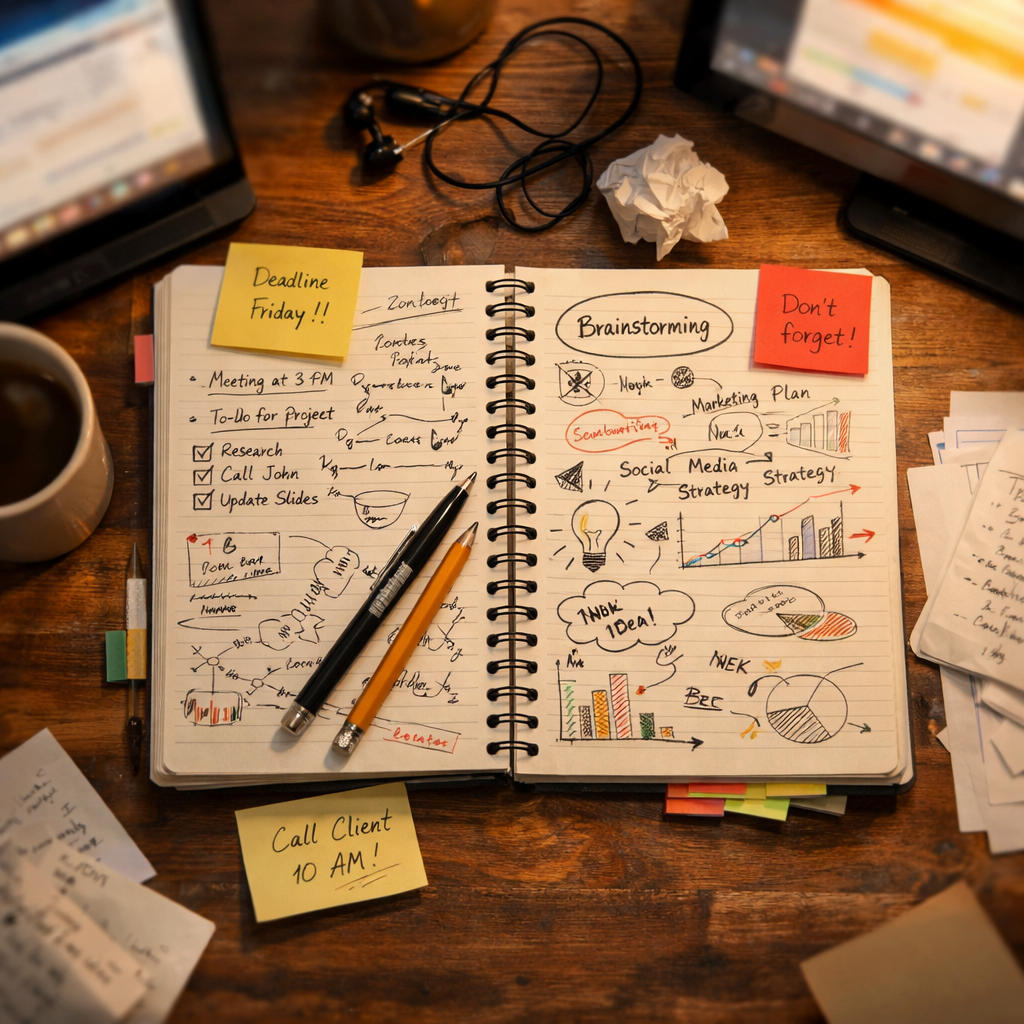
Handwritten notes in the time of AI note takers
The best project management tool is still a pen, plus the discipline to notice what the machine cannot. Wisdom from Lucas Radke.
-

Advice for job seekers
Pitching isn’t bragging.
-
Cold Storage
Good UX is what companies do when they have to. A company that has your stuff locked away doesn’t have to.
-

How do you spell success?
Working in tech means being comfortable with change and uncertainty. Successfully working in tech means not letting change and uncertainty paralyze you. Forge ahead on the best information you have, and be prepared to change…
-

My weekend project
By controlling what I listen to, and the order in which I listen, I’m slowly designing an infinite collage of my evolving musical tastes.
-

Of Books and Conferences Past
Of books and conferences past: A maker looks back on things well-made but no longer with us.
-

The More Things Change… (or: What’s in a Job Title?)
I’m designing for the web. The infinitely flexible web.
-
Just add water.
Quick, before everyone else thinks of it. Set the word “SUCCESSION” in Engravers Gothic and export it to a transparent PNG. Download photos of confederate general Mitch McConnell and Republican Johns Thune (R-S.D.), Cornyn (R-Texas),…
-
Algorithm & Blues
Examining last week’s Verge-vs-Sullivan “Google ruined the web” debate, author Elizabeth Tai writes: I don’t know any class of user more abused by SEO and Google search than the writer. Whether they’re working for their…
-
Position Wanted: Front-End Director
WE have creative directors and design directors, but we don’t seem to have any front-end directors. And maybe we should. For years at big companies, people in different silos have written CSS with no information…
-

Shopify Partners Program wants you—and so do I!
Apply now to join the next round of Shopify Partner Studio!
-
The Year in Design
Mobile is today’s first screen. So design responsively, focusing on content and structure first. Websites and apps alike should remove distractions and let people interact as directly as possible with content. 90 percent of design…
-
2010: The Year in Web Standards
WHAT A YEAR 2010 has been. It was the year HTML5 and CSS3 broke wide; the year the iPad, iPhone, and Android led designers down the contradictory paths of proprietary application design and standards-based mobile…
-
iPad as the new Flash
iPad. Never have so many embraced a great product for exactly the wrong reasons. Too many designers and publishers see the iPad as an opportunity to do all the wrong things—things they once did in…
-
Web Design and Fitness
Three times a week I work out hard with a trainer at a gym. It’s like sex. I don’t mean it feels good. On the contrary, it hurts. And I don’t mean there’s cuddling after.…