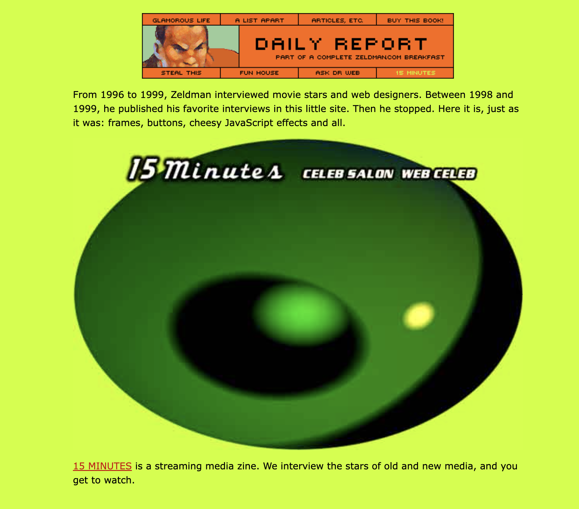
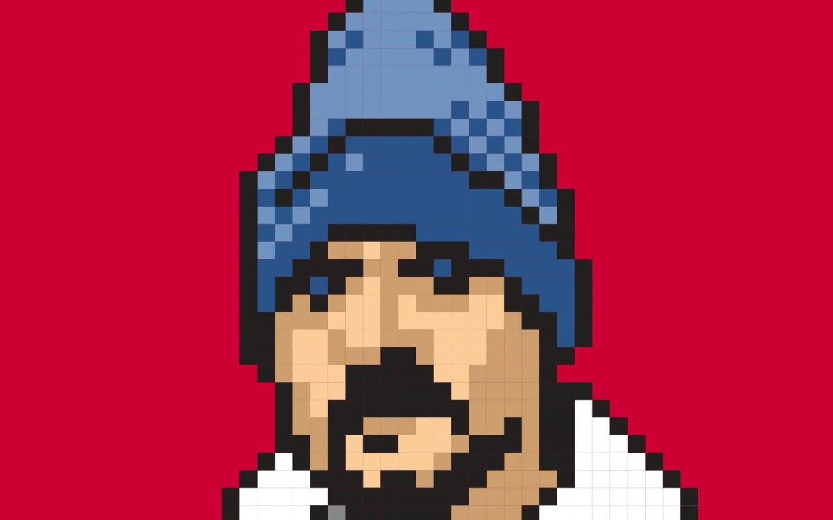
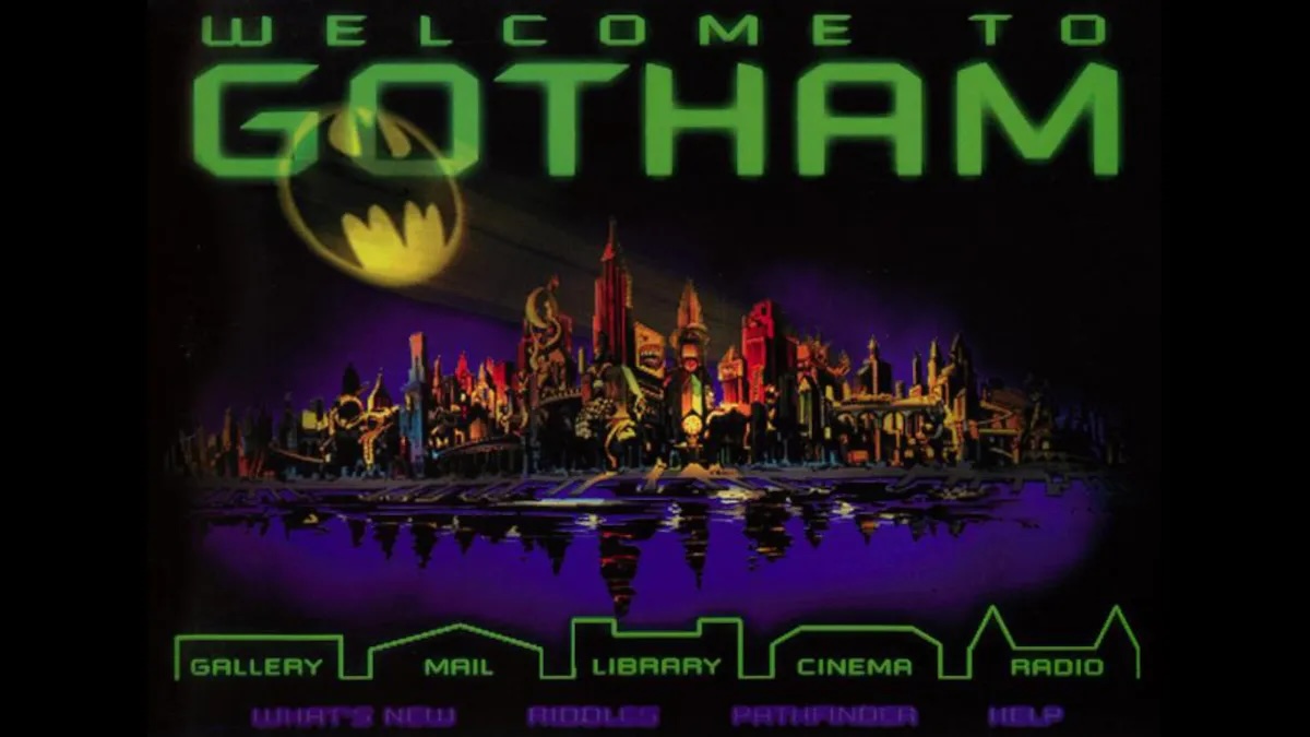
Categories
Design

Resistance makes side projects hard

Today marks 15 full months that I’ve been working on a side project called Crafd. It’s a community for people who make things by hand: In that time …

Resistance makes side projects hard
Categories
Accessibility Design IXD Usability User Experience UX

A faster horse

“The user is never wrong” means, when a user snags on a part of your UX that doesn’t work for her, she’s not making a mistake, she’s doing you a favor.

To benefit from this favor, you must pay vigilant attention, prioritize the discovery, dig deeply enough to understand the problem, and then actually solve it.

In so doing, you will not only be secretly thanking the user who discovered your error, you’ll be aiding all of your users, and ultimately, attracting new ones.


Think about this tomorrow. For today, Happy Labor Day to all who toil.

Categories
Design

Through Your Tears & Sorrow

My daughter Ava has written a new essay about autism, trauma, and the mysteries of socialization.

Categories
Design industry Information architecture

My Liz Danzico Joke

I used to tell a joke I made up. An American goes to the Vatican on Easter Sunday, joining a huge crowd of worshippers who gaze up in awe at a raised platform. On the platform stands the Pope. Beside him is Liz Danzico.

The American turns to a nearby man and asks, “Excuse me. Who is that with the Holy Father?”

The man answers, “I don’t-a know who’s the guy in the pointy hat, but that’s-a Liz Danzico up there.”

Categories
A List Apart art direction Design Standards State of the Web Web Design Web Design History Web Standards webfonts Websites webtype

The Next Generation of Web Layouts

Who will design the next generation of readable, writerly web layouts?

Layouts for sites that are mostly writing. Designed by people who love writing. Where text can be engaging even if it isn’t offset by art or photography. Where text is the point.

With well considered flexible typesettingmodular scaling, and readable measures across a full range of proportions and devices. With optional small details that make reading screens of text a pleasure instead of a chore. With type sizes that are easy to read without needing to zoom in. And with a range of interesting sans and serif fonts (including variable fonts) that support reading and encourage creative exploration where headlines are concerned.

Well? How did we get here?

The web has come along way since design meant crafting UIs in Photoshop and exporting them as sliced GIFs. Flash. SiFR. Table layout. Rebellion and rethinking. Liquid layout. Semantic HTML and CSS layout. Adaptive layout. Responsive layout. Intrinsic layout. Web fonts. Big type and super lightweight UX emphasizing readability was new (and controversial!) in 2012. We’ve long since accepted and improved upon it. Today’s news, magazine, and blog pages are more flexible, readable, and refined than ever before.

So what comes next? For writers, one hopes that what’s next is a fresh crop of small, innovative advancements. Improvements that are felt by readers, even when they aren’t always consciously noticed. Layouts that are not merely legible, but actually feel inevitable, at all sizes and in all contexts.

Beyond outside the box

Services like Typetura may point the way. A marriage of type and tech, Typetura is different from other typesetting methods. An intrinsic typography technology, it “enables you to design with more flexibility, while dramatically reducing code.” Disclaimer: I’m friends with, and have long admired the work of, Typetura founder Scott Kellum. Designing With Web Standards readers will recognize his name from the Kellum Image Replacement days of the early 2000s, but that ain’t the half of what he has done for web design, e.g. inventing dynamic typographic systemshigh impact ad formatsnew parallax techniques, and fluid typesetting technology. Scott was also the coder, along with Filipe Fortes, of Roger Black’s late, lamented Treesaver technology. But I digress.

The tech is not the pointexcept in so far as it improves our ability to think beyond our current understanding of what design and layout means. Just as Gutenberg’s printing press was not the point, but it was the point of departure. Initially, the invention of movable type reproduced the writing we already knew (i.e. the King James Bible). But ultimately, by freeing writing and reading from narrow elite circles and bringing it to more (and more diverse) minds, Gutenberg’s invention transformed what writing was and could be—from the invention of newspapers to the fiction of Virginia Woolf to multimedia experiences, and perhaps even to the web.

Let us all to play with Jen Simmons’s intrinsic web layout ideas and Scott Kellum and partners’s Typetura. While we also sketch in pencil and spend time looking at well designed books —printed, bound ones as well as digital publications in various devices. And specifically, not just fabulous coffee table books, but books that you’ve reread over and over, to understand what, beyond the text itself, encourages that reading response. So that, together, we may take the experiences of both reading and writing to the next level.

Appendix: Resources

If you’re new to the interplay between design and code on the open web, or if you just want a refresher, here are some evergreen links for your further learning and pleasure:


Categories
A Book Apart Accessibility Advocacy Authoring Best practices books Design

Immersive Content and Usability

So little time, so many wonderful, evergreen titles. The A Book Apart library for people who design, write, and code ... in coffee mug format.

As the lines between our physical and digital surroundings continue to blur, it’s more important than ever to design usable and accessible content for our ever-expanding array of contexts.

In 2021, A Book Apart and I were delighted to bring you Preston So’s Voice Content and Usability, the definitive book on voice content, and A Book Apart’s first voice title.

Now, in 2023, we’re thrilled to present Preston’s brilliant follow-up, Immersive Content and Usability, coming April 18.

Armed with this book, you’ll create incisive and inclusive user-centered experiences across augmented, extended, and virtual realities, transforming the physical world into an exciting new canvas for content.

Pre-order now! https://abookapart.com/products/immersive-content-and-usability

Categories
Design industry tweets twitter

Twitter Blues

Before the present owner, I was a Twitter Blue customer, because I always pay for software—to support its creators and help prevent it from disappearing, as so many great websites and platforms have done over the years. 

It wasn’t about the Twitter Blue pro features, to be honest, because they were few and inessential.

For instance, the ability to unsend a tweet for 30 seconds turned out to be more of an annoyance than an asset. Its value could be replicated without the feature, simply by taking a few seconds to reread your post before hitting Send. Most of the time, the feature felt to me like an annoying delay before every tweet went up.

And as Twitter compulsion is closely connected to the dopamine hit of instant gratification—voila! your thought is out there in the world, quick as the firing of a synapse!—waiting 30 seconds soon came to feel like a drag on the experience, not a benefit worth paying for. Like a cigarette that takes thirty seconds to deliver nicotine when you drag on it.

Nevertheless, as long as I had the income to do so, I would have continued to pay, simply to help Twitter keep going.

Because we’ve all seen what happens to beloved platforms after they run for too long on fumes. Investors grab lifeboats. Founders sell to a new owner who rapidly enshittifies the platform. Or the product disappears. Or it lingers as an under-resourced shadow of its former self, like a loved one with a tragically wasting disease. (Something I know far too much about.)

Besides: Twitter, as a town square, was important. Leaving its future health to the mercies of subscription models and advertising was risky enough.

Just as, despite the many obstacles to true representative democracy that threaten my country, it remains my sacred duty to vote, so too—as a user and fellow creator—did it feel like my duty to vote for Twitter’s continued existence with my wallet. (Again, acknowledging the privilege of having employment and at least a modicum of disposable income.) 

I won’t rehash the history of the new regime’s dangerous decisions and confounding errors of judgement—and that’s putting it charitably. Or share my anxieties about the Beloved Platform turning into a red-pilled fuckfest of racist, sexist pile-ons. 

Even when a longtime web acquaintance persuaded the new owner to “democratize” the blue checkmark by charging for it (and we’ll skip that history, which is still in progress, as well), I kept using Twitter, kept paying my Twitter Blue dues, and kept hoping for the best.

Even as brilliant people with vital jobs got kicked out by the thousands. Even when respected friends and colleagues abandoned Twitter like it was a room that smelled of corpses. Even when each day’s freshly absurd Twitter news cycle conjured disbelief worthy of U.S. Election Night 2016.

“Maybe it won’t be so bad,” I whispered to myself.

“I’ll hang in there,” I said.

As if continuing to use Twitter was some bizarre loyalty test to the platform itself, and not to the ideas and human beings that drove it. Like loyalty to a friend who drives his car into trees while drunk. “I’m not going to abandon him now, he needs help.”

Here comes the punchline: one day Twitter emailed me to say that my Twitter Blue account was being discontinued, but I would soon have the opportunity to pay for an exciting *new* version of Twitter Blue.

Then Twitter emailed me inviting me to roll over my credit card so as to become a member of the new Twitter Blue. Which made me wonder: do I continue to go by the principle of paying for software I use, even when I disapprove of the direction in which a new owner is taking the platform? Or do I register my dislike of that direction by refusing to pay, even if it accelerates the death of the platform? (Whereas I was still hoping for the platform to survive and right itself, no pun intended.)

In the end, and I know I’ll lose many of you here, I decided to keep paying. And now the promised punchline: Twitter was unable to accept my credit card, and the subscription failed. 

I tried for maybe 30 minutes.

I’ve successfully used software for over 30 years, and I’ve written a few things about UX and web design and development, so I generally have some idea of what I’m doing when I interact with internet content, and I also know that shopping carts are supposed to work. They’re not supposed to make users think. They’re supposed to make it easy to pay, whether you actually need the product or not.

Yet somehow—I wonder if it had to do with (illegally) firing most of the staff?—Twitter was not able to take my money.

The attempt to subscribe failed. Over and over. Perhaps it was my higher power telling me something. Perhaps it was my unconscious telling me something. But most likely, it was simple engineering and UX incompetence, caused by the removal of almost everyone at Twitter who knew what they were doing.

And the second punchline? I still have my blue checkmark. Which I’ve had since, like, 2006, or whenever the original Twitter first bestowed it. I guess because I’m of some small note in my field.

Of course, for all of having 322K followers, almost nobody sees my tweets, as the stats (and lack of engagement) plainly show me.

So either most of my 322K followers have abandoned the platform, or the algorithm works to minimize my footprint. And, theoretically, that latter situation would change if I paid Twitter the monthly $8—or, I believe it has gone up to $11, now, with price increases over time part of this week’s strategy to frighten folks into subscribing while they can still afford do so.

But I tried to give Twitter my money, even when I had Enormous Doubts that it was the right thing to do. And they simply wouldn’t take it. La de da. And for now I’m content to wait, peck my posts into the maw of the blind white whale, and see what changes next. 

Twitter Blue, Twitter Blues, Twitter blew it.

Categories
Design social media social networking software twitter

“A $44 billion version of MySpace.”

The beautiful Twitterific icon, designed by The Iconfactory. Rest in peace.

My longtime friend and former collaborative partner Craig Hockenberry bids a dignified adieu to Twitterific, Twitter, and his mom … and calls for a standards-based universal timeline. — The Shit Show

Categories
Advocacy Archiving Browsers Community Design glamorous HTML industry javascript launches links Off My Lawn! people Publications Responsive Web Design Standards State of the Web Stories The Profession W3C Web Design Web Design History Web Standards Websites

He Built This City: The Return of Glenn Davis

You may not know his name, but he played a huge part in creating the web you take for granted today. 

As the first person to realize, way back in 1994, that the emerging web could be a playground, he created Cool Site of the Day as a single-focused blog dedicated to surfacing interesting sites, thereby demonstrating the web’s potential while creating its first viral content. (As an example, traffic from his followers, or, as we called them back then, readers, brought NASA’s web server to its knees.)

He co-founded The Web Standards Project, which succeeded in bringing standards to our browsers at a time when browser makers saw the web as a software market to be dominated, and not a precious commons to be nurtured.

He anticipated responsive web design by more than 20 years with his formulation of Liquid, Ice, and Jello as the three possible ways a designer could negotiate the need for meaningful layout vis-a-vis the unknowns of the user’s browsing environment.

He taught the web DHTML through his educational Project Cool Site. 

And then, like a handful of other vital contributors to the early web (e.g. Todd Fahrner and Dean Allen), he vanished from the scene he’d played so large a role in creating.

He’s ba-ack

Glenn Davis wasn’t always missed. Like many other creators of culture, he is autistic and can be abrasive and socially unclueful without realizing it. Before he was diagnosed, some people said Glenn was an a**hole—and some no doubt still will say that. I think of him as too big for any room that would have him. And I’m talking about him here because he is talking about himself (and the history of the early web) on his new website, Verevolf.

If you go there, start with the introduction, and, if it speaks to you, read his stories and consider sharing your own. That’s how we did it in the early days, and it’s still a fine way to do it—maybe even the best way.

I knew Glenn, I worked with him and a lot of other talented people on The Web Standards Project (you’re welcome!), and it’s my opinion that—if you’re interested in how the web got to be the web, or if you were around at the time and are curious about a fellow survivor—you might enjoy yourself.

Categories
Advertising client services Design glamorous industry

Fear of getting noticed

Back when I was in advertising, one of my team’s clients was a well-known Irish Airline. They could only afford an 1/8th-page ad in the travel section of the paper. But my partners and I didn’t think creativity was dependent on budget. We were determined to deliver great ads for them—ads that would make a viewer look, even though the ad was tiny and was surrounded by other ads.

So we created a standout campaign for them—the kind that would not simply be noticed, but would also make travel-focused consumers smile and encourage them to buy tickets.

We blew up our tiny layouts and mounted the enlargements on illustration board, for an impactful creative presentation when we met to show the client the work.

The great day came. The work was good, and we had rehearsed our presentation to perfection. We booked the conference room, had the client’s favorite snacks and beverages spread out when they arrived, and sold our little hearts out as we presented.

Silence.

The lead client blinked, cleared his throat, and finally said, in a thick Irish brogue:

“I’m afraid it’s far too clever for our needs. It calls too much attention to itself on the page,” he explained—as if getting a distracted newspaper reader to notice his company’s message was a bad thing.

The lead client asked us to set “Ireland $399” in bold type, stick a shamrock in one of the 9s, and call it a day.


Fear of getting noticed is a terrible thing. It’s also a self-fulfilling prophecy.

Clickbait headlines get a deservedly bad rap in digital marketing, but you know what else should get a bad rap? Blind, boring, infinitely ignorable links and titles, that’s what.

Crafting messages that get noticed and acted upon by their intended audience—the people for whom you create your company’s digital products in the first place—isn’t a crime. It’s your job.


Hat tip to Mark Mazut and Tim Irwin, my fellow passengers on the above disaster. Bit o’ nostalgia for those who remember The Ad Graveyard.

Categories
art art direction creativity Design Designers experience Illustration industry New York City NYC people Portfolios Startups Stories Web Design

Looking Back, Looking Ahead: artist Dan Licht

Illustration by Dan Licht: a scary cowboy smoking a stogie and sloshing his drink. His eyes are red and he looks like he's itching for a fight.
Illustration by Dan Licht
Illustration by Dan Licht.

In 1999, I had the good fortune to work alongside Dan Licht at an NYC digital startup called SenseNet, RIP. Back then, although still in his early 20s, Dan was already an accomplished art director and digital designer. Today he’s a fantastic comics illustrator, artist, and creative director. Check his recent art on Instagram and his client work at Daniel V. Licht dot com.

A heroic letter carrier is pictured sending letters on their way in this illustration by Dan Licht. The picture has a great deal of energy, and the action is all flying toward you, the viewer.
“Protect the U.S. Postal Service,” a 2020 illustration by Dan Licht.
Categories
Advocacy automattic Blogs and Blogging Brands Community Design industry Own your content software Standards Web Design Web Standards wordpress

Enabling Folks to Express Themselves on the Web: State of the Word 2021

Screenshot of slide highlighting the four phases of WordPress Gutenberg.

Not only are we enabling folks to express themselves uniquely on the web, unlike the cookie cutter looks that all the social sites try to put you into. We’re doing it in a way which is standards-based, interoperable, based on open source, and increases the amount of freedom on the web.

—Matt Mullenweg, State of the Word 

In a live address, Automattic’s Matt Mullenweg

  • Introduces Openverse (an opt-in content commons);
  • Announces that WordPress’s beginner-friendly Learn.Wordpress.org is now available in 21 languages;
  • Philosophizes about Web3 and the “decentralized web” —which, despite big company colonization attempts, is really what the web has always been;
  • Extols the virtues of Open Source;
  • And more. 

Watch the 2021 #StateoftheWord annual keynote address on YouTube. It’s two hours long, so bring popcorn.

Selected Additional Reactions & Commentary

Hat tips to Chenda Ngak, Reyes Martínez, and Josepha Haden.

Categories
Design

#SpotifyWrapped

She’s Got It by The Leonard Simpson Duo; Mittrom by Mach-Hommy & Earl Sweatshirt; Open the Brain by Quelle Chris; Snake Oil Scientist by Marlowe; and Aunties Steak & Rice Hold the Cabbage by Camoflauge Monk (from Chopin Prelude in E Minor by Les Baxter). #SpotifyWrapped

Categories
Accessibility Best practices Blue Beanie Day Design W3C Web Design Web Standards

Blue Beanie Day 2021

Photo of astronaut David Bowman from Stanley Kubrick’s 2001 wearing a blue beanie in support of web standards.

Blue Beanie Day in support of web standards is celebrated around the world on November 30. Hey, that’s today.

So how can you help? Glad you asked! Take a self-portrait wearing a blue beanie (toque, tuque, cap) and post it to your website and social media channels with the hashtag #BlueBeanieDay.

And for that extra extra, slap a blue beanie on your web and social media avatars, as well.

Do this on November 30 as a reminder to design accessible, web-standards-based websites 365 days a year. Thank you. Love you.

Categories
An Event Apart Appearances art direction better-know-a-speaker books Career conferences Design Designers Education events Genius glamorous Illustration industry Interviews New York City NYC Off My Lawn! speaking Stories Surviving Teaching The Profession UX Web Design Web Design History work

My Night With Essl

Mike Essl and I discuss his portfolio.
Mike Essl and I discuss his portfolio on Night 2 of An Event Apart Online Together Fall Summit.

Herewith, a scene from last night’s interview with legendary web & book designer (and Dean of The Cooper Union School of Art) Mike Essl, who shared his portfolio, career highlights, early web design history, and more. Fun!

If you get a chance to meet, work with, or learn from Mike, take it. He’s brilliant, hilarious, warmly human, and one of the most creative people you’ll ever have the good fortune to know. 

Mike Essl

So ended Day 2 of An Event Apart Online Together Fall Summit 2021. Day 3 begins in less than two hours. You can still join us … or watch later On Demand.

%d bloggers like this: