Category: creativity
-
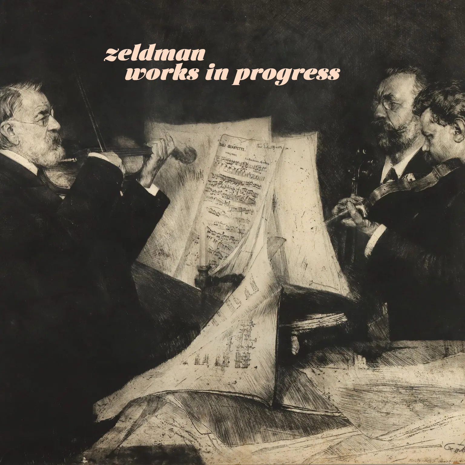
Works in Progress
New tunes from an old maker.
-

My weekend project
By controlling what I listen to, and the order in which I listen, I’m slowly designing an infinite collage of my evolving musical tastes.
-
Web Design Inspiration
If you’re finding today a bit stressful for some reason, grab a respite by sinking into any of these web design inspiration websites.
-

This Web of Ours, Revisited
Why did leading designers in 2000 look down their nose at the web? And are things any better today?
-

Our Lady of Perpetual Profit
A business world with deeply misguided priorities—exemplified by horror stories from the worlds of tech, gaming, and entertainment—accounts for much worker unhappiness and customer frustration.
-

“Where the people are”
Fortunately, on that day, I allowed a strong, simple idea to penetrate my big, beautiful wall of assumptions.
-

Just add water.
Quick, before everyone else thinks of it. Set the word “SUCCESSION” in Engravers Gothic and export it to a transparent PNG. Download photos of confederate general Mitch McConnell and Republican Johns Thune (R-S.D.), Cornyn (R-Texas),…
-
Knowledge Management for the win
Knowledge management (KM) is the process of organizing, creating, using, and sharing collective knowledge within an organization. Unlock and unblock For companies, institutions, and projects struggling to become more efficient and productive—and who these days is…
-

Fly, my designers, fly!
Designers can either become drivers of business within their organizations, or they can create the businesses they want to drive. We’re entering an era of design entrepreneurship, in which some designers are realizing that they’re…
-
Algorithm & Blues
Examining last week’s Verge-vs-Sullivan “Google ruined the web” debate, author Elizabeth Tai writes: I don’t know any class of user more abused by SEO and Google search than the writer. Whether they’re working for their…
-
Looking Back, Looking Ahead: artist Dan Licht
In 1999, I had the good fortune to work alongside Dan Licht at an NYC digital startup called SenseNet, RIP. Back then, although still in his early 20s, Dan was already an accomplished art director and digital…
-

Rediscovering music
If Spotify exposes you to new music, Last.fm helps remind you of great music in your existing collection that may have slipped your mind.
-

First, be kind.
Your feedback has the power to encourage another person, or shut them down, possibly forever.
-
Never give up
The really good designers stand up to the misfortune of a killed idea.
-
Grateful X 2
Sometimes you are reminded how just how incredibly lucky you are to know and work with passionate, talented people.