Category: books
We like to read ’em. And write ’em.
-
Cold Storage
Good UX is what companies do when they have to. A company that has your stuff locked away doesn’t have to.
-

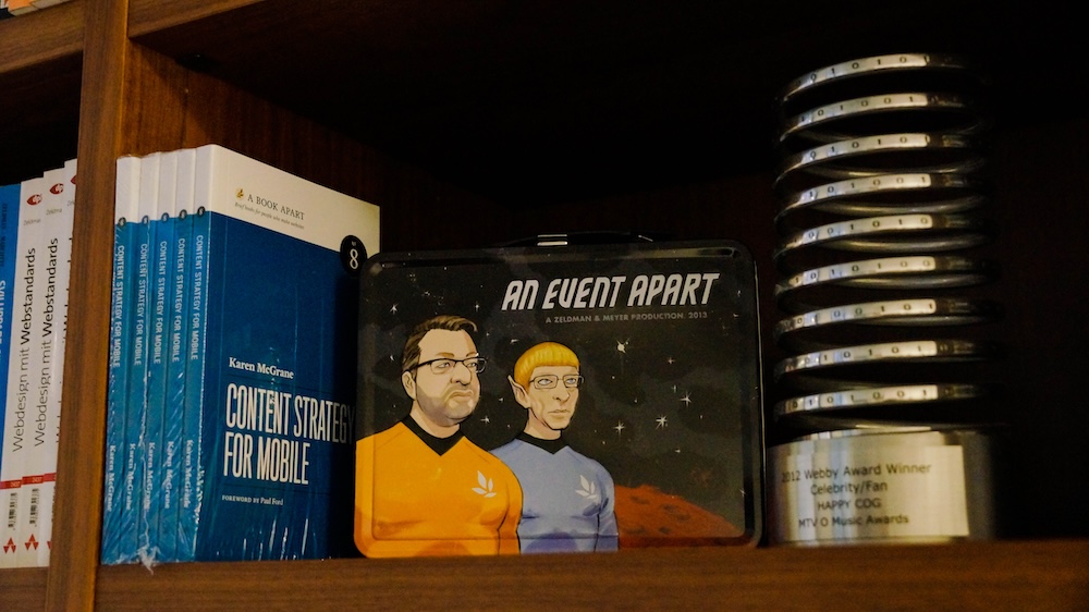
Of Books and Conferences Past
Of books and conferences past: A maker looks back on things well-made but no longer with us.
-
Immersive Content and Usability
As the lines between our physical and digital surroundings continue to blur, it’s more important than ever to design usable and accessible content for our ever-expanding array of contexts. In 2021, A Book Apart and…
-
My Night With Essl
Herewith, a scene from last night’s interview with legendary web & book designer (and Dean of The Cooper Union School of Art) Mike Essl, who shared his portfolio, career highlights, early web design history, and…
-
The Young Man from Proviso and His Monkey Friends Meet the Hamburglar
First draft, first chapter, of a children’s book I’m writing.
-
Designing For Touch
Design’s future is in your hands. Designing For Touch by Josh Clark (foreword by Brad Frost) guides you through the new frontier in design.
-
Evolving Responsive Web Design
In What We Mean When We Say “responsive” and Defining Responsiveness, Lyza Danger Gardner and Jason Grigsby cut to the heart of a disagreement I had three years ago with Ethan Marcotte, the creator of…
-
Big Web Show ? 102: Sass for Web Designers with Dribbble’s Dan Cederholm
-
Build Books With CSS3; Design a Responsive Résumé
“WE ARE ALL PUBLISHERS,” claims Issue No. 353 of A List Apart for people who make websites. Design books with CSS3; craft a responsive web résumé. Building Books with CSS3 by NELLIE MCKESSON While historically,…
-
5th annual Blue Beanie Day is November 30, 2011
New! Official Blue Beanie Day 2011 page, with banners and instructions.
-
This media life – and death
IN A GORGEOUSLY PACED ESSAY at n+1, “the magazine that believes history isn’t over just yet,” an amazing young (22?) writer named Alice Gregory reviews a novel by Gary Shteyngart while simultaneously describing her exhausted…
-
Progressive enhancement: all you need to know is here
ONE GLORIOUS AFTERNOON in March, 2006, as a friend and I hurried past Austin’s Downtown Hilton Hotel to catch the next session of the SXSW Interactive Festival, a young stranger arrested our progress. With no…
-
Episode 38: Macworld’s Jason Snell live on The Big Web Show
Macworld editorial director Jason Snell is our guest on The Big Web Show (“Everything Web That Matters”) Episode #38, recording live Thursday, February 10, at 12:00 PM Eastern. Jason, co-host Dan Benjamin and I will…
-
Top Web Books of 2010
“It’s been a great year for web design books; the best we can remember for a while, in fact!” So begins Goburo’s review of the Top Web Books of 2010. The list is extremely selective,…
-
Blue Beanie Day Haiku Contest – Win Prizes from Peachpit and A Book Apart
ATTENTION, web design geeks, contest fans, standards freaks, HTML5ophiles, CSSistas, grammarians, bookworms, UXers, designers, developers, and budding Haikuists. Can you do this? Do not tell me I Am source of your browser woes. Template validates.…