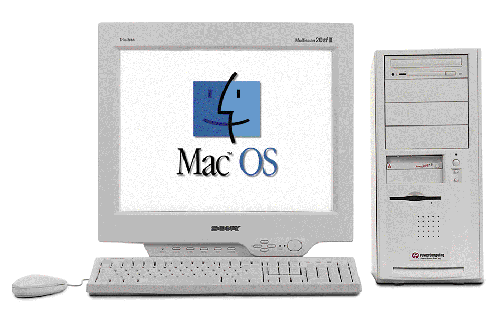
Category: Apple
-
My UX Superpower: Nothing Works!
Maybe I’m special. Or unlucky. But things that supposedly work intuitively for most users tend to fail spectacularly for me. After stints in academia, journalism, advertising, and music, I poured myself into web design in…
-
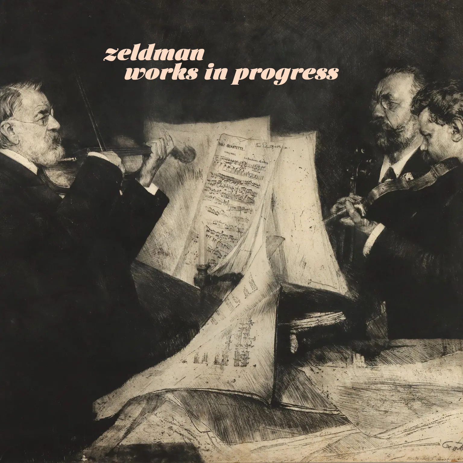
Works in Progress
New tunes from an old maker.
-

Don’t bring venture capital to a knife fight
Why you can’t build another Apple with VC bucks.
-

Just add water.
Quick, before everyone else thinks of it. Set the word “SUCCESSION” in Engravers Gothic and export it to a transparent PNG. Download photos of confederate general Mitch McConnell and Republican Johns Thune (R-S.D.), Cornyn (R-Texas),…
-
Do Not Go Gentle into that iTunes Store
AT HOME, sick with a cold and bored, my daughter buys a single packet of “My School Dance” in a freemium iTunes game. The manufacturer charges her (well, charges me) for ten packets. This same…
-
sh: /usr/bin/lockfile: No such file or directory
sh: /usr/bin/lockfile: No such file or directory in Mac OS X El Capitan explained and fixed.
-
Zen & The Art of iTunes Failure
What a recent iTunes failure taught me about attachment to work and memories.
-
Phonedrome
Did I wake the moment my phone died? Was my phone jealous of my tablet? Phonedrome: speculations on the phone-human connection.
-
Ad Blocking and the Future of the Web
By including ad blocking in iOS9, Apple isn’t trying to take down your site or mine—just like the drone program doesn’t deliberately target civilians and children. Apple is trying to hurt arch-rival Google while providing…
-
This Week In The Death of Publishing & The Web
FAST COMPANY writes: Apple, like Facebook, has entered into a standoff with the publishing industry and the open, if for-profit, web. And it’s being done under the aegis of design: choose a better reading experience…
-
Give me file hierarchies, or give me chaos.
Folders über alles.
-
Why DNS in OS X 10.10 is broken
MAC USERS, if you’ve experienced occasional (but not infrequent) network dropout problems since upgrading to Yosemite, this article in Ars Technica explains why, and tells how to fix it … if you dare. I most…
-
Dispossessed
@kirilnyc @naveen Soho Apple store circa 11:30pm pic.twitter.com/Q0PAKflG9A — Jordan Elpern-Waxman (@jelpernw) September 20, 2013 “HOMELESS FOLK sleeping in front of the SoHo Apple Store. What a perfect commentary on our society,” I thought. Then…
-
Curse of the Zeldman Curse
I HAVEN’T GRIPED about a run of bad luck with Apple products for some time, because I haven’t experienced such a run in years. So I was due. So pretty much all the Apple products…
-
Big Web Show 80: Daring Fireball’s John Gruber
IN EPISODE No. 80 of The Big Web Show (“Everything Web That Matters”) I interview Daring Fireball author John Gruber about his background in computer programming and journalism; the joy of designing print layouts with…