Category: Web Standards
-
RSS creator on Bluesky & AT Proto
Bluesky can’t abandon the developers who made a bet on AT Proto, so they should give the protocol to a standards body while catching up on UX.—Dave Winer
-
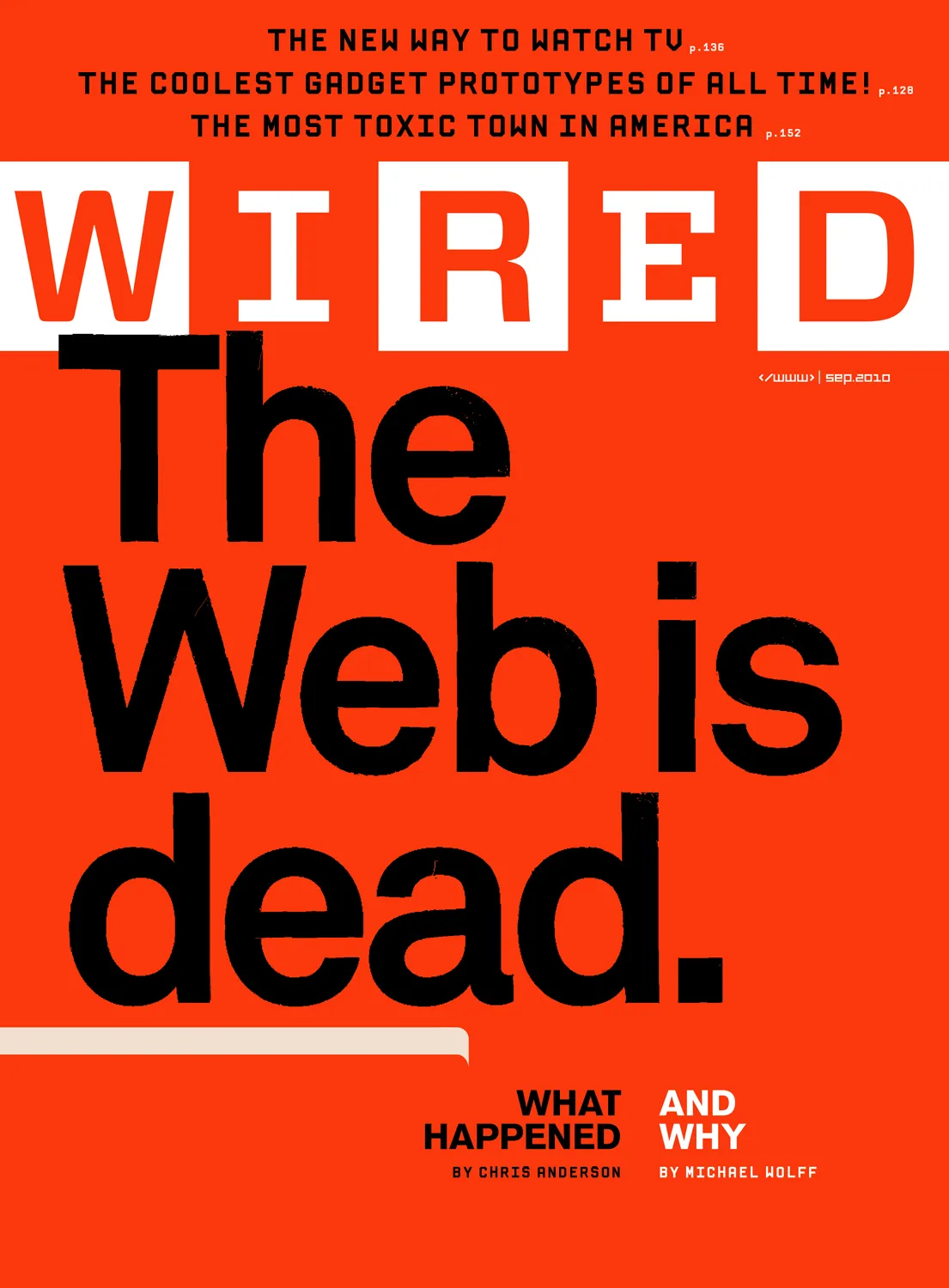
Receipts: a brief history of the death of the web.
They say AI will replace the web as we know it, and this time they mean it. Here follows a short list of previous times they also meant it, starting way back in 1997. Wired:…
-

Web typography: a refresher and history
A refreshing dip into what we’ve learned about web typography over the past 20+ years.
-

My weekend project
By controlling what I listen to, and the order in which I listen, I’m slowly designing an infinite collage of my evolving musical tastes.
-

How to Join Blue Beanie Day: Wear and Share!
Saturday, 30 November 2024, marks the 17th annual Blue Beanie Day celebration. It’s hard to believe, but web standards fan Douglas Vos conceived of this holiday way back in ’07: The origin of the name…
-
A List Apart contributors list on Bluesky
I’ve started a Bluesky list featuring some of the brilliant writers, designers, coders, editors, and others who’ve contributed to A List Apart “for people who make websites.”
-
Understanding MARTI: A New Metadata Framework for AI
At its core, MARTI is a bridge. It harmonizes with existing metadata standards like the Content Authenticity Initiative, Anthropic’s Responsible Scaling Policy, and the W3C’s PROV. It anticipates the needs of future standards, laws and practices, such as…
-

This Web of Ours, Revisited
Why did leading designers in 2000 look down their nose at the web? And are things any better today?
-

The More Things Change… (or: What’s in a Job Title?)
I’m designing for the web. The infinitely flexible web.
-
CAPTCHA excludes disabled web users
The W3C explains how CAPTCHA excludes disabled users, and suggests alternatives that may be kinder and more reliable.
-

Heal an ailing web
Leadership, hindered by a lack of diversity, has steered away from a tool for public good and one that is instead subject to capitalist forces resulting in monopolisation. Governance, which should correct for this, has…
-
The Next Generation of Web Layouts
Who will design the next generation of readable, writerly web layouts? Layouts for sites that are mostly writing. Designed by people who love writing. Where text can be engaging even if it isn’t offset by…
-
He Built This City: The Return of Glenn Davis
You may not know his name, but he played a huge part in creating the web you take for granted today. And he’s back—kind of.
-
Enabling Folks to Express Themselves on the Web: State of the Word 2021
Bring popcorn.
-
Blue Beanie Day 2021
Blue Beanie Day in support of web standards is celebrated around the world on November 30. Hey, that’s today. So how can you help? Glad you asked! Take a self-portrait wearing a blue beanie (toque,…