Categories
Design Fonts type Typography

Franklin Goes Dutch (Fonts In Use)

Dutch design studio Experimental Jetset carried out the graphic design for Pioneers of Change—a festival of Dutch design, fashion, and architecture which took place on New York’s Governors Island in September 2009. The design system, which included a website, printed programs, and wayfinding elements, made prominent use of Franklin Gothic Extra Condensed

Nick Sherman discusses a smart application of my favorite font, Franklin Gothic, in the virtual pages of what might be my new favorite design website, Fonts in Use.

Fonts in Use: Pioneers of Change

Categories
Best practices Big Web Show CSS CSS3 Design E-Books editorial HTML HTML5 State of the Web The Big Web Show Typography

Big Web Show Episode 34: Craig Mod on the Form of the Book

Craig Mod

CRAIG MOD is our guest today January 13, 2011 in Episode No. 34 of The Big Web Show (“Everything Web That Matters”), co-hosted by Dan Benjamin and recorded at 12:00 PM Eastern (new time!) before a live internet audience.

Mod (craigmod.com, @craigmod) is a writer, designer, publisher, and developer concerned with the future of publishing and storytelling. Based in Tokyo for a decade, he is co-author and designer of Art Space Tokyo, an intimate guide to the Tokyo art world. Since October 2010 Craig has been working in the California Bay Area helping sculpt the future of digital publishing with Flipboard.

Craig speaks frequently on the future of books, publishing, and digital content design. In this week’s A List Apart he presents the initial release of Bibliotype, an HTML baseline typography library for tablet reading released under the MIT License.

The Big Web Show records live every Thursday at 12:00 PM Eastern (new time).

Edited episodes can be watched afterwards, often within hours of recording, via iTunes (audio feed | video feed) and the web. Subscribe and enjoy!

Categories
A Book Apart A List Apart Adobe An Event Apart Apple architecture art direction Authoring Best practices Big Web Show client services Code content content strategy creativity CSS CSS3 Dan Benjamin Design DWWS E-Books editorial Education eric meyer Fonts Formats Free Advice Happy Cog™ Haters industry Information architecture interface ipad iphone IXD javascript links maturity New Riders peachpit Publications Publishing Real type on the web Respect Responsibility Responsive Web Design Standards State of the Web tbws The Big Web Show The Essentials The Profession This never happens to Gruber Typekit Typography Usability User Experience UX W3C Web Design Web Design History Web Standards webfonts webkit Websites webtype work Working writing Zeldman zeldman.com

2010: The Year in Web Standards

WHAT A YEAR 2010 has been. It was the year HTML5 and CSS3 broke wide; the year the iPad, iPhone, and Android led designers down the contradictory paths of proprietary application design and standards-based mobile web application design—in both cases focused on user needs, simplicity, and new ways of interacting thanks to small screens and touch-sensitive surfaces.

It was the third year in a row that everyone was talking about content strategy and designers refused to “just comp something up” without first conducting research and developing a user experience strategy.

CSS3 media queries plus fluid grids and flexible images gave birth to responsive web design (thanks, Beep!). Internet Explorer 9 (that’s right, the browser by Microsoft we’ve spent years grousing about) kicked ass on web standards, inspiring a 10K Apart contest that celebrated what designers and developers could achieve with just 10K of standards-compliant HTML, CSS, and JavaScript. IE9 also kicked ass on type rendering, stimulating debates as to which platform offers the best reading experience for the first time since Macintosh System 7.

Even outside the newest, best browsers, things were better than ever. Modernizr and eCSStender brought advanced selectors and @font-face to archaic browsers (not to mention HTML5 and SVG, in the case of Modernizr). Tim Murtaugh and Mike Pick’s HTML5 Reset and Paul Irish’s HTML5 Boilerplate gave us clean starting points for HTML5- and CSS3-powered sites.

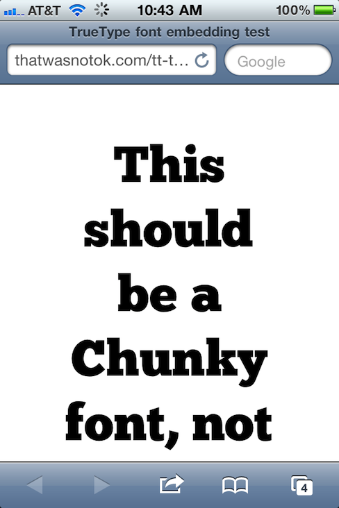
Web fonts were everywhere—from the W3C to small personal and large commercial websites—thanks to pioneering syntax constructions by Paul Irish and Richard Fink, fine open-source products like the Font Squirrel @Font-Face Generator, open-source liberal font licensing like FontSpring’s, and terrific service platforms led by Typekit and including Fontdeck, Webtype, Typotheque, and Kernest.

Print continued its move to networked screens. iPhone found a worthy adversary in Android. Webkit was ubiquitous.

Insights into the new spirit of web design, from a wide variety of extremely smart people, can be seen and heard on The Big Web Show, which Dan Benjamin and I started this year (and which won Video Podcast of the Year in the 2010 .net Awards), on Dan’s other shows on the 5by5 network, on the Workers of the Web podcast by Alan Houser and Eric Anderson, and of course in A List Apart for people who make websites.

Zeldman.com: The Year in Review

A few things I wrote here at zeldman.com this year (some related to web standards and design, some not) may be worth reviewing:

iPad as the New Flash 17 October 2010
Masturbatory novelty is not a business strategy.
Flash, iPad, and Standards 1 February 2010
Lack of Flash in the iPad (and before that, in the iPhone) is a win for accessible, standards-based design. Not because Flash is bad, but because the increasing popularity of devices that don’t support Flash is going to force recalcitrant web developers to build the semantic HTML layer first.
An InDesign for HTML and CSS? 5 July 2010
while our current tools can certainly stand improvement, no company will ever create “the modern day equivalent of Illustrator and PageMaker for CSS, HTML5 and JavaScript.” The assumption that a such thing is possible suggests a lack of understanding.
Stop Chasing Followers 21 April 2010
The web is not a game of “eyeballs.” Never has been, never will be. Influence matters, numbers don’t.
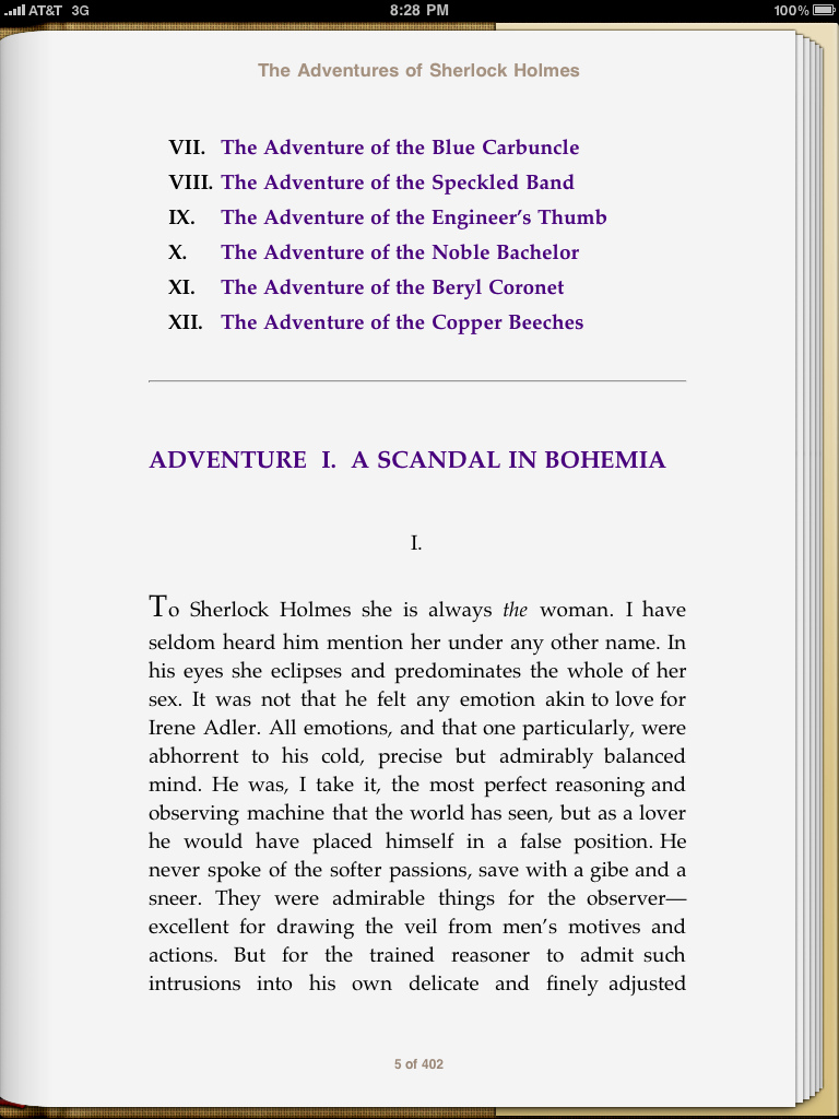
Crowdsourcing Dickens 23 March 2010
Like it says.
My Love/Hate Affair with Typekit 22 March 2010
Like it says.
You Cannot Copyright A Tweet 25 February 2010
Like it says.
Free Advice: Show Up Early 5 February 2010
Love means never having to say you’re sorry, but client services means apologizing every five minutes. Give yourself one less thing to be sorry for. Take some free advice. Show up often, and show up early.

Outside Reading

A few things I wrote elsewhere might repay your interest as well:

The Future of Web Standards 26 September, for .net Magazine
Cheap, complex devices such as the iPhone and the Droid have come along at precisely the moment when HTML5, CSS3 and web fonts are ready for action; when standards-based web development is no longer relegated to the fringe; and when web designers, no longer content to merely decorate screens, are crafting provocative, multi-platform experiences. Is this the dawn of a new web?
Style vs. Design written in 1999 and slightly revised in 2005, for Adobe
When Style is a fetish, sites confuse visitors, hurting users and the companies that paid for the sites. When designers don’t start by asking who will use the site, and what they will use it for, we get meaningless eye candy that gives beauty a bad name.

Happy New Year, all!

Categories
Design Fonts Tools type Typekit Typography webfonts webkit Websites webtype

Cure for the Common Webfont, Part 2: Alternatives to Georgia

For nearly fifteen years, if you wanted to set a paragraph of web text in a serif typeface, the only truly readable option was Georgia. But now, in web type’s infancy, we’re starting to see some valid alternatives for the king of screen serifs. What follows is a list of serif typefaces that have been tuned—and in some cases drawn from scratch—for the screen.

Stephen Coles, December 6, 2010:
Cure for the Common Webfont, Part 2: Alternatives to Georgia

Categories
CSS CSS3 Design type Typekit Typography Web Design Web Design History Web Standards webfonts webkit Websites webtype

Web type news: iPhone and iPad now support TrueType font embedding. This is huge.

TrueType font embedding in iPhone, Hallelujah!

TrueType font embedding has come to iPhone and iPad, Hallelujah, brothers and sisters. That is to say, Mobile Safari now supports CSS embedding of lower-bandwidth, higher-quality, more ubiquitous TrueType fonts. This is huge. Test on your device(s), then read and rejoice:

The Typekit Blog: iOS 4.2 improves support for web fonts

iOS 4.2 is also the first version of Mobile Safari to support native web fonts (in TrueType format) instead of SVG. This is also exciting news, as TrueType fonts are superior to SVG fonts in two very important ways: the files sizes are dramatically smaller (an especially important factor on mobile devices), and the rendering quality is much higher.

Ryan N.: Confirmed: TrueType Font Support on Mobile Safari on iOS 4.2

Thanks to Matt Wiebe for mentioning the rumour that Mobile Safari on iOS 4.2 supports TrueType fonts and providing a handy link to test.

TrueType

TrueType is an outline font standard originally developed by Apple Computer in the late 1980s as a competitor to Adobe’s Type 1 fonts used in PostScript. TrueType has become the most common format for fonts on both the Mac OS and Microsoft Windows operating systems.

The primary strength of TrueType was originally that it offered font developers a high degree of control over precisely how their fonts are displayed, right down to particular pixels, at various font sizes. With widely varying rendering technologies in use today, pixel-level control is no longer certain in a TrueType font.

More about webfonts

If you’re coming late to the party, the following bits of required reading and listening will get you up to speed on the joys (and occasional frustrations) of “real type” on the web:

  1. Bulletproof @font-face syntax, Paul Irish, 4 September, 2009
  2. Web Fonts at the Crossing, Richard Fink, 8 June 2010, A List Apart
  3. Big Web Show Episode 1, Dan Benjamin and I discuss webtype with Ethan Dunham of Fontspring and Font Squirrel and Jeffrey Veen of Typekit
  4. Big Web Show Episode 18, Dan Benjamin and I discuss webtype, screen resolution, and more with Roger Black
  5. Thanks

    My thanks to David Berlow of Font Bureau for waking me from my Thanksgiving stupor and alerting me to this exciting slash overdue development.

Categories
Design Layout type Typography

Weirdest Type Design Ever?

Movie poster captured by Heather Shaw. There are several variations, all equally baffling. I’m hoping there’s a concept behind it—that it’s bad design to make a point.

Categories
Design Fonts Fun Typography

Designer Flow Chart Picks Typefaces For Your Projects

So you need a typeface

Tired of staring at your font collection, wondering what a trained graphic designer would do with all those typefaces? Unsure whether Times or Miller is the more appropriate choice for that vaguely left-leaning newspaper you have to design? Want to make sure that info-graphic you’re designing looks hot? Then, friend, you need So You Need a Typeface, a large, hot-looking info-graphic suitable for printing and framing (or at least taping to the wall of your cubicle).

From the good folks at Inspiration Lab.

Categories
Applications apps Big Web Show Chicago Design Small Business software The Big Web Show Typography

Episode 20: Designing Web Applications, Managing Teams, and Creating Readability


Rich Ziade

Rich Ziade, creator of the popular reading tool Readability, guests on Thursday’s today’s episode of The Big Web Show, co-hosted by Dan Benjamin and taped before a live internet audience.

Richard Ziade is the founding partner of Arc90, a consulting firm, product shop, and idea incubator based in New York City. Arc90 has a reputation as one of the best web application design shops around. Alas, nearly all their web application design work is for private corporate clients. Thus most of us don’t get a chance to see and learn from Arc90’s work. Fortunately we can get a taste of what they’re about by visiting the Arc90 Lab, where the company shares ideas, tools, and the occasional experiment in web technology.

During Thursday’s Friday’s taping of The Big Web Show, we will probe Rich (if you’ll excuse the disgusting imagery) to find out where his ideas come from, how Arc90 manages the balance between product development and client services, and how to build a reputation when your client services agreements prevent you from having a public portfolio. I will also try to force Rich to tell our listeners if he has any awesome future plans for Readability.

Prior to Arc90, Richard worked in various roles crossing disciplines in design, technology and product management. Rich shares his occasional thought on design and technology at his blog: www.basement.org.

The Big Web Show (“Everything Web That Matters”) is taped live in front of an internet audience every Thursday at 1:00 PM ET today at 2:00 pm! on live.5by5.tv. Edited episodes can be watched afterwards, often within hours of taping, via iTunes (audio feed | video feed) and the web.

Categories
A List Apart An Event Apart Announcements Appearances Applications architecture art direction Best practices Browsers chrome Code CSS CSS3 Damned Fine Journalism Design Designers editorial Education engagement glamorous Happy Cog™ HTML HTML5 Ideas industry interface ipad iphone launches Layout photography Press Publications Publishing Real type on the web Responsive Web Design Standards State of the Web The Big Web Show The Essentials The Profession This never happens to Gruber type Typography User Experience UX W3C Web Design Web Design History Web Standards webfonts webkit Websites webtype writing Zeldman zeldman.com

I guest-edit .net magazine

Web 2.1. Zeldman guest-edits .net magazine.

A List Apart and .net magazine have long admired each other. So when .net editor Dan Oliver did me the great honor of asking if I wished to guest edit an issue, I saluted smartly. The result is now arriving in subscriber post boxes and will soon flood Her Majesty’s newsstands.

In .net magazine Issue No. 206, on sale 17th August in UK (and next month in the US, where it goes by the name “Practical Web Design”), we examine how new standards like CSS3 and HTML5, new devices like iPhone and Droid, and maturing UX disciplines like content strategy are converging to create new opportunities for web designers and the web users we serve:

  • Exult as Luke Wroblewski shows how the explosive growth of mobile lets us stop bowing to committees and refocus on features customers need.
  • Marvel as Ethan Marcotte explains how fluid grids, flexible images, and CSS3 media queries help us create precise yet context-sensitive layouts that change to fit the device and screen on which they’re viewed.
  • Delight as Kristina Halvorson tells how to achieve better design through coherent content wrangling.
  • Thrill as Andy Hume shows how to sell wary clients on cutting-edge design methods never before possible.
  • Geek out as Tim Van Damme shows how progressive enhancement and CSS3 make for sexy experiences in today’s most capable browsers—and damned fine experiences in those that are less web-standards-savvy.

You can also read my article, which asks the musical question:

Cheap, complex devices such as the iPhone and the Droid have come along at precisely the moment when HTML5, CSS3 and web fonts are ready for action; when standards-based web development is no longer relegated to the fringe; and when web designers, no longer content to merely decorate screens, are crafting provocative, multi-platform experiences. Is this the dawn of a newer, more mature, more ubiquitous web?

Today’s web is about interacting with your users wherever they are, whenever they have a minute to spare. New code and new ideas for a new time are what the new issue of .net magazine captures. There has never been a better time to create websites. Enjoy!


Photo by Daniel Byrne for .net magazine. All rights reserved.

Categories
A List Apart An Event Apart Appearances Best practices better-know-a-speaker conferences content content strategy creativity CSS CSS3 Curation Design Designers engagement eric meyer Happy Cog™ HTML HTML5 Ideas Images industry Minneapolis people photography Responsive Web Design Typography Usability User Experience UX W3C Web Design Web Standards webfonts Zeldman

Minneapolis Remembered

Eric Meyer at An Event Apart Minneapolis - photo by Jared Mehle

The show’s over but the photos linger on. An Event Apart Minneapolis was two days of nonstop brilliance and inspiration. In an environment more than one attendee likened to a “TED of web design,” a dozen of the most exciting speakers and visionaries in our industry explained why this moment in web design is like no other.

If you were there, relive the memories; if you couldn’t attend, steal a glance at some of what you missed: An Event Apart Minneapolis: the photo pool at Flickr.

Next up: An Event Apart DC and San Diego. These shows will not be streamed, simulcast, or repackaged in DVD format. To experience them, you must attend. Tickets are first-come, first-served, and every show this year has sold out. Forewarned is forearmed; we’d love to turn you on.


Photo: Jared Mehle.

Categories
Design Education Fonts type Typography

Type@Cooper

Starting in the fall of 2010, the Continuing Education Department of The Cooper Union, in conjunction with the Type Directors Club, will offer a Certificate Program in Typeface Design.

More information about this remarkable program is available at coopertype.org.

The gorgeous typefaces used on the Coopertype website are FB Franklin Web (Benton Sans) designed by Tobias Frere-Jones & Cyrus Highsmith, and Farnham, designed by Christian Schwartz. The site design is by Nick Sherman of Brooklyn and Font Bureau.

Categories
Design type Typography Usability Web Design Web Design History Web Standards webfonts webtype

Fink on Web Fonts

In Issue 307 of A List Apart for people who make websites:

Web Fonts at the Crossing

by Richard Fink

Everything you wanted to know about web fonts but were afraid to ask. Richard Fink summarizes the latest news in web fonts, examining formats, rules, licenses, and tools. He creates a checklist for evaluating font hosting and obfuscation services like Typekit; looks at what’s coming down the road (from problems of advanced typography being pursued by the CSS3 Fonts Module group, to the implications of Google-hosted fonts); and wraps up with a how-to on making web fonts work today.

A List Apart: Web Fonts at the Crossing


Illustration by Kevin Cornell for A List Apart


Categories
Design downloads E-Books Layout Publishing Standards State of the Web Typography Usability User Experience UX

Battle of the e-Book readers: Stanza vs. iBooks

A Scandal in Bohemia, by Conan Doyle, as viewed in Stanza.

Above, page one of “A Scandal in Bohemia,” the first story in Sir Arthur Conan Doyle’s Adventures of Sherlock Holmes, as seen in Stanza, a free reader for iPad and iPhone. Stanza has a simple interface for finding, buying (and downloading free) e-books.

Stanza lets you control font size and choose from a number of templates offering a useful variety of foreground and background color and contrast. As the screenshot shows, it also lets you set text ragged right, which is the most legible setting for onscreen text.

Below, the same page in iBooks, the reader that comes with iPad. As one would expect from the company that brought us iTunes, the iBooks application has a slick interface for buying (and downloading free) e-books. But as a reader, it is currently less feature-rich, and thus less usable and less pleasing, than Stanza.

A Scandal in Bohemia, by Conan Doyle, as viewed in iBooks.

In iBooks, one cannot turn off full justification. While full justification is lovely in carefully produced printed books, it has a long history of bad aesthetics and poor usability on the screen. Given a sufficiently wide measure, full justification can be used onscreen for short passages, but it is inappropriate for anything beyond a paragraph or two.

Combine full justification with a single high-contrast template, and you have a reader that is better to look at than to read. Indeed, the 1.0 version of iBooks seems more like a flashy demo intended to wow potential iPad purchasers in the store than an application designed to provide book lovers with a viable alternative to print.

One suspects that future upgrades of iBooks will address these concerns. Meanwhile, if you intend to do serious reading on your iPad (or iPhone/Touch), download Stanza for free from the iTunes store.


Addendum: One wonders what will become of Stanza given Amazon’s ownership of the parent company. More here. Best scenario: the Kindle reader incorporates excellent Stanza features, while Stanza continues to operate as an alternative to Kindle, iBooks, et al.


Categories
Dan Benjamin podcasts tbws The Big Web Show type Typography Web Design Web Standards webfonts Websites webtype Zeldman

Live Today: Web Fonts Dialog

The Big Web Show, a live video call-in show and podcast. Today's show is all about web fonts.

Update! Final audio and video are now available for your listening and viewing pleasure.

Live today, Dan Benjamin and I grill Ethan Dunham of Fontspring and Font Squirrel and Jeffrey Veen of Typekit and numerous other good things on the web about one of your favorite subjects, “real fonts on your website.”

The Big Web Show

Be part of this dialog that takes place via streaming video feed with live call-in.

Don’t miss the inaugural live broadcast of The Big Web Show today at 1:00 PM Eastern.

(And get the podcast next week by following 5by5 on iTunes.)


Categories
Authoring books Community Compatibility content Design development E-Books editorial ipad iphone Kindle Layout Publications Publishing Tools Touchscreen type Typography webfonts

More Mod on the Digital Book

Embracing the Digital Book by Craig Mod.

A Reading Heatmap: Key passages illuminated by layering all readers’ highlights for the same text.

LAST MONTH, he wowed us with Books in the Age of the iPad, a call to make digital books as beautiful as printed ones. This month, Craig Mod is back with Embracing the Digital Book, an article (or blog post if you must) that begins as a critique of iBooks and Kindle and moves on to discuss the e-reader of our dreams, complete with reasoned social features:

I’m excited about digital books for a number of reasons. Their proclivity towards multimedia is not one of them. I’m excited about digital books for their meta potential. The illumination of, in the words of Richard Nash, that commonality between two people who have read the same book.

We need to step back for a moment and stop acting purely on style. There is no style store. Retire those half-realized metaphors while they’re still young.

Instead, let’s focus on the fundamentals. Improve e-reader typography and page balance. Integrate well considered networked (social) features. Respect the rights of the reader and then — only then — will we be in a position to further explore our new canvas.

Embracing the digital book — Craig Mod