Categories
Accessibility Adobe Advocacy Apple Applications apps architecture art direction Authoring Best practices business development E-Books editorial Flash Formats Free Advice glamorous HTML HTML5 industry ipad iphone Publications Publishing Responsibility Standards State of the Web The Essentials W3C Web Design Web Design History Web Standards

iPad as the new Flash


Jeffrey Zeldman Presents

iPad. Never have so many embraced a great product for exactly the wrong reasons.

Too many designers and publishers see the iPad as an opportunity to do all the wrong things—things they once did in Flash—without the taint of Flash.

In the minds of many, the iPad is like Flash that pays. You can cram traditional publishing content into an overwrought, novelty Flash interface as The New York Times once did with its T magazine. You may win a design award but nobody will pay you for that content. Ah, but do the same thing on the iPad instead, and subscribers will pay—maybe not enough to save publishing, but enough to keep the content coming and at least some journalists, editors, and art directors employed.

It’s hard to argue with money and jobs, and I wouldn’t dream of doing so.

Alas, the early success of a few publications—publications so good they would doubtless survive with or without iPad—is creating a stampede that will not help most magazines and interfaces that will not please most readers.

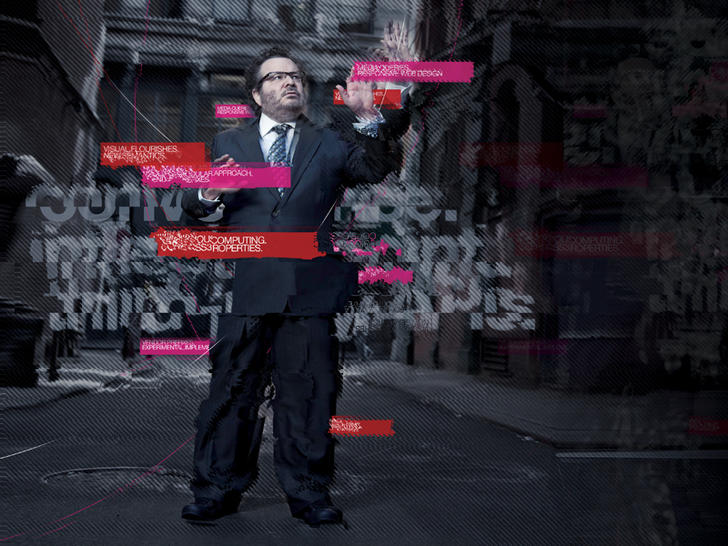
Everything we’ve learned in the past decade about preferring open standards to proprietary platforms and user-focused interfaces to masturbatory ones is forgotten as designers and publishers once again scramble to create novelty interfaces no one but them cares about.

While some of this will lead to useful innovation, particularly in the area of gestural interfaces, that same innovation can just as readily be accomplished on websites built with HTML, CSS, and JavaScript—and the advantage of creating websites instead of iPad apps is that websites work for everyone, on browsers and devices at all price points. That, after all, is the point of the web. It’s the point of web standards and progressive enhancement.

Luke Wroblewski’s Touch Gesture Reference Guide gives designers plenty of ammunition to create dynamic user experiences that work on a wide variety of mobile phones and devices (including iPad) while these same sites can use traditional desktop browser effects like hover to offer equally rich experiences on non-touch-enabled browsers. Unless your organization’s business model includes turning a profit by hiring redundant, competing teams, “Write once, publish everywhere” makes more economic sense than “Write once, publish to iPad. Write again, publish to Kindle. Write again, publish to some other device.”

I’m not against the iPad. I love my iPad. It’s great for storing and reading books, for browsing websites, for listening to music and watching films, for editing texts, presentations, and spreadsheets, for displaying family photos, and on and on. It’s nearly all the stuff I love about my Mac plus a great ePub reader slipped into a little glass notebook I play like a Theremin.

I’m not against iPad apps. Twitterific for iPad is by far the best way to use Twitter. After all, Twitter is really an internet service, not a website; Twitter’s own site, while leaps ahead of where it used to be, is hardly the most useful or delightful way to access its service. Gowalla for iPad is my constant companion. I dread the idea of traveling without it. And there are plenty of other great iPad apps I love, from Bloom, an “endless music machine” by Brian Eno and Peter Chilvers, to Articles, which turns Wikipedia into an elegant reading experience, to Mellotronics for iPad, an uncannily accurate Mellotron simulator packed with 13 authentic voices—“the same production tapes featured on Strawberry Fields Forever” and other classic tracks (not to mention tracks by nouveau retro bands like Eels).

There are apps that need to be apps, demand to be apps, and I admire and learn from them like every other designer who’s alive at this moment.

I’m just not sold on what the magazines are doing. Masturbatory novelty is not a business strategy.

Categories
Accessibility Adobe Advocacy Apple Applications apps architecture Authoring Best practices Browsers business Code content strategy CSS3 Design Designers development editorial Happy Cog™ HTML HTML5 industry javascript Platforms Publications Publishing Real type on the web Standards State of the Web The Essentials The Profession W3C Web Design Web Design History Web Standards webfonts webtype Zeldman

The future of web standards

Jeffrey Zeldman on the future of web standards.

“Cheap, complex devices such as the iPhone and the Droid have come along at precisely the moment when HTML5, CSS3 and web fonts are ready for action; when standards-based web development is no longer relegated to the fringe; and when web designers, no longer content to merely decorate screens, are crafting provocative, multi-platform experiences. Is this the dawn of a newer, more mature, more ubiquitous web?”

The Future of Web Standards by Jeffrey Zeldman

Originally written for .net magazine, Issue No. 206, published 17 August in UK and this month in the US in “Practical Web Design” Magazine. Now you can read the article even if you can’t get your hands on these print magazines.

See also: I Guest-Edit .net magazine.

Categories
A List Apart An Event Apart Announcements Appearances Applications architecture art direction Best practices Browsers chrome Code CSS CSS3 Damned Fine Journalism Design Designers editorial Education engagement glamorous Happy Cog™ HTML HTML5 Ideas industry interface ipad iphone launches Layout photography Press Publications Publishing Real type on the web Responsive Web Design Standards State of the Web The Big Web Show The Essentials The Profession This never happens to Gruber type Typography User Experience UX W3C Web Design Web Design History Web Standards webfonts webkit Websites webtype writing Zeldman zeldman.com

I guest-edit .net magazine

Web 2.1. Zeldman guest-edits .net magazine.

A List Apart and .net magazine have long admired each other. So when .net editor Dan Oliver did me the great honor of asking if I wished to guest edit an issue, I saluted smartly. The result is now arriving in subscriber post boxes and will soon flood Her Majesty’s newsstands.

In .net magazine Issue No. 206, on sale 17th August in UK (and next month in the US, where it goes by the name “Practical Web Design”), we examine how new standards like CSS3 and HTML5, new devices like iPhone and Droid, and maturing UX disciplines like content strategy are converging to create new opportunities for web designers and the web users we serve:

  • Exult as Luke Wroblewski shows how the explosive growth of mobile lets us stop bowing to committees and refocus on features customers need.
  • Marvel as Ethan Marcotte explains how fluid grids, flexible images, and CSS3 media queries help us create precise yet context-sensitive layouts that change to fit the device and screen on which they’re viewed.
  • Delight as Kristina Halvorson tells how to achieve better design through coherent content wrangling.
  • Thrill as Andy Hume shows how to sell wary clients on cutting-edge design methods never before possible.
  • Geek out as Tim Van Damme shows how progressive enhancement and CSS3 make for sexy experiences in today’s most capable browsers—and damned fine experiences in those that are less web-standards-savvy.

You can also read my article, which asks the musical question:

Cheap, complex devices such as the iPhone and the Droid have come along at precisely the moment when HTML5, CSS3 and web fonts are ready for action; when standards-based web development is no longer relegated to the fringe; and when web designers, no longer content to merely decorate screens, are crafting provocative, multi-platform experiences. Is this the dawn of a newer, more mature, more ubiquitous web?

Today’s web is about interacting with your users wherever they are, whenever they have a minute to spare. New code and new ideas for a new time are what the new issue of .net magazine captures. There has never been a better time to create websites. Enjoy!


Photo by Daniel Byrne for .net magazine. All rights reserved.

Categories
Acclaim Applications apps architecture art direction Authoring Best practices Browsers business Career Code creativity CSS Design development HTML HTML5 Ideas industry interface ipad iphone javascript links maturity Photoshop Platforms Publishing Standards State of the Web Stories The Profession Web Design Web Design History Web Standards

SlideShowPro adds HTML5

Todd Dominey at Happy Cog.

Most of us web folk are hybrids of one sort or another, but Todd Dominey was one of the first web designers to combine exceptional graphic design talent with serious mastery of code.

Being so good at both design and development that you could easily earn a fine living doing just one of them is still rare, although it looks like the future of our profession. One of the first serious designers to embrace web standards, Todd was also one of the few who did so while continuing to achieve recognition for his work in Flash. (Daniel Mall, who came later, is another.)

Finally, Todd was one of the first—along with 37signals and Coudal Partners—to abandon an enviably successful client services career in favor of full-time product development, inspiring a generation to do likewise, and helping bring us to our current world of web apps and startups.

A personal project that became an empire

In Todd’s case, the product was SlideShowPro, a project he designed for himself, which has grown to become the web’s most popular photo and video slideshow and gallery viewer. When you visit a photographer’s portfolio website, there’s an excellent chance that SlideShowPro powers its dynamic photo viewing experience. The same is true for the photo and video gallery features of many major newspaper and magazine sites, quite possibly including your favorites.

SlideShowPro

But deliberate lack of Flash support in the iPad and iPhone, while lauded here on February 1, 2010 as a win for accessible, standards-based design (“Not because Flash is bad, but because the increasing popularity of devices that don’t support Flash is going to force recalcitrant web developers to build the semantic HTML layer first”), presented a serious problem for developers who use SlideShowPro and readers who enjoy browsing dynamic photo and video galleries.

Mr Dominey has now solved that problem:

SlideShowPro Mobile is an entirely new media player built using HTML5 that doesn’t require the Flash Player plugin and can serve as a fallback for users accessing your web sites using these devices. But it’s not just any fallback — it’s specially designed for touch interfaces and smaller screen sizes. So it looks nothing like the SlideShowPro player and more like a native application that’s intuitive, easy to use, and just feels right.

The best part though is that because SlideShowPro Director (which will be required) publishes the mobile content, you’ll be able to provide the mobile alternative by simply updating the Flash Player embed code in your HTML documents. And just like when using the SlideShowPro player, because Director is behind the scenes, all your photos will be published for the target dimensions of these devices — which gives your users top quality, first generation images. The mobile player will automatically load whatever content is assigned to the Flash version, so the same content will be accessible to any browser accessing your web site.

A public beta will be released in the next weeks. Meanwhile, there is a video demo. There’s also an excellent Question and Answer page that answers questions you may have, whether you’re a SlideShow Pro customer or not. For instance:

Why mobile? Why not desktop?

We believe that (on the desktop) Flash is still the best delivery method for photo/video galleries and slideshows for it provides the most consistent user experience across all browsers and the broadest range of playback and customization options. As HTML5 support matures across all desktop browsers, we’ll continue to look into alternate presentation options.

Into the future!

Categories
architecture Brands cities Design Happy Cog™ New York City

I ? NY

New York Life Tower as seen from Happy Cog

New York Life Tower as seen from Happy Cog


Categories
Apple Applications apps architecture Design industry Information architecture ipad Platforms Usability User Experience UX Web Design

Design Lessons from iPad

Comparison of iMac and iPad screens at informationarchitects.jp.

It’s only Wednesday but we already have our link of the week. Although they call it merely a “quick write-up” (and it is a fast read), iA’s mini-compendium of design insights before and after the appearance of the iPad at their office should be required reading for all web, app, and/or interaction designers.

In the equivalent of a breathlessly quick seminar presentation, iA discusses typographic resolution and feel; the effect of the device’s brilliant contrast on readability; the kitsch produced by rigorously adhering to Apple’s “make it 3D” guidelines; whether metaphors work; and more—all of it well worth far more than the little time it will take you to absorb.

In particular, I call your attention to the section entitled, “Interaction Design: So What Works?” Although intended as a guideline to producing well-tuned iPad apps, it also works splendidly as a mini-guide to creating better websites, much like Luke Wroblewski’s brilliant “Mobile First” presentation at last week’s An Event Apart, which carried a similar message:

  1. The limited screen estate and the limited credit on the number of physical actions needed to complete one task (don’t make me swipe and touch too often), pushes the designer to create a dead simple information architecture and an elaborate an interaction design pattern with a minimal number of actions. This goes hand in hand with the economic rule of user interaction design: Minimize input, maximize output.
  2. Since the smallest touch point for each operation is a circle of the size of a male index finger tip, we cannot cram thousands of features (or ads!) in the tight frame; we have to focus on the essential elements. Don’t waste screen estate and user attention on processing secondary functions.
  3. We found that the iPad applications we designed, made it relatively easy to be translated back into websites. The iPad could prove to be a wonderful blue print to design web sites and applications. If it works on the iPad, with a few tweaks, it will work on a laptop.

Via iA » Designing for iPad: Reality Check.

Categories
architecture Blogs and Blogging Design Publications Publishing Tools

Tumblr v. Posterous

Business Insider: Why Tumblr Is Kicking Posterous’s Ass

Posted via web from Does This Zeldman Make My Posterous Look Fat?


Categories
A List Apart An Event Apart Appearances architecture art direction Authoring Browsers bugs Career Chicago cities Code Community Compatibility conferences content content strategy creativity CSS Design development DOM downloads editorial Education engagement eric meyer events flickr Fonts Formats glamorous Happy Cog™ HTML HTML5 industry Information architecture Jason Santa Maria javascript Markup photography Real type on the web Scripting Search social networking speaking spec Standards State of the Web

Chicago Deep Dish

Dan Cederholm and Eric Meyer at An Event Apart Chicago 2009. Photo by John Morrison.

For those who couldn’t be there, and for those who were there and seek to savor the memories, here is An Event Apart Chicago, all wrapped up in a pretty bow:

AEA Chicago – official photo set
By John Morrison, subism studios llc. See also (and contribute to) An Event Apart Chicago 2009 Pool, a user group on Flickr.
A Feed Apart Chicago
Live tweeting from the show, captured forever and still being updated. Includes complete blow-by-blow from Whitney Hess.
Luke W’s Notes on the Show
Smart note-taking by Luke Wroblewski, design lead for Yahoo!, frequent AEA speaker, and author of Web Form Design: Filling in the Blanks (Rosenfeld Media, 2008):

  1. Jeffrey Zeldman: A Site Redesign
  2. Jason Santa Maria: Thinking Small
  3. Kristina Halvorson: Content First
  4. Dan Brown: Concept Models -A Tool for Planning Websites
  5. Whitney Hess: DIY UX -Give Your Users an Upgrade
  6. Andy Clarke: Walls Come Tumbling Down
  7. Eric Meyer: JavaScript Will Save Us All (not captured)
  8. Aaron Gustafson: Using CSS3 Today with eCSStender (not captured)
  9. Simon Willison: Building Things Fast
  10. Luke Wroblewski: Web Form Design in Action (download slides)
  11. Dan Rubin: Designing Virtual Realism
  12. Dan Cederholm: Progressive Enrichment With CSS3 (not captured)
  13. Three years of An Event Apart Presentations

Note: Comment posting here is a bit wonky at the moment. We are investigating the cause. Normal commenting has been restored. Thank you, Noel Jackson.

Short URL: zeldman.com/?p=2695

Categories
Applications architecture art direction books business client services Code Community content creativity Design development editorial Happy Cog™ launches links people Publications Publishing social networking software Web Design Websites

The Amanda Project

Designed by Happy Cog and launched today, The Amanda Project is a social media network, creative writing project, interactive game, and book series combined:

The Amanda Project is the story of Amanda Valentino, told through an interactive website and book series for readers aged 13 & up. On the website, readers are invited to become a part of the story as they help the main characters search for Amanda.

The writing-focused social media network is designed and written as if by characters from the Amanda novels, and encourages readers to enter the novel’s world by joining the search for Amanda, following clues and reading passages that exist only online, and ultimately helping to shape the course of the Amanda narrative across eight novels. (The first Amanda novel—Invisible I, written by Melissa Kantor—comes out 22 September.)

The site developed over a year of intense creative collaboration between Happy Cog and Fourth Story Media, a book publisher and new media company spearheaded by publishing whiz Lisa Holton. Prior to starting Fourth Story, Lisa was was President, Scholastic Trade Publishing and Book Fairs; managed the publication of Harry Potter and the Deathly Hallows; and oversaw development of The 39 Clues. Before that she spent nearly a decade developing numerous bestselling, franchise-launching series at Disney.

Happy Cog‘s New York office developed this project. The team:

Equally vital to the project’s success were Fourth Story’s leaders and partners, including:

  • Lorraine Shanley, Principal Advisor
  • Ariel Aberg-Riger (website, Twitter), Creative Development & Marketing Manager
  • JillEllyn Riley, Editorial Director
  • Dale Robbins, Creative Director
  • David Stack, Director, Digital Partnerships
  • Melissa Kantor, Writer
  • Peter Silsbee, Writer
  • Polly Kanevsky, Art Director
  • Sam Gerstenzang, Technology Consultant

Today’s launch is not the end of our relationship with Fourth Story Media. The Amanda Project will continue to evolve, and Happy Cog will remain an active partner in its direction and growth. We thank our brilliant collaborators and congratulate them on today’s milestone.

Read more

[tags]amanda, amandaproject, theamandaproject, TAP, happycog, design, webdesign, contentstrategy, userexperience, publishing, books, aarongustafson, lizdanzico, erinkissane, whitneyhess, mattgoldenberg, kellymccarthy, jasonsantamaria, jeffreyzeldman, lisaholton, dalerobbins, davidstack, JillEllynRiley, ArielAberg-Riger[/tags]

Categories
Advocacy Applications architecture Browsers Code Compatibility creativity CSS Design DOM Markup spec Standards State of the Web W3C Web Design Web Design History Web Standards wisdom

Why Standards Fail

Back in 2000, CSS co-creator Bert Bos set out to explain the W3C’s design principles—“to make explicit what the developers in the various W3C working groups mean when they invoke words like efficiency, maintainability, accessibility, extensibility, learnability, simplicity, [and] longevity….”

Eventually published in 2003, the essay, although ostensibly concerned with explaining W3C working group principles to the uninitiated, actually articulates the key principle that separates great design from the muck we normally wade through. It also serves as a warning to Bert’s fellow W3C wizards not to seek the dark magic of abstract purity at the expense of the common good. Tragically for these wizards, and for we who use their technologies, it is a warning some developers of W3C specifications continue to overlook.

Design is for people

In his introduction, Bert summarizes the humanistic value that is supposed to be at the core of every web standard:

Contrary to appearances, the W3C specifications are for the most part not designed for computers, but for people. … Most of the formats are in fact compromises between human-readability and computer efficiency….

But why do we want people to read them at all? Because all our specs are incomplete. Because people, usually other people than the original developers, have to add to them….

For the same reason we try to keep the specifications of reasonable size. They must describe a useful chunk of technology, but not one that is too large for an individual to understand.

Over the succeeding 25 web pages (the article is chunked out in pamphlet-sized pages, each devoted to a single principle such as “maintainability” and “robustness”) Bert clearly, plainly, and humbly articulates a series of rather profound ideas that are key to the web’s growth and that might apply equally admirably to realms of human endeavor beyond the web.

For instance, in the page entitled “Use What Is There,” Bert says:

The Web now runs on HTML, HTTP and URLs, none of which existed before the ’90s. But it isn’t just because of the quality of these new formats and protocols that the Web took off. In fact, the original HTTP was a worse protocol than, e.g., Gopher or FTP in its capabilities….

And that fact shows nicely what made the Web possible at all: it didn’t try to replace things that already worked, it only added new modules, that fit in the existing infrastructure. …

And nowadays (the year 2000), it may look like everything is XML and HTTP, but that impression is only because the “old” stuff is so well integrated that you forget about it: there is no replacement for e-mail or Usenet, for JPEG or MPEG, and many other essential parts of the Web.

He then warns:

There is, unfortunately, a tendency in every standards organization, W3C not excluded, to replace everything that was created by others with things developed in-house. It is the not-invented-here syndrome, a feeling that things that were not developed “for the Web” are somehow inferior. And that “we” can do better than “them.” But even if that is true, maybe the improvement still isn’t worth spending a working group’s resources on.

Shrinkage and seduction

In his gentle way, Bert seems to be speaking directly to his W3C peers, who may not always share his and Håkon‘s humanism. For, despite what designers new to CSS, struggling for the first time with concepts like “float” and the box model may think, Bert and Håkon designed the web’s layout language to be easy to learn, teach, implement, maintain, and (eventually) extend. They also designed CSS not to overwhelm the newcomer with advanced power at the cost of profound complexity. (“CSS stops short of even more powerful features that programmers use in their programming languages: macros, variables, symbolic constants, conditionals, expressions over variables, etc. That is because these things give power-users a lot of rope, but less experienced users will unwittingly hang themselves; or, more likely, be so scared that they won’t even touch CSS. It’s a balance.”)

This striving to be understood and used by the inexperienced is the underlying principle of all good design, from the iPhone to the Eames chair. It’s what Jared Spool would call usability and you and I may consider the heart of design. When anything new is created, be it a website, a service, or a web markup language, there is a gap between what the creator knows (which is everything about how it’s supposed to work), and what you and I know (which is nothing). The goal of design is to shrink this ignorance gap while seducing us into leaping across it.

What were once vices are now habits

You can see this principle at work in CSS, whose simplicity allowed us to learn it. Although we now rail against the limitations of CSS 1 and even CSS 2.1, what we are really complaining about is the slow pace of CSS 3 and the greater slowness with which browser makers (some more than others) adopt bits of it.

Note that at one time we would have railed against browser makers who implemented parts of a specification that was still under development; now we admire them. Note, too, that it has taken well over a decade for developers to understand and browsers to support basic CSS, and it is only from the perspective of the experienced customer who craves more that advanced web designers now cry out for immediate CSS 3 adoption and chafe against the “restrictions” of current CSS as universally supported in all browsers, including IE8.

If CSS had initially offered the power, depth, and complexity that CSS 3 promises, we would still be designing with tables or Flash. Even assuming a browser had existed that could demonstrate the power of CSS 3, the complexity of the specification would have daunted everyone but Eric Meyer, had CSS 1 not come out of the gate first.

The future of the future of standards

It was the practical simplicity of CSS that enabled browser engineers to implement it and tempted designers to use (and then evangelize) it. In contrast, it was the seeming complexity and detachment from practical workaday concerns that doomed XHTML 2, while XHTML 1.0 remains a valid spec that will likely still be working when you and I have retired (assuming retirement will be possible in our lifetime—but that’s another story).

And yet, compared to some W3C specs in progress, XHTML 2 was a model of accessible, practical, down-to-earth usability.

To the extent that W3C specifications remain modular, practical, and accessible to the non-PhD in computer science, they will be adopted by browser makers and the marketplace. The farther they depart from the principles Bert articulated, the sooner they will peter out into nothingness, and the likelier we are to face a crisis in which web standards once again detach from the direction in which the web is actually moving, and the medium is given over to incompatible, proprietary technologies.

I urge everyone to read “What is a Good Standard?“, and I thank my friend Tantek for pointing it out to me.

[tags]W3C, design, principles, bertbos, maintainability, accessibility, extensibility, learnability, simplicity, specs, standards, css, markup, code, languages, web, webdesign, webstandards, webdevelopment, essays[/tags]

Categories
architecture Blogs and Blogging business Design findability HTML Ideas industry Information architecture links Publications Publishing Respect Standards State of the Web twitter Usability User Experience UX Web Design Web Standards Websites

Tiny URL, Big Trouble

Joshua Schachter explains how URL shorteners like TinyURL, bit.ly, etc., originally created to prevent long URLs from breaking in 1990s e-mail clients, and now used primarily as a means of monetizing someone else’s content, are bad:

  • They “add another layer of indirection to an already creaky system, [making what] used to be transparent … opaque,” slowing down web use by adding needless lookups, and potentially disguising spam.
  • Shorteners “steal search juice” from the original publishers. (For example, with the Digg bar and Digg short URL, your content makes Digg more valuable and your site less valuable; the more content you create, the richer you make Digg.)
  • “A new and potentially unreliable middleman now sits between the link and its destination. And the long-term archivability of the hyperlink now depends on the health of a third party.”

And more. Via Merlin Mann.

Anyone who creates web content should read Joshua’s post. I’m sold and will dial way back on my use of the zeldman.com short URL. The question remains, what to do when you need to paste a long, cumbersome link into a 140-character service like Twitter. (If you do nothing, Twitter itself will shorten the link via TinyURL.)

[tags]URL, URLshortener, JoshuaSchachter, redirect, abstraction, Digg, findability, searchjuice, SEO[/tags]

Categories
A List Apart Advocacy Applications architecture business Career client services Design development experience Information architecture Standards Tools Usability User Experience UX work Working

ALA No. 273: trad vs. agile

Issue No. 273 of A List Apart, for people who make websites, looks at web design from both sides now:

Flexible Fuel: Educating the Client on IA

by KEITH LAFERRIERE

IA is about selling ideas effectively, designing with accuracy, and working with complex interactivity to guide different types of customers through website experiences. The more your client knows about IA’s processes and deliverables, the likelier the project is to succeed.

Getting Real About Agile Design

by CENNYDD BOWLES

Agile development was made for tough economic times, but does not fit comfortably into the research-heavy, iteration-focused process designers trust to deliver user- and brand-based sites. How can we update our thinking and methods to take advantage of what agile offers?

About the magazine

A List Apart explores the design, development, and meaning of web content, with a special focus on web standards and best practices. Issue No. 273 was edited by Krista Stevens with Erin Kissane and Carolyn Wood; produced by Erin Lynch; art-directed by Jason Santa Maria; illustrated by Kevin Cornell; technical-edited by Aaron Gustafson, Ethan Marcotte, Daniel Mall, and Eric Meyer; and published by Happy Cog.

[tags]agiledevelopment, agiledesign, informationarchitecture, scope, scopecreep, managing, client, expectations, alistapart, forpeoplewhomakewebsites[/tags]

Categories
A List Apart Accessibility architecture Code Design development User Experience UX Web Design

ALA 272: Accessible web video, better 404

In Issue No. 272 of A List Apart, for people who make websites:

This is How the Web Gets Regulated

by JOE CLARK

As in finance, so on the web: self-regulation has failed. Nearly ten years after specifications first required it, video captioning can barely be said to exist on the web. The big players, while swollen with self-congratulation, are technically incompetent, and nobody else is even trying. So what will it take to support the human and legal rights of hearing impaired web users? It just might take the law, says Joe Clark.

A More Useful 404

by DEAN FRICKEY

When broken links frustrate your site’s visitors, a typical 404 page explains what went wrong and provides links that may relate to the visitor’s quest. That’s good, but now you can do better. With Dean Frickey’s custom 404, when something’s amiss, pertinent information is sent not only to the visitor, but to the developer—so that, in many cases, the problem can be fixed! A better 404 means never having to say you’re sorry.

[tags]alistapart, closedcaptioning, captioning, captions, webvideo, video, accessible, accessibility, 404, error, reporting, usability, programming, design, webdesign, webdevelopment[/tags]

Categories
Accessibility Applications architecture art direction Browsers bugs business Code Community content copyright creativity Fonts Ideas industry Layout links spec Standards stealing Tools Typography Usability User Experience W3C Working

Real type on the web?

A proposal for a fonts working group is under discussion at the W3C. The minutes of a small meeting held on Thursday 23 October include a condensed, corrected transcription of a discussion between Sampo Kaasila (Bitstream), Mike Champion (Microsoft), John Daggett (Mozilla), Håkon Wium Lie (Opera), Liam Quin (W3C), Bert Bos (W3C), Alex Mogilevsky (Microsoft), Josh Soref (Nokia), Vladimir Levantovsky (Monotype), Klaas Bals (Inventive Designers), and Richard Ishida (W3C).

The meeting started with a discussion of Microsoft’s EOT (Embedded OpenType) versus raw fonts. Bert Bos, style activity lead and co-creator of CSS, has beautifully summarized the relevant pros and cons discussed.

For those just catching up with the issue of real type on the web, here’s a bone-simple intro:

  1. CSS provides a mechanism for embedding real fonts on your website, and some browsers support it, but its use probably violates your licensing agreement with the type foundry, and may also cause security problems on an end-user’s computer.
  2. Microsoft’s EOT (based on the same standard CSS mechanism) works harder to avoid violating your licensing agreement, and has long worked in Internet Explorer, but is not supported in other browsers, is not foolproof vis-a-vis type foundry licensing rules, and may also cause PC security problems.

The proposed fonts working group hopes to navigate the technical and business problems of providing real fonts on the web, and in its first meeting came up with a potential compromise proposal before lunch.

Like everyone these days, the W3C is feeling a financial pinch, which means, if a real fonts working group is formed, its size and scope will necessarily be somewhat limited. That could be a good thing, since small groups work more efficiently than large groups. But a financial constraint on the number of invited experts could make for tough going where some details are concerned—and with typography, as with web technology, the details are everything.

I advise every web designer who cares about typography and web standards—that’s all of you, right?—to read the minutes of this remarkable first gathering, and to keep watching the skies.

[tags]web typography, typography, standards, webstandards, W3C, fonts, embedded, @fontface, EOT, workinggroup[/tags]

Categories
architecture cities glamorous homeownership industry New York City NYC spec Standards Tools work Working Zeldman

Fast high-speed access for NYC internet professionals

I’m home watching a sick kid and waiting for Time Warner Cable to come make a third attempt to install a cable modem. If you’re good at math, that means Time Warner Cable, the market leader in my city, has twice failed to install the correct cable modem in my home.

Because the web never sleeps, even web professionals who work in an office need reliable high-speed access when they are at home. Speakeasy provided that service via DSL in our old apartment (our previous DSL provider having been wiped out, literally, on September 11, 2001), but, as documented in old posts on this site, it took two months of comedic mishap for Speakeasy to get our home DSL working. And after Best Buy bought Speakeasy, it became harder and harder to contact the company’s technical support people to resolve service problems—of which there were more and more. By the time we moved out of our old apartment in December, 2007, frequent gapping and blackouts made our 6Mb Speakeasy DSL service more frustrating than pleasant to use.

The monopoly wins the bid

So when we moved to the new apartment, we decided to immediately install cable modem access as a baseline, and then secure reliable DSL access for redundancy. Time Warner Cable had set up a deal with our new building, and no cable competitor was available to service our location (you read that right), so the Time Warner got the gig. They came quickly and the system worked immediately. The digital HD cable fails once a week, probably due to excessive line splitting, but that’s another story, and we don’t watch much TV, so it doesn’t bug us, and it isn’t germane here.

Unwilling to repeat the failures and miscommunications that marked our Speakeasy DSL installation, I went ahead and had Time Warner Cable set up the wireless network. It costs extra every month, and Time Warner’s combination modem/wireless/Ethernet hub isn’t as good as the Apple Airport devices I own, but it makes more sense to pay for a system that’s guaranteed to work than to waste billable hours debugging a network.

Due to the thickness of our walls, the wireless network never reached our bedroom, but otherwise everything was hunky-dory. Within a few days of moving in, we had reliable, wireless, high-speed internet access. Until Time Warner told us otherwise.

The notice

Last spring we received a form letter from Time Warner stating that they’d installed the wrong modem, and that we were not getting the service we’d paid for. Apparently this was true for all customers who chose the service. Some of our money was refunded, and we were advised to schedule a service appointment or come to the 23rd Street office for a free replacement modem.

I went to the 23rd Street office, took a number, and within about fifteen minutes I was sitting in front of a representative. I showed him the form letter and requested the new modem.

He asked me for my old modem.

I said I hadn’t brought it, and pointed out that I hadn’t been instructed to bring it.

We both reread the form letter.

“It’s implied,” the rep said.

“Implied?” I said.

“Sure,” he said. “If we’re going to give you a new modem, of course we’ll want your old modem.”

I guess it was implied. But it wasn’t stated. And when you charge an installation fee, a hardware fee, and a monthly service fee, and then give people the wrong modem, you probably shouldn’t rely on inference in your customer support copy. To avoid compounding your customer’s frustration, you should probably be absolutely explicit.

I didn’t say these things to the rep, because he didn’t write or approve the copy or send the wrong modem to all those homes. I left empty-handed and continued to use the modem we had. There didn’t seem to be anything wrong with it. Whatever the poorly written form letter had to say about it, as a customer, I didn’t have a problem with the modem.

A visit from a professional

As summer ended, Time Warner Cable sent me a new form letter. This time I was told, rather darkly, that if I failed to replace my modem, I definitely would not get the service I was paying for. Indeed, my service level would somehow be lowered, although it appeared that I would continue being billed a premium price.

So I called Time Warner, arranged a service visit, and spent the day working at home.

Around the middle of the service window, a Time Warner Cable authorized technician showed up with a regular DSL modem (not a wireless modem).

“You have wireless?” he asked in amazement.

“Yes,” I said. “Doesn’t it say that on your service ticket?”

“Hey, I’m just a consultant. I don’t work for Time Warner Cable,” he helpfully informed me.

“So are you going to get a wireless router from your truck?” I offered after a pause.

“I don’t have those,” he said.

We looked at each other for a while, and then he said, “Besides, you don’t need to replace your modem. There’s nothing wrong with it.”

“Come again?”

“There’s nothing wrong with your modem. You don’t need to replace it,” he said.

Then he called someone to inform them that he hadn’t swapped modems.

Then he asked me to sign a form.

“What am I signing?” I asked. “That you didn’t do anything?” I said it more politely than it reads.

“You’re signing that I was here,” he said. So I did.

That evening, as I was bathing my daughter, Time Warner Cable called to ask if I was satisfied with the experience.

I said frankly I was confused why I’d had to stay home all afternoon for a service visit on a modem that didn’t need to be replaced.

The nice lady said she would talk to her supervisor and run some tests.

I was on hold about five minutes, during which my daughter found various ways of getting water out of the tub and onto me.

The nice lady came back on and said, “I’m sorry, sir, but we just ran tests, and you do have the wrong modem. We’ll need to send someone out.”

So here I am, two weeks later, waiting for a technician to come try again. Will this one bring the right hardware? The suspense is awesome.

Although New York is a leading creator of websites and digital content, the town’s home and office internet connectivity lag behind that of practically every other U.S. city. Two factors account for it:

  1. An aging infrastructure. It’s hard to deliver best internet services over a billion miles of fraying, overstretched, jerry-rigged copper line.
  2. Monopoly. How hard would you try if you had no real competitors?

In future installments, I’ll discuss our adventures securing high-speed access to our studios at Happy Cog New York, and discuss the pros and cons of Verizon home DSL.

[Update: Don’t miss the denoument.]

[tags]timewarner, timewarnercable, speakeasy, Verizon, DSL, cablemodem, internet, access, highspeed, high-speed, roadrunner, turbo[/tags]