The Daily Report
21 July 2003 :::
11 am edt
Inc.com redesigns with standards
Another business website has redesigned with web standards. Inc.com’s table-free CSS layout and XHTML structure cut page weight by over 50% in the markup alone. Over 11,000 pages were cleaned up and validated. Dan Cederholm of SimpleBits and the Fast Company/Inc. internal web team supervised the redesign and provides a brief yet illuminating write-up on his personal site. :::
Rustboy details posted
Details of Brian Taylor’s forthcoming Rustboy book are now online. If you’re interested in a signed and numbered edition, visit the site for details. (The site may be slow due to heavy traffic.) :::
Busy week
This week, prior to leaving for Seattle, we’re preparing two new lectures for Web Design World. By a strange coincidence, we’re also judging The Seattle Show this week. We will continue to post normally. :::
20 July 2003 :::
weekend edition
Finder icon bug
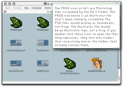
The screenshot above shows the recursive Finder icon bug in Mac OS X discussed in Friday’s AppleMatters interview. As files are saved in an open icon view window, the Finder scrambles their icons. Instead of thumbnails (as expected in saved Photoshop files) or application icons (as expected in saved MS Word or Adobe Illustrator files), the files take on the appearance of an icon located elsewhere on the hard drive. In the screen shot above, it happens to be a frog icon that graced a folder created several years earlier; at other times the scrambled files simply assume the appearance of a standard Mac OS folder icon.
It isn’t merely a question of scrambled icons, though. When you double-click any of these icons, instead of opening the expected file, you open a “ghost” folder that mirrors the actual folder containing the files. Double-click 070301.psd, and instead of the Photoshop file, you’ve opened a mirror of the folder seen in this screen shot. Drag 070301.psd to the trash and empty the trash. Instead of deleting a “corrupted” Photoshop file from your hard drive, you’ve actually deleted the folder and all the files it contained. There goes a day’s work – or a week’s.
Another example can be seen in this PDF, in which Photoshop files a.psd and b.psd look like ordinary Mac folder icons instead of Photoshop files. Double-click the files, and they turn into folders containing themselves.
Repairing permissions in Disk Utility does not fix the bug. Rebooting in DiskWarrior and using that tool to repair the hard drive’s directory structure also does not fix the bug. Only logging out or restarting makes the bug go away. Days may pass before it crops up again. We first noticed the bug in OS X 10.2.5 and it has persisted through subsequent upgrades. It doesn’t happen to all OS X users, just the lucky ones.
UPDATE: Several readers have written to say that they too have experienced the OS X recursive icon bug. Two readers said they work around it by quitting the Finder instead of logging out, since logging out wastes time and disrupts work. We have found that quitting the Finder (via DragThing or by invoking OS X’s Force Quit dialog) does not solve the problem at all. In fact, it sometimes introduces an additional problem where the Finder will not relaunch but thinks it has, and the entire User Interface gets scrambled – as seen in this screenshot (1.9 MB PDF file).
When the Finder goes missing in this way, you cannot log out or restart. All you can do is hold the power button until the computer shuts down or reboots, and then try to repair the damage you’ve just done to your files and directory structure.
There are other bugs in the OS X Finder that can also cause you to lose work and waste time, but we’re not trying to list every bug; we’re merely pointing out that the OS X Finder is still a work in progress. We wish Apple would fix these bugs instead of reinventing the OS X interface and peppering it with new visual metaphors and new ways of working (and presumably a host of new bugs).
We used to say to browser makers, your innovations are great, but please nail down support for basic standards first. Our message to Apple, if they are listening, is similar. The stuff coming down the pipe looks fantastic – but fix the basics first. :::
18 July 2003 :::
2 pm | 9 am edt
AppleMatters interview
AppleMatters interviews Zeldman about why he likes Macs, how he uses them in his studio, and a recursive bug in the OS X Finder, whereby files turn into folders containing themselves. :::
Jack, we hardly knew ye
Six Degrees of Jack Nicholson. Spotted at jotbe-fx.de. :::
17 July 2003 :::
5 pm | 1 pm | 11 am | 9 am edt
WebVisions 3
WebVisions 3 is tomorrow. We wish we could be there. :::
A better CSS horizontal menu
In our mini-site for Designing With Web Standards, we used CSS to transform an unordered XHTML list into a horizontal navigation bar. It worked well in most browsers, surprisingly including IE5/Windows. But the individual text labels were uncentered in IE5/Macintosh. Worse yet, menu boxes were not clickable in IE5/Mac, making the nav bar harder to use for people with limited mobility.
Reader Alexander Hill took it upon himself to work around IE5/Mac’s bugs by re-coding our CSS. What changed? Instead of display: inline on the li elements, Alexander used display: block and float: left. Browsercam shows the results: a proper nav bar in ’most every CSS-capable browser. (There are display glitches in Opera 6/Mac, but that browser fared no better with our original CSS.)
The revised style sheet is up and the mini-site now works correctly in IE5/Mac. To avoid caching problems, IE5/Mac users might need to manually refresh the style sheet and then reload the web page. As always, feel free to adapt this CSS and the related markup for use in your own projects. More of Alexander’s work can be seen in this blog he designed for Ian Janes. :::
CSS design championship
In keeping with our recent theme (standards-based design can be great design), we are pleased to point to The Open Championship, designed and hand coded in lightweight XHTML and CSS by the brilliant Todd Dominey. If you are a designer, he is the man to beat. :::
Homeland security
USA Today: Microsoft acknowledges a critical flaw in nearly all Windows software allows hackers to seize control of your computer over the Net, steal your data, delete your files, and eavesdrop on your email.
In spite of that minor glitch, the U.S. “Department of Homeland Security has awarded a five-year, $90-million contract to Microsoft to supply all its most important desktop and server software for about 140,000 computers inside the new federal agency.” (Spotted at Megnut and Meyerweb.)
Let’s see what the government might have chosen in its effort to protect American lives from ruthless, technologically sophisticated terrorists:
- UNIX, Linux
- Inexpensive or free.
- Requires some user knowledge.
- Practically invulnerable to attack.
- Mac OS
- Costs money.
- Easy to use.
- Practically invulnerable to attack.
- Windows
- Costs money.
- Easy to use.
- Can be hacked by a squirrel monkey, thus is wide open to attack.
- Produced by a company the Department of Justice found guilty of criminally abusing its monopoly power – a finding that is supposed to result in punishment, not in fat contracts bankrolled by taxpayers.
To the bureaucratic mind, the choice was obvious. Sweden is looking better all the time. :::
16 July 2003 :::
4 pm edt
More sexy standards-based sites
Jon Hicks’s Hicks Design is a great-looking site built with XHTML and laid out with CSS. Jeff Hyde has redesigned Quark Inc. with XHTML and CSS (hat tip: Patrick Sanders). Accessibility maven Joe Clark’s “Ten Years ago in ‘Spy’” has been reformulated in CSS by Matt Mullenweg. (Joe created the original design; Matt translated it to CSS.) These sites travel well, avoid code bloat, and look marvelous, particularly with OS-level antialiasing (OS X Quartz, Windows XP Cleartype). :::
Two fine interviews
Zlog interviews Shirley Kaiser, longtime web designer, musician, and steering committee member of The Web Standards Project. DMXZone interviews Eric Meyer, author of Eric Meyer on CSS and Netscape standards evangelist. Read ’em.
:::
Netscape’s first mistake
In Taking Your Talent to the Web (New Riders, 2001) and in earlier writings that are now offline, we cited Netscape’s ballyhooed alliance with Sun as the misstep that started its troubles and might one day result in its destruction.
Microsoft had slept through the Netscape-fueled growth of the web, and might have slumbered indefinitely. But when Netscape told the world that its browser, combined with Sun’s Java, would make operating systems obsolete, Microsoft recognized the threat to its business and hit back like a military superpower crushing a small, upstart nation.
It took years for Microsoft to extinguish Netscape’s last spark of life, and they couldn’t have done it without AOL’s help. At times, at least from the outside, AOL resembled a criminally demented parent, pinning its child’s arms so a bully could more easily beat the kid to a pulp.
One wonders what would have happened if Netscape had partnered with Microsoft in 1996, instead of bragging that its browser would make companies like Microsoft obsolete. But that is idle.
One wonders what can be done to foster diversity and improved standards compliance in the marketplace, given that the original brand name web browser is dead and the currently market-leading browser has not changed in three years and will not be updated except as part of a future Microsoft operating system – and its updates, years from now, will likely be in the area of proprietary operating system hooks rather than, say, improved support for CSS.
One wonders what AOL and Microsoft are thinking. They may be tired of browsers, but the public is not.
More ruminations on the death of Netscape may be found at News.com, Meyerweb (1) (2), Molly.com, Vanderwal.net, The Web Standards Project, and elsewhere. :::
15 July 2003 :::
6 pm edt
“People, it’s over”: AOL kills Netscape
Mozillazine reports that AOL “has cut or will cut the remaining team working on Mozilla in a mass firing and are dismantling what was left of Netscape (they’ve even pulled the logos off the buildings).” Software engineer, W3C working groups member, and former AOL/Netscape employee Daniel Glazman sums up: “Netscape hired me three years ago, AOL laid me off today.... AOL axed Netscape [at] the same time. People, it’s over. Netscape is dead. Nothing to see here.” :::
Mozilla lives
The Mozilla Foundation is a new, non-profit org that will serve as the home for the coordination, development, and testing of Mozilla-based browsers and applications. :::
14 July 2003 :::
1 pm | 11 am | 10 am edt
It’s Standards Compliant Redesign day. Below are some recent sites that combine good code with good looks.
Longevity matters
Blake Scarbrough just finished redesigning American Longevity, using CSS layout and XHTML Transitional. A third party polling system breaks validation on the home page; all other pages validate, and the site looks sharp. :::
On message
Andy Budd has redesigned Message Digital Design Ltd. using pure CSS layout and XHTML. It looks great! :::
Chopped Phish
Last week, our friends at The Chopping Block, in association with coder Chris Casciano, launched version 3 of Phish.com. It looks as good under the hood as it does on the surface. With the exception of one video popup template (where the creators are still trying to figure out how best to cope with EMBED tags on Quicktime videos), Phish.com is made of valid XHTML 1.0, CSS2, and JavaScript. The underlying XHTML structure enables the site to work in web phones, text browsers, and other non-traditional devices. Oh yeah, and in modern browsers, it looks great, too. :::
Everybody talks about the weather
Weather report for Lawrence, Kansas: clear and bright with standards rising. Graphic design and illustration by Dan Cox; sophisticated layout by Adrian Holovaty. Adrian’s writeup is worth reading. :::
Fleurs de bonne
The Cape Town Flower Show, to be held at Cape Town Convention Centre, is dedicated to “nature, art, culture, and learning.” John Nicholas of Wireframe Studio designed phase one of the site using CSS and XHTML 1.0 Transitional. Watch for phase two. :::
Mozilla bug
We’ve mentioned this bug in previous reports, but readers keep sending us screen shots. In some flavors of Mozilla, if you choose an alternate color scheme via our style sheet switcher, when you return to this site, the side bar may disappear. It’s a known bug. It will get fixed. Ordinarily we’d post a bug note to our side bar, but if you can’t see the side bar, you wouldn’t get much out of the note. :::
Recent work
Happy Cog has been busy doing design studies for Antarctica Systems and Clear Channel Entertainment. :::
11 July 2003 :::
6 pm edt

Hey, you never know.
10 July 2003 :::
11 am edt
Sins of omission
In yesterday’s discussion of Iconfactory’s new stock icons service, we neglected to mention that the site on which the service lives is nicely done in CSS layout and XHTML 1.0 Transitional.
In an earlier entry on Coudal Partners’s Summer Reading 2003 omnibus (to which we contributed), we neglected to mention that it, along with the rest of Coudal.com, was redone with CSS layout. It was Coudal Partners’s first all-CSS venture, and as such, it includes a few errors. Nevertheless, as recast in CSS, the site is lower in bandwidth and maintains the famous Coudal look and feel.
Two companies, both known for their design smarts, both designing with web standards. :::
Feed validator
There’s a new RSS validator in town, in the same old location, from those same wonderful people who brought you the previous version. :::
9 July 2003 :::
7 pm | 11 am edt
Bowman reshapes Path
Next time some ill informed person declares that clean, structural XHTML markup and CSS layout are of no use to a “real” designer, show that fool Doug Bowman’s sensitive, nuanced, and altogether pleasing redesign of the Adaptive Path website, which launched last night. On his business site, Bowman dishes the details behind the design. Lovely work, Doug. Congratulations, Adaptive Path. :::
Stock icons for developers, designers
Our friends at Iconfactory have launched a stock icons service featuring royalty-free icon collections designed for use in software development projects and websites. Three collections are up so far; more are coming. The icons strike a balance between information design and illustration and can add a professional sheen to XP software, Mac OS X software, or online applications. At US $350 per collection, they cost less than two hours of a graphic designer’s time.
Iconfactory designed the widgets in software programs and operating systems including Windows XP, Netscape 6, Extensis Suitcase, Panic’s Transmit and Audion, Microsoft Messenger, Outlook Express (Mac), AOL 6.0 (avatars), Spring Cleaning, Toast, Jam, and plenty more. They’re good at what they do. Their new StockIcons service can let you look good, too.
We’ve recommended the service to a client who creates web-based software. With Iconfactory’s StockIcons covering the micro level (what should the UI widgets look like?), we can focus on the macro level of overall interface, usability, user flow, and branding. :::
Independent days
The ever eloquent John Gruber discusses the nature and advantages of independent websites in a longish column that’s worth savoring and bookmarking. :::
Seems like old times
Weirdsmobile bills itself as a “legitimate, if ill-advised, attempt at personal expression outside the boundaries of what is ‘hip’ or ‘popular’ on the web, yet hewing to certain conventions of the form in a shameful concession to the sensibilities of the ‘typical’ web reader, who may be alienated by unfamiliar or atonal forms of expression, and thereby lose interest.” In other words, it’s an independent site that isn’t trying to build a brand, deliver a service, or test a business model. Instead, you get comics, quirky little blogs, and other entertainments, delivered with self-effacing humor. It reminds us in some ways of what our own site was like in the mid 1990s, and we mean that in a good way. :::
7 July 2003 :::
12 noon edt
Virtual book tour
In yesterday’s Report, we began talking about the power of networks to drive traffic and improve ranking in search engines and directories, thus enabling independent sites to achieve high levels of readership despite having little or no budget for advertising and promotion. The Virtual Book Tour concocted by Kevin Smokler hopes to deliver similar benefits to book authors.
The first book to be so promoted is Mary Roach’s Stiff: The Curious Lives of Human Cadavers; the first stop on the Virtual Book Tour is Carrie Bickner Zeldman’s RogueLibrarian.com.
(In other book news, Carrie has delivered the final manuscript of Web Design on a Shoestring to New Riders for publication in September.) :::
How not to influence people
Stop yelling, you’ll hurt your throat.
By the way, if you really want to persuade designers to use web standards, try creating something beautiful to inspire them. (Flies: honey.) :::
Zope, love and charity
Zope Newbies, a free online resource for those using Zope to build dynamic sites, has converted to CSS layout and XHTML. :::
The RSS tango
Following our wedding, we paid little attention to the web. Even so, we couldn’t help noticing two trends that popped up in the weblogging segment of the independent content community. Half the network seemed to be arguing about the limitations of the RSS content syndication format; the other half was slapping up Google text ads in hopes of generating cash for clicks. (Hivelogic’s “optional advertising” gambit lets you turn off the ads permanently if you can’t stand looking at them, which is a fair and user-centric compromise.)
How you feel about the limitations of RSS probably depends on what you use it for. If you want a simple format that lets you notify subscribers when your site’s content is updated, and makes it easy to include a few lines of that content so they can decide whether or not it interests them, RSS 2.0 fits the bill perfectly. Its genius is its simplicity – and simplicity, whether in furniture design or software design, is a high virtue.
If you want to syndicate all your content – every word, every script, every image – maybe what you’re looking for is not a new syndication format. Maybe what you need is a news reader that understands XHTML.
There are some things you can’t do with RSS 2.0, and there are other things you can do, but the spec doesn’t make clear whether you’re doing them the right way or not. (For instance, it doesn’t specify how to handle high ASCII characters, such as the “a” in Håkon Lie.)
RSS 2.0 was frozen so it could be widely supported and used. The frozen nature of the spec may be driving some of the smart people who are collectively endeavoring to create a richer or at least more explicitly specified syndication format. We wish them godspeed.
But meanwhile, RSS 2.0 works well, and we don’t mind writing “Hakon” in our hand-coded RSS feed. After all, that’s how Håkon himself writes his name in ASCII email – which is also a simple format that is rather popular and does a fine job of disseminating information in spite of its limitations.
But then, we also don’t know why you’d want to distribute all your content outside your site. It seems to us that your website is the natural home for all your textual, visual, and functional content, and that at least one goal of syndication is to drive interested readers to your site, not encourage them never to visit it. The Google text ad brigade might agree; after all, if no one visits their sites, no one will click their ads. :::
6 July 2003 :::
holiday edition ii
Tasty tutorials and network effects
Several sites recently added to our Externals Department offer sweet little tutorials. Mike Pick’s “Pull Quotes and the Web” describes the pros and cons of pull quotes in web design and provides visual samples along with the CSS and markup that makes them work.
Hebig.org’s “About the Title Pictures” shows how to use the CSS overflow: hidden property to create an image that reveals more or less of its mise en scene depending on the width of the visitor’s browser window. (A similar technique is employed at v-2.org.)
Both tutorials will repay your interest, and both would have made swell articles for A List Apart. One reason ALA slowed down over the last year is that your humble scribe was too busy writing Designing With Web Standards to maintain a weekly ALA publishing schedule. But the other reason ALA slowed down had to do with the growth of focused personal sites over the past year.
An explosion of personal sites by and for web designers has changed the climate in much the same way that general weblogs and their network effects have decentralized web publishing for the better. Two years ago, if you had a web design technique to share, you would likely contact A List Apart or Digital Web Magazine or Evolt. Today, you can publish that same tutorial on your own site or blog. It may not get the same amount of traffic that ALA, Digital Web, and Evolt get, but with more blogs creating more network effects it will eventually be seen and bookmarked by most of the people who would be interested in it.
This decentralization is a good thing; it fulfills the web’s promise as a networked, democratic medium open to all.
Back in 1999, in the ALA articles “Slouching Toward Authorship” and “Whose Web Is It, Anyway?,” we opined that more web designers would soon migrate from facilitator and vendor into new, self-empowered roles as content creators – and many have since done so. In those same articles, we recommended that independent web creators form linked networks, lest well financed commercial sites and portals render indie sites invisible to search engines and directories.
Indie design portals like netdiver and Australia Infront were already doing this; so were semi-professional web rings; and there were (now defunct) independent networks like Glassdog.net, i2K, and the Project Cool network (which included High Five, Project Cool, and A List Apart).
But the power of the network truly came to the fore with the rise of weblogs and their various formalized blogrolls, etc. So much so, that a well-linked topical blog created on a shoestring budget can rank higher in Google than a well-funded commercial site, as anyone reading this page knows.
Some people fetishize their rankings or burn brain cells trying to manipulate their position in one Top 100 Blogs list or another, but this is understandable: when you’ve been a passive recipient of mass media all your life, and you suddenly realize that you are the media (and even The New York Times knows it), well, it can certainly go to your head.
What does this change mean for a centralized web design information magazine like A List Apart? With so much wonderful material available across ten hundred thousand million design blogs, our value, we think, will come from building a library of the most and best information on a narrow but important range of design topics. This also means that weekly publication is out the window, because a library is not about frequency. Quality or quantity? The choice is easy. :::
In other news...
iStockPro launches a macro and closeup gallery.
Our pals at Pixelsurgeon redesign. Looks great, doesn’t validate. :::
Sick transit gloria
Our plan after the wedding was to take the week off and do all the New York things visitors do: hit the galleries and museums, picnic in Central Park, and like that. But as soon as the last wedding guest had departed, we both came down with a summer flu.
For over two years, since the moment we told each other how we felt about each other, we’ve been pulling the equivalent of triple shifts. The few days off after the wedding were the first chance our bodies have had to rest, and our bodies have insisted that we do as little as possible.
Friday we made it to a friend’s roof to watch fireworks explode over the East River – a somewhat eerie experience after September 11th and the wars in Afghanistan and Iraq. Yesterday we dragged ourselves to the side of a pond in Central Park. But basically we’ve laid low, sleeping half the day away.
Through two years we’ve had a good long run of keeping it together while doing twice as much personally and professionally as we’d ever done before. But now we rest. :::
4–5 July 2003 :::
holiday edition
Don’t be fooled by the rocks we’ve got
Thank you to all well wishers who shared their wedding congratulations and sometimes their own love stories. We love you, too. :::
Sold out
The first printing of Designing With Web Standards has sold out, but a second printing is now hitting online and brick-and-mortar stores. :::
Pretties
Blog de Pfunder sports clean, clear, usable, attractive design done with CSS layout. (It has a couple of easily correctable CSS and markup bugs, we know.)
Omino Design v3.0 presents a lovely Flash-based interface that is kin to Pixel Imp and certain Kaleidoscope schemes yet has its own good grey panache. :::
The next frontier
Tim O’Reilly: “All Software Should Be Network Aware.” Hat tip: Luke Tymowski. :::
Updated
Great sizzling heaps of worthwhile sites, articles, tools, and blogs have been added to our Externals Department. Bookmark that sucker! Also, the DWWS mini-site’s Press page has been updated. :::