Categories
Blue Beanie Day books Browsers creativity CSS CSS3 Design Designers DOM DWWS E-Books editorial Happy Cog™ HTML HTML5 Ideas industry tweets twitter Voting W3C Web Design Web Design History Web Standards webtype XHTML Zeldman

Blue Beanie Day Haiku Contest – Win Prizes from Peachpit and A Book Apart

ATTENTION, web design geeks, contest fans, standards freaks, HTML5ophiles, CSSistas, grammarians, bookworms, UXers, designers, developers, and budding Haikuists. Can you do this?

Do not tell me I
Am source of your browser woes.
Template validates.

Write a web standards haiku (like that one), and post it on Twitter with the hashtag #bbd4 between now and November 30th—which happens to be the fourth international Blue Beanie Day in support of Web Standards.

Winning haikus will receive free books from Peachpit/New Riders (“Voices That Matter”) and A Book Apart.

Ethan Marcotte, co-author of Designing With Web Standards 3rd Edition and I will determine the winners.

Enter as many haikus as you like. Sorry, only one winning entry per person. Now get out there and haiku your heart out!

See you on Blue Beanie Day.

P.S. An ePub version of Designing With Web Standards 3rd Edition is coming soon to a virtual bookstore near you. Watch this space.

Categories
Accessibility Adobe Advocacy Apple Applications apps architecture Authoring Best practices Browsers business Code content strategy CSS3 Design Designers development editorial Happy Cog™ HTML HTML5 industry javascript Platforms Publications Publishing Real type on the web Standards State of the Web The Essentials The Profession W3C Web Design Web Design History Web Standards webfonts webtype Zeldman

The future of web standards

Jeffrey Zeldman on the future of web standards.

“Cheap, complex devices such as the iPhone and the Droid have come along at precisely the moment when HTML5, CSS3 and web fonts are ready for action; when standards-based web development is no longer relegated to the fringe; and when web designers, no longer content to merely decorate screens, are crafting provocative, multi-platform experiences. Is this the dawn of a newer, more mature, more ubiquitous web?”

The Future of Web Standards by Jeffrey Zeldman

Originally written for .net magazine, Issue No. 206, published 17 August in UK and this month in the US in “Practical Web Design” Magazine. Now you can read the article even if you can’t get your hands on these print magazines.

See also: I Guest-Edit .net magazine.

Categories
art direction Best practices Big Web Show Design The Big Web Show The Profession Web Design Web Design History Web Standards webfonts Websites webtype Working

Episode 18: Roger Black on web type and templates

Roger Black

Legendary art director Roger Black guests on tomorrow’s episode of The Big Web Show, co-hosted by Dan Benjamin and taped in front of a live internet audience.

Roger co-founded the following new companies: Webtype, creators of high-end fonts for online typography; Treesaver, a platform that uses CSS, HTML, JavaScript, and the principles of responsive design to publish beautifully formatted content on any device with a web browser; Ready-Media, which designs templates for newspaper and magazine publishers (and attracts controversy); and Nomad Editions, a series of digital weeklies designed directly for mobile devices.

Roger is also a founding partner in Danilo Black, an international design agency he co-founded with Eduardo Danilo, and The Font Bureau, a leading type foundry he co-founded with David Berlow.

“He pioneered the use of computers in design, cut the best deals, and made himself synonymous with the modern magazine,” wrote Michael Wolff in a New York Magazine profile of Roger back in the 1990s, when Roger was the best-known magazine art director in the world. (Among many others, he designed Rolling Stone, The New York Times Magazine, Newsweek, The New Republic, Fast Company, Advertising Age, and Esquire.)

He also co-founded Interactive Bureau, one of the biggest and most successful web design agencies of the dot-com era.

In his free time, Roger putters around in his award-winning West Texas vacation home made of recycled shipping containers.

Roger Black is an astoundingly prolific creative force; we hope you can join us for this Episode of the show.

The Big Web Show (“Everything Web That Matters”) is taped live in front of an internet audience every Thursday at 1:00 PM ET on live.5by5.tv. Edited episodes can be watched afterwards, often within hours of taping, via iTunes (audio feed | video feed) and the web.


Photo of Roger Black at Happy Cog by Jeffrey Zeldman.


Categories
A List Apart An Event Apart Announcements Appearances Applications architecture art direction Best practices Browsers chrome Code CSS CSS3 Damned Fine Journalism Design Designers editorial Education engagement glamorous Happy Cog™ HTML HTML5 Ideas industry interface ipad iphone launches Layout photography Press Publications Publishing Real type on the web Responsive Web Design Standards State of the Web The Big Web Show The Essentials The Profession This never happens to Gruber type Typography User Experience UX W3C Web Design Web Design History Web Standards webfonts webkit Websites webtype writing Zeldman zeldman.com

I guest-edit .net magazine

Web 2.1. Zeldman guest-edits .net magazine.

A List Apart and .net magazine have long admired each other. So when .net editor Dan Oliver did me the great honor of asking if I wished to guest edit an issue, I saluted smartly. The result is now arriving in subscriber post boxes and will soon flood Her Majesty’s newsstands.

In .net magazine Issue No. 206, on sale 17th August in UK (and next month in the US, where it goes by the name “Practical Web Design”), we examine how new standards like CSS3 and HTML5, new devices like iPhone and Droid, and maturing UX disciplines like content strategy are converging to create new opportunities for web designers and the web users we serve:

  • Exult as Luke Wroblewski shows how the explosive growth of mobile lets us stop bowing to committees and refocus on features customers need.
  • Marvel as Ethan Marcotte explains how fluid grids, flexible images, and CSS3 media queries help us create precise yet context-sensitive layouts that change to fit the device and screen on which they’re viewed.
  • Delight as Kristina Halvorson tells how to achieve better design through coherent content wrangling.
  • Thrill as Andy Hume shows how to sell wary clients on cutting-edge design methods never before possible.
  • Geek out as Tim Van Damme shows how progressive enhancement and CSS3 make for sexy experiences in today’s most capable browsers—and damned fine experiences in those that are less web-standards-savvy.

You can also read my article, which asks the musical question:

Cheap, complex devices such as the iPhone and the Droid have come along at precisely the moment when HTML5, CSS3 and web fonts are ready for action; when standards-based web development is no longer relegated to the fringe; and when web designers, no longer content to merely decorate screens, are crafting provocative, multi-platform experiences. Is this the dawn of a newer, more mature, more ubiquitous web?

Today’s web is about interacting with your users wherever they are, whenever they have a minute to spare. New code and new ideas for a new time are what the new issue of .net magazine captures. There has never been a better time to create websites. Enjoy!


Photo by Daniel Byrne for .net magazine. All rights reserved.

Categories
Design type Typography Usability Web Design Web Design History Web Standards webfonts webtype

Fink on Web Fonts

In Issue 307 of A List Apart for people who make websites:

Web Fonts at the Crossing

by Richard Fink

Everything you wanted to know about web fonts but were afraid to ask. Richard Fink summarizes the latest news in web fonts, examining formats, rules, licenses, and tools. He creates a checklist for evaluating font hosting and obfuscation services like Typekit; looks at what’s coming down the road (from problems of advanced typography being pursued by the CSS3 Fonts Module group, to the implications of Google-hosted fonts); and wraps up with a how-to on making web fonts work today.

A List Apart: Web Fonts at the Crossing


Illustration by Kevin Cornell for A List Apart


Categories
Browsers chrome CSS Design Fonts Google type Web Design Web Design History Web Standards webfonts webkit webtype

And now, Google

Web Fonts Part 9: Google enters the fray.

THE long-planned inevitable has now been announced. With open-source-licensed web fonts, web font hosting, and add-a-line-to-your-header ease of configuration, Google has joined Typekit, Font Squirrel, Ascender, Font Bureau and others in forever changing the meaning of the phrase, “typography on the web.”

The Google Font Directory lets you browse all the fonts available via the Google Font API. All fonts in the directory are available for use on your website under an open source license and served by Google servers.

Oh, and Typekit? They’re in on it, and they couldn’t be more pleased.


Categories
Big Web Show Dan Benjamin Design development Fonts Web Design Web Standards webfonts webtype

Big Web Show No. 1 up!

Jeffrey Zeldman

FOR YOUR viewing and listening pleasure, The Big Web Show’s Episode 1: Web Fonts is now online.

Jeffrey Zeldman and Dan Benjamin grill Ethan Dunham of Fontspring and Font Squirrel and Jeffrey Veen of Typekit (and other sites, too numerous to name) about one of your favorite subjects, “real fonts on your website” in this, our inaugural episode.

Enjoy!

Categories
Dan Benjamin podcasts tbws The Big Web Show type Typography Web Design Web Standards webfonts Websites webtype Zeldman

Live Today: Web Fonts Dialog

The Big Web Show, a live video call-in show and podcast. Today's show is all about web fonts.

Update! Final audio and video are now available for your listening and viewing pleasure.

Live today, Dan Benjamin and I grill Ethan Dunham of Fontspring and Font Squirrel and Jeffrey Veen of Typekit and numerous other good things on the web about one of your favorite subjects, “real fonts on your website.”

The Big Web Show

Be part of this dialog that takes place via streaming video feed with live call-in.

Don’t miss the inaugural live broadcast of The Big Web Show today at 1:00 PM Eastern.

(And get the podcast next week by following 5by5 on iTunes.)


Categories
Design Fonts type webfonts webtype

Verdana Pro (and Con)

Although Matthew Carter is overseeing the project and David Berlow of The Font Bureau is leading development, I’m feeling twitchy about Verdana Pro, a new print family from an old screen face.

Start there: Verdana was born of the screen. In particular, as all reading this know, it was born of the needs of the crude, non-anti-aliased, 72/96 ppi desktop screen of the mid-1990s. At Microsoft’s behest, Matthew Carter created the original cross-platform Verdana with its generous x-height so computer users, whether PC- or Mac-based, would have a sans-serif that was easy to read at small sizes.

Verdana Pro, a new print family from an old screen face.

Verdana is a font that looks gorgeous at 11px in a non-antialiased environment, and handsome at 9px and 10px in that same setting. Make it any bigger than 11px, and it looks grotesque. Set it via ems or percentages rather than pixels—as most accessibility-conscious designers do—and you ding its perfection. View it in a sub-pixel antialiased environment (i.e. on a modern platform) and, if it is small enough and near enough to an exact pixel size, it still looks nice and reads well … but not nearly as nice or as well as it does in the environment for which it was originally created.

Yes, if you are a genius like Matthew Carter or David Berlow, you can take a screen font, even one of the two definitive screen fonts of the 20th century—the other being Carter’s Georgia, which also looks best at exactly 11px in a non-antialiased environment, though it survives handsomely in modern environments and at inexact, percentage-based sizes—and build a true print family around it. But the idea makes me twitchy.

And that screen guy’s twitch I can’t quite shake makes me start to understand how type designers may be feeling as they watch their gorgeous high-resolution creations, rooted in hundreds of years of craft and technology, take the first small steps toward a new world of web fonts.


Categories
Accessibility Advocacy Apple Applications apps art direction Browsers bugs Code Compatibility CSS Design HTML ipad iphone Layout Real type on the web Standards State of the Web The Essentials Tools W3C Web Design Web Standards webfonts webkit webtype zeldman.com

Opera loves my web font

And so do my iPhone and your iPad. All it took was a bit o’ the old Richard Fink syntax and a quick drive through the Font Squirrel @Font-Face Kit Generator (featuring Base 64 encoding and SVG generation) to bring the joy and wonder of fast, optimized, semi-bulletproof web fonts to Safari, Firefox, Opera, Chrome, iPhone, and Apple’s latest religious device.

Haven’t checked IE7, IE8, IE9, or iPad yet; photos welcome. (Post on Flickr and link here.)

What I learned:

? Even if manufacturer supplies “web font” versions with web license purchase, it’s better to roll your own web font files as long as this doesn’t violate the license.


Categories
Browsers bugs State of the Web The Essentials Web Design Web Design History Web Standards webfonts webkit webtype

Opera hates my web font

Opera hates my web font.

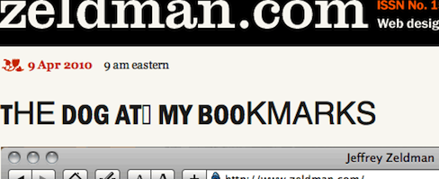
So I’ve wanted to use a condensed, bold Franklin typeface for my site’s headlines since, well, forever. So I bought Fontspring’s fine Franklin Gothic FS Demi Condensed and licensed it for @font-face use for a mere $2.99, an incomparable value.

It looks great in Safari, Chrome, and Firefox, but not so nice in the latest version of Opera, where it resembles the inside-out test monkey in Cronenberg’s “The Fly.” (Okay, okay, it looks like a ransom note, but the monkey simile was more picturesque.)

And this, my friends, is why Typekit exists. Because even when you find a great font that’s optimized for screen display and can be licensed for CSS @font-face use, guess what? There is almost always some glitch or bug somewhere. And Typekit almost always seems to find and work around these bugs. It’s the kind of grueling task designers hate dealing with, and Typekit’s team loves solving.

If this were a client site, I’d switch to Typekit, or try licensing a different vendor’s Franklin, or (if neither of those options proved satisfactory) dump web fonts altogether and use Helvetica backed by Arial instead. But as this is zeldman.com, I’d rather nudge my friends at Opera to look into the problem and fix it. This will make browsing zeldman.com in Opera a somewhat weird experience, but hopefully it will help all Opera users in the long run.

Implementation Notes and Details

  • I haven’t made an SVG version yet, so the web fonts don’t work in iPhone or iPad.
  • iPhone and iPad see normal weight Helvetica instead of bold Helvetica, because if I leave “font-weight: bold” in the CSS declaration, Firefox double-bolds the font. This is not smart of Firefox. Fixed via technique below.
  • In order to match the impact of the previous Helvetica/Arial bold, I boosted the font-size from 25px to 32px. (This also helps smooth the font. Web fonts need more help in this regard than system fonts.)
  • Camino ignores @font-face and supports the first system font in the font stack, Helvetica Neue (correctly styled bold).

Update: Problem solved. See Opera Loves My Web Font.


Categories
Design Respect software Standards State of the Web The Essentials type Typography Usability Web Design Web Design History Web Standards Web Type Day Web Type Week webfonts webkit webtype

My Love/Hate Affair With Typekit

GEORGIA and Verdana, Lucida and (to a lesser extent) Arial and Times New Roman have served us well. For fifteen years, these cross-platform default fonts have been faithful stewards of our desire to read, write, design, and publish web pages. Yet we designers have always wanted more. As far back as 1994, we hoped for the day when we could brand our layouts as magazine and poster designers do, by setting our pages in Franklin or Garamond, our headlines in Futura or Rosewood. And since 1998, CSS2 has provided a standard way to embed any typeface, not just the fab five, on a web page.

In August, 2007, CSS co-creator and Opera Software CTO Håkon Wium Lie wrote CSS At Ten, reminding us that CSS provided a mechanism by which actual font files could be linked to and retrieved from the web. Soon after the article was published, “web fonts” discussions started popping up at interactive design festivals and my friend Jeffrey Veen got the idea for a product that would get web fonts happening without running afoul of inconsistent browser support, multiple format hangups, or type designer licensing agreements and piracy concerns.

Speeding up design acceptance

While browser improvements and web standards alone provided multiple partial solutions, Typekit offered a complete solution that just worked. And the people behind Typekit (including Bryan Mason and Jason Santa Maria) did everything right: they reached out to the type design, graphic design, and standards-based web design communities; they worked with vendor after vendor to offer as many fonts as possible; they spoke everywhere, marketing their venture one lecture and even one designer at a time.

Typekit excited the web design community about type and proved that licensing and hosting web type was a viable business, providing options and convenience for designers and their clients, while bringing new revenue to type designers and protecting their intellectual property.

Typekit is the tipping point

Publicly and truly, I support Typekit because it is getting us to the world of web fonts faster. We could wait indefinitely for type vendors to agree to industry-standard licensing terms and font formats. We could wait far longer for IE, Firefox, Safari, Chrome, Opera, Opera Mini, Mobile Safari, and the rest to support the same font formats. (Currently Firefox supports WOFF and TrueType, Safari and Chrome support TrueType, MobileSafari supports SVG, IE supports EOT, and on, and on.)

But with Typekit, we don’t have to bother our pretty little heads worrying about these inconsistencies, and we don’t have to sit on the sidelines, waiting for all font makers and all browser makers to support a single standard format.

Platforms and performance

Typekit works, and that helps web designers and type designers take “web fonts” seriously. Typekit’s success is even helping to make web designers and type designers more aware of platform problems that can make fonts hideous on various platforms. Georgia was designed for the screen. Garamond was not. Moreover, platforms vary the way they hint fonts (Apple throws out hinting altogether, Microsoft over-hints) and the way they render them (from purely pixellated to at least three varieties of sub-pixel anti-aliasing), making a font’s appearance on a given user’s system hard to predict.

If not for Typekit, we might have had to wait years for most or all type designers to license web fonts. Only then would we have discovered that body text set in anything other than Georgia and Verdana pretty much blows on many Windows OS, browser, and monitor combinations.

Thanks to Typekit, we all know about the problem, and type designers are re-hinting their fonts, and in some cases redesigning them for the screen.

For all this I and all of us can be grateful to Typekit.

They also understand that designers will only use “web fonts” if they have access to the fonts they need. Just as a huge selection enabled iTunes to dominate online music, Typekit’s makers know their service must offer pretty much every good typeface out there—and they are working on it.

Renting versus “owning”

All this said in Typekit’s favor, I have mixed feelings about their product because I’d rather buy a web-licensed font than rent it—and Typekit’s success at establishing the viability of a rental model means that individual type foundries will also rent their fonts—and those who succeed at renting their fonts to web designers may not be inclined to sell.

Of course you never really own the fonts you buy—you simply license their use. So the analogy of owning versus renting doesn’t exactly hold true. But a one-time font purchase as a line item in a design budget is easier to explain and sell to a client than an ongoing rental charge.

Web Standards and @font-face

My other qualm has to do with a preference for pure web standards over product-assisted web standards. I don’t know if my preference is ideological or just the way my mind works (or fails to). But, given my druthers, I’d rather see millions of websites using standard @font-face to link to self-hosted web-licensed fonts than see that same number of fonts using a service—even a brilliant service created by friends for whom I wish continued, deserved, great success. It must be a quirk of mind; there’s no other logical explanation for this preference.

For those who share this bias, possess the properly licensed fonts, and don’t mind using FTP and writing a little code, the CSS @Font-Face Generator by Font Squirrel provides an exceptionally easy way to automatically generate the font formats necessary to take all browsers (including mobile) into account—complete with automated Cufón backup and your choice of best-practice @font-face code strings.

See also FontSpring.

Read more

Categories
Code content content strategy creativity CSS Design Fonts Standards State of the Web style type User Experience webfonts webtype

Model Site

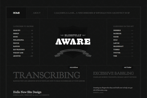
Blissfully Aware site redesign.

Web designer Joshua Lane, currently best know for doing fancy web stuff at Virb.com, has overhauled his personal site in ways that are aesthetically pleasing and visually instructive.

Like all good site redesigns, this one starts with the content. Whereas the recent zeldman.com redesign emphasizes blog posts (because I write a lot and that’s what people come here for), Lane’s redesign appropriately takes exactly the opposite approach:

There is a much smaller focus on blog posts (since I don’t write often), and a much larger focus on the things I do elsewhere (Twitter, Flickr, Last.fm etc). Individually, I don’t contribute a great deal to each of those services. But collectively, I feel like it’s a good amount of content to showcase (as seen on the home page). And something that feels like a really good representation of “me.”

Not one to ignore the power of web fonts, Lane makes judicious use of Goudy Bookletter 1911 from The League of Movable Type, an open-source type site founded by Caroline and Micah, featuring only “well-made, free & open-source, @font-face ready fonts.” (Read their Manifesto here.)

The great Barry Schwartz based his Goudy Bookletter 1911 on Frederic Goudy’s Kennerley Oldstyle, a font Schwartz admires because it “fits together tightly and evenly with almost no kerning.” Lane inserts Schwartz’s open-source gem via simple, standards-compliant CSS @font-face. Because of its size, it avoids the secret shame of web fonts, looking great in Mac and Windows.

But considered type is far from the redesigned site’s only nicety. Among its additional pleasures are elegant visual balance, judicious use of an underlying horizontal grid, and controlled tension between predictability and variation, ornament and minimalism. Restraint of color palette makes photos, portfolio pieces, and other featured elements pop. And smart CSS3 coding allows the designer to play with color variations whenever he wishes: “the entire color scheme can be changed by replacing a single background color thanks to transparent pngs and rgba text and borders.”

In short, what Lane has wrought is the very model of a modern personal site: solid design that supports content, backed by strategic use of web standards.


Categories
Fonts type Web Design Web Standards webfonts webtype

New Franklin in Town

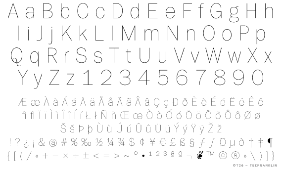
TeeFranklin by Tomi Haaparanta.

There’s a new Franklin in town. It’s TeeFranklin, designed by Tomi Haaparanta for T26. Haaparanta specializes in what we used to call grunge fonts, but you’d never know from his Franklin, which is classic and pure. In terms of available weights and styles (not to mention fanatical attention to detail), Haaparanta’s new font can’t compare to Font Bureau’s ITC Franklin, but TeeFranklin is a nice and clean, and comes in 14 weights, which may be enough. Better still, according to reader Ethan Dunham, it is licensed for @font-face embedding.


Categories
links Web Design Web Standards Websites webtype

Nice Web Type For iPhone

m.nicewebtype.com is a light yet essential mobile site for people who design websites, love type, and struggle to keep up with the dizzying world of web fonts. In it, Tim Brown, author of Nice Web Type, creator of Web Font Specimen (what’s that?), and latterly type manager for Typekit, curates the Design Twitterverse to share the latest insights, innovations, quips, and controversies regarding everyone’s favorite new web design fetish.

Don’t leave home without it.