
Movie poster captured by Heather Shaw. There are several variations, all equally baffling. I’m hoping there’s a concept behind it—that it’s bad design to make a point.
Movie poster captured by Heather Shaw. There are several variations, all equally baffling. I’m hoping there’s a concept behind it—that it’s bad design to make a point.

A List Apart and .net magazine have long admired each other. So when .net editor Dan Oliver did me the great honor of asking if I wished to guest edit an issue, I saluted smartly. The result is now arriving in subscriber post boxes and will soon flood Her Majesty’s newsstands.
In .net magazine Issue No. 206, on sale 17th August in UK (and next month in the US, where it goes by the name “Practical Web Design”), we examine how new standards like CSS3 and HTML5, new devices like iPhone and Droid, and maturing UX disciplines like content strategy are converging to create new opportunities for web designers and the web users we serve:
You can also read my article, which asks the musical question:
Cheap, complex devices such as the iPhone and the Droid have come along at precisely the moment when HTML5, CSS3 and web fonts are ready for action; when standards-based web development is no longer relegated to the fringe; and when web designers, no longer content to merely decorate screens, are crafting provocative, multi-platform experiences. Is this the dawn of a newer, more mature, more ubiquitous web?
Today’s web is about interacting with your users wherever they are, whenever they have a minute to spare. New code and new ideas for a new time are what the new issue of .net magazine captures. There has never been a better time to create websites. Enjoy!
Photo by Daniel Byrne for .net magazine. All rights reserved.

Starting in the fall of 2010, the Continuing Education Department of The Cooper Union, in conjunction with the Type Directors Club, will offer a Certificate Program in Typeface Design.
More information about this remarkable program is available at coopertype.org.
The gorgeous typefaces used on the Coopertype website are FB Franklin Web (Benton Sans) designed by Tobias Frere-Jones & Cyrus Highsmith, and Farnham, designed by Christian Schwartz. The site design is by Nick Sherman of Brooklyn and Font Bureau.

In Issue 307 of A List Apart for people who make websites:
by Richard Fink
Everything you wanted to know about web fonts but were afraid to ask. Richard Fink summarizes the latest news in web fonts, examining formats, rules, licenses, and tools. He creates a checklist for evaluating font hosting and obfuscation services like Typekit; looks at what’s coming down the road (from problems of advanced typography being pursued by the CSS3 Fonts Module group, to the implications of Google-hosted fonts); and wraps up with a how-to on making web fonts work today.
A List Apart: Web Fonts at the Crossing
Illustration by Kevin Cornell for A List Apart

THE long-planned inevitable has now been announced. With open-source-licensed web fonts, web font hosting, and add-a-line-to-your-header ease of configuration, Google has joined Typekit, Font Squirrel, Ascender, Font Bureau and others in forever changing the meaning of the phrase, “typography on the web.”
The Google Font Directory lets you browse all the fonts available via the Google Font API. All fonts in the directory are available for use on your website under an open source license and served by Google servers.
Oh, and Typekit? They’re in on it, and they couldn’t be more pleased.

Update! Final audio and video are now available for your listening and viewing pleasure.
Live today, Dan Benjamin and I grill Ethan Dunham of Fontspring and Font Squirrel and Jeffrey Veen of Typekit and numerous other good things on the web about one of your favorite subjects, “real fonts on your website.”

Be part of this dialog that takes place via streaming video feed with live call-in.
Don’t miss the inaugural live broadcast of The Big Web Show today at 1:00 PM Eastern.
(And get the podcast next week by following 5by5 on iTunes.)

A Reading Heatmap: Key passages illuminated by layering all readers’ highlights for the same text.
LAST MONTH, he wowed us with Books in the Age of the iPad, a call to make digital books as beautiful as printed ones. This month, Craig Mod is back with Embracing the Digital Book, an article (or blog post if you must) that begins as a critique of iBooks and Kindle and moves on to discuss the e-reader of our dreams, complete with reasoned social features:
I’m excited about digital books for a number of reasons. Their proclivity towards multimedia is not one of them. I’m excited about digital books for their meta potential. The illumination of, in the words of Richard Nash, that commonality between two people who have read the same book.
We need to step back for a moment and stop acting purely on style. There is no style store. Retire those half-realized metaphors while they’re still young.
Instead, let’s focus on the fundamentals. Improve e-reader typography and page balance. Integrate well considered networked (social) features. Respect the rights of the reader and then — only then — will we be in a position to further explore our new canvas.
Embracing the digital book — Craig Mod

Although Matthew Carter is overseeing the project and David Berlow of The Font Bureau is leading development, I’m feeling twitchy about Verdana Pro, a new print family from an old screen face.
Start there: Verdana was born of the screen. In particular, as all reading this know, it was born of the needs of the crude, non-anti-aliased, 72/96 ppi desktop screen of the mid-1990s. At Microsoft’s behest, Matthew Carter created the original cross-platform Verdana with its generous x-height so computer users, whether PC- or Mac-based, would have a sans-serif that was easy to read at small sizes.

Verdana is a font that looks gorgeous at 11px in a non-antialiased environment, and handsome at 9px and 10px in that same setting. Make it any bigger than 11px, and it looks grotesque. Set it via ems or percentages rather than pixels—as most accessibility-conscious designers do—and you ding its perfection. View it in a sub-pixel antialiased environment (i.e. on a modern platform) and, if it is small enough and near enough to an exact pixel size, it still looks nice and reads well … but not nearly as nice or as well as it does in the environment for which it was originally created.
Yes, if you are a genius like Matthew Carter or David Berlow, you can take a screen font, even one of the two definitive screen fonts of the 20th century—the other being Carter’s Georgia, which also looks best at exactly 11px in a non-antialiased environment, though it survives handsomely in modern environments and at inexact, percentage-based sizes—and build a true print family around it. But the idea makes me twitchy.
And that screen guy’s twitch I can’t quite shake makes me start to understand how type designers may be feeling as they watch their gorgeous high-resolution creations, rooted in hundreds of years of craft and technology, take the first small steps toward a new world of web fonts.
Apple has a typography desk. It is not exactly crowded with developers vying for every square centimetre, but it really exists. Have you ever heard of it? …
Then compare Microsoft, which has two divisions focussed on type and reading (Typography and Advanced Reading Technologies). Esteemed colleagues Simon Daniels and Kevin Larson are but two of many people with a high profile in the type business who work for Microsoft (in those departments respectively). MS Typo itself does a great deal of work. Apart from commissioning the confusable Microsoft C-fonts, the department does everything from creating box-drawing characters for teletext fonts to designing Liberian symbol systems….
As you’d expect, I urge Apple to get back into the business of type design. The chief lesson of the Web must be observed: Do what works and don’t do what doesn’t work.
Worth reading in its entirety, rereading, bookmarking, and sharing (especially with friends at Apple): Where Microsoft beats Apple on the Personal Weblog of Joe Clark, Toronto. Nobody does it better.
Gloriously available for @font-face embedding, TeeFranklin by Suomi Type Foundry at Fontspring is a family of 14 weights/styles that may be perfect when you want to offer something a tad different from Helvetica and Franklin while retaining many of the qualities that make those fonts great.

Brandon Grotesque is a sans serif family of six weights plus matching italics, designed by Hannes von Döhren.
Influenced by the geometric-style sans serif faces that were popular during the 1920s and 30s, the fonts are based on geometric forms that have been optically corrected for better legibility. Brandon Grotesque has a functional look with a warm touch.
The Regular weight is free through April 15.
![]()
GEORGIA and Verdana, Lucida and (to a lesser extent) Arial and Times New Roman have served us well. For fifteen years, these cross-platform default fonts have been faithful stewards of our desire to read, write, design, and publish web pages. Yet we designers have always wanted more. As far back as 1994, we hoped for the day when we could brand our layouts as magazine and poster designers do, by setting our pages in Franklin or Garamond, our headlines in Futura or Rosewood. And since 1998, CSS2 has provided a standard way to embed any typeface, not just the fab five, on a web page.
In August, 2007, CSS co-creator and Opera Software CTO Håkon Wium Lie wrote CSS At Ten, reminding us that CSS provided a mechanism by which actual font files could be linked to and retrieved from the web. Soon after the article was published, “web fonts” discussions started popping up at interactive design festivals and my friend Jeffrey Veen got the idea for a product that would get web fonts happening without running afoul of inconsistent browser support, multiple format hangups, or type designer licensing agreements and piracy concerns.
While browser improvements and web standards alone provided multiple partial solutions, Typekit offered a complete solution that just worked. And the people behind Typekit (including Bryan Mason and Jason Santa Maria) did everything right: they reached out to the type design, graphic design, and standards-based web design communities; they worked with vendor after vendor to offer as many fonts as possible; they spoke everywhere, marketing their venture one lecture and even one designer at a time.
Typekit excited the web design community about type and proved that licensing and hosting web type was a viable business, providing options and convenience for designers and their clients, while bringing new revenue to type designers and protecting their intellectual property.
Publicly and truly, I support Typekit because it is getting us to the world of web fonts faster. We could wait indefinitely for type vendors to agree to industry-standard licensing terms and font formats. We could wait far longer for IE, Firefox, Safari, Chrome, Opera, Opera Mini, Mobile Safari, and the rest to support the same font formats. (Currently Firefox supports WOFF and TrueType, Safari and Chrome support TrueType, MobileSafari supports SVG, IE supports EOT, and on, and on.)
But with Typekit, we don’t have to bother our pretty little heads worrying about these inconsistencies, and we don’t have to sit on the sidelines, waiting for all font makers and all browser makers to support a single standard format.
Typekit works, and that helps web designers and type designers take “web fonts” seriously. Typekit’s success is even helping to make web designers and type designers more aware of platform problems that can make fonts hideous on various platforms. Georgia was designed for the screen. Garamond was not. Moreover, platforms vary the way they hint fonts (Apple throws out hinting altogether, Microsoft over-hints) and the way they render them (from purely pixellated to at least three varieties of sub-pixel anti-aliasing), making a font’s appearance on a given user’s system hard to predict.
If not for Typekit, we might have had to wait years for most or all type designers to license web fonts. Only then would we have discovered that body text set in anything other than Georgia and Verdana pretty much blows on many Windows OS, browser, and monitor combinations.
Thanks to Typekit, we all know about the problem, and type designers are re-hinting their fonts, and in some cases redesigning them for the screen.
For all this I and all of us can be grateful to Typekit.
They also understand that designers will only use “web fonts” if they have access to the fonts they need. Just as a huge selection enabled iTunes to dominate online music, Typekit’s makers know their service must offer pretty much every good typeface out there—and they are working on it.
All this said in Typekit’s favor, I have mixed feelings about their product because I’d rather buy a web-licensed font than rent it—and Typekit’s success at establishing the viability of a rental model means that individual type foundries will also rent their fonts—and those who succeed at renting their fonts to web designers may not be inclined to sell.
Of course you never really own the fonts you buy—you simply license their use. So the analogy of owning versus renting doesn’t exactly hold true. But a one-time font purchase as a line item in a design budget is easier to explain and sell to a client than an ongoing rental charge.
My other qualm has to do with a preference for pure web standards over product-assisted web standards. I don’t know if my preference is ideological or just the way my mind works (or fails to). But, given my druthers, I’d rather see millions of websites using standard @font-face to link to self-hosted web-licensed fonts than see that same number of fonts using a service—even a brilliant service created by friends for whom I wish continued, deserved, great success. It must be a quirk of mind; there’s no other logical explanation for this preference.
For those who share this bias, possess the properly licensed fonts, and don’t mind using FTP and writing a little code, the CSS @Font-Face Generator by Font Squirrel provides an exceptionally easy way to automatically generate the font formats necessary to take all browsers (including mobile) into account—complete with automated Cufón backup and your choice of best-practice @font-face code strings.
See also FontSpring.
Is it getting hot in here? Or is it just the flames?
In An Early Look At IE9 for Developers, Dean Hachamovitch, General Manager for Internet Explorer, reports on performance progress, web standards progress (border-radius, bits of CSS3, Acid 3 performance), and “bringing the power of PC hardware and Windows to web developers in the browser” (e.g. improved type rendering via Direct2D, a Windows sub-pixel rendering technology that replaces Cleartype).
The reported web standards improvements are encouraging, and better type rendering in IE is a consummation much to be desired. These positive notes notwithstanding, what is most interesting about the post is the political tightrope Microsoft team leaders are still forced to walk.
The world has moved to web standards, and Microsoft knows it must at least try to catch up. Its brilliant browser engineers have been working hard to do so. This web standards support is not optional: having just been spanked hard in Europe for anticompetitive practices, Microsoft knows it is no longer invincible, and cannot continue to use claims of innovation to stifle the overall market or drag its feet on advanced standards compliance.
At the same time, Microsoft’s marketing department wants the public to believe that IE and Windows are profoundly innovative. Thus efforts to catch up to the typographic legibility and beauty of Mac OS X and Webkit browsers are presented, in Dean Hachamovitch’s blog post, as leading-edge innovations. Don’t get me wrong: these improvements are desirable, and Direct2D may be great. I’m not challenging the quality of the hardware and software improvements; I’m pointing out the enforced bragging, which is mandated from on high, and which flies in the face of the humble stance other high-level divisions in Microsoft would like to enforce in the wake of the company’s European drubbing and the dents Apple and Google have made on its monopoly and invulnerability.
In short, the tone of these announcements has not changed, even though the times have.
Hachamovitch does an admirable job of sticking to the facts and pointing out genuine areas of interest. But he is stuck in a corporate box. A slightly more personal, down-to-earth tone would have come across as the beginnings of transparency—Web 1.1, if not Web 2.0—and a more transparent tone might have slightly reduced the percentage of flamebait in the post’s comments. (It could only have slightly reduced that percentage, because, on the internet, there is no such thing as a calm discussion of improvements to a Microsoft browser, but still.)
Although I disagree with the tone of many of the comments—rudeness to engineers is not admirable, kind, or helpful—I agree with the leading thoughts they express, which are:
On the other hand, Microsoft’s refusal to switch to Webkit gives Apple and Google a competitive advantage, and that is good because a web in which one browser has a monopoly stifles standards and innovation alike. By torturing the IE rendering engine every couple of years instead of putting it out of its misery, Microsoft contributes to the withering away of its own monopoly. That might not be good for the shareholders, but it is great for everyone else.
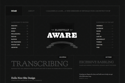
Web designer Joshua Lane, currently best know for doing fancy web stuff at Virb.com, has overhauled his personal site in ways that are aesthetically pleasing and visually instructive.
Like all good site redesigns, this one starts with the content. Whereas the recent zeldman.com redesign emphasizes blog posts (because I write a lot and that’s what people come here for), Lane’s redesign appropriately takes exactly the opposite approach:
There is a much smaller focus on blog posts (since I don’t write often), and a much larger focus on the things I do elsewhere (Twitter, Flickr, Last.fm etc). Individually, I don’t contribute a great deal to each of those services. But collectively, I feel like it’s a good amount of content to showcase (as seen on the home page). And something that feels like a really good representation of “me.”
Not one to ignore the power of web fonts, Lane makes judicious use of Goudy Bookletter 1911 from The League of Movable Type, an open-source type site founded by Caroline and Micah, featuring only “well-made, free & open-source, @font-face ready fonts.” (Read their Manifesto here.)
The great Barry Schwartz based his Goudy Bookletter 1911 on Frederic Goudy’s Kennerley Oldstyle, a font Schwartz admires because it “fits together tightly and evenly with almost no kerning.” Lane inserts Schwartz’s open-source gem via simple, standards-compliant CSS @font-face. Because of its size, it avoids the secret shame of web fonts, looking great in Mac and Windows.
But considered type is far from the redesigned site’s only nicety. Among its additional pleasures are elegant visual balance, judicious use of an underlying horizontal grid, and controlled tension between predictability and variation, ornament and minimalism. Restraint of color palette makes photos, portfolio pieces, and other featured elements pop. And smart CSS3 coding allows the designer to play with color variations whenever he wishes: “the entire color scheme can be changed by replacing a single background color thanks to transparent pngs and rgba text and borders.”
In short, what Lane has wrought is the very model of a modern personal site: solid design that supports content, backed by strategic use of web standards.
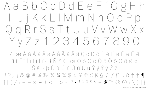
There’s a new Franklin in town. It’s TeeFranklin, designed by Tomi Haaparanta for T26. Haaparanta specializes in what we used to call grunge fonts, but you’d never know from his Franklin, which is classic and pure. In terms of available weights and styles (not to mention fanatical attention to detail), Haaparanta’s new font can’t compare to Font Bureau’s ITC Franklin, but TeeFranklin is a nice and clean, and comes in 14 weights, which may be enough. Better still, according to reader Ethan Dunham, it is licensed for @font-face embedding.