Categories
"Digital Curation" Advertising Advocacy architecture Authoring Best practices copyright Corporatism Culture democracy Design engagement environment ethics The Essentials The Mind The Profession work

We Didn’t Stop The Fire.

OUR LIBRARY IS BURNING. Copyright extension has banished millions of books to the scrapheap. Digital permanence is a tragically laughable ideal to anyone who remembers the VHS format wars or tries to view Joshua Davis’s 1990s masterpieces on a modern computer. Digital archiving is only as permanent as the next budget cycle—as when libraries switched from microfilm to digital subscriptions and then were forced to cancel the subscriptions during the pre-recession recession. And of course, my digital work vanishes the moment I die or lose the ability to keep hosting it. If you really want to protect your family photos, take them off Flickr and your hard drive, get them on paper, and store them in an airtight box.

Though bits are forever, our medium is mortal, as all but the most naive among us know. And we accept that some of what we hold digitally dear will perish before our eyes. But it irks most especially when people or companies with more money than judgement purchase a thriving online community only to trash it when they can’t figure out how to squeeze a buck out of it. Corporate black thumb is not new to our medium: MGM watered down the Marx Bros; the Saatchis sucked the creative life and half the billings out of the ad agencies they acquired during the 1980s and beyond. But outside the digital world, some corporate purchases and marriages have worked out (think: Disney/Pixar). And with the possible exception of Flickr (better now than the day Yahoo bought it), I can’t think of any online community or publication that has improved as a result of being purchased. Whereas we can all instantly call to mind dozens of wonderful web properties that died or crawled up their own asses as a direct result of new corporate ownership.

My colleague Mandy Brown has written a moving call to arms which, knowingly or unknowingly, invokes the LOCKSS method (“Lots of Copies Keep Stuff Safe”) of preserving digital content by making copies of it; she encourages us all to become archivists. Even a disorganized ground-level effort such as Mandy proposes will be beneficial—indeed, the less organized, the better. And this is certainly part of the answer. (It’s also what drives my friend Tantek’s own your data efforts; my beef with T is mainly aesthetic.) So, yes, we the people can do our part to help undo the harm uncaring companies cause to our e-ecosystem.

But there is another piece of this which no one is discussing and which I now address specifically to my colleagues who create great digital content and communities:

Stop selling your stuff to corporate jerks. It never works. They always wreck what you’ve spent years making.

Don’t go for the quick payoff. You can make money maintaining your content and serving your community. It won’t be a fat fistful of cash, but that’s okay. You can keep living, keep growing your community, and, over the years, you will earn enough to be safe and comfortable. Besides, most people who get a big payoff blow the money within two years (because it’s not real to them, and because there are always professionals ready to help the rich squander their money). By contrast, if you retain ownership of your community and keep plugging away, you’ll have financial stability and manageable success, and you’ll be able to turn the content over to your juniors when the time comes to retire.

Our library is burning. We didn’t start the fire but we sure don’t have to help fan the flames. You can’t sell out if you don’t sell. Owning your content starts with you.

Categories
A Book Apart A List Apart Adobe An Event Apart Apple architecture art direction Authoring Best practices Big Web Show client services Code content content strategy creativity CSS CSS3 Dan Benjamin Design DWWS E-Books editorial Education eric meyer Fonts Formats Free Advice Happy Cog™ Haters industry Information architecture interface ipad iphone IXD javascript links maturity New Riders peachpit Publications Publishing Real type on the web Respect Responsibility Responsive Web Design Standards State of the Web tbws The Big Web Show The Essentials The Profession This never happens to Gruber Typekit Typography Usability User Experience UX W3C Web Design Web Design History Web Standards webfonts webkit Websites webtype work Working writing Zeldman zeldman.com

2010: The Year in Web Standards

WHAT A YEAR 2010 has been. It was the year HTML5 and CSS3 broke wide; the year the iPad, iPhone, and Android led designers down the contradictory paths of proprietary application design and standards-based mobile web application design—in both cases focused on user needs, simplicity, and new ways of interacting thanks to small screens and touch-sensitive surfaces.

It was the third year in a row that everyone was talking about content strategy and designers refused to “just comp something up” without first conducting research and developing a user experience strategy.

CSS3 media queries plus fluid grids and flexible images gave birth to responsive web design (thanks, Beep!). Internet Explorer 9 (that’s right, the browser by Microsoft we’ve spent years grousing about) kicked ass on web standards, inspiring a 10K Apart contest that celebrated what designers and developers could achieve with just 10K of standards-compliant HTML, CSS, and JavaScript. IE9 also kicked ass on type rendering, stimulating debates as to which platform offers the best reading experience for the first time since Macintosh System 7.

Even outside the newest, best browsers, things were better than ever. Modernizr and eCSStender brought advanced selectors and @font-face to archaic browsers (not to mention HTML5 and SVG, in the case of Modernizr). Tim Murtaugh and Mike Pick’s HTML5 Reset and Paul Irish’s HTML5 Boilerplate gave us clean starting points for HTML5- and CSS3-powered sites.

Web fonts were everywhere—from the W3C to small personal and large commercial websites—thanks to pioneering syntax constructions by Paul Irish and Richard Fink, fine open-source products like the Font Squirrel @Font-Face Generator, open-source liberal font licensing like FontSpring’s, and terrific service platforms led by Typekit and including Fontdeck, Webtype, Typotheque, and Kernest.

Print continued its move to networked screens. iPhone found a worthy adversary in Android. Webkit was ubiquitous.

Insights into the new spirit of web design, from a wide variety of extremely smart people, can be seen and heard on The Big Web Show, which Dan Benjamin and I started this year (and which won Video Podcast of the Year in the 2010 .net Awards), on Dan’s other shows on the 5by5 network, on the Workers of the Web podcast by Alan Houser and Eric Anderson, and of course in A List Apart for people who make websites.

Zeldman.com: The Year in Review

A few things I wrote here at zeldman.com this year (some related to web standards and design, some not) may be worth reviewing:

iPad as the New Flash 17 October 2010
Masturbatory novelty is not a business strategy.
Flash, iPad, and Standards 1 February 2010
Lack of Flash in the iPad (and before that, in the iPhone) is a win for accessible, standards-based design. Not because Flash is bad, but because the increasing popularity of devices that don’t support Flash is going to force recalcitrant web developers to build the semantic HTML layer first.
An InDesign for HTML and CSS? 5 July 2010
while our current tools can certainly stand improvement, no company will ever create “the modern day equivalent of Illustrator and PageMaker for CSS, HTML5 and JavaScript.” The assumption that a such thing is possible suggests a lack of understanding.
Stop Chasing Followers 21 April 2010
The web is not a game of “eyeballs.” Never has been, never will be. Influence matters, numbers don’t.
Crowdsourcing Dickens 23 March 2010
Like it says.
My Love/Hate Affair with Typekit 22 March 2010
Like it says.
You Cannot Copyright A Tweet 25 February 2010
Like it says.
Free Advice: Show Up Early 5 February 2010
Love means never having to say you’re sorry, but client services means apologizing every five minutes. Give yourself one less thing to be sorry for. Take some free advice. Show up often, and show up early.

Outside Reading

A few things I wrote elsewhere might repay your interest as well:

The Future of Web Standards 26 September, for .net Magazine
Cheap, complex devices such as the iPhone and the Droid have come along at precisely the moment when HTML5, CSS3 and web fonts are ready for action; when standards-based web development is no longer relegated to the fringe; and when web designers, no longer content to merely decorate screens, are crafting provocative, multi-platform experiences. Is this the dawn of a new web?
Style vs. Design written in 1999 and slightly revised in 2005, for Adobe
When Style is a fetish, sites confuse visitors, hurting users and the companies that paid for the sites. When designers don’t start by asking who will use the site, and what they will use it for, we get meaningless eye candy that gives beauty a bad name.

Happy New Year, all!

Categories
art art direction Design experience glamorous The Essentials work writing Zeldman

Pixy Stix | Jason Santa Maria

I wrote a true story of  love, obsession, heartbreak, and candy and my friend Jason Santa Maria art directed it. I’m proud of this tiny, fast-reading story, which is like condensed essence of me (and all these years later, nothing has really changed) and I love what Jason’s done with the page. Please enjoy Pixy Stix, the October 19th Candygram.

Categories
Accessibility Adobe Advocacy Apple Applications apps architecture art direction Authoring Best practices business development E-Books editorial Flash Formats Free Advice glamorous HTML HTML5 industry ipad iphone Publications Publishing Responsibility Standards State of the Web The Essentials W3C Web Design Web Design History Web Standards

iPad as the new Flash


Jeffrey Zeldman Presents

iPad. Never have so many embraced a great product for exactly the wrong reasons.

Too many designers and publishers see the iPad as an opportunity to do all the wrong things—things they once did in Flash—without the taint of Flash.

In the minds of many, the iPad is like Flash that pays. You can cram traditional publishing content into an overwrought, novelty Flash interface as The New York Times once did with its T magazine. You may win a design award but nobody will pay you for that content. Ah, but do the same thing on the iPad instead, and subscribers will pay—maybe not enough to save publishing, but enough to keep the content coming and at least some journalists, editors, and art directors employed.

It’s hard to argue with money and jobs, and I wouldn’t dream of doing so.

Alas, the early success of a few publications—publications so good they would doubtless survive with or without iPad—is creating a stampede that will not help most magazines and interfaces that will not please most readers.

Everything we’ve learned in the past decade about preferring open standards to proprietary platforms and user-focused interfaces to masturbatory ones is forgotten as designers and publishers once again scramble to create novelty interfaces no one but them cares about.

While some of this will lead to useful innovation, particularly in the area of gestural interfaces, that same innovation can just as readily be accomplished on websites built with HTML, CSS, and JavaScript—and the advantage of creating websites instead of iPad apps is that websites work for everyone, on browsers and devices at all price points. That, after all, is the point of the web. It’s the point of web standards and progressive enhancement.

Luke Wroblewski’s Touch Gesture Reference Guide gives designers plenty of ammunition to create dynamic user experiences that work on a wide variety of mobile phones and devices (including iPad) while these same sites can use traditional desktop browser effects like hover to offer equally rich experiences on non-touch-enabled browsers. Unless your organization’s business model includes turning a profit by hiring redundant, competing teams, “Write once, publish everywhere” makes more economic sense than “Write once, publish to iPad. Write again, publish to Kindle. Write again, publish to some other device.”

I’m not against the iPad. I love my iPad. It’s great for storing and reading books, for browsing websites, for listening to music and watching films, for editing texts, presentations, and spreadsheets, for displaying family photos, and on and on. It’s nearly all the stuff I love about my Mac plus a great ePub reader slipped into a little glass notebook I play like a Theremin.

I’m not against iPad apps. Twitterific for iPad is by far the best way to use Twitter. After all, Twitter is really an internet service, not a website; Twitter’s own site, while leaps ahead of where it used to be, is hardly the most useful or delightful way to access its service. Gowalla for iPad is my constant companion. I dread the idea of traveling without it. And there are plenty of other great iPad apps I love, from Bloom, an “endless music machine” by Brian Eno and Peter Chilvers, to Articles, which turns Wikipedia into an elegant reading experience, to Mellotronics for iPad, an uncannily accurate Mellotron simulator packed with 13 authentic voices—“the same production tapes featured on Strawberry Fields Forever” and other classic tracks (not to mention tracks by nouveau retro bands like Eels).

There are apps that need to be apps, demand to be apps, and I admire and learn from them like every other designer who’s alive at this moment.

I’m just not sold on what the magazines are doing. Masturbatory novelty is not a business strategy.

Categories
glamorous The Essentials

My Life

More email coming in than going out.

Categories
family glamorous The Essentials

Blood and Bone


Jeffrey Zeldman Presents

MY EX-WIFE is one of my heroes. Six years ago today, during 33 hours of labor in a stiflingly hot room, she brought forth our daughter. When my body rebels in the gym, I think of her courage and push out another rep. When a lift or stretch hurts, I remember what she did and breathe through the pain. From her and those long moments, I learned mind over matter. From witnessing and helping during those 33 hours, I learned that life is blood and bone, and that we can achieve anything if we push hard enough.

Thank you, Carrie, for that lesson and for this girl. Happy sixth birthday, dearest Ava. And, by wonderful coincidence and similar courage and marvels, joyous first day on earth, Nash Thomas Hoy. Fill your lungs and holler, boy!

Categories
Accessibility Adobe Advocacy Apple Applications apps architecture Authoring Best practices Browsers business Code content strategy CSS3 Design Designers development editorial Happy Cog™ HTML HTML5 industry javascript Platforms Publications Publishing Real type on the web Standards State of the Web The Essentials The Profession W3C Web Design Web Design History Web Standards webfonts webtype Zeldman

The future of web standards

Jeffrey Zeldman on the future of web standards.

“Cheap, complex devices such as the iPhone and the Droid have come along at precisely the moment when HTML5, CSS3 and web fonts are ready for action; when standards-based web development is no longer relegated to the fringe; and when web designers, no longer content to merely decorate screens, are crafting provocative, multi-platform experiences. Is this the dawn of a newer, more mature, more ubiquitous web?”

The Future of Web Standards by Jeffrey Zeldman

Originally written for .net magazine, Issue No. 206, published 17 August in UK and this month in the US in “Practical Web Design” Magazine. Now you can read the article even if you can’t get your hands on these print magazines.

See also: I Guest-Edit .net magazine.

Categories
A List Apart Accessibility Amazon Apple art direction Authoring Best practices books Browsers Code Compatibility Design E-Books Formats HTML industry Layout Site Optimization The Essentials Touchscreen Web Design Web Design History Web Standards webkit zeldman.com

My other iPad is a Kindle

Zeldman.com as seen on Kindle

The new Kindle has a lot going for it. It’s inexpensive compared to a full-featured tablet computer like the iPad; you can slip it in your back pocket, where it’s more comfortable than an old-style paperback; and it includes a Webkit browser. This last point is where folks like us start to give a hoot, whether we’re fans of epub reading or not.

The flavor of Kindle’s browser concerns us because it affords us the ability to optimize the mobile viewing experience with a single line of markup. You can see this in action in the photo at the head of this article (published and discussed on Flickr).

I made no tweaks for Kindle per se; the Kindle is simply responding to a line of markup I’ve been putting into my web pages since 2007—namely, the viewport meta element, which controls the width of the viewport, thus enabling mobile devices with a limited number of pixels to focus all available pixels on your site’s core content (instead of, for instance, wasting part of the small screen on a background color, image, or gradient). The technique is as simple as web design gets:

meta name="viewport" content="width=770"

(Obviously, the value of “width” should be adjusted to match your site’s layout.)

I learned this little trick from Craig Hockenberry’s Put Your Content in My Pocket (A List Apart, August 28, 2007), which I naturally recommend to any designer who hasn’t seen it.

Categories
A List Apart An Event Apart Announcements Appearances Applications architecture art direction Best practices Browsers chrome Code CSS CSS3 Damned Fine Journalism Design Designers editorial Education engagement glamorous Happy Cog™ HTML HTML5 Ideas industry interface ipad iphone launches Layout photography Press Publications Publishing Real type on the web Responsive Web Design Standards State of the Web The Big Web Show The Essentials The Profession This never happens to Gruber type Typography User Experience UX W3C Web Design Web Design History Web Standards webfonts webkit Websites webtype writing Zeldman zeldman.com

I guest-edit .net magazine

Web 2.1. Zeldman guest-edits .net magazine.

A List Apart and .net magazine have long admired each other. So when .net editor Dan Oliver did me the great honor of asking if I wished to guest edit an issue, I saluted smartly. The result is now arriving in subscriber post boxes and will soon flood Her Majesty’s newsstands.

In .net magazine Issue No. 206, on sale 17th August in UK (and next month in the US, where it goes by the name “Practical Web Design”), we examine how new standards like CSS3 and HTML5, new devices like iPhone and Droid, and maturing UX disciplines like content strategy are converging to create new opportunities for web designers and the web users we serve:

  • Exult as Luke Wroblewski shows how the explosive growth of mobile lets us stop bowing to committees and refocus on features customers need.
  • Marvel as Ethan Marcotte explains how fluid grids, flexible images, and CSS3 media queries help us create precise yet context-sensitive layouts that change to fit the device and screen on which they’re viewed.
  • Delight as Kristina Halvorson tells how to achieve better design through coherent content wrangling.
  • Thrill as Andy Hume shows how to sell wary clients on cutting-edge design methods never before possible.
  • Geek out as Tim Van Damme shows how progressive enhancement and CSS3 make for sexy experiences in today’s most capable browsers—and damned fine experiences in those that are less web-standards-savvy.

You can also read my article, which asks the musical question:

Cheap, complex devices such as the iPhone and the Droid have come along at precisely the moment when HTML5, CSS3 and web fonts are ready for action; when standards-based web development is no longer relegated to the fringe; and when web designers, no longer content to merely decorate screens, are crafting provocative, multi-platform experiences. Is this the dawn of a newer, more mature, more ubiquitous web?

Today’s web is about interacting with your users wherever they are, whenever they have a minute to spare. New code and new ideas for a new time are what the new issue of .net magazine captures. There has never been a better time to create websites. Enjoy!


Photo by Daniel Byrne for .net magazine. All rights reserved.

Categories
Browsers bugs Code Compatibility CSS CSS3 development Free Happy Cog™ HTML HTML5 Ideas industry links Standards State of the Web The Essentials The Profession Tools Web Design Web Design History Web Standards

HTML5, CSS3 default templates

Free for use in all web projects, professional or personal, HTML5 Reset by Monkey Do! is a set of HTML5 and CSS templates that jumpstart web development by removing the styling native to each browser, establishing basic HTML structures (title, header, footer, etc.), clearing floats, correcting for IE problems, and more.

Most of us who design websites begin every project with bits and pieces of this kind of code, but developer Tim Murtaugh, who created these files and who modestly thanks everyone in the universe, has struck a near-ideal balance. In these lean, simple files, without fuss or clutter, he manages to give us the best-practices equivalent of everything but the kitchen sink.

Tim Murtaugh sits beside me at Happy Cog, so I’ve seen him use these very files (and earlier versions of them) to quickly code advanced websites. If you’re up to speed on all the new hotness, these files will help you stay that way and work faster. If you’re still learning (and who isn’t?) about HTML5, CSS3, and browser workarounds, studying these files and Tim’s notes about them will help you become a more knowledgeable web designer slash developer. (We need a better name for what we do.)

My daughter calls Mr Murtaugh “Tim the giant.” With the release of this little package, he earns the moniker. Highly recommended.

Categories
Adobe Code Design development HTML HTML5 The Essentials Tools Web Design Web Standards

An InDesign for HTML and CSS?

In “CSS is the new Photoshop” (?), Adobe’s John Nack correctly observes, as have many of us, that “Cascading Style Sheets can create a great deal of artwork now, without reliance on bitmap graphics.” Nack quotes Shawn Blanc, one of several concurrent authors of the phrase “CSS is the new Photoshop,” who cites as evidence Louis Harboe’s iOS icons and Jeff Batterton’s iPhone, both designed entirely in CSS and both only viewable in the latest Webkit browsers, Safari 5 and Google Chrome 5.

He’s not alone: Håkon Wium Lie from Opera predicts that CSS3 could eliminate half the images used on the Web. You can use various graphical tools to generate things like CSS gradients and rounded corners. As people can do more and more in code, it makes sense to ask whether even to use Photoshop in designing Web content.

I think Adobe should be freaking out a bit, but in a constructive way.

So far, so good. But Nack’s “constructive” suggestion for Adobe, quoting Michael Slade, is to create “the modern day equivalent of Illustrator and PageMaker for CSS, HTML5 and JavaScript.”

Nack acknowledges that this will be difficult. I propose that it will be impossible. Says Nack:

As I noted the other day, “Almost no one would look inside, say, an EPS file and harrumph, ‘Well, that’s not how I’d write PostScript’–but they absolutely do that with HTML.”

Well, there is a reason they absolutely do that with HTML. PostScript is a programming language designed to describe page layouts and text shapes in a world of known, fixed dimensions (the world of print), with no underlying semantics. PostScript doesn’t care whether an element is a paragraph, a headline, or a list item. It doesn’t care if a bit of content on one page cites another bit of content on a different page. PostScript is a visual plotting language. And HTML is anything but.

HTML is a language with roots in library science. It doesn’t know or care what content looks like. (Even HTML5 doesn’t care what content looks like.) Neither a tool like Photoshop, which is all about pixels, nor a tool like Illustrator, which is all about vectors, can generate semantic HTML, because the visual and the semantic are two different things.

Moreover, authoring good HTML and CSS is an art, just as authoring good poetry or designing beautiful comps in Photoshop is an art. Expecting Photoshop to write the kind of markup and CSS you and I write at our best is like challenging TextMate to convert semantic HTML into a visually appropriate and aesthetically pleasing layout. Certain kinds of human creativity and expertise cannot be reproduced by machines. Yes, there are machines that create music, and a composer like Brian Eno can program such systems to create somewhat interesting aural landscapes, but such music can never be the Eroica or “This Land is Your Land,” because there is no algorithm with the creative and life experience of Beethoven or Woody Guthrie.

Adobe already has a fine product in the code arena. Some hand coders knock Dreamweaver, but it does about as good a job as is possible of converting groupings of meaningless pixels into chunks of valid code. It is unreasonable to expect more than that from a tool that begins by importing a multi-layered Photoshop comp. Of course you can do much more with Dreamweaver if you use its code merely as a starting point, or if you use it simply as a hand-coding environment. But that’s the point. Some things, to be done right, must be done by the human mind.

There’s something to what Nack says. Photoshop could be made friendlier to serious web designers. Adobe could also stop ignoring Fireworks, as Fireworks is a better starting place for web design. They might even interview serious, standards-oriented web designers and start from scratch, as a new tool will suffer from fewer political constraints and user expectations than a beloved existing product with deep features and multiple audiences.

But while our current tools can certainly stand improvement, no company will ever create “the modern day equivalent of Illustrator and PageMaker for CSS, HTML5 and JavaScript.” The very assumption that a such thing is possible suggests a lack of understanding of the professionalism, wisdom, and experience required to create good HTML, CSS, and JavaScript. Fortunately, a better understanding is easy to come by.

Categories
37signals Acclaim Announcements Appearances Applications apps Authoring Best practices better-know-a-speaker business Chicago client services Code Coudal Partners Design ethics HTML Ideas industry interface Interviews Journalism at its Finest Press Products Publications Publishing Respect Ruby on Rails Small Business State of the Web The Big Web Show The Essentials The Profession User Experience

37signals’ Jason Fried live today on The Big Web Show

I have known 37signals CEO Jason Fried since he was a young copywriter who reminded me of me, only smarter and more confident. Like many of you, with a mixture of awe and pleasure, I have watched him change our industry, along with book publishing and business generally. Dan Benjamin and I are delighted to announce the mercurial Mr Fried as our guest on The Big Web Show. Join us today, 1 July 2010, for the live taping at 1:00 PM ET.

Jason’s official bio is brief, but he can write at length when he wishes: see Rework, Getting Real, and Defensive Web Design, each a classic, and to each of which he was principal co-writer and guiding force. Besides saying no to meetings, contracts, and VC money, Jason and 37signals are famous for godfathering a speedy, iterative form of web application design; for gifting the industry with Ruby on Rails; for creating a suite of beloved (yes, really) business productivity web apps; for mastering and then abandoning client services in favor of making stuff; for somehow, in the midst of all that busyness, churning out tons of fine content on their popular blog; and for being roommates with the equally fantastic Coudal Partners.

Can’t wait to interview Jason Fried in front of a live internet audience today. Hope you’ll join us.

The Big Web Show is taped live in front of an internet audience every Thursday at 1:00 PM ET on live.5by5.tv. Edited episodes can be watched afterwards (often within hours of taping) via iTunes (audio feed | video feed) and the web.

Photo © John Morrison – Subism.com

Categories
A Book Apart A List Apart Accessibility Best practices Blogs and Blogging books Design Ideas The Essentials Usability User Experience UX Web Design Web Design History Web Standards

Responsive design is the new black

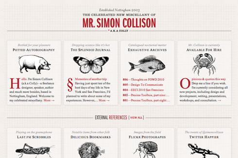
Collylogic.com, retooled as responsive design. The wide version.

The blog of Mr Simon Collison, retooled as responsive web design. The wide version.

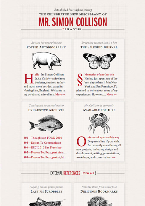
Collylogic.com, retooled as responsive design. The narrow version.

The blog of Mr Simon Collison, retooled as responsive web design. The narrow version.

See more versions in Mr Collison’s “Media Query Layouts” set on Flickr.

Read the article that started it all. Coming soon as a book by Mr Ethan Marcotte from A Book Apart. (The current A Book Apart book, Mr Jeremy Keith’s HTML5 For Web Designers, ships Friday. Mr Ethan Marcotte will be our guest this Thursday, June 24, on The Big Web Show. Synchronicity. It’s not just an LP by The Police. Kids, ask your parents.)

The beauty of responsive web design becomes obvious when you see your site in smart phones, tablets, and widescreen desktop browsers. It’s as if your site was redesigned to perfectly fit that specific environment. And yet there is but one actual design—a somewhat plastic design, if you will. An extensible design, if you prefer. It’s what some of us were going for with “liquid” web design back in the 1990s, only it doesn’t suck. Powered by CSS media queries, it’s the resurrection of a Dao of Web Design and a spiffy new best practice. All the kids are doing it.

Well, anyway, some of the cool ones are. See also the newly retooled-per-responsive-design Journal by Mr Hicks. Hat tip: Mr Stocks. I obviously have some work to do on this site. And you may on yours.

Seen any good responsive redesigns lately?


Categories
Interviews State of the Web The Big Web Show The Essentials The Mind

Big Web Show Roundup

The Big Web Show

The Big Web Show is a weekly video podcast on Everything Web That Matters, co-hosted by 5×5 network founder Dan Benjamin and yours truly. Here’s a roundup of recent shows:

  • In Episode 2: HTML5, Dan and I talk with Jeremy Keith, designer, writer, featured An Event Apart speaker, and author of HTML5 for Web Designers. We discuss the goals and inspiration behind the book, as well as what HTML5 means for both web creators and those who consume the web, covering topics that range from structure to accessibility and implementation.
  • Melissa Pierce’s new film, “Life in Perpetual Beta,” asks the question, “is the planned life worth living?” and sketches an answer via interviews with the likes of Baratunde Thuston, Irina Slutsky, and Twitter’s Biz Stone. In Episode 3: Re-invent Yourself, Dan and I interview Melissa about the unplanned life, Facebook privacy, and using the internet to re-invent yourself.
  • In Episode 4: Content Strategy, Dan and I get down to cases with Kristina Halvorson, CEO, Brain Traffic and author, Content Strategy for the Web (New Riders, 2010), and Erin Kissane, content strategist with Happy Cog, and author of Incisive.nu.
  • In Episode 5: Web Education, we talk with special guest Liz Danzico, author of Bobulate, and chairperson of the MFA in Interaction Design program at New York’s School of Visual Arts. They discuss web and interaction design education, user experience design, how to structure a program and teach a class, acquiring and editing content, and much more.
  • In Episode 6: Mobile First, Dan and I chat with leading interaction designer Luke Wroblewski about designing for the mobile space, and learn why the mobile experience for a web application or site should be designed before the PC version.
  • In Episode 7: Usability Testing, we schmooze larger-than-life user experience design guru Jared Spool about usability testing in the real world. Jared is the founder of User Interface Engineering, the largest usability research organization of its kind in the world, and has been working in the field of usability and design since 1978, before the term “usability” was ever associated with computers.
  • Most recently, in Episode 8: User Experience Design, Dan and I talk with Happy Cog’s senior UX designer Whitney Hess about social networking, getting clients, and user experience design—from research to wireframes to testing and beyond.

Categories
Advertising Brands business Career creativity glamorous The Essentials Zeldman

The Great Salami Caper

In the late 1980s, while making efforts to move to New York City, I came up with the winning ad campaign for Hebrew National Kosher Salami. Only I didn’t win.

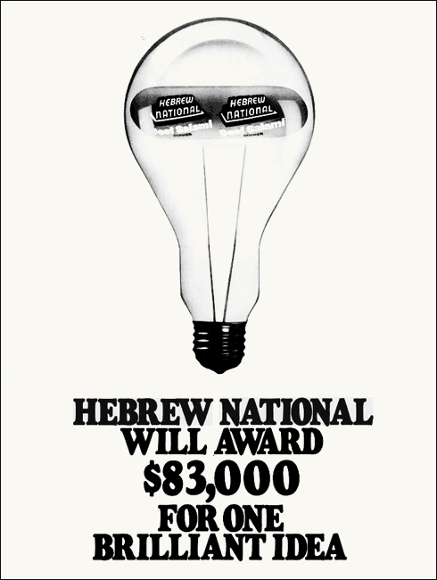
Hebrew National held a contest to see if people outside Madison Avenue could come up with a great ad idea for their 83% fat free salami. The grand prize was $83,000.

Even in New York, $83,000 would have more than covered a moving van, broker’s fee, and first and last month’s rent.

But creating the winning ad carried a benefit even bigger than the cash for someone like me who was trying to break into New York advertising. I’d worked for a couple of years at Washington, DC-area ad agencies, one of them pretty good, but that and my portfolio bought me nothing in the competitive New York advertising job market of the late 1980s. There were kids coming out of school with better portfolios than mine.

Winning that contest, I believed at the time, would make a New York ad agency take me seriously.

My then-girlfriend Eva S and I submitted an ad built around the headline, “You should be so fat.”


Well, we never heard back after entering the contest, and months passed the way they do.

I continued to drive back and forth from DC to NYC looking for jobs and an apartment.

A couple of times I flew to New York for an interview in the middle of my work day. I told my DC-area-agency creative director I was seeing a doctor. I still feel bad about that lie.

One day I open a magazine, and there’s a picture of an athletic woman wearing a leotard, working out.

The headline reads, “You should be so lean.”


Lean. You should be so lean.

It was our concept made safe. “You should be so lean” was a faster read and a much less interesting idea.

Hebrew National had said in the contest rules that, in the event of duplicate ideas, they would pick the one that was best executed. I am certain today that several people submitted similar ideas and Hebrew National and its agency chose the best-looking comp, which was not mine. Quite probably the winner even wrote “You should be so lean.” All perfectly ethical.

But at the time I was sure that we had gotten ripped off.

So I confided in the president of the DC-area agency where I worked—like he needed another reason to fire me—and asked him if I should sue Hebrew National.

I sought this advice while buying a drink for the president of the agency when I should have been at my desk, working. I figured if the president of the agency was spending the afternoon in a bar, he wouldn’t mind his peon employee doing likewise.

I was thirsty and not very bright. A while later, for many reasons, the agency let me go, surprising absolutely no one but me.

But meantime I’m in the bar buying my boss a drink on his time.

He tells me something I’ll never forget: a big company has lawyers on retainer, and you don’t.