Categories
Design editorial experience facebook findability glamorous industry Information architecture interface Layout Marketing privacy Products Scripting social networking software State of the Web The Essentials This never happens to Gruber Usability User Experience UX Web Design History Websites work Working Zeldman

Migrating from a conventional Facebook account to a public figure (“fan”) page – a report from the trenches

BECAUSE FACEBOOK LIMITS USERS to 5,000 contacts, I had to migrate from a conventional user account to what used to be called a “fan” page and is now called an “Artist, Band or Public Figure” page. (Page, not account, notice.)

There’s a page on Facebook called “Create a Page” that is supposed to seamlessly migrate from a conventional user account to a public figure (aka “fan”) page.

The page says it will only migrate your connections—it will lose all your content, photos, apps, and so on—and Facebook means it. After migrating, all my stuff is gone. Years of photos, wall posts, blog posts, tweets, you name it. Even the “help” page link is gone once you’ve migrated, so you can’t refer to any help documentation to find out where all your stuff went and if any of it can be saved.

Custom URL breaks on migration

Because of an idiocy in the database, you can’t keep your existing custom URL, since, when you request it, Facebook tells you it is “taken.” My Facebook page was “jzeldman,” but that URL is “taken” by a fellow named “Jeffrey Zeldman,” so I can’t use it on my Jeffrey Zeldman page. So I had to change to a new URL (“JeffreyZeldman”) and now all my admin links (for instance at facebook.com/happycog) are broken, as they point to the old user page instead of the new fan page. At the very least, Facebook should seamlessly redirect from facebook.com/jzeldman (my old URL) to facebook.com/JeffreyZeldman (the new one), but it does not.

So all my other social media sites that point to the old Facebook account need to be updated by hand, and any third-party links will now be broken because Facebook doesn’t let you keep your custom URL during a migration.

Third-party apps disappear completely

Likewise, none of the third-party functionality (Twitter, Tumblr, Flickr, RSS, and so on) has migrated from the user page to the fan page, and there is no information explaining how to reconnect these apps.

No reasonable app like the ones I’ve mentioned appears in the “apps” section of the sidebar on my new page. When I look for additional apps, I get treated to a bloated browse of crappy apps nobody on earth uses, whose creators probably made deals with Facebook in hopes that newbies would be persuaded to hook up these contraptions. You can find “PhotoMyButt” but not Flickr.

I, however, use Flickr.

So, since I can’t find it in the big dull browse, I resort to Facebook’s Apps’ “Search” box. Typing Flickr in that box is exciting. Instead of being taken to the Flickr apps on Facebook, I’m treated to endless redirects courtesy of a broken PHP script that loops infinitely forever suffering like Christ on the cross world without end amen while never actually resolving. Each new partial page that loads for an instant before being replaced by the next is undesigned and unbranded and contains only the sentence fragment, “Please stand by, redirecting…”

The devil will see you now.

So much for content

My photos are gone. My existing writing is gone. Facebook does seem to be migrating human beings who were “friends” on my old page, but nothing else works.

Oh my God, I can’t Admin my own page

I can’t Admin my new Facebook page because the “Admin” is “jzeldman” (me at the old account, which Facebook deleted). Perhaps this is why it’s impossible to post content, no apps work, etc. Nice.

Kids, don’t try this at home

All these bugs are probably known to Facebook, and there are probably nice people at Facebook whose job is to execute known secret internal workarounds when helping an actual “celebrity” migrate his or her page. I’m just guessing of course, but it stands to reason that Ashton K or Lady Gaga, if they want a Facebook page, probably don’t have to deal with all this frustrating brokenness. They have people for that.

But I don’t. I’m a web guy. And web stuff should just work.

Categories
Browsers bugs Code CSS CSS3 Design HTML interface javascript launches Layout maturity Standards State of the Web Tools

Finally, cross-browser visual control over forms.

Now we have something else to be thankful for. Nathan Smith of Sonspring has created a library that gives designers and developers “some measure of control over form elements, without changing them so drastically as to appear foreign in a user’s operating system.” Smith calls his new library Formalize CSS:

I’ve attempted to bridge the gap between various browsers and OS’s, taking the best ideas from each, and implementing what is possible across the board. For the most part, this means most textual form elements have a slight inset, and all buttons look consistent, including the button tag.

For more, including demos, options, screenshots, thanks, and the library itself, read Smith’s write-up at SonSpring | Formalize CSS. Hat tip and happy Thanksgiving to my good friend Aaron Gustafson for sharing this gem.

Categories
Design Layout type Typography

Weirdest Type Design Ever?

Movie poster captured by Heather Shaw. There are several variations, all equally baffling. I’m hoping there’s a concept behind it—that it’s bad design to make a point.

Categories
A List Apart Accessibility Amazon Apple art direction Authoring Best practices books Browsers Code Compatibility Design E-Books Formats HTML industry Layout Site Optimization The Essentials Touchscreen Web Design Web Design History Web Standards webkit zeldman.com

My other iPad is a Kindle

Zeldman.com as seen on Kindle

The new Kindle has a lot going for it. It’s inexpensive compared to a full-featured tablet computer like the iPad; you can slip it in your back pocket, where it’s more comfortable than an old-style paperback; and it includes a Webkit browser. This last point is where folks like us start to give a hoot, whether we’re fans of epub reading or not.

The flavor of Kindle’s browser concerns us because it affords us the ability to optimize the mobile viewing experience with a single line of markup. You can see this in action in the photo at the head of this article (published and discussed on Flickr).

I made no tweaks for Kindle per se; the Kindle is simply responding to a line of markup I’ve been putting into my web pages since 2007—namely, the viewport meta element, which controls the width of the viewport, thus enabling mobile devices with a limited number of pixels to focus all available pixels on your site’s core content (instead of, for instance, wasting part of the small screen on a background color, image, or gradient). The technique is as simple as web design gets:

meta name="viewport" content="width=770"

(Obviously, the value of “width” should be adjusted to match your site’s layout.)

I learned this little trick from Craig Hockenberry’s Put Your Content in My Pocket (A List Apart, August 28, 2007), which I naturally recommend to any designer who hasn’t seen it.

Categories
A List Apart An Event Apart Announcements Appearances Applications architecture art direction Best practices Browsers chrome Code CSS CSS3 Damned Fine Journalism Design Designers editorial Education engagement glamorous Happy Cog™ HTML HTML5 Ideas industry interface ipad iphone launches Layout photography Press Publications Publishing Real type on the web Responsive Web Design Standards State of the Web The Big Web Show The Essentials The Profession This never happens to Gruber type Typography User Experience UX W3C Web Design Web Design History Web Standards webfonts webkit Websites webtype writing Zeldman zeldman.com

I guest-edit .net magazine

Web 2.1. Zeldman guest-edits .net magazine.

A List Apart and .net magazine have long admired each other. So when .net editor Dan Oliver did me the great honor of asking if I wished to guest edit an issue, I saluted smartly. The result is now arriving in subscriber post boxes and will soon flood Her Majesty’s newsstands.

In .net magazine Issue No. 206, on sale 17th August in UK (and next month in the US, where it goes by the name “Practical Web Design”), we examine how new standards like CSS3 and HTML5, new devices like iPhone and Droid, and maturing UX disciplines like content strategy are converging to create new opportunities for web designers and the web users we serve:

  • Exult as Luke Wroblewski shows how the explosive growth of mobile lets us stop bowing to committees and refocus on features customers need.
  • Marvel as Ethan Marcotte explains how fluid grids, flexible images, and CSS3 media queries help us create precise yet context-sensitive layouts that change to fit the device and screen on which they’re viewed.
  • Delight as Kristina Halvorson tells how to achieve better design through coherent content wrangling.
  • Thrill as Andy Hume shows how to sell wary clients on cutting-edge design methods never before possible.
  • Geek out as Tim Van Damme shows how progressive enhancement and CSS3 make for sexy experiences in today’s most capable browsers—and damned fine experiences in those that are less web-standards-savvy.

You can also read my article, which asks the musical question:

Cheap, complex devices such as the iPhone and the Droid have come along at precisely the moment when HTML5, CSS3 and web fonts are ready for action; when standards-based web development is no longer relegated to the fringe; and when web designers, no longer content to merely decorate screens, are crafting provocative, multi-platform experiences. Is this the dawn of a newer, more mature, more ubiquitous web?

Today’s web is about interacting with your users wherever they are, whenever they have a minute to spare. New code and new ideas for a new time are what the new issue of .net magazine captures. There has never been a better time to create websites. Enjoy!


Photo by Daniel Byrne for .net magazine. All rights reserved.

Categories
Design downloads E-Books Layout Publishing Standards State of the Web Typography Usability User Experience UX

Battle of the e-Book readers: Stanza vs. iBooks

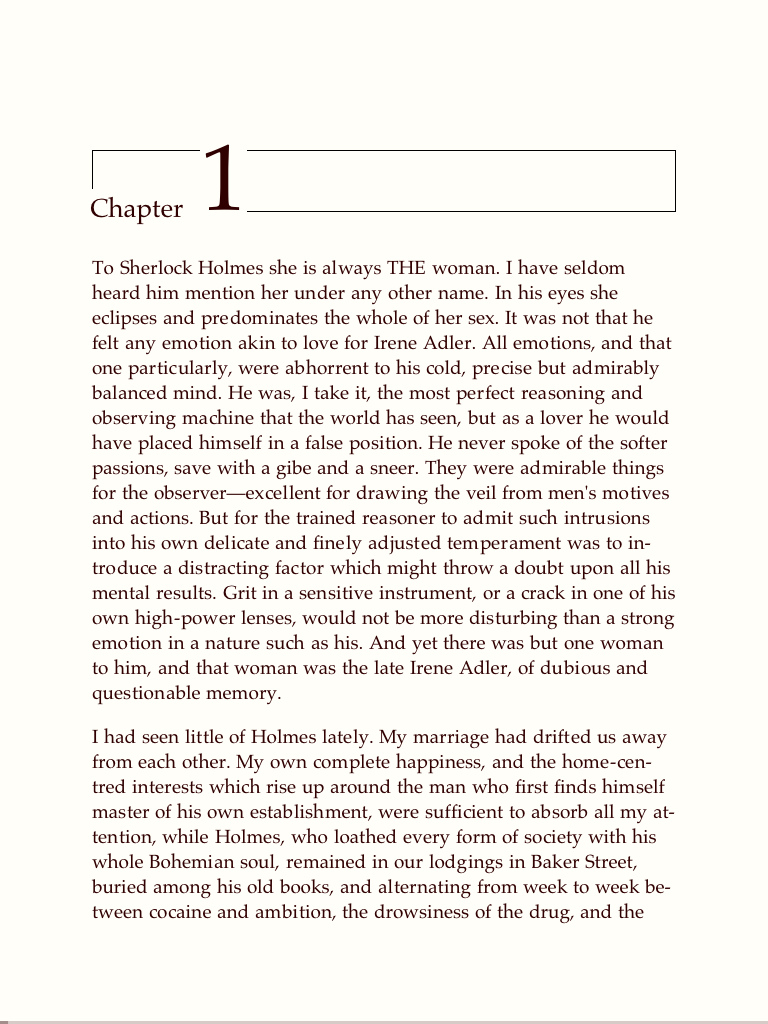
A Scandal in Bohemia, by Conan Doyle, as viewed in Stanza.

Above, page one of “A Scandal in Bohemia,” the first story in Sir Arthur Conan Doyle’s Adventures of Sherlock Holmes, as seen in Stanza, a free reader for iPad and iPhone. Stanza has a simple interface for finding, buying (and downloading free) e-books.

Stanza lets you control font size and choose from a number of templates offering a useful variety of foreground and background color and contrast. As the screenshot shows, it also lets you set text ragged right, which is the most legible setting for onscreen text.

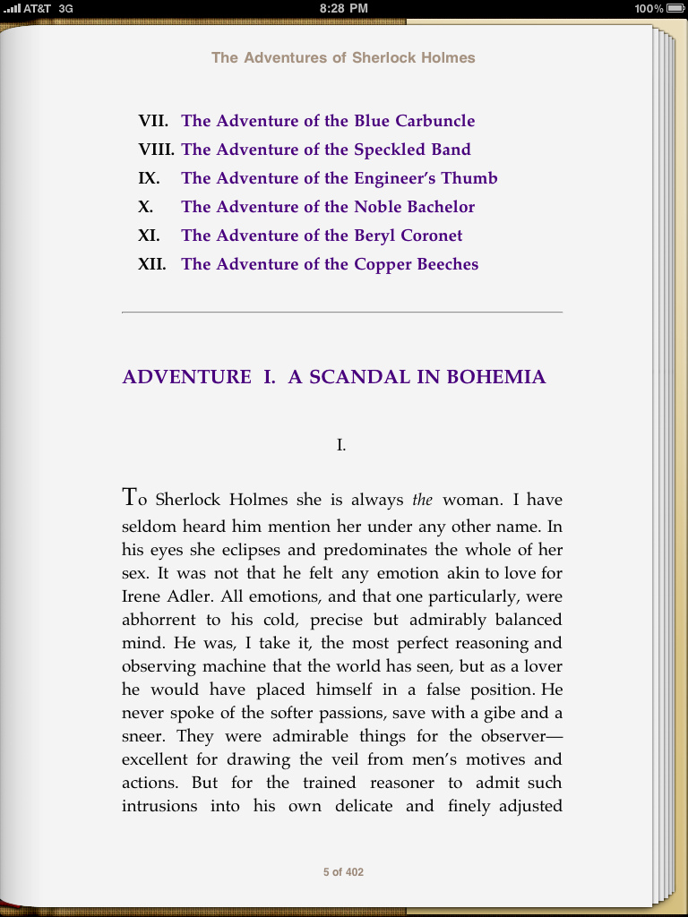
Below, the same page in iBooks, the reader that comes with iPad. As one would expect from the company that brought us iTunes, the iBooks application has a slick interface for buying (and downloading free) e-books. But as a reader, it is currently less feature-rich, and thus less usable and less pleasing, than Stanza.

A Scandal in Bohemia, by Conan Doyle, as viewed in iBooks.

In iBooks, one cannot turn off full justification. While full justification is lovely in carefully produced printed books, it has a long history of bad aesthetics and poor usability on the screen. Given a sufficiently wide measure, full justification can be used onscreen for short passages, but it is inappropriate for anything beyond a paragraph or two.

Combine full justification with a single high-contrast template, and you have a reader that is better to look at than to read. Indeed, the 1.0 version of iBooks seems more like a flashy demo intended to wow potential iPad purchasers in the store than an application designed to provide book lovers with a viable alternative to print.

One suspects that future upgrades of iBooks will address these concerns. Meanwhile, if you intend to do serious reading on your iPad (or iPhone/Touch), download Stanza for free from the iTunes store.


Addendum: One wonders what will become of Stanza given Amazon’s ownership of the parent company. More here. Best scenario: the Kindle reader incorporates excellent Stanza features, while Stanza continues to operate as an alternative to Kindle, iBooks, et al.


Categories
Authoring books Community Compatibility content Design development E-Books editorial ipad iphone Kindle Layout Publications Publishing Tools Touchscreen type Typography webfonts

More Mod on the Digital Book

Embracing the Digital Book by Craig Mod.

A Reading Heatmap: Key passages illuminated by layering all readers’ highlights for the same text.

LAST MONTH, he wowed us with Books in the Age of the iPad, a call to make digital books as beautiful as printed ones. This month, Craig Mod is back with Embracing the Digital Book, an article (or blog post if you must) that begins as a critique of iBooks and Kindle and moves on to discuss the e-reader of our dreams, complete with reasoned social features:

I’m excited about digital books for a number of reasons. Their proclivity towards multimedia is not one of them. I’m excited about digital books for their meta potential. The illumination of, in the words of Richard Nash, that commonality between two people who have read the same book.

We need to step back for a moment and stop acting purely on style. There is no style store. Retire those half-realized metaphors while they’re still young.

Instead, let’s focus on the fundamentals. Improve e-reader typography and page balance. Integrate well considered networked (social) features. Respect the rights of the reader and then — only then — will we be in a position to further explore our new canvas.

Embracing the digital book — Craig Mod


Categories
Accessibility Advocacy Apple Applications apps art direction Browsers bugs Code Compatibility CSS Design HTML ipad iphone Layout Real type on the web Standards State of the Web The Essentials Tools W3C Web Design Web Standards webfonts webkit webtype zeldman.com

Opera loves my web font

And so do my iPhone and your iPad. All it took was a bit o’ the old Richard Fink syntax and a quick drive through the Font Squirrel @Font-Face Kit Generator (featuring Base 64 encoding and SVG generation) to bring the joy and wonder of fast, optimized, semi-bulletproof web fonts to Safari, Firefox, Opera, Chrome, iPhone, and Apple’s latest religious device.

Haven’t checked IE7, IE8, IE9, or iPad yet; photos welcome. (Post on Flickr and link here.)

What I learned:

? Even if manufacturer supplies “web font” versions with web license purchase, it’s better to roll your own web font files as long as this doesn’t violate the license.


Categories
A List Apart business Career Design HTML industry Layout User Experience

ALA 284: scaling video, avoiding burnout

In Issue No. 284 of A List Apart, for people who make websites:

Creating Intrinsic Ratios for Video

by THIERRY KOBLENTZ

Have you ever wanted to resize a video on the fly, scaling it as you would an image? Using intrinsic ratios for video and some padding property magic, you can. Thierry Koblentz shows us how.

Burnout

by SCOTT BOMS

Does every day feel like a bad day? Blurry boundaries between work and home, and the “always on” demands of the web can lead to depression and burnout. Learn the signs of burnout and how to maintain your bliss.

And don’t miss this issue’s Editor’s Choice:

The ALA Primer: A Guide for New Readers

by ERIN LYNCH

New to A List Apart? Welcome! ALA’s own Erin Lynch suggests a few good places to start reading. (Originally ran: September 12, 2006.)

Comments off.

Categories
Accessibility Browsers business CSS Design development DWWS Layout Standards

A new answer to the IE6 question?

In “Universal Internet Explorer 6 CSS,” Andy Clarke proposes a novel approach to the problem that has vexed standards-based designers since time immemorial (or at least since we could quit worrying about Netscape 4).

The problem is IE6. Outdated but still widely used, especially in the developing world, its inaccurate and incomplete CSS support forces web designers and developers to spend expensive hours on workarounds ranging from hacks, to IE6-only styles served via conditional comments, to JavaScript. Some refuse to serve CSS to IE6 at all; others stop IE6 users at the gate. In some situations (personal site, web app used by first-world hipsters), ignoring IE6 may work; but mostly it doesn’t.

After a brief but thorough tour of current IE6 solutions and their limitations, Andy unveils his zinger. He proposes to serve IE6 users a set of universal styles completely unrelated to the design of the site in question. Not unlike Arc90’s awesome Readability plug-in, the styles Andy has designed concern themselves with typographic hierarchy and whitespace. Here’s the theory: make the page easy to read, make it obvious that somebody designed it, and the IE6 user will have a good experience.

(By contrast, block styles from IE6, as some developers suggest, and that user will have a bad experience. Most likely, in the absence of styles, the user will think the page is broken.)

No hammer fits all nails, and no solution, however elegant, will work for every situation. But if we’re open minded, Andy’s proposal may work in more situations than we at first suspect. Where it works, it’s what business folk call a “win, win:” the visitor has a good reading experience, and client and developer are spared tedium and expense.

Check it out.

[tags]IE6, workarounds, design, development, webdesign, hacks, legibility, styles, CSS, andyclarke[/tags]

Categories
Appearances Browsers content creativity CSS Design Fonts HTML Layout Web Design Web Standards Websites wordpress work Working XHTML Zeldman zeldman.com

Redesign in progress

Here’s a little something for a Wednesday evening. (Or wherever day and time it is in your part of the world.)

The body and bottom of the next zeldman.com design are now finished. Tomorrow I start working on the top.

Have a look.

Looks extra sweet in iPhone.

I’m designing from the content out. Meaning that I designed the middle of the page (the part you read) first. Because that’s what this site is about.

When I was satisfied that it was not only readable but actually encouraged reading, I brought in colors and started working on the footer. (The colors, I need not point out to longtime visitors, hearken back to the zeldman.com brand as it was in the 1990s.)

The footer, I reckoned, was the right place for my literary and software products.

I designed the grid in my head, verified it on sketch paper, and laid out the footer bits in Photoshop just to make sure they fit and looked right. Essentially, though, this is a design process that takes place outside Photoshop. That is, it starts in my head, gets interpreted via CSS, viewed in a browser, and tweaked.

Do not interpret this as me dumping on Photoshop. I love Photoshop and could not live or work without it. But especially for a simple site focused on reading, I find it quicker and easier to tweak font settings in code than to laboriously render pages in Photoshop.

If you view source, I haven’t optimized the CSS. (There’s no sense in doing so yet, as I still have to design the top of the page.)

I thought about waiting till I was finished before showing anything. That, after all, is what any sensible designer would do. But this site has a long history of redesigning in public, and the current design has been with us at least four years too long. Since I can’t snap my fingers and change it, sharing is the next best thing.

A work in progress. Like ourselves.

[tags]zeldman, zeldman.com, redesign, webdesign, css, code[/tags]

Categories
A List Apart Advocacy art direction business CSS Design development Fonts Happy Cog™ HTML Ideas industry Interviews Layout Publications Publishing Standards State of the Web Typography Usability User Experience UX Web Design Web Standards Working XHTML

ALA 282: Life After Georgia

In Issue No. 282 of A List Apart, For People Who Make Websites:

  • Can we finally get real type on the web?
  • Does beauty in design have a benefit besides aesthetic pleasure?

Real Fonts on the Web: An Interview with The Font Bureau’s David Berlow

by DAVID BERLOW, JEFFREY ZELDMAN

Is there life after Georgia? We ask David Berlow, co-founder of The Font Bureau, Inc, and the ?rst TrueType type designer, how type designers and web designers can work together to resolve licensing and technology issues that stand between us and real fonts on the web.

In Defense of Eye Candy

by STEPHEN P. ANDERSON

Research proves attractive things work better. How we think cannot be separated from how we feel. The next time a boss, client, or co-worker scoffs at the notion that beauty is an important aspect of interface design, point their peepers here.

A List Apart explores the design, development, and meaning of web content, with a special focus on web standards and best practices.

[tags]alistapart, type, typography, realtype, truetype, CSS, beauty, design, aesthetics[/tags]

Categories
art direction books Community content creativity CSS Design downloads Free Happy Cog™ HTML Ideas industry Information architecture jobs Layout Publications Publishing reprints State of the Web The Essentials The Profession Tools Typography Usability User Experience UX W3C Web Design Web Standards Websites Working writing Zeldman

“Taking Your Talent to the Web” is now a free downloadable book

Taking Your Talent To The Web, a guide for the transitioning designer, by L. Jeffrey Zeldman. Hand model: Tim Brown.

RATED FIVE STARS at Amazon.com since the day it was published, Taking Your Talent to the Web (PDF) is now a free downloadable book from zeldman.com:

I wrote this book in 2001 for print designers whose clients want websites, print art directors who’d like to move into full–time web and interaction design, homepage creators who are ready to turn pro, and professionals who seek to deepen their web skills and understanding.

Here we are in 2009, and print designers and art directors are scrambling to move into web and interaction design.

The dot-com crash killed this book. Now it lives again. While browser references and modem speeds may reek of 2001, much of the advice about transitioning to the web still holds true.

It’s yours. Enjoy.

Oh, yes, here’s that ancient Amazon page.


Short Link

Update – now with bookmarks

Attention, K-Mart shoppers. The PDF now includes proper Acrobat bookmarks, courtesy of Robert Black. Thanks, Robert!

Categories
art arts creativity Design flickr Ideas Images Layout links photography work

Meshes of the Afternoon

Some of my favorite images from Flickr; part of a series.

Favorites of the afternoon of April 10, 2009. Part of this complete breakfast.

[tags]flickr, favorites, art, photography, images, image, collections[/tags]

Categories
Accessibility Applications architecture art direction Browsers bugs business Code Community content copyright creativity Fonts Ideas industry Layout links spec Standards stealing Tools Typography Usability User Experience W3C Working

Real type on the web?

A proposal for a fonts working group is under discussion at the W3C. The minutes of a small meeting held on Thursday 23 October include a condensed, corrected transcription of a discussion between Sampo Kaasila (Bitstream), Mike Champion (Microsoft), John Daggett (Mozilla), Håkon Wium Lie (Opera), Liam Quin (W3C), Bert Bos (W3C), Alex Mogilevsky (Microsoft), Josh Soref (Nokia), Vladimir Levantovsky (Monotype), Klaas Bals (Inventive Designers), and Richard Ishida (W3C).

The meeting started with a discussion of Microsoft’s EOT (Embedded OpenType) versus raw fonts. Bert Bos, style activity lead and co-creator of CSS, has beautifully summarized the relevant pros and cons discussed.

For those just catching up with the issue of real type on the web, here’s a bone-simple intro:

  1. CSS provides a mechanism for embedding real fonts on your website, and some browsers support it, but its use probably violates your licensing agreement with the type foundry, and may also cause security problems on an end-user’s computer.
  2. Microsoft’s EOT (based on the same standard CSS mechanism) works harder to avoid violating your licensing agreement, and has long worked in Internet Explorer, but is not supported in other browsers, is not foolproof vis-a-vis type foundry licensing rules, and may also cause PC security problems.

The proposed fonts working group hopes to navigate the technical and business problems of providing real fonts on the web, and in its first meeting came up with a potential compromise proposal before lunch.

Like everyone these days, the W3C is feeling a financial pinch, which means, if a real fonts working group is formed, its size and scope will necessarily be somewhat limited. That could be a good thing, since small groups work more efficiently than large groups. But a financial constraint on the number of invited experts could make for tough going where some details are concerned—and with typography, as with web technology, the details are everything.

I advise every web designer who cares about typography and web standards—that’s all of you, right?—to read the minutes of this remarkable first gathering, and to keep watching the skies.

[tags]web typography, typography, standards, webstandards, W3C, fonts, embedded, @fontface, EOT, workinggroup[/tags]