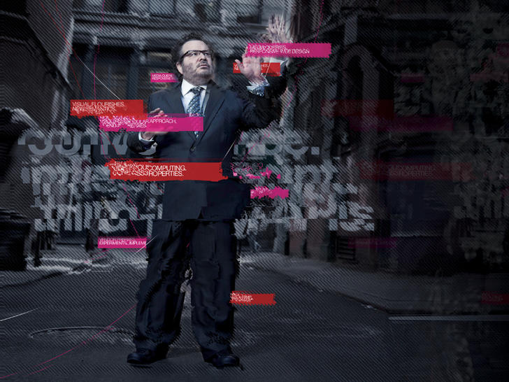
Meeting of the Minds: Ethan Marcotte and AEA attendee discuss the wonders of CSS3. Photo by the incomparable Jim Heid.
THE SHOW IS OVER, but the memories, write-ups, demos, and links remain. Enjoy!
Speakers, attendees, parties, and the wonders of Boston, captured by those who were there.
Jeremy Keith quite effectively live-blogs my opening keynote on the particular opportunities of Now in the field of web design, and the skills every designer needs to capitalize on the moment and make great things.
Related to my talk: Jeremy Keith’s original write-up on a notorious but all-too-common practice. If your boss or client tells you to design this pattern, just say no. Design that does not serve users does not serve business.
“In his opening keynote … Jeffrey Zeldman talked about the skills and opportunities that should be top of mind for everyone designing on the Web today.” Luke Wroblewski’s write-up.
“As a consultant, [Whitney] spends a lot of time talking about UX and inevitably, the talk turns to deliverables and process but really we should be establishing a philosophy about how to treat people, in the same way that visual design is about establishing a philosophy about how make an impact. Visual design has principles to achieve that: contrast, emphasis, balance, proportion, rhythm, movement, texture, harmony and unity.” In this talk, Whitney proposed a set of 10 principles for UX design.
Live blogging by Jeremy Keith. Veerle, a noted graphic and interaction designer from Belgium, shared her process for discovering design through iteration and experimentation.
Luke’s live awesomeness cannot be captured in dead written words, but Mr Keith does a splendid job of quickly sketching many of the leading ideas in this key AEA 2011 talk.
See also: funky dance moves with Luke Wroblewski, a very short video I captured as Luke led the crowd in the opening moves of Michael Jackson’s “Thriller.”
“The next talk here at An Event Apart in Boston is one I’ve really, really, really been looking forward to: it’s a presentation by my hero Ethan Marcotte.”
Ethan’s amazing talk—a key aspect of design in 2011 and AEA session of note—as captured by the great Luke Wroblewski.
“In his presentation at An Event Apart in Boston, MA 2011 Jared Spool detailed the importance and role of links on Web pages.” No writer can capture Jared Spool’s engaging personality or the quips that produce raucous laughter throughout his sessions, but Luke does an outstanding job of noting the primary ideas Jared shares in this riveting and highly useful UX session.
Luke W: “In his All Our Yesterdays presentation at An Event Apart in Boston, MA 2011 Jeremy Keith outlined the problem of digital preservation on the Web and provided some strategies for taking a long term view of our Web pages.”
Although it is hard to pick highlights among such great speakers and topics, this talk was a highlight for me. As in, it blew my mind. Several people said it should be a TED talk.
Luke: “In his Idea to Interface presentation at An Event Apart in Boston, MA 2011 Aarron Walter encouraged Web designers and developers to tackle their personal projects by walking through examples and ways to jump in. Here are my notes from his talk.”
Compiled by the speaker, links include Design Personas Template and Example, the story behind the illustrations in the presentation created by Mike Rhode, Dribble, Huffduffer, Sketchboards, Mustache for inserting data into your prototypes, Keynote Kung Fu, Mocking Bird, Yahoo Design Patterns, MailChimp Design Pattern Library, Object Oriented CSS by Nicole Sullivan and more!
“In his Smoke Gets In Your Eyes presentation at An Event Apart in Boston, MA 2011 Andy Clarke showcased what is possible with CSS3 animations using transitions and transforms in the WebKit browser.” Write-up by the legendary Luke Wroblewski.
The “Mad Men” opening titles re-created entirely in CSS3 animation. (Currently requires Webkit browser, e.g. Safari, Chrome.)
Anthony Calzadilla, a key collaborator on the Mad Men CSS3 animation, showcases his works.
Pure CSS3 box-shadow page curl effect. Mentioned during Ethan Marcotte’s Day 3 session on exploring CSS3.
Fascinating article by Anton Peck (who attended the show). Proposed: a solution to a key problem with CSS transitions. (“Even now, my main issue with transitions is that they use the same time-length value for the inbound effect as they do the outbound. For example, when you create a transition on an image with a 1-second duration, you get that length of time for both mousing over, and mousing away from the object. This type of behavior should be avoided, for the sake of the end-user!”)
Ethan Marcotte: “Hello. I am here to discuss CSS3 gradients. Because, let’s face it, what the web really needed was more gradients.”
Like it says.
By the incomparable John Allsopp.
These sessions were not captured
Some of our best talks were not captured by note-takers, at least not to my knowledge. They include:
- Eric Meyer: CSS Anarchist’s Cookbook
- Mark Boulton: Outing the Mind: Designing Layouts That Think for You
- Jeff Veen: Disaster, DNA, and the Fathomless Depth of the Web
It’s possible that the special nature of these presentations made them impossible to capture in session notes. (You had to be there.)
There are also no notes on the two half-day workshop sessions, “Understand HTML5 With Jeremy Keith,” and “Explore CSS3 With Ethan Marcotte.”
What have I missed?
Attendees and followers, below please add the URLs of related educational links, write-ups, and tools I’ve missed here. Thanks!