Categories
Big Web Show Dan Benjamin Design development Fonts Web Design Web Standards webfonts webtype

Big Web Show No. 1 up!

Jeffrey Zeldman

FOR YOUR viewing and listening pleasure, The Big Web Show’s Episode 1: Web Fonts is now online.

Jeffrey Zeldman and Dan Benjamin grill Ethan Dunham of Fontspring and Font Squirrel and Jeffrey Veen of Typekit (and other sites, too numerous to name) about one of your favorite subjects, “real fonts on your website” in this, our inaugural episode.

Enjoy!

Categories
Design Fonts type webfonts webtype

Verdana Pro (and Con)

Although Matthew Carter is overseeing the project and David Berlow of The Font Bureau is leading development, I’m feeling twitchy about Verdana Pro, a new print family from an old screen face.

Start there: Verdana was born of the screen. In particular, as all reading this know, it was born of the needs of the crude, non-anti-aliased, 72/96 ppi desktop screen of the mid-1990s. At Microsoft’s behest, Matthew Carter created the original cross-platform Verdana with its generous x-height so computer users, whether PC- or Mac-based, would have a sans-serif that was easy to read at small sizes.

Verdana Pro, a new print family from an old screen face.

Verdana is a font that looks gorgeous at 11px in a non-antialiased environment, and handsome at 9px and 10px in that same setting. Make it any bigger than 11px, and it looks grotesque. Set it via ems or percentages rather than pixels—as most accessibility-conscious designers do—and you ding its perfection. View it in a sub-pixel antialiased environment (i.e. on a modern platform) and, if it is small enough and near enough to an exact pixel size, it still looks nice and reads well … but not nearly as nice or as well as it does in the environment for which it was originally created.

Yes, if you are a genius like Matthew Carter or David Berlow, you can take a screen font, even one of the two definitive screen fonts of the 20th century—the other being Carter’s Georgia, which also looks best at exactly 11px in a non-antialiased environment, though it survives handsomely in modern environments and at inexact, percentage-based sizes—and build a true print family around it. But the idea makes me twitchy.

And that screen guy’s twitch I can’t quite shake makes me start to understand how type designers may be feeling as they watch their gorgeous high-resolution creations, rooted in hundreds of years of craft and technology, take the first small steps toward a new world of web fonts.


Categories
Advocacy Apple Fonts type

Clark on Apple’s weak type

Apple has a typography desk. It is not exactly crowded with developers vying for every square centimetre, but it really exists. Have you ever heard of it? …

Then compare Microsoft, which has two divisions focussed on type and reading (Typography and Advanced Reading Technologies). Esteemed colleagues Simon Daniels and Kevin Larson are but two of many people with a high profile in the type business who work for Microsoft (in those departments respectively). MS Typo itself does a great deal of work. Apart from commissioning the confusable Microsoft C-fonts, the department does everything from creating box-drawing characters for teletext fonts to designing Liberian symbol systems….

As you’d expect, I urge Apple to get back into the business of type design. The chief lesson of the Web must be observed: Do what works and don’t do what doesn’t work.

Worth reading in its entirety, rereading, bookmarking, and sharing (especially with friends at Apple): Where Microsoft beats Apple on the Personal Weblog of Joe Clark, Toronto. Nobody does it better.


Categories
CSS Design Fonts Real type on the web type

Friday Font: TeeFranklin

TeeFranklin, an alternative to Helvetica and Franklin

Gloriously available for @font-face embedding, TeeFranklin by Suomi Type Foundry at Fontspring is a family of 14 weights/styles that may be perfect when you want to offer something a tad different from Helvetica and Franklin while retaining many of the qualities that make those fonts great.


Categories
Fonts type

Brandon Grotesque

Brandon Grotesque is a sans serif family of six weights plus matching italics, designed by Hannes von Döhren.

Influenced by the geometric-style sans serif faces that were popular during the 1920s and 30s, the fonts are based on geometric forms that have been optically corrected for better legibility. Brandon Grotesque has a functional look with a warm touch.

The Regular weight is free through April 15.

Categories
Code content content strategy creativity CSS Design Fonts Standards State of the Web style type User Experience webfonts webtype

Model Site

Blissfully Aware site redesign.

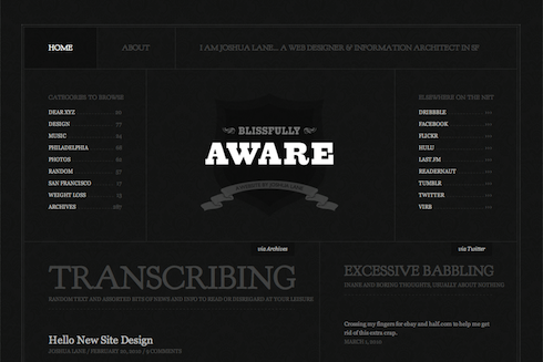
Web designer Joshua Lane, currently best know for doing fancy web stuff at Virb.com, has overhauled his personal site in ways that are aesthetically pleasing and visually instructive.

Like all good site redesigns, this one starts with the content. Whereas the recent zeldman.com redesign emphasizes blog posts (because I write a lot and that’s what people come here for), Lane’s redesign appropriately takes exactly the opposite approach:

There is a much smaller focus on blog posts (since I don’t write often), and a much larger focus on the things I do elsewhere (Twitter, Flickr, Last.fm etc). Individually, I don’t contribute a great deal to each of those services. But collectively, I feel like it’s a good amount of content to showcase (as seen on the home page). And something that feels like a really good representation of “me.”

Not one to ignore the power of web fonts, Lane makes judicious use of Goudy Bookletter 1911 from The League of Movable Type, an open-source type site founded by Caroline and Micah, featuring only “well-made, free & open-source, @font-face ready fonts.” (Read their Manifesto here.)

The great Barry Schwartz based his Goudy Bookletter 1911 on Frederic Goudy’s Kennerley Oldstyle, a font Schwartz admires because it “fits together tightly and evenly with almost no kerning.” Lane inserts Schwartz’s open-source gem via simple, standards-compliant CSS @font-face. Because of its size, it avoids the secret shame of web fonts, looking great in Mac and Windows.

But considered type is far from the redesigned site’s only nicety. Among its additional pleasures are elegant visual balance, judicious use of an underlying horizontal grid, and controlled tension between predictability and variation, ornament and minimalism. Restraint of color palette makes photos, portfolio pieces, and other featured elements pop. And smart CSS3 coding allows the designer to play with color variations whenever he wishes: “the entire color scheme can be changed by replacing a single background color thanks to transparent pngs and rgba text and borders.”

In short, what Lane has wrought is the very model of a modern personal site: solid design that supports content, backed by strategic use of web standards.


Categories
Fonts type Web Design Web Standards webfonts webtype

New Franklin in Town

TeeFranklin by Tomi Haaparanta.

There’s a new Franklin in town. It’s TeeFranklin, designed by Tomi Haaparanta for T26. Haaparanta specializes in what we used to call grunge fonts, but you’d never know from his Franklin, which is classic and pure. In terms of available weights and styles (not to mention fanatical attention to detail), Haaparanta’s new font can’t compare to Font Bureau’s ITC Franklin, but TeeFranklin is a nice and clean, and comes in 14 weights, which may be enough. Better still, according to reader Ethan Dunham, it is licensed for @font-face embedding.


Categories
Design Fonts type

New Slab in Town

via typographyserved.com


Categories
Design Fonts type Typography

David Berlow Type Specimens

“A collection of David Berlow’s prolific typographic work as co-founder of Font Bureau is showcased in this impressive booklet, a celebration of him receiving the Society of Typographic Aficionados (SoTA) Typography Award in 2007. Specimen pages show styles of each family for easy comparison of weight, width, copyfit and aesthetic.”

From Does This Zeldman Make My Posterous Look Fat?


Categories
Fonts Typography

FontShop 51

In Behance Gallery: Find the latest FontFont Releases at the FontShop (50 and 51) or download the 64-page FIFTY|1 Release Magazine.

Categories
Design Fonts Genius Gifts Typography

Font Geek? There’s an app for that

The Font Game for iPhone

If the geek on your list loves playing The Rather Difficult Font Game by Kari Pätilä, and if that geek owns an iPhone or iPod Touch, she will adore The Font Game app, created by Kari Pätilä (game designer, web stuff), John Boardley (ilovetypography founder), and Justin Stahl (iPhone development). With 657 font samples, three levels of difficulty, and the ability to post your results to Twitter, it’s the perfect way to test or show off your type chops, or just learn.


Short URL: zeldman.com/?p=3309

Categories
Design Fonts software Tools Typography Web Design Web Standards webfonts webtype widgets

Fab Font Favelet

This is a bookmarklet made for web designers who want to rapidly check how different fonts and font styles look on their screen without editing code and refreshing pages. 

Download the amazing and oh-so-practical Soma FontFriend bookmarklet.

Categories
Browsers bugs Compatibility CSS Design Fonts OSX

Last Tangle in Firefox

Incorrect Helvetica in Firefox rendition of zeldman.com

Snow Leopard plus FontExplorer X equals screwed-up fonts in Firefox (especially Helvetica).

  • Google Search on “Snow Leopard Firefox FontExplorer X” reveals numerous incidents of CSS displaying incorrectly in Firefox (wrong font weight, wrong font style) when Font Explorer X is on Snow Leopard Macs.
  • My Flickr thread contains a screenshot demonstrating the problem plus a useful discussion of causes and possible workarounds.
  • Disabling FontExplorer X solves the problem.

Update: Buying FontExplorer X Pro and clearing font caches also solves the problem. (The problem is with Apple’s fonts, not with Firefox or FontExplorer X, but it takes mediation to fix it.)

Categories
Fonts Web Design History Web Standards Web Type Day webfonts webtype

FontShop Fonts on the Web

Zeldman

FontShop announces that they are ready to deliver their font library as web type:

[S]tarting today, Typekit users can pick from dozens of FontFonts, including FF Meta, FF Dax, and FF Netto. Plus, the Typekit service lets you test any of those FontFonts on your page before you publish.

And tomorrow?

Typekit is just one piece of a holistic strategy for FontFonts on the web. The library should be licensable in a more traditional way too. That’s where WOFF fits in. … Soon anyone will be able to license and download for their website the same professional quality FontFont they use in desktop applications, but crafted specifically for the new medium.

Hat tip: Jason Santa Maria

This has been a belated part of Web Type Day.


Short URL: zeldman.com/?p=3023

Categories
better-know-a-speaker creativity CSS Design Fonts industry Press Real type on the web Standards State of the Web Web Design Web Design History Web Standards Web Type Day webfonts webtype

Web Type: Lupton on Zeldman

Designing With Web Standards

Today in Print, Ellen Lupton interviews Jeffrey Zeldman (that’s me) on web typography, web standards, and more. Part one of a two-part interview.

Ellen Lupton is curator of contemporary design at Cooper-Hewitt, National Design Museum in New York City and director of the Graphic Design MFA program at Maryland Institute College of Art (MICA) in Baltimore. She is the author of numerous books and articles on design, a frequent lecturer, and an AIGA Gold Medalist.

This has been a nutritious part of Web Type Day.

Short URL: zeldman.com/?p=2932