Categories
Code CSS HTML HTML5 Tools

How to use TextMate


Jeffrey Zeldman Presents

For nearly 13 years, I created websites with PageSpinner, a charmingly old-fashioned HTML coding environment from the days of Netscape 1.0. But two years ago, seeking updated web page encoding and other modern conveniences, I switched to TextMate, “the missing editor for MacOS X.”

PageSpinner greatly helps coders (but offends the aesthete’s eye) with Microsoft-Word-like menu bars containing buttons that let you instantly create paragraphs, list items, and so on. In contrast, TextMate has no UI chrome whatever. A screenshot of the TextMate interface is like a photograph of snow.

For two years, I’ve created web pages in TextMate, hand-coding every entity with no help from the application because I didn’t know it offered any. But my friend Ethan Marcotte knew, and today, responding to my cry for help, he sent the following info:


I highly recommend starting here. (If you only read one thing in this email—and who could blame you?—make it that link.)

Moving on! Here’s a more exhaustive “getting started” tutorial.

Random feature blogs:

Macromates has some helpful screencasts (most of which could use a good editor, but they might be good train fodder):

Because I have no life, I’ll occasionally trawl through Vimeo to find random tips.

And here’s Dan Rubin’s macro to convert multi-line CSS to single-line (or vice versa).

Categories
A List Apart An Event Apart Announcements Appearances Applications architecture art direction Best practices Browsers chrome Code CSS CSS3 Damned Fine Journalism Design Designers editorial Education engagement glamorous Happy Cog™ HTML HTML5 Ideas industry interface ipad iphone launches Layout photography Press Publications Publishing Real type on the web Responsive Web Design Standards State of the Web The Big Web Show The Essentials The Profession This never happens to Gruber type Typography User Experience UX W3C Web Design Web Design History Web Standards webfonts webkit Websites webtype writing Zeldman zeldman.com

I guest-edit .net magazine

Web 2.1. Zeldman guest-edits .net magazine.

A List Apart and .net magazine have long admired each other. So when .net editor Dan Oliver did me the great honor of asking if I wished to guest edit an issue, I saluted smartly. The result is now arriving in subscriber post boxes and will soon flood Her Majesty’s newsstands.

In .net magazine Issue No. 206, on sale 17th August in UK (and next month in the US, where it goes by the name “Practical Web Design”), we examine how new standards like CSS3 and HTML5, new devices like iPhone and Droid, and maturing UX disciplines like content strategy are converging to create new opportunities for web designers and the web users we serve:

  • Exult as Luke Wroblewski shows how the explosive growth of mobile lets us stop bowing to committees and refocus on features customers need.
  • Marvel as Ethan Marcotte explains how fluid grids, flexible images, and CSS3 media queries help us create precise yet context-sensitive layouts that change to fit the device and screen on which they’re viewed.
  • Delight as Kristina Halvorson tells how to achieve better design through coherent content wrangling.
  • Thrill as Andy Hume shows how to sell wary clients on cutting-edge design methods never before possible.
  • Geek out as Tim Van Damme shows how progressive enhancement and CSS3 make for sexy experiences in today’s most capable browsers—and damned fine experiences in those that are less web-standards-savvy.

You can also read my article, which asks the musical question:

Cheap, complex devices such as the iPhone and the Droid have come along at precisely the moment when HTML5, CSS3 and web fonts are ready for action; when standards-based web development is no longer relegated to the fringe; and when web designers, no longer content to merely decorate screens, are crafting provocative, multi-platform experiences. Is this the dawn of a newer, more mature, more ubiquitous web?

Today’s web is about interacting with your users wherever they are, whenever they have a minute to spare. New code and new ideas for a new time are what the new issue of .net magazine captures. There has never been a better time to create websites. Enjoy!


Photo by Daniel Byrne for .net magazine. All rights reserved.

Categories
Browsers bugs Code Compatibility CSS CSS3 development Free Happy Cog™ HTML HTML5 Ideas industry links Standards State of the Web The Essentials The Profession Tools Web Design Web Design History Web Standards

HTML5, CSS3 default templates

Free for use in all web projects, professional or personal, HTML5 Reset by Monkey Do! is a set of HTML5 and CSS templates that jumpstart web development by removing the styling native to each browser, establishing basic HTML structures (title, header, footer, etc.), clearing floats, correcting for IE problems, and more.

Most of us who design websites begin every project with bits and pieces of this kind of code, but developer Tim Murtaugh, who created these files and who modestly thanks everyone in the universe, has struck a near-ideal balance. In these lean, simple files, without fuss or clutter, he manages to give us the best-practices equivalent of everything but the kitchen sink.

Tim Murtaugh sits beside me at Happy Cog, so I’ve seen him use these very files (and earlier versions of them) to quickly code advanced websites. If you’re up to speed on all the new hotness, these files will help you stay that way and work faster. If you’re still learning (and who isn’t?) about HTML5, CSS3, and browser workarounds, studying these files and Tim’s notes about them will help you become a more knowledgeable web designer slash developer. (We need a better name for what we do.)

My daughter calls Mr Murtaugh “Tim the giant.” With the release of this little package, he earns the moniker. Highly recommended.

Categories
A Book Apart An Event Apart Code Design development Happy Cog™ HTML HTML5 Standards State of the Web Tools User Experience UX

10K Apart – inspire the web!

Just launched and just wonderful! The 10K Apart contest (“Inspire the web with just 10K”) presented by MIX Online and An Event Apart hearkens back to Stewart Butterfield’s 5k Contest of yesteryear while anticipating the HTML5-powered web of tomorrow … and encouraging us to design that web today.

We want beauty. We want utility. We want excitement. And we want it all under 10K:

HTML5 For Web Designers

Prizes, we got prizes! One grand prize winner will receive registration to An Event Apart plus $3,000 cash and a copy of HTML5 For Web Designers. Three runners-up (Best Design, Best Technical, and People’s Choice) will win free registration to An Event Apart plus a $1000 Visa cash card and HTML5 For Web Designers. Nine honorable mentions will receive HTML5 For Web Designers.

The judging panel that will evaluate all this awesomeness is made up of Jeremy Keith, Nicole Sullivan, Eric Meyer, Whitney Hess, and yours truly.

Sorry, no back-end, this is a client-side contest only.

Check the 10K Apart site for more info. Happy designing and developing!

Categories
Apple Applications apps art direction Code Dan Benjamin Design downloads Formats Google ipad iphone mobile The Big Web Show

Design Apps for Fun and Profit

Josh, Williams, CEO of Gowalla. Photo: Keegan Jones.

Update! Episode 14 is now available for your listening and viewing pleasure at 5by5.tv.

Josh Williams, founder of Gowalla, is our guest at 1:00 PM ET today, July 29, in Episode 14 of The Big Web Show. Whether you’re a social media user/creator, an entrepreneur, an application developer, an iconist or illustrator, a freelancer with big dreams, an API wizard, a devotee of marketing 2.0, a web designer, a Gowalla fan, or what, you won’t want to miss this episode.

The Big Web Show is taped in front of a live internet audience, and you can be part of it. Join co-host Dan Benjamin and me at 1:00 PM ET today to participate in the live taping of Episode 14.

If you miss the live taping, you can watch the show on our website or via iTunes later tonight.

The Big Web Show (“Everything Web That Matters”) is taped live in front of an internet audience every Thursday at 1:00 PM ET on live.5by5.tv. Edited episodes can be watched afterwards (often within hours of taping) via iTunes (audio feed | video feed) and the web.


Photo: Keegan Jones.

Categories
automattic Best practices Big Web Show clients Code CSS CSS3 Design Interviews

Nicole Sullivan on CSS

CSS troubleshooter Nicole Sullivan on The Big Web Show.

Update! Episode 11 featuring Nicole Sullivan on CSS optimization is now available for your listening and viewing pleasure at 5by5.tv.

If writing good CSS is tough, fixing someone else’s (or multiple someones’) bad CSS is a rarified art calling for the skill of a surgeon, the sensitivity of a Stradivarius, the patience of a saint, and the diplomacy of a Zheng He. Nicole Sullivan is one of the best and most successful of that small pool of CSS troubleshooters. Dan Benjamin and I are thrilled to have her as our guest on Episode 11 of The Big Web Show. Join us today, 8 July 2010, for the live taping at 1:00 PM ET.

Nicole is an evangelist, front-end performance consultant, CSS Ninja, and author. She started the Object-Oriented CSS open source project, which answers the question: how do you scale CSS for millions of visitors or thousands of pages? She also consulted with the W3C for their beta redesign, and is the co-creator of Smush.it, an image optimization service in the cloud.

Nicole is passionate about CSS, web standards, and scalable front-end architecture for large commercial websites. She speaks about performance at conferences around the world, most recently at An Event Apart, The Ajax Experience, ParisWeb, and Web Directions North.

The Big Web Show is taped live in front of an internet audience every Thursday at 1:00 PM ET on live.5by5.tv. Edited episodes can be watched afterwards (often within hours of taping) via iTunes (audio feed | video feed) and the web.

Categories
Adobe Code Design development HTML HTML5 The Essentials Tools Web Design Web Standards

An InDesign for HTML and CSS?

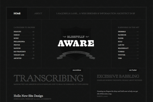
In “CSS is the new Photoshop” (?), Adobe’s John Nack correctly observes, as have many of us, that “Cascading Style Sheets can create a great deal of artwork now, without reliance on bitmap graphics.” Nack quotes Shawn Blanc, one of several concurrent authors of the phrase “CSS is the new Photoshop,” who cites as evidence Louis Harboe’s iOS icons and Jeff Batterton’s iPhone, both designed entirely in CSS and both only viewable in the latest Webkit browsers, Safari 5 and Google Chrome 5.

He’s not alone: Håkon Wium Lie from Opera predicts that CSS3 could eliminate half the images used on the Web. You can use various graphical tools to generate things like CSS gradients and rounded corners. As people can do more and more in code, it makes sense to ask whether even to use Photoshop in designing Web content.

I think Adobe should be freaking out a bit, but in a constructive way.

So far, so good. But Nack’s “constructive” suggestion for Adobe, quoting Michael Slade, is to create “the modern day equivalent of Illustrator and PageMaker for CSS, HTML5 and JavaScript.”

Nack acknowledges that this will be difficult. I propose that it will be impossible. Says Nack:

As I noted the other day, “Almost no one would look inside, say, an EPS file and harrumph, ‘Well, that’s not how I’d write PostScript’–but they absolutely do that with HTML.”

Well, there is a reason they absolutely do that with HTML. PostScript is a programming language designed to describe page layouts and text shapes in a world of known, fixed dimensions (the world of print), with no underlying semantics. PostScript doesn’t care whether an element is a paragraph, a headline, or a list item. It doesn’t care if a bit of content on one page cites another bit of content on a different page. PostScript is a visual plotting language. And HTML is anything but.

HTML is a language with roots in library science. It doesn’t know or care what content looks like. (Even HTML5 doesn’t care what content looks like.) Neither a tool like Photoshop, which is all about pixels, nor a tool like Illustrator, which is all about vectors, can generate semantic HTML, because the visual and the semantic are two different things.

Moreover, authoring good HTML and CSS is an art, just as authoring good poetry or designing beautiful comps in Photoshop is an art. Expecting Photoshop to write the kind of markup and CSS you and I write at our best is like challenging TextMate to convert semantic HTML into a visually appropriate and aesthetically pleasing layout. Certain kinds of human creativity and expertise cannot be reproduced by machines. Yes, there are machines that create music, and a composer like Brian Eno can program such systems to create somewhat interesting aural landscapes, but such music can never be the Eroica or “This Land is Your Land,” because there is no algorithm with the creative and life experience of Beethoven or Woody Guthrie.

Adobe already has a fine product in the code arena. Some hand coders knock Dreamweaver, but it does about as good a job as is possible of converting groupings of meaningless pixels into chunks of valid code. It is unreasonable to expect more than that from a tool that begins by importing a multi-layered Photoshop comp. Of course you can do much more with Dreamweaver if you use its code merely as a starting point, or if you use it simply as a hand-coding environment. But that’s the point. Some things, to be done right, must be done by the human mind.

There’s something to what Nack says. Photoshop could be made friendlier to serious web designers. Adobe could also stop ignoring Fireworks, as Fireworks is a better starting place for web design. They might even interview serious, standards-oriented web designers and start from scratch, as a new tool will suffer from fewer political constraints and user expectations than a beloved existing product with deep features and multiple audiences.

But while our current tools can certainly stand improvement, no company will ever create “the modern day equivalent of Illustrator and PageMaker for CSS, HTML5 and JavaScript.” The very assumption that a such thing is possible suggests a lack of understanding of the professionalism, wisdom, and experience required to create good HTML, CSS, and JavaScript. Fortunately, a better understanding is easy to come by.

Categories
Acclaim Applications apps architecture art direction Authoring Best practices Browsers business Career Code creativity CSS Design development HTML HTML5 Ideas industry interface ipad iphone javascript links maturity Photoshop Platforms Publishing Standards State of the Web Stories The Profession Web Design Web Design History Web Standards

SlideShowPro adds HTML5

Todd Dominey at Happy Cog.

Most of us web folk are hybrids of one sort or another, but Todd Dominey was one of the first web designers to combine exceptional graphic design talent with serious mastery of code.

Being so good at both design and development that you could easily earn a fine living doing just one of them is still rare, although it looks like the future of our profession. One of the first serious designers to embrace web standards, Todd was also one of the few who did so while continuing to achieve recognition for his work in Flash. (Daniel Mall, who came later, is another.)

Finally, Todd was one of the first—along with 37signals and Coudal Partners—to abandon an enviably successful client services career in favor of full-time product development, inspiring a generation to do likewise, and helping bring us to our current world of web apps and startups.

A personal project that became an empire

In Todd’s case, the product was SlideShowPro, a project he designed for himself, which has grown to become the web’s most popular photo and video slideshow and gallery viewer. When you visit a photographer’s portfolio website, there’s an excellent chance that SlideShowPro powers its dynamic photo viewing experience. The same is true for the photo and video gallery features of many major newspaper and magazine sites, quite possibly including your favorites.

SlideShowPro

But deliberate lack of Flash support in the iPad and iPhone, while lauded here on February 1, 2010 as a win for accessible, standards-based design (“Not because Flash is bad, but because the increasing popularity of devices that don’t support Flash is going to force recalcitrant web developers to build the semantic HTML layer first”), presented a serious problem for developers who use SlideShowPro and readers who enjoy browsing dynamic photo and video galleries.

Mr Dominey has now solved that problem:

SlideShowPro Mobile is an entirely new media player built using HTML5 that doesn’t require the Flash Player plugin and can serve as a fallback for users accessing your web sites using these devices. But it’s not just any fallback — it’s specially designed for touch interfaces and smaller screen sizes. So it looks nothing like the SlideShowPro player and more like a native application that’s intuitive, easy to use, and just feels right.

The best part though is that because SlideShowPro Director (which will be required) publishes the mobile content, you’ll be able to provide the mobile alternative by simply updating the Flash Player embed code in your HTML documents. And just like when using the SlideShowPro player, because Director is behind the scenes, all your photos will be published for the target dimensions of these devices — which gives your users top quality, first generation images. The mobile player will automatically load whatever content is assigned to the Flash version, so the same content will be accessible to any browser accessing your web site.

A public beta will be released in the next weeks. Meanwhile, there is a video demo. There’s also an excellent Question and Answer page that answers questions you may have, whether you’re a SlideShow Pro customer or not. For instance:

Why mobile? Why not desktop?

We believe that (on the desktop) Flash is still the best delivery method for photo/video galleries and slideshows for it provides the most consistent user experience across all browsers and the broadest range of playback and customization options. As HTML5 support matures across all desktop browsers, we’ll continue to look into alternate presentation options.

Into the future!

Categories
37signals Acclaim Announcements Appearances Applications apps Authoring Best practices better-know-a-speaker business Chicago client services Code Coudal Partners Design ethics HTML Ideas industry interface Interviews Journalism at its Finest Press Products Publications Publishing Respect Ruby on Rails Small Business State of the Web The Big Web Show The Essentials The Profession User Experience

37signals’ Jason Fried live today on The Big Web Show

I have known 37signals CEO Jason Fried since he was a young copywriter who reminded me of me, only smarter and more confident. Like many of you, with a mixture of awe and pleasure, I have watched him change our industry, along with book publishing and business generally. Dan Benjamin and I are delighted to announce the mercurial Mr Fried as our guest on The Big Web Show. Join us today, 1 July 2010, for the live taping at 1:00 PM ET.

Jason’s official bio is brief, but he can write at length when he wishes: see Rework, Getting Real, and Defensive Web Design, each a classic, and to each of which he was principal co-writer and guiding force. Besides saying no to meetings, contracts, and VC money, Jason and 37signals are famous for godfathering a speedy, iterative form of web application design; for gifting the industry with Ruby on Rails; for creating a suite of beloved (yes, really) business productivity web apps; for mastering and then abandoning client services in favor of making stuff; for somehow, in the midst of all that busyness, churning out tons of fine content on their popular blog; and for being roommates with the equally fantastic Coudal Partners.

Can’t wait to interview Jason Fried in front of a live internet audience today. Hope you’ll join us.

The Big Web Show is taped live in front of an internet audience every Thursday at 1:00 PM ET on live.5by5.tv. Edited episodes can be watched afterwards (often within hours of taping) via iTunes (audio feed | video feed) and the web.

Photo © John Morrison – Subism.com

Categories
A Book Apart Code Design HTML HTML5 Publications Publishing writing

Real Publishers Ship

Jeremy Keith

Yippee! Jeremy Keith’s HTML5 For Web Designers (A Book Apart, 2010) ships Friday.

In this brilliant and entertaining user’s guide, Jeremy Keith tells web designers what they need to know about the web’s new markup language—and the first version of HTML designed for a web of applications, not just documents.

Photo: Jason Santa Maria.


Categories
A List Apart Accessibility Authoring Code Compatibility Design

Responsive Web Design

Responsive Web Design by Ethan Marcotte

Hot dang! Use fluid grids, flexible images, and CSS media queries to create elegant user experiences that fit any browser or device’s viewport. By Ethan Marcotte, co-author of Designing With Web Standards 3rd Edition.

A List Apart: Responsive Web Design


Categories
Announcements Applications Code Design development editorial Education HTML HTML5 industry Jeremy Keith Publications Publishing Web Design Web Design History Web Standards Zeldman

HTML5 For Web Designers

HTML5 For Web Designers, by Jeremy Keith.

WHEN MANDY BROWN, Jason Santa Maria and I formed A Book Apart, one topic burned uppermost in our minds, and there was only one author for
the job.

Nothing else, not even “real fonts” or CSS3, has stirred the standards-based design community like the imminent arrival of HTML5. Born out of dissatisfaction with the pacing and politics of the W3C, and conceived for a web of applications (not just documents), this new edition of the web’s lingua franca has in equal measure excited, angered, and confused the web design community.

HTML5 For Web Designers

Win free copies of HTML5 For Web Designers on Gowalla!

Just as he did with the DOM and JavaScript, Jeremy Keith has a unique ability to illuminate HTML5 and cut straight to what matters to accessible, standards-based designer-developers. And he does it in this book, using only as many words and pictures as are needed.

The Big Web Show

Watch Jeremy Keith discuss HTML5 with Dan Benjamin and me live on The Big Web Show this Thursday at 1:00 PM Eastern.

There are other books about HTML5, and there will be many more. There will be 500 page technical books for application developers, whose needs drove much of HTML5’s development. There will be even longer secret books for browser makers, addressing technical challenges that you and I are blessed never to need to think about.

But this is a book for you—you who create web content, who mark up web pages for sense and semantics, and who design accessible interfaces and experiences. Call it your user guide to HTML5. Its goal—one it will share with every title in the forthcoming A Book Apart catalog—is to shed clear light on a tricky subject, and do it fast, so you can get back to work.


4 May 2010
Jeffrey Zeldman, Publisher
A Book Apart “for people who make websites”
In Association with A List Apart
An imprint of Happy Cog

The present-day content producer refuses to die.

And don’t miss…

Categories
Accessibility Advocacy Apple Applications apps art direction Browsers bugs Code Compatibility CSS Design HTML ipad iphone Layout Real type on the web Standards State of the Web The Essentials Tools W3C Web Design Web Standards webfonts webkit webtype zeldman.com

Opera loves my web font

And so do my iPhone and your iPad. All it took was a bit o’ the old Richard Fink syntax and a quick drive through the Font Squirrel @Font-Face Kit Generator (featuring Base 64 encoding and SVG generation) to bring the joy and wonder of fast, optimized, semi-bulletproof web fonts to Safari, Firefox, Opera, Chrome, iPhone, and Apple’s latest religious device.

Haven’t checked IE7, IE8, IE9, or iPad yet; photos welcome. (Post on Flickr and link here.)

What I learned:

? Even if manufacturer supplies “web font” versions with web license purchase, it’s better to roll your own web font files as long as this doesn’t violate the license.


Categories
cities Code Community conferences content content strategy CSS Design development eric meyer Happy Cog™ HTML HTML5 Seattle speaking Standards State of the Web Tools Usability User Experience UX Web Design Web Standards Zeldman

An Event Apart Seattle

Above: Part of my deck for “Put Your Worst Foot Forward,” a talk on learning from mistakes at An Event Apart Seattle 2010.

Greetings, web design fans. I’m in Seattle doing the final prep for three days of kick-ass design, code, and content. Starting Monday, April 5 and running through Wednesday, April 8, An Event Apart Seattle 2010 features 13 great speakers and 13 sessions, and has been sold out for over a month. A Day Apart, a special one-day learning experience on HTML5 and CSS3, follows the regular conference and is led by Jeremy Keith and Dan Cederholm.

The all-star cast includes …

… And that’s just the first day.

There are also two parties (sponsored by our good friends at Media Temple and MSNBC) and seven more great speakers with topics of interest to all standards-based web designers.

If you can’t be with us, follow the Twitter stream live on A Feed Apart.

Categories
Code content content strategy creativity CSS Design Fonts Standards State of the Web style type User Experience webfonts webtype

Model Site

Blissfully Aware site redesign.

Web designer Joshua Lane, currently best know for doing fancy web stuff at Virb.com, has overhauled his personal site in ways that are aesthetically pleasing and visually instructive.

Like all good site redesigns, this one starts with the content. Whereas the recent zeldman.com redesign emphasizes blog posts (because I write a lot and that’s what people come here for), Lane’s redesign appropriately takes exactly the opposite approach:

There is a much smaller focus on blog posts (since I don’t write often), and a much larger focus on the things I do elsewhere (Twitter, Flickr, Last.fm etc). Individually, I don’t contribute a great deal to each of those services. But collectively, I feel like it’s a good amount of content to showcase (as seen on the home page). And something that feels like a really good representation of “me.”

Not one to ignore the power of web fonts, Lane makes judicious use of Goudy Bookletter 1911 from The League of Movable Type, an open-source type site founded by Caroline and Micah, featuring only “well-made, free & open-source, @font-face ready fonts.” (Read their Manifesto here.)

The great Barry Schwartz based his Goudy Bookletter 1911 on Frederic Goudy’s Kennerley Oldstyle, a font Schwartz admires because it “fits together tightly and evenly with almost no kerning.” Lane inserts Schwartz’s open-source gem via simple, standards-compliant CSS @font-face. Because of its size, it avoids the secret shame of web fonts, looking great in Mac and Windows.

But considered type is far from the redesigned site’s only nicety. Among its additional pleasures are elegant visual balance, judicious use of an underlying horizontal grid, and controlled tension between predictability and variation, ornament and minimalism. Restraint of color palette makes photos, portfolio pieces, and other featured elements pop. And smart CSS3 coding allows the designer to play with color variations whenever he wishes: “the entire color scheme can be changed by replacing a single background color thanks to transparent pngs and rgba text and borders.”

In short, what Lane has wrought is the very model of a modern personal site: solid design that supports content, backed by strategic use of web standards.