
BABY GOT FRONT-END! Tim Murtaugh, Dan Benjamin and I discuss “mobile” versus “small screen,” HTML5 and HTML5 Reset, Science Blogs, the Edible City beta, and more. The Big Web Show #45: Tim Murtaugh.
BABY GOT FRONT-END! Tim Murtaugh, Dan Benjamin and I discuss “mobile” versus “small screen,” HTML5 and HTML5 Reset, Science Blogs, the Edible City beta, and more. The Big Web Show #45: Tim Murtaugh.

Are Doctypes the New Lunch Tables? – Cognition: The blog of web design & development firm Happy Cog.
From the floor of An Event Apart Seattle 2011:

“Mobile is huge. The iPhone, iPad, and Android are huge. On the one hand, they are standards-facing, because they all support HTML5 and CSS3, so you can create great mobile experiences using web standards. You can create apps using web standards. On the other hand, there is also the temptation to go a proprietary route. In a strange way, although the browsers are much more standards compliant, it seems like we are redoing the browser war. Only now, it’s not the browser wars, it’s platform wars.”
Video interview, plus transcript: Interview with Jeffrey Zeldman on the State of Web Design. Thank you, Michael Slater.

I’m enjoying An Event Apart Seattle 2011 and you’re not. Despair not, help is available:

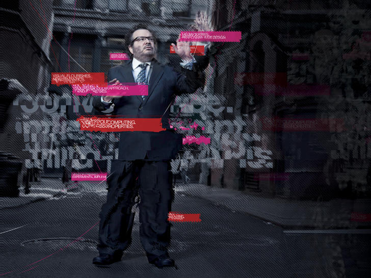
In Issue No. 323 of A List Apart for people who make websites, learn to love (and make cool stuff with) SVG and design web registration forms for kids.
by Jim Ray
Pity Scalable Vector Graphics. It’s been an official standard since before IE6 was released yet has never found much of an audience on the web, certainly not the one it deserves. Just as SVG was starting to establish some browser support, along came the canvas tag, stealing the thunder of dynamically generated client-side images. Yet despite all the attention being paid to canvas, there’s still a place for SVG, particularly for developers looking to replace plug-ins like Flash for data visualization. Unlike canvas or other script-only approaches, SVG can be easily divided into design and code elements, with just a little code to add interactivity. It even works on devices like the iPad and iPhone. And now, thanks to svgweb and a clever use of Flash, it works on older platforms no one could have ever imagined supporting SVG. Jim Ray shows how.
by Debra Levin Gelman
Designing websites for kids is a fascinating, challenging, rewarding, and exasperating experience: you’re trying to create a digital experience for people who lack the cognitive capacity to understand abstraction; to establish brand loyalty with people who are influenced almost exclusively by their peers; and to communicate subjective value propositions to people who can only see things in black-and-white. Fortunately, it’s possible to create a successful registration process for these folks with an understanding of how their brains work. Debra Levin Gelman explores how to design effective registration forms for kids based on their context, technical skills, and cognitive capabilities.
Illustration by Kevin Cornell for A List Apart.

JEN SIMMONS is our guest today, January 20, 2011, in Episode No. 35 of The Big Web Show, co-hosted by Dan Benjamin. Tune in to 5by5.tv/live at 12:00 PM Eastern (new time!) to be part of the live recording.
Jen (jensimmons.com, @jensimmons), is a designer who builds stuff too. She designed and created the new default theme for Drupal 7, named Bartik. And she’s currently leading a movement to bring HTML5 to Drupal. Jen began using Drupal in early 2007, when it was frighteningly hard to use. She started creating websites in 1996, and used many flavors of technology over the years.
Besides designing for the web, Jen has 20 years experience designing for live performance and for print. She’s created seven-channel digital projections for an opera about Nikola Tesla. She’s created short films that toured the globe in film festivals. And she’s taught media arts to high school kids in San Antonio. Jen has a MFA in Film and Media Arts from Temple University, where she taught as an Adjunct Professor.
The Big Web Show (“Everything Web That Matters”) records live every Thursday at 12:00 PM Eastern. Edited episodes can be watched afterwards, often within hours of recording, via iTunes (audio feed | video feed) and the web. Subscribe and enjoy!

WHAT A YEAR 2010 has been. It was the year HTML5 and CSS3 broke wide; the year the iPad, iPhone, and Android led designers down the contradictory paths of proprietary application design and standards-based mobile web application design—in both cases focused on user needs, simplicity, and new ways of interacting thanks to small screens and touch-sensitive surfaces.
It was the third year in a row that everyone was talking about content strategy and designers refused to “just comp something up” without first conducting research and developing a user experience strategy.
CSS3 media queries plus fluid grids and flexible images gave birth to responsive web design (thanks, Beep!). Internet Explorer 9 (that’s right, the browser by Microsoft we’ve spent years grousing about) kicked ass on web standards, inspiring a 10K Apart contest that celebrated what designers and developers could achieve with just 10K of standards-compliant HTML, CSS, and JavaScript. IE9 also kicked ass on type rendering, stimulating debates as to which platform offers the best reading experience for the first time since Macintosh System 7.
Even outside the newest, best browsers, things were better than ever. Modernizr and eCSStender brought advanced selectors and @font-face to archaic browsers (not to mention HTML5 and SVG, in the case of Modernizr). Tim Murtaugh and Mike Pick’s HTML5 Reset and Paul Irish’s HTML5 Boilerplate gave us clean starting points for HTML5- and CSS3-powered sites.
Web fonts were everywhere—from the W3C to small personal and large commercial websites—thanks to pioneering syntax constructions by Paul Irish and Richard Fink, fine open-source products like the Font Squirrel @Font-Face Generator, open-source liberal font licensing like FontSpring’s, and terrific service platforms led by Typekit and including Fontdeck, Webtype, Typotheque, and Kernest.
Print continued its move to networked screens. iPhone found a worthy adversary in Android. Webkit was ubiquitous.
Insights into the new spirit of web design, from a wide variety of extremely smart people, can be seen and heard on The Big Web Show, which Dan Benjamin and I started this year (and which won Video Podcast of the Year in the 2010 .net Awards), on Dan’s other shows on the 5by5 network, on the Workers of the Web podcast by Alan Houser and Eric Anderson, and of course in A List Apart for people who make websites.
A few things I wrote here at zeldman.com this year (some related to web standards and design, some not) may be worth reviewing:
A few things I wrote elsewhere might repay your interest as well:
Happy New Year, all!
DREW McCLELLAN’S 24 WAYS IS THE ADVENT calendar for web geeks, publishing a daily dose of web goodness throughout December. This year’s 24 ways is being turned into a beautiful printed annual. All proceeds benefit UNICEF children’s charities. The sale ends December 31, 2010. Please buy this collector’s item and spread holiday cheer to those who need it most:

“It’s been a great year for web design books; the best we can remember for a while, in fact!” So begins Goburo’s review of the Top Web Books of 2010. The list is extremely selective, containing only four books. But what books! They are: Andy Clarke’s Hardboiled Web Design (Five Simple Steps); Jeremy Keith’s HTML5 For Web Designers (A Book Apart); Dan Cederholm’s CSS3 For Web Designers (A Book Apart); and Eric Meyer’s Smashing CSS (Wiley and Sons).
I’m thrilled to have had a hand in three of the books, and to be a friend and business partner to the author of the fourth. It may also be worth noting that three of the four books were published by scrappy, indie startup publishing houses.
Congratulations, all. And to you, good reading (and holiday nerd gifting).

Now we have something else to be thankful for. Nathan Smith of Sonspring has created a library that gives designers and developers “some measure of control over form elements, without changing them so drastically as to appear foreign in a user’s operating system.” Smith calls his new library Formalize CSS:
I’ve attempted to bridge the gap between various browsers and OS’s, taking the best ideas from each, and implementing what is possible across the board. For the most part, this means most textual form elements have a slight inset, and all buttons look consistent, including the
buttontag.
For more, including demos, options, screenshots, thanks, and the library itself, read Smith’s write-up at SonSpring | Formalize CSS. Hat tip and happy Thanksgiving to my good friend Aaron Gustafson for sharing this gem.

The 10K Apart Challenge had a simple premise: Could you build a complete web application using less than 10 kilobytes? … A joint effort between An Event Apart and MIX Online, the 10K Apart reaped 367 web applications in 28 days—everything from casual games to RIAs—that demonstrate, even with their tiny footprints, what is truly possible with modern [web] standards.
Read about the winning entries: 10K Apart – IEBlog.

Paul Ford is our guest on The Big Web Show, taped live before an internet audience at 1:00 PM ET tomorrow, 14 October 2010, on the 5by5 network at live.5by5.tv.
Paul is a freelance writer and computer programmer. He was an editor at Harper’s Magazine from 2005–2010, and brought Harper’s 159-year, 250,000-page archive to the web in 2007; the system now supports tens of thousands of registered subscribers. More recently he helped the media strategy firm Activate with the launch of Gourmet Live, a re-imagining of Gourmet Magazine for iPad, and co-founded Popsicle Weasel, a small company totally focused on microsites.
He has written for NPR, TheMorningNews.org, XML.com, and the National Information Standards Organization’s Information Standards Quarterly, and is the author of the novel Gary Benchley, Rock Star (Penguin/Plume). Paul programs in PHP, Java, and XSLT2.0, but lately is all about Python and Django. His writing has been anthologized in Best Software Writing I (2005) and Best Music Writing 2009. He enjoys both software and music.
He will teach Content Strategy at the School of Visual Arts in New York City starting in 2011. His personal website, started in 1997, is Ftrain.com. He lives in Brooklyn, New York with his wife Mo and the obligatory cats.
The Big Web Show (“Everything Web That Matters”) is recorded live in front of an internet audience every Thursday at 1:00 PM ET on live.5by5.tv. Join us!
Edited episodes can be watched afterwards, often within hours of recording, via iTunes (audio feed | video feed) and the web. Subscribe and enjoy!
“Cheap, complex devices such as the iPhone and the Droid have come along at precisely the moment when HTML5, CSS3 and web fonts are ready for action; when standards-based web development is no longer relegated to the fringe; and when web designers, no longer content to merely decorate screens, are crafting provocative, multi-platform experiences. Is this the dawn of a newer, more mature, more ubiquitous web?”
—The Future of Web Standards by Jeffrey Zeldman
Originally written for .net magazine, Issue No. 206, published 17 August in UK and this month in the US in “Practical Web Design” Magazine. Now you can read the article even if you can’t get your hands on these print magazines.
See also: I Guest-Edit .net magazine.

Issue No. 314 of A List Apart For People Who Make Websites is all about your form.
Ryan Seddon shows how to reduce errors and guide users to success via new methods made possible by HTML5 and CSS3. Harness HTML5 form input types and attributes to set validation constraints to check user input, and use CSS3’s new UI pseudo-classes to style validation states, making form completion quick and effortless.
And Luke Wroblewski explains how accordion forms increase completion rates and user happiness by dynamically showing and hiding sections of related questions as people complete the form—allowing them to focus on what matters and finish quickly. Learn how your smallest design decisions affect completion speed, which design choices make these innovative forms feel familiar and easy—and which make them feel foreign and complex, leading people to make errors.
Illustration by Kevin Cornell for A List Apart Magazine.

The new Kindle has a lot going for it. It’s inexpensive compared to a full-featured tablet computer like the iPad; you can slip it in your back pocket, where it’s more comfortable than an old-style paperback; and it includes a Webkit browser. This last point is where folks like us start to give a hoot, whether we’re fans of epub reading or not.
The flavor of Kindle’s browser concerns us because it affords us the ability to optimize the mobile viewing experience with a single line of markup. You can see this in action in the photo at the head of this article (published and discussed on Flickr).
I made no tweaks for Kindle per se; the Kindle is simply responding to a line of markup I’ve been putting into my web pages since 2007—namely, the viewport meta element, which controls the width of the viewport, thus enabling mobile devices with a limited number of pixels to focus all available pixels on your site’s core content (instead of, for instance, wasting part of the small screen on a background color, image, or gradient). The technique is as simple as web design gets:
meta name="viewport" content="width=770"
(Obviously, the value of “width” should be adjusted to match your site’s layout.)
I learned this little trick from Craig Hockenberry’s Put Your Content in My Pocket (A List Apart, August 28, 2007), which I naturally recommend to any designer who hasn’t seen it.