The new Kindle has a lot going for it. It’s inexpensive compared to a full-featured tablet computer like the iPad; you can slip it in your back pocket, where it’s more comfortable than an old-style paperback; and it includes a Webkit browser. This last point is where folks like us start to give a hoot, whether we’re fans of epub reading or not.
The flavor of Kindle’s browser concerns us because it affords us the ability to optimize the mobile viewing experience with a single line of markup. You can see this in action in the photo at the head of this article (published and discussed on Flickr).
I made no tweaks for Kindle per se; the Kindle is simply responding to a line of markup I’ve been putting into my web pages since 2007—namely, the viewport meta element, which controls the width of the viewport, thus enabling mobile devices with a limited number of pixels to focus all available pixels on your site’s core content (instead of, for instance, wasting part of the small screen on a background color, image, or gradient). The technique is as simple as web design gets:
meta name="viewport" content="width=770"
(Obviously, the value of “width” should be adjusted to match your site’s layout.)
I learned this little trick from Craig Hockenberry’s Put Your Content in My Pocket (A List Apart, August 28, 2007), which I naturally recommend to any designer who hasn’t seen it.
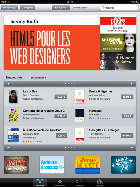
Sacrebleu! The French edition of the ebook of Monsieur Jeremy Keith’s HTML5 For Web Designers is in the top five sellers in the iTunes Store Français.
To answer your other questions: an eBook version in English is coming to books.alistapart.com next week, will soon thereafter also be sold via the iTunes Store, and will be followed by a PDF version. Get those downloading fingers in shape now!
Dear Apple: It is a triumph of engineering and marketing and general cause for joy that Apple provides highly functional iPad versions of Keynote, Pages, and Numbers for a mere $9.99 apiece. Alas, the iPad versions’ inability to import or transfer fonts diminishes the apps’ value and utility.
You, Apple, have done much to foster today’s design culture, so it is no surprise to you that we designers are particular about the fonts we use. One font is not the same as another. Helvetica is not the same as Franklin or Gotham. You know this as well as we do. Which means you also know that, in transferring Keynote presentations and Pages layouts between the Macs and iPads you sell us, our joy gets dented when the iPad replaces our fonts with “a close match” or Helvetica.
And it’s not just a matter of joy. I sometimes spend weeks on a Keynote presentation, and so do my colleagues. We’d love to be able to work on them whether we have a Mac or an iPad at hand—that, after all, is the promise of the devices we buy from you; frankly, it is the promise of all computers. But when the iPad loses my fonts, it loses me. A Keynote presentation with substitute fonts is of no use to me, except perhaps as a rehearsal tool—and I can just as easily rehearse with a PDF.
Please either add the ability to retain fonts (and all their settings) when importing Keynote, Pages, and Numbers documents from computer to iPad, or else please create a simple font management tool for the iPad that allows us to import a reasonable subset of our fonts to the device.
Update! Episode 14 is now available for your listening and viewing pleasure at 5by5.tv.
Josh Williams, founder of Gowalla, is our guest at 1:00 PM ET today, July 29, in Episode 14 of The Big Web Show. Whether you’re a social media user/creator, an entrepreneur, an application developer, an iconist or illustrator, a freelancer with big dreams, an API wizard, a devotee of marketing 2.0, a web designer, a Gowalla fan, or what, you won’t want to miss this episode.
The Big Web Show is taped in front of a live internet audience, and you can be part of it. Join co-host Dan Benjamin and me at 1:00 PM ET today to participate in the live taping of Episode 14.
If you miss the live taping, you can watch the show on our website or via iTunes later tonight.
The Big Web Show (“Everything Web That Matters”) is taped live in front of an internet audience every Thursday at 1:00 PM ET on live.5by5.tv. Edited episodes can be watched afterwards (often within hours of taping) via iTunes (audio feed | video feed) and the web.
In Heaven, if I should get there, I will play the Mellotron. Meanwhile, I play the Mellotronics M3000 HD, a $12 Mellotron for iPad (and soon for iPhone and iPod touch as well) by Synthtopia.
From the manufacturers:
The M3000 is an uncannily accurate, beautiful-sounding and immensely playable instrument, packed with 13 huge, authentic voices from the Mellotronics tape vault. These are the same production tapes that featured on Strawberry Fields Forever, Nights in White Satin, Watcher of the Skies, Odessey and Oracle, and hundreds more timeless classics.
Or in my case, “In The Court of the Crimson King,” the album that blew my mind in ninth grade and still holds up in 2010, despite lyrical conceits that would make Chuck D giggle and border on Sp?n?al Tap parody. But I digress.
The real Mellotron was powered by looped audio tape recordings of full orchestra, solo flute, and so on—one recording, one tape loop, for each note of the 35-note keyboard. The M3000 is powered by individual samples of all 35 notes of each original tape set. The resulting sound is incredible, even over the iPad’s tiny built-in speaker.
All 35 keys are on-screen and available at once, so anything that can be played on a Mellotron can be played on the M3000. … The M3000 also supports 4 in-memory voices at one time, with independent keyboard and chordpad voices. The inclusion of a rich, spacious onboard reverb unit allows the M3000 to be used as a recording or performance instrument with no outboard effects chain.
Here’s what you can’t do. You can’t plug a MIDI keyboard into your iPad to drive the M3000’s performance. You have to play the virtual onscreen keyboard. You also can’t record your M3000 performance to a sequencer.
But there’s nothing stopping you from taking this $12 iPad Mellotron onstage or into a home or professional recording studio. Or just whipping it out on a long bus trip or tough day in the cubicle and regaling your companions with impromptu renditions of “Space Oddity.”
There is a new Safari update. After I installed it, my home iMac cannot reboot.
For about an hour, the iMac was stuck in the grey Apple screen (sometimes with, and sometimes without, a progress bar). The progress bar would “finish,” then the Mac would restart back into the grey Apple screen.
I decided to leave the iMac alone while I worked out.
When I returned two hours later, the iMac had progressed from the grey screen to a blue screen. Zapping PRAM and restarting gets me a grey Apple screen followed by a blue screen. The blue screen flashes twice while changing its color balance settings, indicating that some part of the operating system still works. Then a tiny white rectangle appears at the top left of the screen. Then, nothing further.
This machine contains my entire music collection and all my photos of my daughter.
I have a backup drive but cannot force the iMac to boot from it.
I have an OS X CD but cannot force the iMac to start from it.
It shouldn’t be this much work, but hats off to Nick Cernis for showing us the trick to enabling multiple “from” addresses under a single Gmail account in Mail on the iPad and iPhone.
On 1 May 1995, young James Thomson released the first version of DragThing, “the original dock designed to tidy up your Macintosh desktop.” On 1 May 2010, a still young James Thomson celebrated his product’s 15th birthday the way any good indie software developer would: with a free update.
It’s been over six years since we last charged for an update, and we’ve released over twenty free updates since then, so this should really be a paid one. But since it’s a relatively minor release, this is still free for people who bought any earlier version of DragThing 5.
My favorite DragThing feature
… is the ability to assign keystrokes to my favorite apps. I launch TextEdit with F1, Mail with F2, Fetch with F3, TextMate with F6, Photoshop with F7, Safari with F8, Illustrator with F10. The best part is that even when I’m working in a half-dozen or more apps at once, I can easily switch between them with a keypress—for instance, after copying a selection in Illustrator, I can hit F7 and paste it into Photoshop.
There are certainly other ways of doing these things (including other ways of assigning keystrokes to applications), but DragThing makes it easy.
Trash Can love
DragThing also lets you stick documents, folders, and applications in single or multiple, highly configurable docks, and can store frequently used text and photo clippings for pasting into other applications with a click. Plus you can assign sounds to actions (now you can hear when you empty the Trash can), stick the Trash can back on the desktop where it belongs, and play with all manner of dock styles and color schemes (caution! a little goes a long way).
You can take my copy of DragThing when you pry it out of my cold, dead hands.
New open standards created in the mobile era, such as HTML5, will win on mobile devices (and PCs too). Perhaps Adobe should focus more on creating great HTML5 tools for the future, and less on criticizing Apple for leaving the past behind.
ZingChart hopes to end the war between HTML5 and Flash in web-based charting:
Today we launched the first charting library that renders charts and graphs in both HTML5 <canvas> and Flash. Rather than join the Flash vs. <canvas> debate, we built a version that renders charts in both frameworks. With the recent launch of the iPad, we hope ZingChart Flash + HTML5 <canvas> helps the growing data visualization community focus on building great visualizations rather than worrying about compatibility.
For you visual learners and tinkerers, here’s the demo:
It’s only Wednesday but we already have our link of the week. Although they call it merely a “quick write-up” (and it is a fast read), iA’s mini-compendium of design insights before and after the appearance of the iPad at their office should be required reading for all web, app, and/or interaction designers.
In the equivalent of a breathlessly quick seminar presentation, iA discusses typographic resolution and feel; the effect of the device’s brilliant contrast on readability; the kitsch produced by rigorously adhering to Apple’s “make it 3D” guidelines; whether metaphors work; and more—all of it well worth far more than the little time it will take you to absorb.
In particular, I call your attention to the section entitled, “Interaction Design: So What Works?” Although intended as a guideline to producing well-tuned iPad apps, it also works splendidly as a mini-guide to creating better websites, much like Luke Wroblewski’s brilliant “Mobile First” presentation at last week’s An Event Apart, which carried a similar message:
The limited screen estate and the limited credit on the number of physical actions needed to complete one task (don’t make me swipe and touch too often), pushes the designer to create a dead simple information architecture and an elaborate an interaction design pattern with a minimal number of actions. This goes hand in hand with the economic rule of user interaction design: Minimize input, maximize output.
Since the smallest touch point for each operation is a circle of the size of a male index finger tip, we cannot cram thousands of features (or ads!) in the tight frame; we have to focus on the essential elements. Don’t waste screen estate and user attention on processing secondary functions.
We found that the iPad applications we designed, made it relatively easy to be translated back into websites. The iPad could prove to be a wonderful blue print to design web sites and applications. If it works on the iPad, with a few tweaks, it will work on a laptop.
Apple has a typography desk. It is not exactly crowded with developers vying for every square centimetre, but it really exists. Have you ever heard of it? …
Then compare Microsoft, which has two divisions focussed on type and reading (Typography and Advanced Reading Technologies). Esteemed colleagues Simon Daniels and Kevin Larson are but two of many people with a high profile in the type business who work for Microsoft (in those departments respectively). MS Typo itself does a great deal of work. Apart from commissioning the confusable Microsoft C-fonts, the department does everything from creating box-drawing characters for teletext fonts to designing Liberian symbol systems….
As you’d expect, I urge Apple to get back into the business of type design. The chief lesson of the Web must be observed: Do what works and don’t do what doesn’t work.
Worth reading in its entirety, rereading, bookmarking, and sharing (especially with friends at Apple): Where Microsoft beats Apple on the Personal Weblog of Joe Clark, Toronto. Nobody does it better.
And so do my iPhone and your iPad. All it took was a bit o’ the old Richard Fink syntax and a quick drive through the Font Squirrel @Font-Face Kit Generator (featuring Base 64 encoding and SVG generation) to bring the joy and wonder of fast, optimized, semi-bulletproof web fonts to Safari, Firefox, Opera, Chrome, iPhone, and Apple’s latest religious device.
Haven’t checked IE7, IE8, IE9, or iPad yet; photos welcome. (Post on Flickr and link here.)
What I learned:
? Even if manufacturer supplies “web font” versions with web license purchase, it’s better to roll your own web font files as long as this doesn’t violate the license.