Categories
Advertising Amazon arts Deck, the Design The writing zeldman.com

An e-mail from Chip Kidd

I’ll never forget the day Chip Kidd sent me an e-mail. Chip Kidd, author of The Cheese Monkeys, the book that does for design school what Nathaniel West’s Day of the Locust did for Hollywood.

I wrote about Chip Kidd’s work and he sent me a polite e-mail in response. He called me “Mr Zeldman.” Him. He. That Chip Kidd.

Chip Kidd, my all-time-favorite, hall-of-fame book cover designer. Fabricator of the jackets on at least half the modern novels I’ve bought “on impulse”—that impulse triggered and exquisitely controlled by Kidd, who approaches the problem of book design the way a director approaches montage in film. Not a crude film director, but a sly one. One who attacks at tangents, combining images to create compelling narratives that strangely illuminate but never crassly illustrate each book’s contents.

Let me tell you about Chip Kidd. I stare at his work, trying to figure out how he does it. Looking for flaws, like you do when someone is that good. Chip Kidd, you might say, is a design hero of mine. He is likely a design hero of yours, too.

Now he works for us.

The Deck, the premier network for reaching creative, web and design professionals, is proud to welcome Chip Kidd, Dean Allen, Ze Frank, and the crew behind Aviary as the newest members of our network.

  • Chip Kidd: See above.
  • Dean Allen: One of the finest writers ever to grace the web with wit, insight, and a distinctively detached charm. Also a heck of a book designer, although of a very different school from Chip Kidd. Also a software developer, and not a bad hand at web design. I chose Dean Allen to redesign The Web Standards Project when I was ready to leave the august institution. (It has since been redesigned by Andy Clarke. Not a bad progression.)
  • Ze Frank: A man who needs no introduction. The original bad boy of look-at-me, the-web-is-TV. Artist, illustrator, satirist, programmer, and on-screen personality. The Jon Stewart of confessional web video. The Laurie Anderson of pop. The boy Lonely Girl only dreams of becoming. Too big for TV, too big for your iPhone. Coming soon to a conference near you.
  • Aviary: makers of rich internet applications geared for artists of all genres. From image editing to typography to music to 3D to video, they have a tool for everything.

The Deck delivered 20,121,412 ad impressions during April. Limited opportunities are now available through the Third Quarter of 2008.

[tags]Chip Kidd, Dean Allen, Aviary, Deck, The Deck, advertising[/tags]

Categories
Blogs and Blogging Design people Publishing social networking Tools tweets twitter work writing Zeldman zeldman.com

The vanishing personal site

OUR PERSONAL SITES, once our primary points of online presence, are becoming sock drawers for displaced first-person content. We are witnessing the disappearance of the all-in-one, carefully designed personal site containing professional information, links, and brief bursts of frequently updated content to which others respond via comments. Did I say we are witnessing the traditional personal site’s disappearance? That is inaccurate. We are the ones making our own sites disappear.
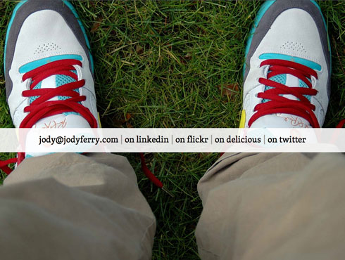
The vanishing personal site.

Obliterating our own readership and page views may not be a bad thing, but let’s be sure we are making conscious choices.

Interactive art director Jody Ferry’s site is a perfect example of the deeply decentralized personal page. I use the term “page” advisedly, as Jody’s site consists of a single page. It’s a fun, punchy page, bursting with personality, as intriguing for what it hides as what it reveals. Its clarity, simplicity, and liquidity demonstrate that Jody Ferry does indeed practice what the site’s title element claims: Interactive Art Direction and User Experience Design. All very good.

It could almost be the freshened-up splash page of a late 1990s personal site, except that the navigation, instead of pointing inward to a contact page, resume, blog, link list, and photos, points outward to external web services containing those same things. Mentally insert interactive diagram here: at left is a 1990s site whose splash page links to sub-pages. Structurally, its site map is indistinguishable from an org chart, with the CEO at the top, and everyone else below. At right, to re-use the org chart analogy, a site like Jody’s is akin to a single-owner company with only virtual (freelance) employees. There is nothing below the CEO. All arrows point outward.

Most personal sites are not yet as radically personal-content-outsourced as Jody’s, and certainly not every personal site will go this way. (Jody’s site might not even be this way tomorrow, and, lest it be misunderstood, I think Jody’s site is great.) But many personal sites are leaning this way. Many so inclined are currently in an interim state not unlike what’s going on here at zeldman.com:

  • There are blog posts here, but I post Tweets far more frequently than I write posts. (For obvious reasons: when you’re stuck in an airport, it’s easier to send a 140-character post via mobile phone and Twitter than it is to write an essay from that same airport. Or really from anywhere. Writing is hard, like design.) To connect the dots, I insert my latest Tweet in my sidebar. I have more readers here than followers at Twitter, but that could change. Are they the same readers? Increasingly, to the best of my knowledge, there are people who follow me on Twitter but do not read zeldman.com (and vice-versa). This is good (I’m getting new readers) and arguably maybe not so good (my site, no longer the core of my brand, is becoming just another piece of it).
  • Like nearly everyone, I outsource discoverable, commentable photography to Flickr.com instead of designing my own photo gallery like my gifted colleagues Douglas Bowman and Todd Dominey. Many bloggers now embed mini-bits of their Flickr feeds in their site’s sidebars. I may get around to that. (One reason I haven’t rushed to do it is that most of my Flickr photos are hidden behind a “friends and family” gateway, as I mainly take pictures of our kid.) Photography was never what this site was about, so for me, using Flickr is not the same as outsourcing the publication of some of my content.
  • As I’ve recently mentioned, links, once a primary source of content (and page views) here, got offloaded to Ma.gnolia a while back. From 1995 until a few years ago, every time I found a good link, an angel got his wings and I got page views. My page views weren’t, brace yourself for an ugly word, monetized, so all I got out of them was a warm feeling—and that was enough. Now my site is, brace yourself again, monetized, but I send my readers to Ma.gnolia every time I find a link. Go figure.

I’m not trying to get rid of my readers, nor are you trying to shake off yours. In the short term, including Flickr, Twitter, and Ma.gnolia or De.licio.us feeds sends traffic both ways—out to those services, but also back to your site. (Remember when some of us were afraid RSS would cost us our readers? It did and it didn’t. With RSS, good writers gain readers while often losing traditional page views. But that’s another story.) I’ve certainly found new websites by going to the Twitter profile pages of people who write funny or poignant Tweets. Behind a great Flickr photo may be a great designer whose site you might not have found if not for first seeing that photo.
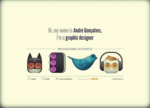
Site of André Gonçalves

But outsourcing the publication of our own content has long-term implications that point to more traffic for the web services we rely on, and less traffic and fewer readers for ourselves.

This is not necessarily a bad thing. Not every person who designs websites needs to run a personal magazine on top of all their other responsibilities. If your goal in creating a personal site way back when was to establish an online presence, meet other people who create websites, have fun chatting with virtual friends, and maybe get a better job, well, you don’t need a deep personal site to achieve those goals any more.

But if world domination is your goal, think twice before offloading every scrap of you.


Translations

[tags]personal sites, blogs, blogging, de.licio.us, ma.gnolia, flickr, twitter, jodyferry, outsourcing, content, readers, readership[/tags]

Categories
Accessibility Design Happy Cog™ Ma.gnolia Usability Zeldman zeldman.com

The feed is gone

Over the weekend, I added my Ma.gnolia bookmarks feed to my blog post template, such that every post would be followed by links to and descriptions of the last five external web pages to have caught my fancy. Inserting the feed into the template was easy and took all of three minutes.

This morning, I removed the feed.

Why I inserted the feed

From 1995 until around the time Happy Cog worked on the Ma.gnolia design project, one of the things I wrote about here was other people’s websites. I did it because I was passionate about web design, and so were the people who read this site. And of course, writing about other people’s sites also provided a ready form and steady stream of content. From 1995 until about 2001, I wrote here several times a day, and had millions of readers.

Then married life, and a business that grew in spite of my lifelong effort to avoid commercial success, ate into my blogging time. Today I write less frequently and have fewer readers. In an effort to provide linkage even when I don’t have time to write posts, I added my Ma.gnolia feed to my site’s sidebar in 2006. (It’s still there, on my front page. You may need to scroll down to see it.)

A flaw in the design

Not everyone notices the Ma.gnolia feed in my sidebar, due to a flaw—one of many—in the way I redesigned zeldman.com in 2004. (I used to redesign this site several times a year, but haven’t touched it since Spring of 2004.)

When I redesigned zeldman.com in 2004, I thought it would be “neat” to make my sidebar’s linked text almost the same color as the background until you hovered over it. The idea being that the focus was on the site’s content, not all the little crap in the sidebar. The sidebar was like sand, and you, the reader, were like a beachcomber with a metal detector. Hover the metal detector over the sand, and you might find a quarter. Hover over my sidebar, and you might find additional content.

Like most “neat” ideas that aren’t entirely practical, this one required compromise in the execution. The result is a conventional sidebar with low-contrast text. Because of the low contrast, lots of people (including people with certain kinds of dyslexia) pay little attention to the sidebar’s content. So I need to redesign.

But meantime, slipping the Ma.gnolia feed out of the sidebar (on blog posts) and into the body of posts itself seemed like another neat idea. People who’d ignored the Ma.gnolia feed in the sidebar would now, finally, bask in its glory. Every post would end with the last five third-party links I’d reviewed. Neat, neat, neat.

Why I removed the feed

This morning I removed the feed from the body of the blog posts for a technical reason and a design/usability reason.

Technically, as we all know, it’s not a great idea to pull content from a third-party site. The third-party site can be slow. It can get hacked. It can even go down, causing one’s own pages not to finish rendering. (As I write this, Ma.gnolia’s server appears to be taking a little nap—an infrequent occurrence, although the server is often slow. As for my embedded Twitter feed, like yours, it suffers from near-constant narcolepsy.)

And from a design usability perspective, the idea just didn’t gel. For one thing, people would dig up old posts and write comments on them about sites newly added to the Ma.gnolia feed. Owing to the age of the posts, those comments were unlikely to be found by other readers. And as soon as the feed updated, the comments would become nonsensical, because they discussed content no longer found in the post.

So the feed is gone.

[tags]design, usability, ma.gnolia, zeldman.com, happycog, links[/tags]