Categories
A Book Apart A List Apart Adobe An Event Apart Apple architecture art direction Authoring Best practices Big Web Show client services Code content content strategy creativity CSS CSS3 Dan Benjamin Design DWWS E-Books editorial Education eric meyer Fonts Formats Free Advice Happy Cog™ Haters industry Information architecture interface ipad iphone IXD javascript links maturity New Riders peachpit Publications Publishing Real type on the web Respect Responsibility Responsive Web Design Standards State of the Web tbws The Big Web Show The Essentials The Profession This never happens to Gruber Typekit Typography Usability User Experience UX W3C Web Design Web Design History Web Standards webfonts webkit Websites webtype work Working writing Zeldman zeldman.com

2010: The Year in Web Standards

WHAT A YEAR 2010 has been. It was the year HTML5 and CSS3 broke wide; the year the iPad, iPhone, and Android led designers down the contradictory paths of proprietary application design and standards-based mobile web application design—in both cases focused on user needs, simplicity, and new ways of interacting thanks to small screens and touch-sensitive surfaces.

It was the third year in a row that everyone was talking about content strategy and designers refused to “just comp something up” without first conducting research and developing a user experience strategy.

CSS3 media queries plus fluid grids and flexible images gave birth to responsive web design (thanks, Beep!). Internet Explorer 9 (that’s right, the browser by Microsoft we’ve spent years grousing about) kicked ass on web standards, inspiring a 10K Apart contest that celebrated what designers and developers could achieve with just 10K of standards-compliant HTML, CSS, and JavaScript. IE9 also kicked ass on type rendering, stimulating debates as to which platform offers the best reading experience for the first time since Macintosh System 7.

Even outside the newest, best browsers, things were better than ever. Modernizr and eCSStender brought advanced selectors and @font-face to archaic browsers (not to mention HTML5 and SVG, in the case of Modernizr). Tim Murtaugh and Mike Pick’s HTML5 Reset and Paul Irish’s HTML5 Boilerplate gave us clean starting points for HTML5- and CSS3-powered sites.

Web fonts were everywhere—from the W3C to small personal and large commercial websites—thanks to pioneering syntax constructions by Paul Irish and Richard Fink, fine open-source products like the Font Squirrel @Font-Face Generator, open-source liberal font licensing like FontSpring’s, and terrific service platforms led by Typekit and including Fontdeck, Webtype, Typotheque, and Kernest.

Print continued its move to networked screens. iPhone found a worthy adversary in Android. Webkit was ubiquitous.

Insights into the new spirit of web design, from a wide variety of extremely smart people, can be seen and heard on The Big Web Show, which Dan Benjamin and I started this year (and which won Video Podcast of the Year in the 2010 .net Awards), on Dan’s other shows on the 5by5 network, on the Workers of the Web podcast by Alan Houser and Eric Anderson, and of course in A List Apart for people who make websites.

Zeldman.com: The Year in Review

A few things I wrote here at zeldman.com this year (some related to web standards and design, some not) may be worth reviewing:

iPad as the New Flash 17 October 2010
Masturbatory novelty is not a business strategy.
Flash, iPad, and Standards 1 February 2010
Lack of Flash in the iPad (and before that, in the iPhone) is a win for accessible, standards-based design. Not because Flash is bad, but because the increasing popularity of devices that don’t support Flash is going to force recalcitrant web developers to build the semantic HTML layer first.
An InDesign for HTML and CSS? 5 July 2010
while our current tools can certainly stand improvement, no company will ever create “the modern day equivalent of Illustrator and PageMaker for CSS, HTML5 and JavaScript.” The assumption that a such thing is possible suggests a lack of understanding.
Stop Chasing Followers 21 April 2010
The web is not a game of “eyeballs.” Never has been, never will be. Influence matters, numbers don’t.
Crowdsourcing Dickens 23 March 2010
Like it says.
My Love/Hate Affair with Typekit 22 March 2010
Like it says.
You Cannot Copyright A Tweet 25 February 2010
Like it says.
Free Advice: Show Up Early 5 February 2010
Love means never having to say you’re sorry, but client services means apologizing every five minutes. Give yourself one less thing to be sorry for. Take some free advice. Show up often, and show up early.

Outside Reading

A few things I wrote elsewhere might repay your interest as well:

The Future of Web Standards 26 September, for .net Magazine
Cheap, complex devices such as the iPhone and the Droid have come along at precisely the moment when HTML5, CSS3 and web fonts are ready for action; when standards-based web development is no longer relegated to the fringe; and when web designers, no longer content to merely decorate screens, are crafting provocative, multi-platform experiences. Is this the dawn of a new web?
Style vs. Design written in 1999 and slightly revised in 2005, for Adobe
When Style is a fetish, sites confuse visitors, hurting users and the companies that paid for the sites. When designers don’t start by asking who will use the site, and what they will use it for, we get meaningless eye candy that gives beauty a bad name.

Happy New Year, all!
Categories
Design Fonts Tools type Typekit Typography webfonts webkit Websites webtype

Cure for the Common Webfont, Part 2: Alternatives to Georgia

For nearly fifteen years, if you wanted to set a paragraph of web text in a serif typeface, the only truly readable option was Georgia. But now, in web type’s infancy, we’re starting to see some valid alternatives for the king of screen serifs. What follows is a list of serif typefaces that have been tuned—and in some cases drawn from scratch—for the screen.

Stephen Coles, December 6, 2010:
Cure for the Common Webfont, Part 2: Alternatives to Georgia

Categories
CSS CSS3 Design type Typekit Typography Web Design Web Design History Web Standards webfonts webkit Websites webtype

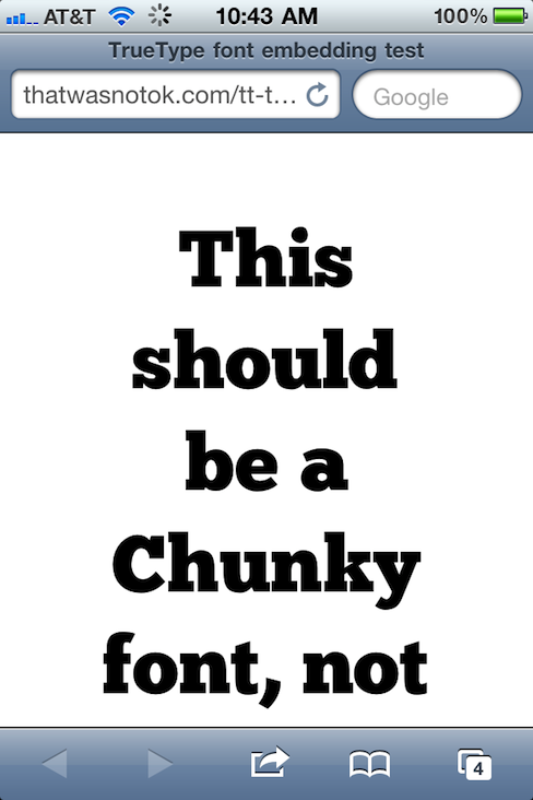
Web type news: iPhone and iPad now support TrueType font embedding. This is huge.

TrueType font embedding in iPhone, Hallelujah!

TrueType font embedding has come to iPhone and iPad, Hallelujah, brothers and sisters. That is to say, Mobile Safari now supports CSS embedding of lower-bandwidth, higher-quality, more ubiquitous TrueType fonts. This is huge. Test on your device(s), then read and rejoice:

The Typekit Blog: iOS 4.2 improves support for web fonts

iOS 4.2 is also the first version of Mobile Safari to support native web fonts (in TrueType format) instead of SVG. This is also exciting news, as TrueType fonts are superior to SVG fonts in two very important ways: the files sizes are dramatically smaller (an especially important factor on mobile devices), and the rendering quality is much higher.

Ryan N.: Confirmed: TrueType Font Support on Mobile Safari on iOS 4.2

Thanks to Matt Wiebe for mentioning the rumour that Mobile Safari on iOS 4.2 supports TrueType fonts and providing a handy link to test.

TrueType

TrueType is an outline font standard originally developed by Apple Computer in the late 1980s as a competitor to Adobe’s Type 1 fonts used in PostScript. TrueType has become the most common format for fonts on both the Mac OS and Microsoft Windows operating systems.

The primary strength of TrueType was originally that it offered font developers a high degree of control over precisely how their fonts are displayed, right down to particular pixels, at various font sizes. With widely varying rendering technologies in use today, pixel-level control is no longer certain in a TrueType font.

More about webfonts

If you’re coming late to the party, the following bits of required reading and listening will get you up to speed on the joys (and occasional frustrations) of “real type” on the web:

  1. Bulletproof @font-face syntax, Paul Irish, 4 September, 2009
  2. Web Fonts at the Crossing, Richard Fink, 8 June 2010, A List Apart
  3. Big Web Show Episode 1, Dan Benjamin and I discuss webtype with Ethan Dunham of Fontspring and Font Squirrel and Jeffrey Veen of Typekit
  4. Big Web Show Episode 18, Dan Benjamin and I discuss webtype, screen resolution, and more with Roger Black
  5. Thanks

    My thanks to David Berlow of Font Bureau for waking me from my Thanksgiving stupor and alerting me to this exciting slash overdue development.

Categories
Applications apps art direction Authoring CSS Design Web Design Web Design History Websites

960 Pixel Grids Made Easy

Listen up, web designers. From Stuntbox with love comes Gridulator, a dandy free web application that calculates multi-column grids for all your pixel-based web layout needs. Creator David Sleight explains how it works:

Tell Gridulator your layout width and the number of columns you want, and it’ll spit back all the possible grids that have nice, round integers. Just the thing for pixel-based designfolk. There are inline previews, courtesy of the canvas element, and when you’re all set Gridulator can crank out full-size PNGs for you, ready for use in your CSS, Photoshop docs, or what have you. And there’s full keyboard control for you snazzy power users.

More:

Thanks, Stuntbox!

Categories
art direction Best practices Big Web Show Design The Big Web Show The Profession Web Design Web Design History Web Standards webfonts Websites webtype Working

Episode 18: Roger Black on web type and templates

Roger Black

Legendary art director Roger Black guests on tomorrow’s episode of The Big Web Show, co-hosted by Dan Benjamin and taped in front of a live internet audience.

Roger co-founded the following new companies: Webtype, creators of high-end fonts for online typography; Treesaver, a platform that uses CSS, HTML, JavaScript, and the principles of responsive design to publish beautifully formatted content on any device with a web browser; Ready-Media, which designs templates for newspaper and magazine publishers (and attracts controversy); and Nomad Editions, a series of digital weeklies designed directly for mobile devices.

Roger is also a founding partner in Danilo Black, an international design agency he co-founded with Eduardo Danilo, and The Font Bureau, a leading type foundry he co-founded with David Berlow.

“He pioneered the use of computers in design, cut the best deals, and made himself synonymous with the modern magazine,” wrote Michael Wolff in a New York Magazine profile of Roger back in the 1990s, when Roger was the best-known magazine art director in the world. (Among many others, he designed Rolling Stone, The New York Times Magazine, Newsweek, The New Republic, Fast Company, Advertising Age, and Esquire.)

He also co-founded Interactive Bureau, one of the biggest and most successful web design agencies of the dot-com era.

In his free time, Roger putters around in his award-winning West Texas vacation home made of recycled shipping containers.

Roger Black is an astoundingly prolific creative force; we hope you can join us for this Episode of the show.

The Big Web Show (“Everything Web That Matters”) is taped live in front of an internet audience every Thursday at 1:00 PM ET on live.5by5.tv. Edited episodes can be watched afterwards, often within hours of taping, via iTunes (audio feed | video feed) and the web.


Photo of Roger Black at Happy Cog by Jeffrey Zeldman.


Categories
A List Apart An Event Apart Announcements Appearances Applications architecture art direction Best practices Browsers chrome Code CSS CSS3 Damned Fine Journalism Design Designers editorial Education engagement glamorous Happy Cog™ HTML HTML5 Ideas industry interface ipad iphone launches Layout photography Press Publications Publishing Real type on the web Responsive Web Design Standards State of the Web The Big Web Show The Essentials The Profession This never happens to Gruber type Typography User Experience UX W3C Web Design Web Design History Web Standards webfonts webkit Websites webtype writing Zeldman zeldman.com

I guest-edit .net magazine

Web 2.1. Zeldman guest-edits .net magazine.

A List Apart and .net magazine have long admired each other. So when .net editor Dan Oliver did me the great honor of asking if I wished to guest edit an issue, I saluted smartly. The result is now arriving in subscriber post boxes and will soon flood Her Majesty’s newsstands.

In .net magazine Issue No. 206, on sale 17th August in UK (and next month in the US, where it goes by the name “Practical Web Design”), we examine how new standards like CSS3 and HTML5, new devices like iPhone and Droid, and maturing UX disciplines like content strategy are converging to create new opportunities for web designers and the web users we serve:

  • Exult as Luke Wroblewski shows how the explosive growth of mobile lets us stop bowing to committees and refocus on features customers need.
  • Marvel as Ethan Marcotte explains how fluid grids, flexible images, and CSS3 media queries help us create precise yet context-sensitive layouts that change to fit the device and screen on which they’re viewed.
  • Delight as Kristina Halvorson tells how to achieve better design through coherent content wrangling.
  • Thrill as Andy Hume shows how to sell wary clients on cutting-edge design methods never before possible.
  • Geek out as Tim Van Damme shows how progressive enhancement and CSS3 make for sexy experiences in today’s most capable browsers—and damned fine experiences in those that are less web-standards-savvy.

You can also read my article, which asks the musical question:

Cheap, complex devices such as the iPhone and the Droid have come along at precisely the moment when HTML5, CSS3 and web fonts are ready for action; when standards-based web development is no longer relegated to the fringe; and when web designers, no longer content to merely decorate screens, are crafting provocative, multi-platform experiences. Is this the dawn of a newer, more mature, more ubiquitous web?

Today’s web is about interacting with your users wherever they are, whenever they have a minute to spare. New code and new ideas for a new time are what the new issue of .net magazine captures. There has never been a better time to create websites. Enjoy!


Photo by Daniel Byrne for .net magazine. All rights reserved.

Categories
clients Design Happy Cog™ launches Redesigns Websites

Happy Cog redesigns Zappos.com

Zappos.com, redesigned by Happy Cog.

Free overnight shipping; a liberal return policy; friendly service: it’s no secret that Zappos.com positions the customer as the cornerstone of their brand promise. Yet despite their success, Zappos.com was a website with a problem: their business growth had outpaced the slowly-evolving aesthetic of their website. While the site enabled customers to make their purchases quickly, it didn’t capture and embrace the hallmarks of the Zappos.com culture. Enter Happy Cog. (Read more.)

Categories
Design Designers Interviews ipad iphone mobile Platforms podcasts The Big Web Show Web Design Web Standards Websites

Episode 6: Mobile First

Designer Luke Wroblewski.

Update! Final audio and video are now available for your listening and viewing pleasure at 5by5.tv.

This Thursday, June 3, 2010, at 1:00 PM EDT, join Dan Benjamin and me for the taping of The Big Web Show Episode Six, as we chat with leading interaction designer Luke Wroblewski about designing for the mobile space, and learn why the mobile experience for a web application or site should be designed before the PC version.

Designing for 700 million people

Luke Wroblewski is an internationally recognized digital product design leader who has designed or contributed to software used by more than 700 million people worldwide. He is the author of Web Form Design (“That rare book capable of transforming the way an entire field does its business.”—Communication Arts) and Functioning Form, and an extremely popular speaker at leading web design conferences. After long stints as Chief Design Architect at Yahoo! and Lead User Interface Designer of eBay Inc.’s platform team, he is currently Chief Design Officer and co-founder of a stealth start-up.

Watch, Listen, Participate

Participate in the live taping by sharing your questions for Luke via chatroom or phone.

Soon after taping, video and audio versions of the Episode 6 podcast will be posted in the iTunes store and on our website and announced here and via Twitter. (The complete schedule of 5by5 podcasts is available for your pleasure.)

The Big Web Show

5by5 is an Internet broadcasting network, home to podcasts like The Pipeline, The Big Web Show, The Conversation, The Dev Show, and more, with over 120,000 downloads per week. The Big Web Show features special guests and topics like the future of publishing, art direction online, content strategy, web fonts and typography, CMS shootouts, HTML5 and CSS3, building an audience, and more. Previous episodes are available for your listening and viewing pleasure.


Categories
Dan Benjamin podcasts tbws The Big Web Show type Typography Web Design Web Standards webfonts Websites webtype Zeldman

Live Today: Web Fonts Dialog

The Big Web Show, a live video call-in show and podcast. Today's show is all about web fonts.

Update! Final audio and video are now available for your listening and viewing pleasure.

Live today, Dan Benjamin and I grill Ethan Dunham of Fontspring and Font Squirrel and Jeffrey Veen of Typekit and numerous other good things on the web about one of your favorite subjects, “real fonts on your website.”

The Big Web Show

Be part of this dialog that takes place via streaming video feed with live call-in.

Don’t miss the inaugural live broadcast of The Big Web Show today at 1:00 PM Eastern.

(And get the podcast next week by following 5by5 on iTunes.)


Categories
Design Products Standards Web Standards Websites

Web Standards Trinkets

Support web standards website.

Support Web Standards: A collection of limited edition products, created so you can show your love and support for web standards.

Categories
links Web Design Web Standards Websites webtype

Nice Web Type For iPhone

m.nicewebtype.com is a light yet essential mobile site for people who design websites, love type, and struggle to keep up with the dizzying world of web fonts. In it, Tim Brown, author of Nice Web Type, creator of Web Font Specimen (what’s that?), and latterly type manager for Typekit, curates the Design Twitterverse to share the latest insights, innovations, quips, and controversies regarding everyone’s favorite new web design fetish.

Don’t leave home without it.

Categories
3e Announcements Design DWWS Franklin Web Design Web Standards webfonts Websites Zeldman

DWWS 3e mini-site updates

Designing With Web Standards, 3rd Edition

The new mini-site for the 3rd Edition of Designing With Web Standards has been updated, with additional information about the substantially revised web standards guidebook, and with tweaks to the CSS which, one hopes, now bring embedded web font goodness to Internet Explorer users, as well as our friends on Safari, Firefox, and Opera. We love the smell of Franklin in the morning.

Short URL: zeldman.com/x/60

Categories
Design Web Design Websites work Zeldman zeldman.com

Past Blast

Among the pleasures of running an independent personal site is the accidental discovery of an ancient page, such as the version of this site’s contact page from the 1990s that I stumbled onto this morning.

“We’ve got mail!” the old site cheerfully announces, complete with a meaningless header image. The image, like the header and navigation typography, is pixellated to convey “webbiness”—in case you forgot that you were looking at a website in a browser, I guess. “Got mail” is a play on America On-line (kids, ask your parents). “We” is the royal first person plural with which I used to write this site, despite being its sole author. I’d gotten into the habit of “we” from writing copy on entertainment sites for clients like Warner Bros. It made their sites, and mine, seem bigger. It was also an ongoing, self-deprecating joke, although not everyone got it.

As I look at this old page, the copy still feels like me, and it also, if I may say so, anticipates the playful directional body copy of Web 2.0 sites like Flickr by about a decade. (Could be coincidence. Derek Powazek and Heather Champ also wrote jovial instructional copy at the time. Others may have done so as well.)

I’m a lot more ashamed of the design. I’m particularly abashed at:

  • My abysmally stupid effort to straddle the “liquid layout” and “fixed width layout” genres by designing a page that doesn’t work as liquid or fixed. Possibly the only web design ever to put peanut butter and bicycle chains together and call it a sandwich. It should have stayed fixed, and the text and input fields should have matched the width of the illustration and header.
  • Alignment, alignment, alignment.
  • Tiny type with seemingly random hierarchy. In my defense, remember that in those days all type was pixellated. I picked 11px Georgia and 9px Verdana because those sizes looked great in that pixellated world. Still. Feh.

If your old work doesn’t shame you, you’re not growing.

It’s nice to look back and feel that you’ve made progress. When you look at old work, it should suck glaringly and you should cringe painfully. But there should also be some germ within it that you’re not ashamed of—some spark of talent or inspiration that connects to what you do now.

Categories
A List Apart Design Redesigns Web Design Websites

ALA 289: Redesign yourself

In Issue No. 289 of A List Apart, for people who make websites: 90% of web design is redesign. The hardest redesigns are the ones you do for yourself. In this special issue, we look at how two of the great ones handled the challenge of redesigning their own sites.

Erskine Design Redesign

by SIMON COLLISON

In a mere two years, Erskine Design grew from two people working at home into a full-fledged agency of eight, working with major clients. Their website needed to better reflect their achievements, abilities, and team strengths. They also sought to improve the quality of data collected during client inquiries. Simon Collison explores the agency’s thought processes, and the decisions they made as their own client.

Redesigning Your Own Site

by LEA ALCANTARA

Redesigning your freelance website is an exercise in masochism. There are no colleagues to share the pain: It’s just you. As the designer who wrote The Art of Self-Branding, freelancer Lea Alcantara knew her site had to be just right. People were bound to scrutinize any update to the design, and she couldn’t afford to damage her credibility. Follow her process and decide for yourself if she succeeded.

[tags]design, redesign, self-branding, webdesign, alistapart[/tags]

Categories
Applications architecture art direction books business client services Code Community content creativity Design development editorial Happy Cog™ launches links people Publications Publishing social networking software Web Design Websites

The Amanda Project

Designed by Happy Cog and launched today, The Amanda Project is a social media network, creative writing project, interactive game, and book series combined:

The Amanda Project is the story of Amanda Valentino, told through an interactive website and book series for readers aged 13 & up. On the website, readers are invited to become a part of the story as they help the main characters search for Amanda.

The writing-focused social media network is designed and written as if by characters from the Amanda novels, and encourages readers to enter the novel’s world by joining the search for Amanda, following clues and reading passages that exist only online, and ultimately helping to shape the course of the Amanda narrative across eight novels. (The first Amanda novel—Invisible I, written by Melissa Kantor—comes out 22 September.)

The site developed over a year of intense creative collaboration between Happy Cog and Fourth Story Media, a book publisher and new media company spearheaded by publishing whiz Lisa Holton. Prior to starting Fourth Story, Lisa was was President, Scholastic Trade Publishing and Book Fairs; managed the publication of Harry Potter and the Deathly Hallows; and oversaw development of The 39 Clues. Before that she spent nearly a decade developing numerous bestselling, franchise-launching series at Disney.

Happy Cog‘s New York office developed this project. The team:

Equally vital to the project’s success were Fourth Story’s leaders and partners, including:

  • Lorraine Shanley, Principal Advisor
  • Ariel Aberg-Riger (website, Twitter), Creative Development & Marketing Manager
  • JillEllyn Riley, Editorial Director
  • Dale Robbins, Creative Director
  • David Stack, Director, Digital Partnerships
  • Melissa Kantor, Writer
  • Peter Silsbee, Writer
  • Polly Kanevsky, Art Director
  • Sam Gerstenzang, Technology Consultant

Today’s launch is not the end of our relationship with Fourth Story Media. The Amanda Project will continue to evolve, and Happy Cog will remain an active partner in its direction and growth. We thank our brilliant collaborators and congratulate them on today’s milestone.

Read more

[tags]amanda, amandaproject, theamandaproject, TAP, happycog, design, webdesign, contentstrategy, userexperience, publishing, books, aarongustafson, lizdanzico, erinkissane, whitneyhess, mattgoldenberg, kellymccarthy, jasonsantamaria, jeffreyzeldman, lisaholton, dalerobbins, davidstack, JillEllynRiley, ArielAberg-Riger[/tags]