Categories
A Feed Apart An Event Apart better-know-a-speaker Boston Community conferences content content strategy creativity CSS Design engagement eric meyer events glamorous HTML5 Ideas industry Information architecture interface Standards State of the Web The Profession W3C Web Design Web Standards XHTML

Boston Bound

Plane travel versus train travel, that sort of thing.

Morning finds me bound by train for Boston, capital of Massachusetts, land of Puritans, patriots, and host of the original Tea Party. Center of high technology and higher education. Where the John Hancock Tower signs its name in the clouds, and the sky-scraping Prudential Tower adds a whole new meaning to the term, “high finance.” Beantown. Cradle of liberty, Athens of America, the walking city, and five-time host to An Event Apart, which may be America’s leading web design conference. (You see what I did there?)

Over 500 advanced web design professionals will join co-host Eric Meyer and me in Boston’s beautiful Back Bay for two jam-packed days of learning and inspiration with Dan Cederholm, Andy Clarke, Kristina Halvorson, Jeremy Keith, Ethan Marcotte, Jared Spool, Nicole Sullivan, Jeff Veen, Aarron Walter, and Luke Wroblewski.

If you can’t attend the sold-out show, which begins Monday, May 24, you can follow the live Tweetage via the souped-up, socially-enriched, aesthetically tricked out new version of A Feed Apart, whose lights go on this Sunday, May 23. Our thanks to developers Nick Sergeant, Pete Karl II, and their expanded creative team including Steve Losh and Ali M. Ali. We and they will have more to say about the project soon. For now, you can always read our 2009 interview with Nick and Pete or sneak a peek on Dribbble.

There’s also a Flickr photo group and an interstitial playlist, so you can ogle and hum along from your favorite cubicle or armchair.

See you around The Hub or right here on the world wide internets.


Categories
Browsers chrome CSS Design Fonts Google type Web Design Web Design History Web Standards webfonts webkit webtype

And now, Google

Web Fonts Part 9: Google enters the fray.

THE long-planned inevitable has now been announced. With open-source-licensed web fonts, web font hosting, and add-a-line-to-your-header ease of configuration, Google has joined Typekit, Font Squirrel, Ascender, Font Bureau and others in forever changing the meaning of the phrase, “typography on the web.”

The Google Font Directory lets you browse all the fonts available via the Google Font API. All fonts in the directory are available for use on your website under an open source license and served by Google servers.

Oh, and Typekit? They’re in on it, and they couldn’t be more pleased.


Categories
A List Apart An Event Apart Announcements Appearances Community conferences CSS Design development editorial events Standards Usability User Experience UX Web Design Web Standards

AEA Minneapolis

An Event Apart Minneapolis 2010.

An Event Apart, the design conference for people who make websites, has posted its Minneapolis 2010 schedule. Join Eric Meyer and me and ten amazing guest speakers on July 26-27, 2010 for two great days of design, code, and content:

Monday, July 26

9:00am–10:00am

Put Your Worst Foot Forward

Jeffrey Zeldman, author, Designing With Web Standards, 3rd Ed.

Nothing teaches like failure. Web standards godfather and An Event Apart cofounder Jeffrey Zeldman shares some of his biggest blunders as a designer, entrepreneur, and creative director, and how each mistake taught him to be better at what he does. Study what the problem was and why the mistake seemed like the right answer at the time; see why it turned out to be a really bad idea after all; and learn the great positive lesson each mistake taught.

10:15am–11:15am

DIY UX: Give Your Users an Upgrade

Whitney Hess, Strategic Partner, Happy Cog

Have you fallen in love with your solution and forgotten the original problem? Are you certain that your product actually makes people’s lives better? Not every company can hire someone like me to help you listen to your users, so you’re gonna have to learn how to do some of this stuff yourself. I’ll show you techniques to find out who your users are, what they really need and how to go about giving it to them in an easy to use and pleasurable way. And it doesn’t have to bankrupt you or kill your release date.

11:30am–12:30pm

The CSS3 Experience

Dan Cederholm, author, Bulletproof Web Design and Handcrafted CSS

In a fast-paced hour of design ideas and techniques, learn how advanced CSS and CSS3 can add richness to your site’s experience layer, and discover the role CSS3 can play in enhancing interactivity.

12:30pm–2:00pm: LUNCH

2:00pm–3:00pm

Mobile First!

Luke Wroblewski, author, Web Form Design

More often than not, the mobile experience for a web application or site is designed and built after the PC version is complete. Learn the three reasons web applications should be designed for mobile first instead: mobile is exploding; mobile forces you to focus; and mobile extends your capabilities.

3:15pm–4:15pm

Learning To Love Humans—Emotional Interface Design

Aarron Walter, author, Building Findable Websites

Humans, though cute and cuddly, are not without their flaws, which makes it a challenge to design for them. By understanding how the wet, mushy processor works in these hairy little devils, you can design interfaces and web experiences that will have them hopelessly devoted to your brand. Aarron will introduce you to the emotional usability principle—a design axiom that identifies a strong connection between human emotion and perceived usability. Through real-world examples, you’ll learn practical interface design techniques that will make your sites and applications more engaging to the humans they serve.

4:30pm–5:30pm

Anatomy of a Design Decision

Jared Spool, Founder, User Interface Engineering

What separates a good design from a bad design are the decisions that the designer made. Jared will explore the five styles of design decisions, showing you when gut instinct produces the right results and when designers need to look to more user-focused research.

7:00pm??pm

Opening Night Party

Sponsored by (mt) Media Temple

Media Temple’s opening night parties for An Event Apart are legendary. Join the speakers and hundreds of fellow attendees for great conversation, lively debate, loud music, hot snacks, and a seemingly endless stream of grown-up beverages. Venue details will be announced soon.

Tuesday, July 27

9:00am–10:00am

Everything Old Is New Again

Eric Meyer, author, CSS: The Definitive Guide, 3rd Ed.

Faux columns. Sliding doors. Image replacement. We rely on these techniques on a near-daily basis, but how will they be affected by the expanding vocabulary of CSS3? Will they be reworked, slimmed down, or abandoned altogether? An Event Apart cofounder and CSS mastermind Eric Meyer pulls some old standbys out of the toolbox and applies the capabilites of CSS3 to see how they can be made leaner, meaner, and more powerful.

10:15am–11:15am

Paranormal Interactivity

Jeremy Keith,
author, DOM Scripting

Interaction is the secret sauce of the web. Understanding interaction is key to understanding the web as its own medium—it’s not print, it’s not television, and it’s certainly not the desktop. Find out how to wield HTML, CSS, and JavaScript to craft experiences that are native to the web.

11:30am–12:30pm

Patterns, Components, and Code, Oh My!

Erin Malone, co-author, Designing Social Interfaces

Designing with patterns sounds like a great idea on the surface. But what does it really take to identify and write patterns? And just what do you do with them once they are created? Rounding out the pattern library with components and code can help prototyping and design move faster, leaving time to solve more challenging problems. This session will discuss the benefits of and issues that arise from designing with patterns, and show how to stay creative while doing so.

12:30pm–2:00pm: LUNCH

2:00pm–3:00pm

Message and Medium: Better Content by Design

Kristina Halvorson, author, Content Strategy for the Web

Designing for multichannel content delivery (mobile, anyone?) means an entirely new set of considerations and challenges for web professionals everywhere. Unfortunately for content creators, it’s nearly impossible to predict whether their writing will maintain impact and readability across each and every platform. But forget about the medium for a minute; it’s the message that matters most. We’ll learn how to identify your key business messages, how they inform your content strategy, and how they impact multi-channel content development and design.

3:15pm–4:15pm

A Dao of Flexibility

Ethan Marcotte, co-author, Handcrafted CSS and Designing With Web Standards, 3rd Edition

“The Way is shaped by use, but then the shape is lost.” Our sites are accessed by an increasing array of devices and browsers, and our users deserve a quality experience no matter how large (or small) their display. Are our designs ready? Explore sites that think beyond the desktop and have successfully adapted to their users’ habits. Ethan will also discuss how bring an extra level of craftsmanship to our page layouts, and revisit popular CSS techniques in this ever-changing environment.

4:30pm–5:30pm

How the Web Works

Jeff Veen, author, Art & Science of Web Design

Turns out that the fundamental principles that led to the success of the web will lead you there, too. Drawing on 15 years of web design and development experience, Jeff will take you on a guided tour of what makes things work on this amazing platform we’re all building together. You’ll learn how to stop selling ice, why web browsers work the way they do, and where Rupert Murdoch can put his business model.


Register through June 28 and save $100 off your conference pass. Hurry: tickets are first-come, first-served, and seating is limited.


Categories
Announcements Applications Code Design development editorial Education HTML HTML5 industry Jeremy Keith Publications Publishing Web Design Web Design History Web Standards Zeldman

HTML5 For Web Designers

HTML5 For Web Designers, by Jeremy Keith.

WHEN MANDY BROWN, Jason Santa Maria and I formed A Book Apart, one topic burned uppermost in our minds, and there was only one author for
the job.

Nothing else, not even “real fonts” or CSS3, has stirred the standards-based design community like the imminent arrival of HTML5. Born out of dissatisfaction with the pacing and politics of the W3C, and conceived for a web of applications (not just documents), this new edition of the web’s lingua franca has in equal measure excited, angered, and confused the web design community.

HTML5 For Web Designers

Win free copies of HTML5 For Web Designers on Gowalla!

Just as he did with the DOM and JavaScript, Jeremy Keith has a unique ability to illuminate HTML5 and cut straight to what matters to accessible, standards-based designer-developers. And he does it in this book, using only as many words and pictures as are needed.

The Big Web Show

Watch Jeremy Keith discuss HTML5 with Dan Benjamin and me live on The Big Web Show this Thursday at 1:00 PM Eastern.

There are other books about HTML5, and there will be many more. There will be 500 page technical books for application developers, whose needs drove much of HTML5’s development. There will be even longer secret books for browser makers, addressing technical challenges that you and I are blessed never to need to think about.

But this is a book for you—you who create web content, who mark up web pages for sense and semantics, and who design accessible interfaces and experiences. Call it your user guide to HTML5. Its goal—one it will share with every title in the forthcoming A Book Apart catalog—is to shed clear light on a tricky subject, and do it fast, so you can get back to work.


4 May 2010
Jeffrey Zeldman, Publisher
A Book Apart “for people who make websites”
In Association with A List Apart
An imprint of Happy Cog

The present-day content producer refuses to die.

And don’t miss…

Categories
Big Web Show Dan Benjamin Design development Fonts Web Design Web Standards webfonts webtype

Big Web Show No. 1 up!

Jeffrey Zeldman

FOR YOUR viewing and listening pleasure, The Big Web Show’s Episode 1: Web Fonts is now online.

Jeffrey Zeldman and Dan Benjamin grill Ethan Dunham of Fontspring and Font Squirrel and Jeffrey Veen of Typekit (and other sites, too numerous to name) about one of your favorite subjects, “real fonts on your website” in this, our inaugural episode.

Enjoy!

Categories
Adobe Apple Design ipad iphone mobile Web Design Web Design History Web Standards

Steve Jobs and Me on Flash

Assume I retweeted Steve Jobs’s thoughts on Flash.

Note Steve’s concluding paragraph:

New open standards created in the mobile era, such as HTML5, will win on mobile devices (and PCs too). Perhaps Adobe should focus more on creating great HTML5 tools for the future, and less on criticizing Apple for leaving the past behind.

Sounds familiar.

Except Steve Jobs’s subtext isn’t “web standards, web standards, web standards, told you so.”

Except it kind of is.


Categories
Dan Benjamin podcasts tbws The Big Web Show type Typography Web Design Web Standards webfonts Websites webtype Zeldman

Live Today: Web Fonts Dialog

The Big Web Show, a live video call-in show and podcast. Today's show is all about web fonts.

Update! Final audio and video are now available for your listening and viewing pleasure.

Live today, Dan Benjamin and I grill Ethan Dunham of Fontspring and Font Squirrel and Jeffrey Veen of Typekit and numerous other good things on the web about one of your favorite subjects, “real fonts on your website.”

The Big Web Show

Be part of this dialog that takes place via streaming video feed with live call-in.

Don’t miss the inaugural live broadcast of The Big Web Show today at 1:00 PM Eastern.

(And get the podcast next week by following 5by5 on iTunes.)


Categories
Accessibility Advocacy Apple Applications apps art direction Browsers bugs Code Compatibility CSS Design HTML ipad iphone Layout Real type on the web Standards State of the Web The Essentials Tools W3C Web Design Web Standards webfonts webkit webtype zeldman.com

Opera loves my web font

And so do my iPhone and your iPad. All it took was a bit o’ the old Richard Fink syntax and a quick drive through the Font Squirrel @Font-Face Kit Generator (featuring Base 64 encoding and SVG generation) to bring the joy and wonder of fast, optimized, semi-bulletproof web fonts to Safari, Firefox, Opera, Chrome, iPhone, and Apple’s latest religious device.

Haven’t checked IE7, IE8, IE9, or iPad yet; photos welcome. (Post on Flickr and link here.)

What I learned:

? Even if manufacturer supplies “web font” versions with web license purchase, it’s better to roll your own web font files as long as this doesn’t violate the license.


Categories
Browsers bugs State of the Web The Essentials Web Design Web Design History Web Standards webfonts webkit webtype

Opera hates my web font

Opera hates my web font.

So I’ve wanted to use a condensed, bold Franklin typeface for my site’s headlines since, well, forever. So I bought Fontspring’s fine Franklin Gothic FS Demi Condensed and licensed it for @font-face use for a mere $2.99, an incomparable value.

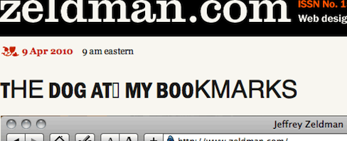
It looks great in Safari, Chrome, and Firefox, but not so nice in the latest version of Opera, where it resembles the inside-out test monkey in Cronenberg’s “The Fly.” (Okay, okay, it looks like a ransom note, but the monkey simile was more picturesque.)

And this, my friends, is why Typekit exists. Because even when you find a great font that’s optimized for screen display and can be licensed for CSS @font-face use, guess what? There is almost always some glitch or bug somewhere. And Typekit almost always seems to find and work around these bugs. It’s the kind of grueling task designers hate dealing with, and Typekit’s team loves solving.

If this were a client site, I’d switch to Typekit, or try licensing a different vendor’s Franklin, or (if neither of those options proved satisfactory) dump web fonts altogether and use Helvetica backed by Arial instead. But as this is zeldman.com, I’d rather nudge my friends at Opera to look into the problem and fix it. This will make browsing zeldman.com in Opera a somewhat weird experience, but hopefully it will help all Opera users in the long run.

Implementation Notes and Details

  • I haven’t made an SVG version yet, so the web fonts don’t work in iPhone or iPad.
  • iPhone and iPad see normal weight Helvetica instead of bold Helvetica, because if I leave “font-weight: bold” in the CSS declaration, Firefox double-bolds the font. This is not smart of Firefox. Fixed via technique below.
  • In order to match the impact of the previous Helvetica/Arial bold, I boosted the font-size from 25px to 32px. (This also helps smooth the font. Web fonts need more help in this regard than system fonts.)
  • Camino ignores @font-face and supports the first system font in the font stack, Helvetica Neue (correctly styled bold).

Update: Problem solved. See Opera Loves My Web Font.


Categories
cities Code Community conferences content content strategy CSS Design development eric meyer Happy Cog™ HTML HTML5 Seattle speaking Standards State of the Web Tools Usability User Experience UX Web Design Web Standards Zeldman

An Event Apart Seattle

Above: Part of my deck for “Put Your Worst Foot Forward,” a talk on learning from mistakes at An Event Apart Seattle 2010.

Greetings, web design fans. I’m in Seattle doing the final prep for three days of kick-ass design, code, and content. Starting Monday, April 5 and running through Wednesday, April 8, An Event Apart Seattle 2010 features 13 great speakers and 13 sessions, and has been sold out for over a month. A Day Apart, a special one-day learning experience on HTML5 and CSS3, follows the regular conference and is led by Jeremy Keith and Dan Cederholm.

The all-star cast includes …

… And that’s just the first day.

There are also two parties (sponsored by our good friends at Media Temple and MSNBC) and seven more great speakers with topics of interest to all standards-based web designers.

If you can’t be with us, follow the Twitter stream live on A Feed Apart.

Categories
Design Products Standards Web Standards Websites

Web Standards Trinkets

Support web standards website.

Support Web Standards: A collection of limited edition products, created so you can show your love and support for web standards.

Categories
Design Products Publications Standards Web Design Web Standards

Test Print

Coming soon to a web store near you.


Categories
Design Respect software Standards State of the Web The Essentials type Typography Usability Web Design Web Design History Web Standards Web Type Day Web Type Week webfonts webkit webtype

My Love/Hate Affair With Typekit

GEORGIA and Verdana, Lucida and (to a lesser extent) Arial and Times New Roman have served us well. For fifteen years, these cross-platform default fonts have been faithful stewards of our desire to read, write, design, and publish web pages. Yet we designers have always wanted more. As far back as 1994, we hoped for the day when we could brand our layouts as magazine and poster designers do, by setting our pages in Franklin or Garamond, our headlines in Futura or Rosewood. And since 1998, CSS2 has provided a standard way to embed any typeface, not just the fab five, on a web page.

In August, 2007, CSS co-creator and Opera Software CTO Håkon Wium Lie wrote CSS At Ten, reminding us that CSS provided a mechanism by which actual font files could be linked to and retrieved from the web. Soon after the article was published, “web fonts” discussions started popping up at interactive design festivals and my friend Jeffrey Veen got the idea for a product that would get web fonts happening without running afoul of inconsistent browser support, multiple format hangups, or type designer licensing agreements and piracy concerns.

Speeding up design acceptance

While browser improvements and web standards alone provided multiple partial solutions, Typekit offered a complete solution that just worked. And the people behind Typekit (including Bryan Mason and Jason Santa Maria) did everything right: they reached out to the type design, graphic design, and standards-based web design communities; they worked with vendor after vendor to offer as many fonts as possible; they spoke everywhere, marketing their venture one lecture and even one designer at a time.

Typekit excited the web design community about type and proved that licensing and hosting web type was a viable business, providing options and convenience for designers and their clients, while bringing new revenue to type designers and protecting their intellectual property.

Typekit is the tipping point

Publicly and truly, I support Typekit because it is getting us to the world of web fonts faster. We could wait indefinitely for type vendors to agree to industry-standard licensing terms and font formats. We could wait far longer for IE, Firefox, Safari, Chrome, Opera, Opera Mini, Mobile Safari, and the rest to support the same font formats. (Currently Firefox supports WOFF and TrueType, Safari and Chrome support TrueType, MobileSafari supports SVG, IE supports EOT, and on, and on.)

But with Typekit, we don’t have to bother our pretty little heads worrying about these inconsistencies, and we don’t have to sit on the sidelines, waiting for all font makers and all browser makers to support a single standard format.

Platforms and performance

Typekit works, and that helps web designers and type designers take “web fonts” seriously. Typekit’s success is even helping to make web designers and type designers more aware of platform problems that can make fonts hideous on various platforms. Georgia was designed for the screen. Garamond was not. Moreover, platforms vary the way they hint fonts (Apple throws out hinting altogether, Microsoft over-hints) and the way they render them (from purely pixellated to at least three varieties of sub-pixel anti-aliasing), making a font’s appearance on a given user’s system hard to predict.

If not for Typekit, we might have had to wait years for most or all type designers to license web fonts. Only then would we have discovered that body text set in anything other than Georgia and Verdana pretty much blows on many Windows OS, browser, and monitor combinations.

Thanks to Typekit, we all know about the problem, and type designers are re-hinting their fonts, and in some cases redesigning them for the screen.

For all this I and all of us can be grateful to Typekit.

They also understand that designers will only use “web fonts” if they have access to the fonts they need. Just as a huge selection enabled iTunes to dominate online music, Typekit’s makers know their service must offer pretty much every good typeface out there—and they are working on it.

Renting versus “owning”

All this said in Typekit’s favor, I have mixed feelings about their product because I’d rather buy a web-licensed font than rent it—and Typekit’s success at establishing the viability of a rental model means that individual type foundries will also rent their fonts—and those who succeed at renting their fonts to web designers may not be inclined to sell.

Of course you never really own the fonts you buy—you simply license their use. So the analogy of owning versus renting doesn’t exactly hold true. But a one-time font purchase as a line item in a design budget is easier to explain and sell to a client than an ongoing rental charge.

Web Standards and @font-face

My other qualm has to do with a preference for pure web standards over product-assisted web standards. I don’t know if my preference is ideological or just the way my mind works (or fails to). But, given my druthers, I’d rather see millions of websites using standard @font-face to link to self-hosted web-licensed fonts than see that same number of fonts using a service—even a brilliant service created by friends for whom I wish continued, deserved, great success. It must be a quirk of mind; there’s no other logical explanation for this preference.

For those who share this bias, possess the properly licensed fonts, and don’t mind using FTP and writing a little code, the CSS @Font-Face Generator by Font Squirrel provides an exceptionally easy way to automatically generate the font formats necessary to take all browsers (including mobile) into account—complete with automated Cufón backup and your choice of best-practice @font-face code strings.

See also FontSpring.

Read more

Categories
Browsers Microsoft Standards State of the Web type Web Design Web Design History Web Standards webkit

IE9 preview

Is it getting hot in here? Or is it just the flames?

In An Early Look At IE9 for Developers, Dean Hachamovitch, General Manager for Internet Explorer, reports on performance progress, web standards progress (border-radius, bits of CSS3, Acid 3 performance), and “bringing the power of PC hardware and Windows to web developers in the browser” (e.g. improved type rendering via Direct2D, a Windows sub-pixel rendering technology that replaces Cleartype).

The reported web standards improvements are encouraging, and better type rendering in IE is a consummation much to be desired. These positive notes notwithstanding, what is most interesting about the post is the political tightrope Microsoft team leaders are still forced to walk.

The world has moved to web standards, and Microsoft knows it must at least try to catch up. Its brilliant browser engineers have been working hard to do so. This web standards support is not optional: having just been spanked hard in Europe for anticompetitive practices, Microsoft knows it is no longer invincible, and cannot continue to use claims of innovation to stifle the overall market or drag its feet on advanced standards compliance.

At the same time, Microsoft’s marketing department wants the public to believe that IE and Windows are profoundly innovative. Thus efforts to catch up to the typographic legibility and beauty of Mac OS X and Webkit browsers are presented, in Dean Hachamovitch’s blog post, as leading-edge innovations. Don’t get me wrong: these improvements are desirable, and Direct2D may be great. I’m not challenging the quality of the hardware and software improvements; I’m pointing out the enforced bragging, which is mandated from on high, and which flies in the face of the humble stance other high-level divisions in Microsoft would like to enforce in the wake of the company’s European drubbing and the dents Apple and Google have made on its monopoly and invulnerability.

In short, the tone of these announcements has not changed, even though the times have.

Hachamovitch does an admirable job of sticking to the facts and pointing out genuine areas of interest. But he is stuck in a corporate box. A slightly more personal, down-to-earth tone would have come across as the beginnings of transparency—Web 1.1, if not Web 2.0—and a more transparent tone might have slightly reduced the percentage of flamebait in the post’s comments. (It could only have slightly reduced that percentage, because, on the internet, there is no such thing as a calm discussion of improvements to a Microsoft browser, but still.)

Although I disagree with the tone of many of the comments—rudeness to engineers is not admirable, kind, or helpful—I agree with the leading thoughts they express, which are:

  • Getting IE fully up to speed on web standards is much more important than introducing any proprietary innovations. (Naturally I agree with this, as it is, in a nutshell, what The Web Standards Project told browser companies back in 1998—and it is still true.)
  • Switching to Webkit might be a better use of engineering resources than patching IE.

On the other hand, Microsoft’s refusal to switch to Webkit gives Apple and Google a competitive advantage, and that is good because a web in which one browser has a monopoly stifles standards and innovation alike. By torturing the IE rendering engine every couple of years instead of putting it out of its misery, Microsoft contributes to the withering away of its own monopoly. That might not be good for the shareholders, but it is great for everyone else.

Categories
Fonts type Web Design Web Standards webfonts webtype

New Franklin in Town

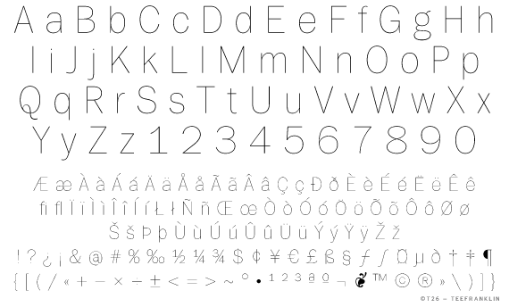
TeeFranklin by Tomi Haaparanta.

There’s a new Franklin in town. It’s TeeFranklin, designed by Tomi Haaparanta for T26. Haaparanta specializes in what we used to call grunge fonts, but you’d never know from his Franklin, which is classic and pure. In terms of available weights and styles (not to mention fanatical attention to detail), Haaparanta’s new font can’t compare to Font Bureau’s ITC Franklin, but TeeFranklin is a nice and clean, and comes in 14 weights, which may be enough. Better still, according to reader Ethan Dunham, it is licensed for @font-face embedding.