Category: UX
-

My UX Superpower: Nothing Works!
Maybe I’m special. Or unlucky. But things that supposedly work intuitively for most users tend to fail spectacularly for me. After stints in academia, journalism, advertising, and music, I poured myself into web design in…
-

The salad bar theory of UX professionalism
Less, but better? Not this week.
-
Cold Storage
Good UX is what companies do when they have to. A company that has your stuff locked away doesn’t have to.
-

Web typography: a refresher and history
A refreshing dip into what we’ve learned about web typography over the past 20+ years.
-
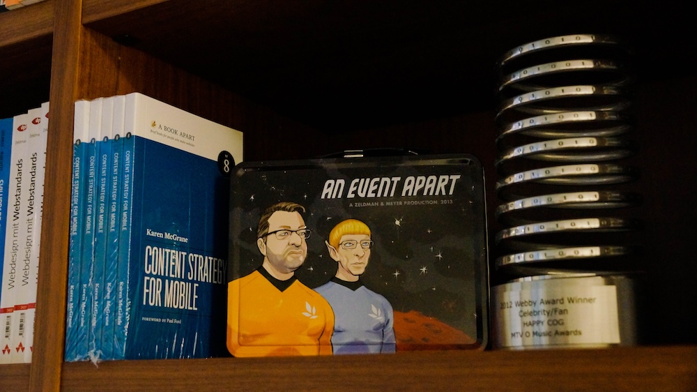
Of Books and Conferences Past
Of books and conferences past: A maker looks back on things well-made but no longer with us.
-
Web Design Inspiration
If you’re finding today a bit stressful for some reason, grab a respite by sinking into any of these web design inspiration websites.
-

This Web of Ours, Revisited
Why did leading designers in 2000 look down their nose at the web? And are things any better today?
-
CAPTCHA excludes disabled web users
The W3C explains how CAPTCHA excludes disabled users, and suggests alternatives that may be kinder and more reliable.
-

“Where the people are”
Fortunately, on that day, I allowed a strong, simple idea to penetrate my big, beautiful wall of assumptions.
-

In search of a digital town square
Ever since an infantile fascist billionaire (hereafter, the IFB) decided to turn Twitter over to the racially hostile anti-science set, folks who previously used that network daily to discuss and amplify topics they cared about…
-

Fly, my designers, fly!
Designers can either become drivers of business within their organizations, or they can create the businesses they want to drive. We’re entering an era of design entrepreneurship, in which some designers are realizing that they’re…
-
A faster horse
“The user is never wrong” means, when a user snags on a part of your UX that doesn’t work for her, she’s not making a mistake, she’s doing you a favor. To benefit from this…
-
My Night With Essl
Herewith, a scene from last night’s interview with legendary web & book designer (and Dean of The Cooper Union School of Art) Mike Essl, who shared his portfolio, career highlights, early web design history, and…
-
Amplifying voices
To inspire the next generation of black and brown designers…
-
Saving Your Web Workflows with Prototyping
Our static tools and linear workflows aren’t the right fit for the flexible, diverse reality of today’s Web. Making prototyping a central element of your workflows will radically change how you approach problem solution and…