Categories
Big Web Show Design people The Big Web Show The Profession Usability User Experience UX Web Design Web Design History Web Standards webfonts work

The Big Web Show: Mandy Brown is up. Dana Chisnell is next.

Mandy Brown (Typekit, A Book Apart) on The Big Web Show

BIG WEB SHOW EPISODE 32 is now online for your listening and viewing pleasure. Mandy Brown (Typekit, A Book Apart) joins Dan Benjamin and me to
discuss the value of customer support, the present and future of type on the web, font choice on reader platforms, what traditional print publishers can learn from the new breed of web-based print publishers, why you’ve got to write, and why the future belongs to editors.

Dan and I thank all of you for listening, watching, and contributing your questions and comments in the chat room during the live sessions. You’ve made our little show worthwhile. We promise more thought-provoking questions and more great guests in 2011.

Dana Chisnell, usability expert, on Episode 33

Join us Thursday, 6 January 2011 at 1:00 PM Eastern for the live recording of Episode 33, as Dan and I talk with Dana Chisnell, co-author, Handbook of Usability Testing Second Edition (Wiley, 2008) about her election design usability project for the US Government, plus usable security, researching social interactions mediated by technology, whether UX is a female ghetto, and lots more.

Categories
A List Apart content Usability User Experience UX

Testing Content (A List Apart 320)

WHETHER THE PURPOSE of your site is to convince people to do something, to buy something, or simply to inform, testing only whether they can find information or complete transactions is a missed opportunity: Is the content appropriate for the audience? Can they read and understand what you’ve written? Angela Colter shows how to predict whether your content will work (without users) and test whether it does work (with users). While you can’t test every sentence on your site, you don’t need to. Focus on tasks that are critical to your users and your business. Learn how to test the content to find out if and where your site falls short.

A List Apart: Testing Content by ANGELA COLTER.

Categories
Apple Applications apps Best practices Design Usability User Experience UX

Et tu, Jon Stewart?

The iTunes Store now features a Daily Show app. When you click to purchase it, the store tells you it doesn’t exist/isn’t available under this name.

Apparently, Apple or MTV Networks has withdrawn the app—and the news never made it to the database. How is this possible?

The error message indicates that the app “may be available” with a different price or “elsewhere on the store.” Neither of these possibilities turns out to be true.

Imagine a shoe store with special shoes highlighted in the window. When you try to buy them, the clerk says you can’t, but they “may be available” elsewhere in the store for a different price.

Somewhere, Steve Krug is quietly weeping.

Categories
Community Design tweets twitter Urbanism Usability User Experience UX

Anatomy of the Goodreads.com Friend Spam Dark Pattern

Goodreads.com is social cataloging service for books. In this post you will see how they’ve used the friend spam dark pattern, but how they’ve also failed to make it go viral. This makes it interesting to carry out a post mortem and work out what they should have done.”

Anatomy of the Goodreads.com Friend Spam Dark Pattern

(Hat tip: Andrew Travers.)

Categories
Design mobile software Standards State of the Web Touchscreen Usability User Experience UX

Touch-based App Design for Toddlers

As always, Luke Wroblewski nails it:  

When kids interact with software they explore and engage with anything that looks interesting. Especially if it looks like content. Graphical user interface components don’t.

Consider the example of Dr. Seuss’s ABC book on the iPad. The intro screen uses colorful blobs to bring attention to large hit targets. But tap on one of these elements and up pops a standard modal menu asking you to select from one of three options. Modal menu dialogs and kids don’t mix.

More at lukew.com.

Categories
Design facebook Usability User Experience UX

Support the families of the fallen, if Facebook lets you.

ONSTAR WILL DONATE up to $250,000 to the families of police officers killed in the line of duty. For every person who fans OnStar, they will donate a dollar to the families. This is a great cause; I encourage you to fan Onstar and help the families of the fallen.

Sadly, I can’t do so myself, as Facebook has told me I have too many friends and fan pages.

How many friends is too many? Whom should I remove? Which fan pages should I unlike, if I could manage Facebook likes?

Here’s the nuttier part. Although I can’t add friends or pages, people can still add me. Every day at least half a dozen people do so. Some of them may have attended An Event Apart. Some may like A List Apart or A Book Apart. Others may have read Designing With Web Standards. Or this website. In some cases I know why people are reaching out to me; in others I don’t. This doesn’t bother me. I pretty much always say yes to new Facebook friends.

My reward for contributing significantly to Facebook’s content and networks is that I can never add another friend or fan another page (although anyone can add me as a friend).

Fanning Onstar to help the families of the fallen is much more important than this silly problem. I don’t lose sleep worrying about the friends I can no longer make on Facebook. I’m not complaining for personal reasons. I just wanted to point out—for my friends who work at Facebook and read this site—that Facebook’s rules about friends are arbitrary, incomprehensible, and broken. And in this case, this foolishness hurts (however slightly) the families of fallen officers. And that’s really not right.

Categories
Design Usability User Experience UX

Managing Facebook Like. Or not.

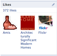
I’M ON FACEBOOK. I want to see everything I supposedly “like” and prune the list of things I don’t. There should be a page where I can do this—that’s UX Design 101—but instead there’s just a sidebar box on my profile page showing a rotating, random sampling of liked items. The box is fine as an outward-facing device: on my profile page, it gives visitors a teasing hint of some of the cool stuff a deep guy like me digs. But inward-facing-wise, as a tool for me to manage my likes, it’s useless.

At the top of sidebar box, there’s text stating that I currently have “372 likes.” The text is a hyperlink. Here’s what should happen when I click that link: I should be taken to a page listing my likes (or the first, say, 100 of my likes, with a pagination tool). Each liked item should link to its corresponding Facebook page in case I need to refresh my memory about it. (This is the one part Facebook actually gets right.) More importantly, each liked item should be preceded by a checkbox. I should be able to check off 50 items on the page that I no longer like, and press a button allowing me to delete them all at once.

A number of elegant variations will occur to even the least experienced interface designer at this point: Perhaps there’s a drop-down allowing me to choose functions other than deletion; perhaps there’s a link to “select all” or de-select all; and so on. Such variations could make Facebook’s hypothetical best-practice “like management” page easier, faster, or more pleasant to use. But they are pretty much beside the point, as Facebook does not provide a like management page when I click that stupid link.

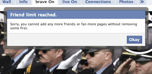
When I click that link, what I get instead of a useful, simple management page—the kind we’ve been building in hypertext for over 15 years—is a small, in-page pop-up window, with a scrolling sidebar … because, like the sidebar box, this window is also a tease instead of a tool.

Inside that scrolling box is every item I’ve liked. I have to scroll to see anything beyond the first handful of liked items. There are no checkboxes. There is no master switch to delete one or more items. There isn’t even an in-place deletion button beside each listed item, like the primitive edit tool in the first iPhone 3G.

No, my friends. There’s nothing.

If I want to delete a liked item, get this! I have to click the item’s hyperlink, go to the individual item page, and then hunt around on that page in search of a tiny link that would let me “unlike” that item. If I manage to find that link and unlike that one item, there’s no confirmation dialog, and I’m not returned to the floating box, because the item’s like page doesn’t know about the box.

All that JavaScript, and no connections. All those pages, and not even the most basic tools.

And nobody complains. Why? Because nobody really uses liked items. Indeed nobody really uses Facebook, except to post links and photos and comment on their friends’ links and photos. Liked items are for advertisers, they’re not for you. In Facebook’s estimation, you don’t need to remove a page you no longer like, because you are never going to visit it anyway.

Hey, they have the stats, they know what their users do and don’t do.

Facebook is a charnel house of features that appeal to advertisers and businesses without actually being used, supported by tools that don’t work, for people who don’t care.

Now I, uh, like Facebook fine, for the same reasons you do (if you do), and I generally ignore its well-branded but otherwise abortive gestures toward key features that have made it famous without actually doing a damned thing—“like” being the people’s Exhibit A. But as a designer, it bothers me, not only because badly designed things bother designers, but because badly designed things in a highly successful product spur a lust for imitation. I don’t want our clients to think “like” works. I don’t want them desiring similarly broken functionality on sites we design for them. I don’t want them thinking users don’t need tools that work, simply because millions of users don’t complain about broken tools on Facebook. Tools like like and its sad little pop-up.

Me no like.

Categories
Big Web Show Design New York City NYC The Big Web Show Usability User Experience UX Web Design Web Design History Web Standards

Making the web more awesome: Karen McGrane on the big web show this week


Karen McGrane, designer of The New York Times website and managing parter at Bond Art + Science is our guest on Episode #25 of The Big Web Show, taped live before an internet audience at 1:00 PM ET Thursday, 28 October at live.5by5.tv.

We will discuss putting publications online (Karen has worked with The Atlantic, The Week, Fast Company, and Conde Nast, and just launched National Journal), the horrifying state of content management, careers in web design and development, running a design business, teaching UX and design, and the explosive web and interaction design scene in New York City, where Karen has long been a major player.

If the internet is more awesome than it was in 1995, Karen would like to claim a very tiny piece of the credit. For more than 15 years Karen has helped create more usable digital products through the power of user experience design and content strategy. Today, as Managing Partner at Bond Art + Science, she develops web strategies and interaction designs for publishers, financial services firms, and healthcare companies.

Prior to starting Bond, Karen built the user-centered design practice at Razorfish in her role as VP and National Lead for User Experience. Karen is also on the faculty of the MFA in Interaction Design program at SVA in New York, where she teaches Design Management, which aims to give students the tools they need to run successful projects, teams, and businesses.

The Big Web Show (“Everything Web That Matters”) is recorded live in front of an internet audience every Thursday at 1:00 PM ET on live.5by5.tv. Edited episodes can be watched afterwards, often within hours of recording, via iTunes (audio feed | video feed) and the web. Subscribe and enjoy!

Categories
Design Information architecture interface twitter Usability User Experience UX

“Similar to You”

IN THE TRADITION of “People who bought ‘Assmasters’ also bought ‘Assmasters II,'” Twitter has chosen four of my Twitter friends and is presenting them to me as being “Similar to You.” Pray what does this odd-in-this-context phrase, with its “Related Products” vibe, mean? Does it mean if I like myself, I would also like these people? Surely not, for I already know that, as demonstrated by the fact that I follow them. Were they chosen for discussing similar subjects (e.g. design, web design, CSS, semantic markup)? Unlikely, as that would imply Google-like keyword data mining and analysis bordering on artificial intelligence.

Then, what? It can’t mean people whose tweets resemble mine, as the Twitter writing style and frequency of the listed friends is purely their own. People with whom I have followers in common? That seems most likely, but it’s just a guess.

I’m curious to know what Twitter and its new CEO (hi, Dick!) mean by this. What is the marketing purpose of this feature? Am I to view Twitter as an informal “personal brand analysis” service? That could be cool for me and for the four people who are “Similar” to me. But surely most users would be uninterested in such a service, unless, unbeknownst to me, nearly everyone who uses Twitter is a marketer who views it primarily as a channel. And most companies don’t spend money developing long-tail features, of interest only to a tiny fraction of their users.

I love Twitter. I wish I’d invented it, and not primarily because if I’d invented it I’d be taking the Japanese women’s gymnastics team on a round-the-world cruise. I wish I’d invented it because it is something really new on the internet, like the web, and filled with potential, like the web. As a designer, I pay attention to Twitter same as I do Apple, Google, Flickr, and Facebook. The new feature intrigues me precisely because its language feels “off” and its purpose eludes me.

Also of interest, although less so: what data is being used, and how is it being analyzed?

What’s your theory?

Categories
A List Apart Code CSS CSS3 Design Happy Cog™ HTML HTML5 Usability User Experience

ALA 314: Web Forms Magic

Issue No. 314 of A List Apart For People Who Make Websites is all about your form.

Ryan Seddon shows how to reduce errors and guide users to success via new methods made possible by HTML5 and CSS3. Harness HTML5 form input types and attributes to set validation constraints to check user input, and use CSS3’s new UI pseudo-classes to style validation states, making form completion quick and effortless.

And Luke Wroblewski explains how accordion forms increase completion rates and user happiness by dynamically showing and hiding sections of related questions as people complete the form—allowing them to focus on what matters and finish quickly. Learn how your smallest design decisions affect completion speed, which design choices make these innovative forms feel familiar and easy—and which make them feel foreign and complex, leading people to make errors.

Illustration by Kevin Cornell for A List Apart Magazine.

Categories
Design Usability User Experience UX Web Design

Best chart ever

xkcd: University Website.

Categories
A List Apart An Event Apart Appearances Best practices better-know-a-speaker conferences content content strategy creativity CSS CSS3 Curation Design Designers engagement eric meyer Happy Cog™ HTML HTML5 Ideas Images industry Minneapolis people photography Responsive Web Design Typography Usability User Experience UX W3C Web Design Web Standards webfonts Zeldman

Minneapolis Remembered

Eric Meyer at An Event Apart Minneapolis - photo by Jared Mehle

The show’s over but the photos linger on. An Event Apart Minneapolis was two days of nonstop brilliance and inspiration. In an environment more than one attendee likened to a “TED of web design,” a dozen of the most exciting speakers and visionaries in our industry explained why this moment in web design is like no other.

If you were there, relive the memories; if you couldn’t attend, steal a glance at some of what you missed: An Event Apart Minneapolis: the photo pool at Flickr.

Next up: An Event Apart DC and San Diego. These shows will not be streamed, simulcast, or repackaged in DVD format. To experience them, you must attend. Tickets are first-come, first-served, and every show this year has sold out. Forewarned is forearmed; we’d love to turn you on.


Photo: Jared Mehle.

Categories
A Book Apart A List Apart Accessibility Best practices Blogs and Blogging books Design Ideas The Essentials Usability User Experience UX Web Design Web Design History Web Standards

Responsive design is the new black

Collylogic.com, retooled as responsive design. The wide version.

The blog of Mr Simon Collison, retooled as responsive web design. The wide version.

Collylogic.com, retooled as responsive design. The narrow version.

The blog of Mr Simon Collison, retooled as responsive web design. The narrow version.

See more versions in Mr Collison’s “Media Query Layouts” set on Flickr.

Read the article that started it all. Coming soon as a book by Mr Ethan Marcotte from A Book Apart. (The current A Book Apart book, Mr Jeremy Keith’s HTML5 For Web Designers, ships Friday. Mr Ethan Marcotte will be our guest this Thursday, June 24, on The Big Web Show. Synchronicity. It’s not just an LP by The Police. Kids, ask your parents.)

The beauty of responsive web design becomes obvious when you see your site in smart phones, tablets, and widescreen desktop browsers. It’s as if your site was redesigned to perfectly fit that specific environment. And yet there is but one actual design—a somewhat plastic design, if you will. An extensible design, if you prefer. It’s what some of us were going for with “liquid” web design back in the 1990s, only it doesn’t suck. Powered by CSS media queries, it’s the resurrection of a Dao of Web Design and a spiffy new best practice. All the kids are doing it.

Well, anyway, some of the cool ones are. See also the newly retooled-per-responsive-design Journal by Mr Hicks. Hat tip: Mr Stocks. I obviously have some work to do on this site. And you may on yours.

Seen any good responsive redesigns lately?


Categories
podcasts The Big Web Show The Profession Usability User Experience UX

Episode 7: Jared Spool

The Big Web Show Episode 7, featuring usability guru Jared Spool.

Episode 7 of The Big Web Show is now online for your listening and viewing pleasure. In this most excellent episode, co-host Dan Benjamin and I talk with special guest Jared Spool about usability testing in the real world, with practical advice for designers, UI engineers, and developers alike.

Jared Spool is the founder of User Interface Engineering, the largest usability research organization of its kind in the world. He’s been working in the field of usability and design since 1978, before the term “usability” was ever associated with computers.

The Big Web Show features special guests and topics like the future of publishing, art direction online, content strategy, web fonts and typography, CMS shootouts, HTML5 and CSS3, building an audience, and more.

Watch on our website or via iTunes. If you like the show, review it on iTunes or become a member of the 5by5 network.


Categories
Design type Typography Usability Web Design Web Design History Web Standards webfonts webtype

Fink on Web Fonts

In Issue 307 of A List Apart for people who make websites:

Web Fonts at the Crossing

by Richard Fink

Everything you wanted to know about web fonts but were afraid to ask. Richard Fink summarizes the latest news in web fonts, examining formats, rules, licenses, and tools. He creates a checklist for evaluating font hosting and obfuscation services like Typekit; looks at what’s coming down the road (from problems of advanced typography being pursued by the CSS3 Fonts Module group, to the implications of Google-hosted fonts); and wraps up with a how-to on making web fonts work today.

A List Apart: Web Fonts at the Crossing


Illustration by Kevin Cornell for A List Apart