Category: State of the Web
-

The Courage to Stop
Brevity was always a discipline. Now it’s a statement.
-

RSS creator on Bluesky & AT Proto
Bluesky can’t abandon the developers who made a bet on AT Proto, so they should give the protocol to a standards body while catching up on UX.—Dave Winer
-

Mark your calendar: Local News Day is 9 April
It’s no secret that newspapers across the country exist in a fragile ecosystem. Automattic has long supported journalism and local media with investments in publications and platforms like Longreads, The Atavist, and Newspack. We believe that local news…
-
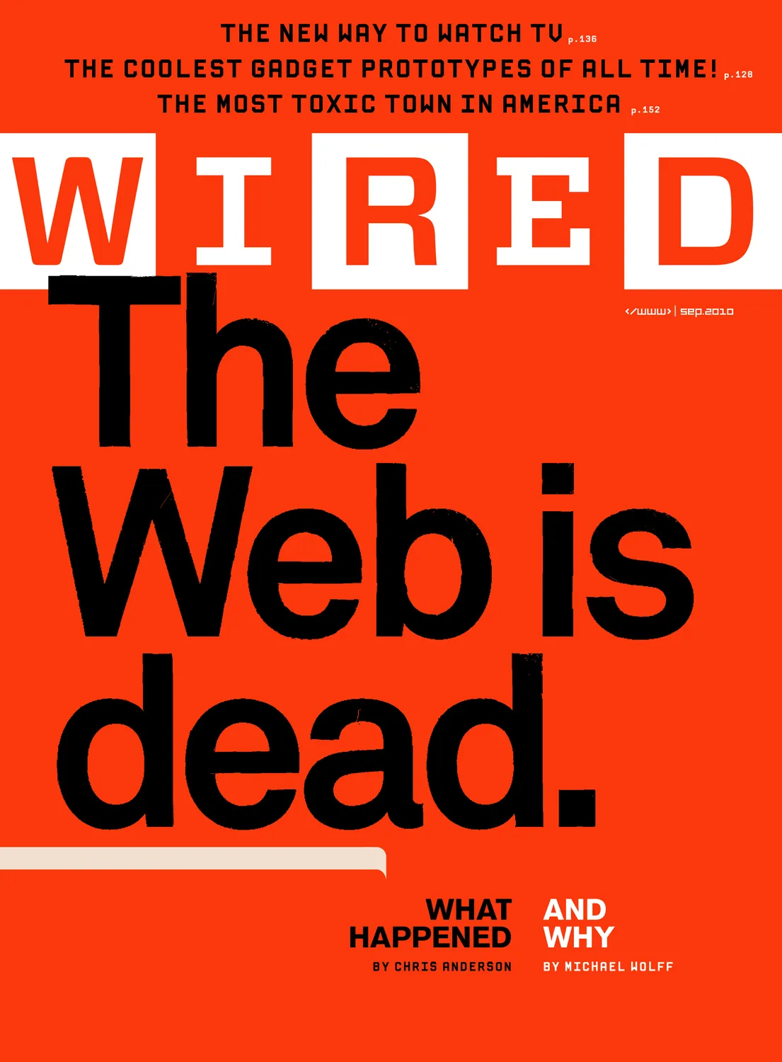
Receipts: a brief history of the death of the web.
They say AI will replace the web as we know it, and this time they mean it. Here follows a short list of previous times they also meant it, starting way back in 1997. Wired:…
-

Web typography: a refresher and history
A refreshing dip into what we’ve learned about web typography over the past 20+ years.
-

Your opt-innie wants to talk to your opt-outtie.
Scrapers gonna scrape.
-
Valediction.
What a ride that was.
-
Domain harvesting and the Twitter long game in retrospect
Tricking people into seeing unexpected content and converting some of them into customers is a tale as old as the web. It was the perfect model for the takeover.
-
Of Books and Conferences Past
Of books and conferences past: A maker looks back on things well-made but no longer with us.
-
Web Design Inspiration
If you’re finding today a bit stressful for some reason, grab a respite by sinking into any of these web design inspiration websites.
-
What happened to the Share button in Zoom?
Zoom has always included a clickable button/badge at the top left of its primary meeting interface window. Click the badge to copy the URL of that meeting. You can then, with just one more click…
-

This Web of Ours, Revisited
Why did leading designers in 2000 look down their nose at the web? And are things any better today?
-

The More Things Change… (or: What’s in a Job Title?)
I’m designing for the web. The infinitely flexible web.
-
Our Lady of Perpetual Profit
A business world with deeply misguided priorities—exemplified by horror stories from the worlds of tech, gaming, and entertainment—accounts for much worker unhappiness and customer frustration.