Categories
Big Web Show Design Publications Publishing Standards State of the Web

Big Web Show No. 66 | David Sleight on publishing, devices, and the web

David Sleight

IN BIG WEB SHOW Episode No. 66, Jeffrey Zeldman interviews veteran web designer and publishing creative director David Sleight about how traditional publishers can transition to creating successful digital experiences, and the (mostly conceptual) obstacles they will have to overcome to do so.

Topics discussed in this episode include: why publishers alternately blame technology and treat it as a savior; the downside for magazine publishers of Apple’s new retina display; why content thieves may be your best customers in waiting; content-focused responsive design versus printed page emulation; and much more.

David Sleight is one of the few people at the intersection of publishing and digital technology who actually understands both worlds. He is a web designer, creative director, and the founder of Stuntbox, a boutique interactive design consultancy based in Brooklyn, New York. Before launching Stuntbox, David helped build web-based textbooks at Pearson Education, and then went on to lead the Interactive Design department at BusinessWeek during one of its largest audience growth periods.

Listen to The Big Web Show #66: David Sleight.

Show Links

Subscribe to The Big Web Show

The Big Web Show features special guests and topics like web publishing, art direction, content strategy, typography, web technology, and more. Get episodes delivered to you automatically:

Categories
Best practices Brands business Ideas parenting Respect Self-Employment Standards Startups State of the Web The Essentials Web Design Web Design History wisdom zeldman.com

The maker makes: on design, community, and personal empowerment

THE FIRST THING I got about the web was its ability to empower the maker. The year was 1995, and I was tinkering at my first website. The medium was raw and ugly, like a forceps baby; yet even in its blind, howling state, it made me a writer, a designer, and a publisher ā€” ambitions which had eluded me during more than a decade of underachieving desert wanderings.

I say “it made me” but I made it, too. You get the power by using it. Nobody confers it on you.

I also got that the power was not for me alone: it was conferred in equal measure on everyone with whom I worked, although not everyone would have the time or desire to use the power fully.

The luckiest makers

Empowerment and desire. It takes extraordinary commitment, luck, and talent to become a maker in, say, music or film, because the production and distribution costs and risks in these fields almost always demand rich outside investors and tightly controlling corporate structures. (Film has held up better than music under these conditions.)

Music and film fill my life, and, from afar, I love many artists involved in these enterprises. But they are mostly closed to you and me, where the web is wide open, and always has been. We all know gifted, hard working musicians who deserve wide acclaim but do not receive it, even after decades of toil. The web is far kinder to makers.

To care is to share

Not only does the web make publishers of those willing to put in the work, it also makes most of us free sharers of our hard-won trade, craft, and business secrets. The minute we grab hold of a new angle on design, interaction, code, or content, we share it with a friend ā€”Ā or with friends we haven’t met yet. This sharing started in news groups and message boards, and flowered on what came to be called blogs, but it can also slip the bounds of its containing medium, empowering makers to create books, meet-ups, magazines, conferences, products, you name it. It is tough to break into traditional book publishing the normal way but comparatively easy to do it from the web, provided you have put in the early work of community building.

The beauty is that the community building doesn’t feel like work; it feels like goofing off with your friends (because, mostly, it is). You don’t have to turn your readers into customers. Indeed, if you feel like you’re turning your readers into customers, you’re doing it wrong.

If you see a chance, take it

The corollary to all this empowerment is that it’s up to each of us to do something positive with it. I sometimes become impatient when members of our community spend their energy publicly lamenting that a website about cats isn’t about dogs. Their energy would be so much better spent starting bow-wow.com. The feeling that something is missing from a beloved online resource (or conference, or product) can be a wonderful motivator to start your own. I created A List Apart because I felt that webmonkey.com wasn’t enough about design and highfive.com was too much about it. If this porridge is too hot and that porridge is too cold, I better make some fresh, eh?

I apologize if I sometimes seem snippy with whiners. My goal is never to make anyone feel bad, especially not anyone in this community. My message to my peers since the days of “Ask Dr Web” has always been: “you can do this! Go do it.” That is still what I say to you all.

Categories
Responsive Web Design Standards State of the Web

Required Reading. Multi-Device Web Design: An Evolution

LUKE WROBLEWSKI: As mobile devices have continued to evolve and spread, so has the process of designing and developing Web sites and services that work across a diverse range of devices. From responsive Web design to future friendly thinking, here’s how I’ve seen things evolve over the past year and a half: LukeW | Multi-Device Web Design: An Evolution.

Categories
Design Standards Zeldman

Shop Web Standards

GET YOUR STANDARDS ON! John Rainsford, working with your humble narrator, has crafted a sweet collection of limited edition products, designed to let you show your love and support for web standards.

What are you waiting for? Shop Web Standards now.

And we thank you.


Categories
Design industry Platforms Responsibility Standards State of the Web The Essentials

Say No to SOPA!

A LIST APART strongly opposes USHR 3261 AKA the Stop Online Piracy Act (SOPA), an ill-conceived lobbyist-driven piece of legislation that is technically impossible to enforce, cripplingly burdensome to support, and would, without hyperbole, destroy the internet as we know it.

SOPA approaches the problem of content piracy with a broad brush, lights that brush on fire, and soaks the whole web in gasoline. Learn why SOPA must not pass, and find out what you can do to help stop it.

A List Apart: Articles: Say No to SOPA.


Illustration by Kevin Cornell for A List Apart Magazine.

Categories
An Event Apart Announcements Appearances apps Atlanta Authoring Best practices business cities client services clients Code Community Compatibility conferences content content strategy creativity CSS CSS3 Design Designers development editorial Education eric meyer events Fonts Formats glamorous Happy Cogā„¢ HTML HTML5 Ideas industry Information architecture interface IXD Jeremy Keith Platforms Real type on the web Redesigns Responsive Web Design Scripting speaking spec Standards State of the Web The Profession Usability User Experience UX W3C Web Design Web Design History Web Standards webfonts webkit webtype work Working Zeldman

An Event Apart Atlanta 2011

YOU FIND ME ENSCONCED in the fabulous Buckhead, Atlanta Intercontinental Hotel, preparing to unleash An Event Apart Atlanta 2011, three days of design, code, and content strategy for people who make websites. Eric Meyer and I co-founded our traveling web conference in December, 2005; in 2006 we chose Atlanta for our second event, and it was the worst show we’ve ever done. We hosted at Turner Field, not realizing that half the audience would be forced to crane their necks around pillars if they wanted to see our speakers or the screen on which slides were projected.

Also not realizing that Turner Field’s promised contractual ability to deliver Wi-Fi was more theoretical than factual: the venue’s A/V guy spent the entire show trying to get an internet connection going. You could watch audience members twitchily check their laptops for email every fourteen seconds, then make the “no internet” face that is not unlike the face addicts make when the crack dealer is late, then check their laptops again.

The food was good, our speakers (including local hero Todd Dominey) had wise lessons to impart, and most attendees had a pretty good time, but Eric and I still shudder to remember everything that went wrong with that gig.

Not to jinx anything, but times have changed. We are now a major three-day event, thanks to a kick-ass staff and the wonderful community that has made this show its home. We thank you from the bottoms of our big grateful hearts.

I will see several hundred of you for the next three days. Those not attending may follow along:

Categories
Standards State of the Web W3C Web Design History

W3C Finalizes CSS 2.1; Meyer, Gustafson, Pope, and Malarkey weigh in.

CASCADING STYLE SHEETS Level 2 Revision 1 (CSS 2.1) Specification (or CSS 2.1 to its friends) has become a real boy, with W3C stamping its seal of approval and making the spec aĀ W3C Recommendation. But in an age of rapidly iterating browsers that are already working hard to win the race regarding CSS3 compatibility, is the W3C now an anachronism? Standard[s] advocates donā€™t seem to think so.”

ā€”Craig Grannell, .net magazine, 9 June 2011 It’s official: W3C finalises CSS 2.1

Categories
Standards State of the Web

Twitter and Facebook Kill RSS

It seems Twitter has completely removed the ability to consume their feeds via the open standard of RSS in favor of their more proprietary API formats. At the same time, Facebook seems to have done the same.

via Stay N Alive: Twitter and Facebook Both Quietly Kill RSS, Completely.

Categories
Code Compatibility Design Responsibility Responsive Web Design Standards State of the Web Usability User Experience UX Web Design Web Design History Web Standards

ā€œMobileā€ versus ā€œSmall Screenā€

As we try to become more responsive with our designs, a lot of attention has been focused on providing “mobile” styles. We’ve all been adding viewport meta tags to our templates and @media screen and (max-device-width: 480px) to our stylesheets.

It’s very tempting (and scope-friendly) to tell a client that we can adjust their site for mobile users, when much of the time what we’re actually doing is simply adjusting a design for small screens.

…Simply adjusting a design for a smaller screen and calling it ā€œmobileā€ does a disservice to both mobile users and developers. Making link targets bigger and image sizes smaller does help the mobile user, but it only addresses the surface issues of usability and readability. It doesnā€™t address their need to do things easily and quickly.

via Itā€™s the Little Things – ā€œMobileā€ versus ā€œSmall Screenā€.

Categories
Authoring Best practices business conferences content Deck, the Design Standards State of the Web SXSW

Complete Audio: Jeffrey Zeldman’s Awesome Internet Design Panel from SXSW Interactive 2011

Jeffrey Zeldman's Awesome Internet Design Panel

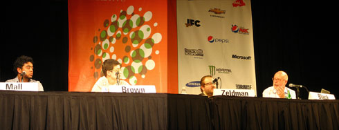
Mandy Brown, Roger Black, Daniel Mall and I discuss the state of web design and publishing at SXSW Interactive, Sunday March 13, 2011.

Photos courtesy Adactio. Audio element courtesy HTML5. Sorry, no transcript is available at this time.

Categories
business Design experience Standards State of the Web Stories Teaching The Essentials The Profession

Our Jobs In Cyberspace: Craft Vocabulary vs. Storytelling

AFTER ALL THESE YEARS designing websites and applications, I still don’t think in words like “affordance.” And when my colleagues use a word like that, my mental process still clatters to a halt while I seek its meaning in a dusty corner of my brain. (When someone says “affordance,” there’s always a blank where thought stops, and then I see a mental image of a finger pushing a button or stroking a surface. Somehow that one image stands in for everything I know about what “affordance” means, and I’m able to jump back into the discussion and catch up with everyone else.)

Should you ask B.B. King if the lick he just played was in Lydian Mode, he could probably answer you after stopping to think about it. But after all these years playing blues guitar, B.B. King doesn’t say to himself, “I’m going to switch to a Lydian scale here,” he just plays blues. Scales and vocabulary are necessary when we are learning the craft behind our art. But the longer we practice, the more intuitive our work becomes. And as it becomes more intuitive, it disconnects further and further from language and constructs.

This is why young practitioners often argue passionately about theory while older practitioners tell stories and draw pictures.

Of course any practitioner, green or experienced, can create a word to describe the work we are inventing together, just as anyone, young or old, can have the next great idea. And it is most often the young who come up with exciting new ideas in UX and design and on the internetā€”possibly because they are still exploring theories and trying on identities, while those who work more intuitively may shut themselves off from the noise of new ideas, the better to perfect a long-term vision.

But the nice thing about the experience arc I’m proposing is that it allows younger practitioners to use words like “affordance” when working together to create a website or application (and soon we will stop distinguishing between those two things), while the older, storyteller practitioners use simpler, down-to-earth language to sell the work to clients, investors, or users.

We need both kinds of practitionersā€”theorists and those for whom everything has become intuitive second natureā€”just as we need both kinds of communication (craft vocabulary and storytelling) to do Our Jobs in Cyberspace.ā„¢ Don’t you think?

Where are you on this arc? Are you the kind of designer who gets fired up from reading a new theory? Or do you sketch and stumble in the dark, guided only by some Tinker Bell twinge in the belly that tells you no, no, no, no, hmm, maybe?

Categories
A Book Apart A List Apart An Event Apart better-know-a-speaker Code Community conferences content strategy Design Designers DWWS Happy Cogā„¢ HTML HTML5 industry Interviews ipad iphone IXD Standards State of the Web The Essentials The Profession type Typekit UX W3C Web Design Web Design History Web Standards Zeldman zeldman.com

Webvanta Video: Jeffrey Zeldman on the State of Web Design

From the floor of An Event Apart Seattle 2011:

Jeffrey Zeldman at An Event Apart Seattle 2011.

“Mobile is huge. The iPhone, iPad, and Android are huge. On the one hand, they are standards-facing, because they all support HTML5 and CSS3, so you can create great mobile experiences using web standards. You can create apps using web standards. On the other hand, there is also the temptation to go a proprietary route. In a strange way, although the browsers are much more standards compliant, it seems like we are redoing the browser war. Only now, itā€™s not the browser wars, itā€™s platform wars.”

Video interview, plus transcript: Interview with Jeffrey Zeldman on the State of Web Design. Thank you, Michael Slater.

Categories
An Event Apart Applications Best practices business Design mobile Standards State of the Web Surviving

A Day Apart: Live Notes on Mobile Web Design with Luke Wroblewski

Luke Wroblewski, A Day Apart, Mobile Design

A FEW QUICK NOTES from the first hour of A Day Apart: Mobile Web Design, an all-day learning session led by Luke Wroblewski (aka Day III of An Event Apart Seattle), Bell Harbor Conference Center, Seattle, WA:

Audience questions for Luke

  1. How to take a website for desktop to mobile?
  2. Do we need to care about non-Webkit?
  3. Trade-offs between native and web
  4. How to navigate differences between different versions of Webkit?
  5. Mobile e-commerce: best practices
  6. Challenges with different cultures/languages
  7. Media queries
  8. If no budget, what can focus on web to make mobile ok?
  9. How to take a website for desktop to mobile?
  10. Mobile e-commerce best practices
  11. Multiple screen sizes and pixel densities
  12. Time for one project: go mobile or tablet (in e-commerce)
  13. CMSes and mobileā€”sigh
  14. Best practices for page load

WHY MOBILE? Convincing clients/bosses to care

  • Of the 50% of total mobile commerce in the US, 70% of it is coming from one iPhone application (eBay).
  • eBay: global mobile sales $2 billion in 2010, $600 million in 2009. Real commercial opportunities emerging on mobile.
  • Best Buy: mobile web users doubling every year: 30M (2010), 17M (2009), 6M (2008).
  • PayPal: mobile transactions increased six-fold in 2009: $25M to $141M.

SOCIAL

  • Double-digit (28%) rise in social networking on mobile web.
  • Twitter: 40% of tweets sent via mobile, 16% of new users start on mobile.
  • Facebook: 200 million active mobile users.
  • Instagram: iPhone only app took three months to hit one million users. Six weeks later they hit two million users.
  • Mixi (Japan): 85% of page views on mobile vs. 14% 4.5 years ago.

PRODUCTIVITY AND MEDIA

  • Google: mobile searches grew 130% in Q3 2010
  • Pandora: 50% of total user base subscribes to the service on mobile
  • Email: 70% of smartphone users have accessed email on mobile device

“I don’t want to be the record executive clinging to CD sales.”

ADDITIONAL USAGE

Yelp: every other second a consumer calls a local business and generates driving directions from a Yelp mobile app.]]27% of all Yelp searches come from their iPhone application, which had 1.4 million unique users in May 2010.

Zillow.com: Viewing active listings 45% more often from mobile devices (audience is primarily active buyers, on location or scoping out neighborhoods)

Facebook: People who use Facebook on their mobile devices (200M active) are twice as active on Facebook as non-mobile users.

Shift in Usage

Let’s look at Gmail:

  • Visitors to web-based emails sites declined 7%.
  • Visitors accessing email on mobile devices increased 36%.

But what about mobile web usage?

Twitter Usage

40% of tweets sent via mobile.

16% of new users start on mobile.

Mobile web usage

  • Mobile phones will overtake PCs as the most common web access devices worldwide by 2013.
  • 600% growth in traffic to mobile websites in 2010.
  • Facebook and Twitter access via mobile browser grows by triple digits in 2010.
  • Average smartphone user visits up to 24 websites per day.
  • Top 50 websites constitute only 40% of mobile visits.
  • Opera Mini traffic up 200% year/year.

For more…

Follow the live tweets at afeedapart.com.

Categories
"Digital Curation" Advocacy Appearances art direction Authoring Best practices business Community conferences content content strategy Design development editorial Education engagement Ideas Micropublishing Molehill Platforms Publications Publishing Responsibility Standards State of the Web The Essentials The Profession Usability User Experience UX Web Design Zeldman

You are all in publishing!

ON SUNDAY, while leading a discussion on the future of web design and publishing, I noticed a slightly confused look appearing on some faces in the audience. The discussion had been billed as “Jeffrey Zeldman’s Awesome Internet Design Panel,” and I thought perhaps there was a disconnect for some in the audience between “design” and such topics as where content comes from and who pays for it.

So I asked, “Who here is in publishing?”

A few hands were gently raised.

Uh-huh. “And how many of you work on the web?”

Every right hand in the room shot up.

“You are all in publishing,” I explained.

Now, I like a good rounded corner talk as much as the next designer. I’ve given my share of them. Also of line height and measure, color and contrast, how to design things that don’t work in old versions of Internet Explorer, and so on. In the practice of web and interaction design, there will always be a place for craft discussionsā€”for craft is execution, and ideas without execution are songs without music, meaningless.

But right now (and always) there is a need for design to also be about the big strategic issues. And right now, as much as design is wrestling with open vs. proprietary formats and the old challenges of new devices, design is also very much in the service of applications and publishing. Who gets content, who pays for it, how it is distributed (and how evenly), the balance between broadcast and conversation, editor and userā€”these are the issues of this moment, and it is designers even more than editors who will answer these riddles.

Categories
Announcements Appearances Authoring Best practices Brands Design Designers development E-Books editorial events glamorous HTML5 industry Interviews Luls Microauthoring Microblogging microformats Micropublishing Molehill New Riders Platforms plugins podcasts Publications Publishing Real type on the web Responsive Web Design software Standards State of the Web Tempest The Big Web Show This never happens to Gruber twitter type Typekit Urbanism Usability User Experience UX W3C Web Design Web Design History Web Standards webfonts webkit Websites Zeldman zeldman.com

Questions, Please: Jeffrey Zeldman’s Awesome Internet Design Panel today at SXSW Interactive

HEY, YOU WITH THE STARS in your eyes. Yes, you, the all too necessary SXSW Interactive attendee. Got questions about the present and future of web design and publishing for me or the illustrious panelists onĀ Jeffrey Zeldman’s Awesome Internet Design Panel at SXSW Interactive 2011? You do? Bravo! Post them on Twitter using hashtag #jzsxsw and we’ll answer the good ones at 5:00 PM in Big Ballroom D of the Austin Convention Center.

Topics include platform wars (native, web, and hybrid, or welcome back to 1999), web fonts, mobile is the new widescreen, how to succeed in the new publishing, responsive design, HTML5, Flash, East Coast West Coast beefs, whatever happened to…?, and many, many more.

Comments are off here so you’ll post your questions on Twitter.

The panel will be live sketched and live recorded for later partial or full broadcast via sxsw.com. In-person attendees, arrive early for best seats. Don’t eat the brown acid.