Categories
Blue Beanie Day books Browsers creativity CSS CSS3 Design Designers DOM DWWS E-Books editorial Happy Cog™ HTML HTML5 Ideas industry tweets twitter Voting W3C Web Design Web Design History Web Standards webtype XHTML Zeldman

Blue Beanie Day Haiku Contest – Win Prizes from Peachpit and A Book Apart

ATTENTION, web design geeks, contest fans, standards freaks, HTML5ophiles, CSSistas, grammarians, bookworms, UXers, designers, developers, and budding Haikuists. Can you do this?

Do not tell me I
Am source of your browser woes.
Template validates.

Write a web standards haiku (like that one), and post it on Twitter with the hashtag #bbd4 between now and November 30th—which happens to be the fourth international Blue Beanie Day in support of Web Standards.

Winning haikus will receive free books from Peachpit/New Riders (“Voices That Matter”) and A Book Apart.

Ethan Marcotte, co-author of Designing With Web Standards 3rd Edition and I will determine the winners.

Enter as many haikus as you like. Sorry, only one winning entry per person. Now get out there and haiku your heart out!

See you on Blue Beanie Day.

P.S. An ePub version of Designing With Web Standards 3rd Edition is coming soon to a virtual bookstore near you. Watch this space.

Categories
blogger Blogs and Blogging Community content content strategy Happy Cog™ Ideas

Cognition: Behind the Music

Happy Cog president Greg Storey describes the thinking behind our latest little experiment in online publishing and community:

Last week we launched Cognition, a studio blog, that replaced the traditional open-mic text area commenting system with two options: Either post a response via your own Twitter account or link to a post on your own blog.

As the primary instigator, Mr. Storey explains his and the agency’s rationale for doing away with traditional comments:

The problem with most comment threads is that they can reach that useless tipping point very quickly. Without having an active moderator to keep up with all of the various threads it’s practically impossible to provide any sort of conversational value.

Meanwhile we have also informally noticed a decline in blog usage since the wider adoption of Twitter within our community. … Happy Cog loves blogs. … What if we could help bring some life back into the old network by encouraging people to write blog posts when they have more to say than what can fit into one-hundred-and-forty characters?

Read more and comment if you wish: Airbag: Babylon.

Categories
A List Apart content content strategy CSS Design HTML Ideas industry Information architecture javascript Standards State of the Web Web Design

ALA 313: CS, CMS, H&J, OK!

Issue No. 313 of A List Apart, for people who make websites.

In Issue No. 313 of A List Apart for people who make websites: Better content management systems start with content strategy; typographically beauteous web pages may benefit from hyphenation and justification.

Strategic Content Management

by JONATHAN KAHN

Any web project more complex than a blog requires custom CMS design work. It’s tempting to use familiar tools and try to shoehorn content in—but we can’t select the appropriate tool until we’ve figured out the project’s specific needs. So what should a CMS give us, apart from a bunch of features? How can we choose and customize a CMS to fit a project’s needs? How can content strategy help us understand what those needs really are? And what happens a day, a week, or a year after we’ve installed and customized the CMS?

Published in: Content Strategy

The Look That Says Book

by RICHARD FINK

Hyphenation and justification: It’s not just for print any more. Armed with good taste, a special unicode font character called the soft hyphen, and a bit o’ JavaScript jiggery, you can justify and hyphenate web pages with the best of them. Master the zero width space. Use the Hyphenator.js library to bottle fame, brew glory, and put a stopper in death. Create web pages that hyphenate and justify on the fly, even when the layout reflows in response to changes in viewport size.

Published in: Layout, Typography


Illustration by Kevin Cornell for A List Apart

Categories
A List Apart An Event Apart Announcements Appearances Applications architecture art direction Best practices Browsers chrome Code CSS CSS3 Damned Fine Journalism Design Designers editorial Education engagement glamorous Happy Cog™ HTML HTML5 Ideas industry interface ipad iphone launches Layout photography Press Publications Publishing Real type on the web Responsive Web Design Standards State of the Web The Big Web Show The Essentials The Profession This never happens to Gruber type Typography User Experience UX W3C Web Design Web Design History Web Standards webfonts webkit Websites webtype writing Zeldman zeldman.com

I guest-edit .net magazine

Web 2.1. Zeldman guest-edits .net magazine.

A List Apart and .net magazine have long admired each other. So when .net editor Dan Oliver did me the great honor of asking if I wished to guest edit an issue, I saluted smartly. The result is now arriving in subscriber post boxes and will soon flood Her Majesty’s newsstands.

In .net magazine Issue No. 206, on sale 17th August in UK (and next month in the US, where it goes by the name “Practical Web Design”), we examine how new standards like CSS3 and HTML5, new devices like iPhone and Droid, and maturing UX disciplines like content strategy are converging to create new opportunities for web designers and the web users we serve:

  • Exult as Luke Wroblewski shows how the explosive growth of mobile lets us stop bowing to committees and refocus on features customers need.
  • Marvel as Ethan Marcotte explains how fluid grids, flexible images, and CSS3 media queries help us create precise yet context-sensitive layouts that change to fit the device and screen on which they’re viewed.
  • Delight as Kristina Halvorson tells how to achieve better design through coherent content wrangling.
  • Thrill as Andy Hume shows how to sell wary clients on cutting-edge design methods never before possible.
  • Geek out as Tim Van Damme shows how progressive enhancement and CSS3 make for sexy experiences in today’s most capable browsers—and damned fine experiences in those that are less web-standards-savvy.

You can also read my article, which asks the musical question:

Cheap, complex devices such as the iPhone and the Droid have come along at precisely the moment when HTML5, CSS3 and web fonts are ready for action; when standards-based web development is no longer relegated to the fringe; and when web designers, no longer content to merely decorate screens, are crafting provocative, multi-platform experiences. Is this the dawn of a newer, more mature, more ubiquitous web?

Today’s web is about interacting with your users wherever they are, whenever they have a minute to spare. New code and new ideas for a new time are what the new issue of .net magazine captures. There has never been a better time to create websites. Enjoy!


Photo by Daniel Byrne for .net magazine. All rights reserved.

Categories
Browsers bugs Code Compatibility CSS CSS3 development Free Happy Cog™ HTML HTML5 Ideas industry links Standards State of the Web The Essentials The Profession Tools Web Design Web Design History Web Standards

HTML5, CSS3 default templates

Free for use in all web projects, professional or personal, HTML5 Reset by Monkey Do! is a set of HTML5 and CSS templates that jumpstart web development by removing the styling native to each browser, establishing basic HTML structures (title, header, footer, etc.), clearing floats, correcting for IE problems, and more.

Most of us who design websites begin every project with bits and pieces of this kind of code, but developer Tim Murtaugh, who created these files and who modestly thanks everyone in the universe, has struck a near-ideal balance. In these lean, simple files, without fuss or clutter, he manages to give us the best-practices equivalent of everything but the kitchen sink.

Tim Murtaugh sits beside me at Happy Cog, so I’ve seen him use these very files (and earlier versions of them) to quickly code advanced websites. If you’re up to speed on all the new hotness, these files will help you stay that way and work faster. If you’re still learning (and who isn’t?) about HTML5, CSS3, and browser workarounds, studying these files and Tim’s notes about them will help you become a more knowledgeable web designer slash developer. (We need a better name for what we do.)

My daughter calls Mr Murtaugh “Tim the giant.” With the release of this little package, he earns the moniker. Highly recommended.

Categories
Brands Design Ideas

Color logos


Gosh knows how they reproduce in newspaper or how effectively they can be translated into favicons, but there’s no denying that there are some lovely works in Wsblogz.com’s gallery of color logos.

Categories
A List Apart An Event Apart Appearances Best practices better-know-a-speaker conferences content content strategy creativity CSS CSS3 Curation Design Designers engagement eric meyer Happy Cog™ HTML HTML5 Ideas Images industry Minneapolis people photography Responsive Web Design Typography Usability User Experience UX W3C Web Design Web Standards webfonts Zeldman

Minneapolis Remembered

Eric Meyer at An Event Apart Minneapolis - photo by Jared Mehle

The show’s over but the photos linger on. An Event Apart Minneapolis was two days of nonstop brilliance and inspiration. In an environment more than one attendee likened to a “TED of web design,” a dozen of the most exciting speakers and visionaries in our industry explained why this moment in web design is like no other.

If you were there, relive the memories; if you couldn’t attend, steal a glance at some of what you missed: An Event Apart Minneapolis: the photo pool at Flickr.

Next up: An Event Apart DC and San Diego. These shows will not be streamed, simulcast, or repackaged in DVD format. To experience them, you must attend. Tickets are first-come, first-served, and every show this year has sold out. Forewarned is forearmed; we’d love to turn you on.


Photo: Jared Mehle.

Categories
Acclaim Applications apps architecture art direction Authoring Best practices Browsers business Career Code creativity CSS Design development HTML HTML5 Ideas industry interface ipad iphone javascript links maturity Photoshop Platforms Publishing Standards State of the Web Stories The Profession Web Design Web Design History Web Standards

SlideShowPro adds HTML5

Todd Dominey at Happy Cog.

Most of us web folk are hybrids of one sort or another, but Todd Dominey was one of the first web designers to combine exceptional graphic design talent with serious mastery of code.

Being so good at both design and development that you could easily earn a fine living doing just one of them is still rare, although it looks like the future of our profession. One of the first serious designers to embrace web standards, Todd was also one of the few who did so while continuing to achieve recognition for his work in Flash. (Daniel Mall, who came later, is another.)

Finally, Todd was one of the first—along with 37signals and Coudal Partners—to abandon an enviably successful client services career in favor of full-time product development, inspiring a generation to do likewise, and helping bring us to our current world of web apps and startups.

A personal project that became an empire

In Todd’s case, the product was SlideShowPro, a project he designed for himself, which has grown to become the web’s most popular photo and video slideshow and gallery viewer. When you visit a photographer’s portfolio website, there’s an excellent chance that SlideShowPro powers its dynamic photo viewing experience. The same is true for the photo and video gallery features of many major newspaper and magazine sites, quite possibly including your favorites.

SlideShowPro

But deliberate lack of Flash support in the iPad and iPhone, while lauded here on February 1, 2010 as a win for accessible, standards-based design (“Not because Flash is bad, but because the increasing popularity of devices that don’t support Flash is going to force recalcitrant web developers to build the semantic HTML layer first”), presented a serious problem for developers who use SlideShowPro and readers who enjoy browsing dynamic photo and video galleries.

Mr Dominey has now solved that problem:

SlideShowPro Mobile is an entirely new media player built using HTML5 that doesn’t require the Flash Player plugin and can serve as a fallback for users accessing your web sites using these devices. But it’s not just any fallback — it’s specially designed for touch interfaces and smaller screen sizes. So it looks nothing like the SlideShowPro player and more like a native application that’s intuitive, easy to use, and just feels right.

The best part though is that because SlideShowPro Director (which will be required) publishes the mobile content, you’ll be able to provide the mobile alternative by simply updating the Flash Player embed code in your HTML documents. And just like when using the SlideShowPro player, because Director is behind the scenes, all your photos will be published for the target dimensions of these devices — which gives your users top quality, first generation images. The mobile player will automatically load whatever content is assigned to the Flash version, so the same content will be accessible to any browser accessing your web site.

A public beta will be released in the next weeks. Meanwhile, there is a video demo. There’s also an excellent Question and Answer page that answers questions you may have, whether you’re a SlideShow Pro customer or not. For instance:

Why mobile? Why not desktop?

We believe that (on the desktop) Flash is still the best delivery method for photo/video galleries and slideshows for it provides the most consistent user experience across all browsers and the broadest range of playback and customization options. As HTML5 support matures across all desktop browsers, we’ll continue to look into alternate presentation options.

Into the future!

Categories
37signals Acclaim Announcements Appearances Applications apps Authoring Best practices better-know-a-speaker business Chicago client services Code Coudal Partners Design ethics HTML Ideas industry interface Interviews Journalism at its Finest Press Products Publications Publishing Respect Ruby on Rails Small Business State of the Web The Big Web Show The Essentials The Profession User Experience

37signals’ Jason Fried live today on The Big Web Show

I have known 37signals CEO Jason Fried since he was a young copywriter who reminded me of me, only smarter and more confident. Like many of you, with a mixture of awe and pleasure, I have watched him change our industry, along with book publishing and business generally. Dan Benjamin and I are delighted to announce the mercurial Mr Fried as our guest on The Big Web Show. Join us today, 1 July 2010, for the live taping at 1:00 PM ET.

Jason’s official bio is brief, but he can write at length when he wishes: see Rework, Getting Real, and Defensive Web Design, each a classic, and to each of which he was principal co-writer and guiding force. Besides saying no to meetings, contracts, and VC money, Jason and 37signals are famous for godfathering a speedy, iterative form of web application design; for gifting the industry with Ruby on Rails; for creating a suite of beloved (yes, really) business productivity web apps; for mastering and then abandoning client services in favor of making stuff; for somehow, in the midst of all that busyness, churning out tons of fine content on their popular blog; and for being roommates with the equally fantastic Coudal Partners.

Can’t wait to interview Jason Fried in front of a live internet audience today. Hope you’ll join us.

The Big Web Show is taped live in front of an internet audience every Thursday at 1:00 PM ET on live.5by5.tv. Edited episodes can be watched afterwards (often within hours of taping) via iTunes (audio feed | video feed) and the web.

Photo © John Morrison – Subism.com

Categories
A Book Apart A List Apart Accessibility Best practices Blogs and Blogging books Design Ideas The Essentials Usability User Experience UX Web Design Web Design History Web Standards

Responsive design is the new black

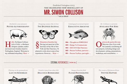
Collylogic.com, retooled as responsive design. The wide version.

The blog of Mr Simon Collison, retooled as responsive web design. The wide version.

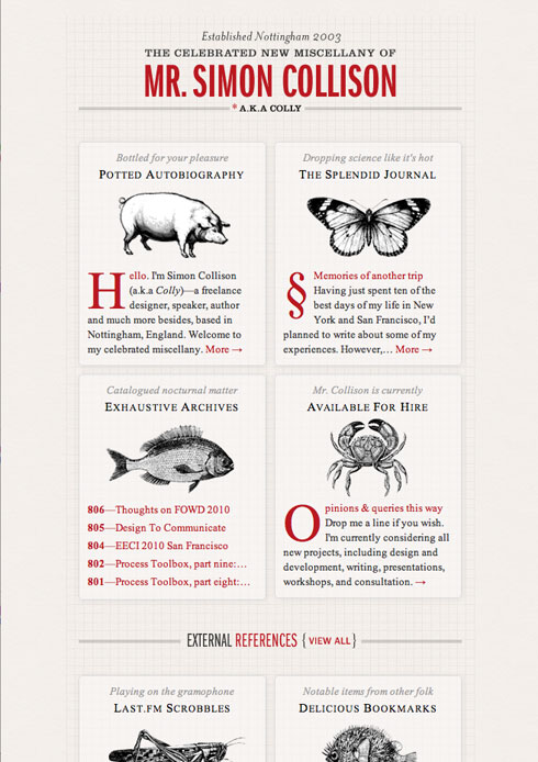
Collylogic.com, retooled as responsive design. The narrow version.

The blog of Mr Simon Collison, retooled as responsive web design. The narrow version.

See more versions in Mr Collison’s “Media Query Layouts” set on Flickr.

Read the article that started it all. Coming soon as a book by Mr Ethan Marcotte from A Book Apart. (The current A Book Apart book, Mr Jeremy Keith’s HTML5 For Web Designers, ships Friday. Mr Ethan Marcotte will be our guest this Thursday, June 24, on The Big Web Show. Synchronicity. It’s not just an LP by The Police. Kids, ask your parents.)

The beauty of responsive web design becomes obvious when you see your site in smart phones, tablets, and widescreen desktop browsers. It’s as if your site was redesigned to perfectly fit that specific environment. And yet there is but one actual design—a somewhat plastic design, if you will. An extensible design, if you prefer. It’s what some of us were going for with “liquid” web design back in the 1990s, only it doesn’t suck. Powered by CSS media queries, it’s the resurrection of a Dao of Web Design and a spiffy new best practice. All the kids are doing it.

Well, anyway, some of the cool ones are. See also the newly retooled-per-responsive-design Journal by Mr Hicks. Hat tip: Mr Stocks. I obviously have some work to do on this site. And you may on yours.

Seen any good responsive redesigns lately?


Categories
A Feed Apart An Event Apart better-know-a-speaker Boston Community conferences content content strategy creativity CSS Design engagement eric meyer events glamorous HTML5 Ideas industry Information architecture interface Standards State of the Web The Profession W3C Web Design Web Standards XHTML

Boston Bound

Plane travel versus train travel, that sort of thing.

Morning finds me bound by train for Boston, capital of Massachusetts, land of Puritans, patriots, and host of the original Tea Party. Center of high technology and higher education. Where the John Hancock Tower signs its name in the clouds, and the sky-scraping Prudential Tower adds a whole new meaning to the term, “high finance.” Beantown. Cradle of liberty, Athens of America, the walking city, and five-time host to An Event Apart, which may be America’s leading web design conference. (You see what I did there?)

Over 500 advanced web design professionals will join co-host Eric Meyer and me in Boston’s beautiful Back Bay for two jam-packed days of learning and inspiration with Dan Cederholm, Andy Clarke, Kristina Halvorson, Jeremy Keith, Ethan Marcotte, Jared Spool, Nicole Sullivan, Jeff Veen, Aarron Walter, and Luke Wroblewski.

If you can’t attend the sold-out show, which begins Monday, May 24, you can follow the live Tweetage via the souped-up, socially-enriched, aesthetically tricked out new version of A Feed Apart, whose lights go on this Sunday, May 23. Our thanks to developers Nick Sergeant, Pete Karl II, and their expanded creative team including Steve Losh and Ali M. Ali. We and they will have more to say about the project soon. For now, you can always read our 2009 interview with Nick and Pete or sneak a peek on Dribbble.

There’s also a Flickr photo group and an interstitial playlist, so you can ogle and hum along from your favorite cubicle or armchair.

See you around The Hub or right here on the world wide internets.


Categories
Dan Benjamin HTML5 Ideas industry Interviews podcasts The Big Web Show Zeldman

Big Web Show Today

The Big Web Show

Live today at 1:00 PM Eastern, watch Jeremy Keith, author of HTML5 For Web Designers, discuss markup and other matters with Dan Benjamin and me on The Big Web Show. Your live calls are welcome.

  1. The Big Web Show
  2. Episode 1: Web Fonts
  3. HTML5 For Web Designers
  4. Jeremy Keith

Categories
dreams Existence glamorous Grief Ideas The Mind Wah!

Sleep never sleeps

Dreamed my parents were getting divorced. I’d be asking my momma why, and she would turn into my wife.

The conscious mind deals with what is in front of you, the unconscious processes what has yet to be behind you.


Categories
Adobe Community creativity Design events Fun Ideas Photoshop

Layer Tennis Around the World

Layer Tennis around the world - Friday at 2:00 PM CT.

Around the world in ten layers with Coudal Partners: Ten designers in ten cities, fifteen minutes at a time. A single Photoshop file will circumnavigate the globe starting in Portland and ending in Tokyo with yours truly, Jeffrey Zeldman, providing the layer-by-layer commentary. Don’t miss this one, live Friday, starting at 2pm Chicago time.

Coudal Partners’ Layer Tennis presented by Adobe Creative Suite.


Categories
art direction Ideas Products

George Lois Tee

George Lois tee shirt

TypographyShop presents the first design in its new series, the Ten Commandments of George Lois, created with the approval and cooperation of the hall of fame art director himself.

The new shirt reads: “Great ideas can’t be tested. Only mediocre ideas can be tested.” Sport it at your next client meeting. Wear it, live it.

Younger readers may ask, “Who is George Lois?” Typography Shop supplies a mini-bio:

From his groundbreaking work at Doyle Dane Bernbach to his controversial Esquire covers to “I want my MTV,” George Lois has carved a career sans equal in the advertising industry. … George chose this design from among our treatments. Set in Franklin Gothic No. 2, designed by Morris Fuller Benton in 1902 and News Gothic, a related 1908 Benton creation.

Look for more George Lois shirts coming soon from Typography Shop.

Full disclosure: there will be Zeldman shirts coming as well.