Categories
business creativity CSS CSS3 style The Profession Tools twitter Typography Usability User Experience UX Zeldman

Advanced web design links

FROM MY TWITTER STREAM of late:

Okay, that last one isn’t a web design link and the Apple comment could go either way, but that’s how I roll. Follow me on Twitter for more snarkeractive funucation!

Categories
Code CSS CSS3 Web Design

Must-read: Switching the display of content and navigation based on browser size

JEREMY KEITH: “Right after I wrote about combining flexbox with responsive design—to switch the display of content and navigation based on browser size—I received an email from Raphaël Goetter. He pointed out a really elegant solution to the same use-case that makes use of display:table.”

Elegant indeed! Follow the delightfully simple code and explanation at Adactio: Journal—Re-tabulate.

Categories
An Event Apart CSS

CSS Best Practices – An Event Apart

LUKE WROBLEWSKI: “In her ‘Our Best Practices Are Killing Us’ presentation at An Event Apart in Minneapolis MN, Nicole Sullivan walked through common CSS best practices that have outlived their usefulness and what we can do instead to improve CSS performance and maintenance long term. Here’s my notes from her talk:” LukeW | An Event Apart: CSS Best Practices.

Categories
CSS Design

An Event Apart: Using Flexible Boxes – Eric Meyer

“IN HIS ‘USING FLEXIBLE BOXES’ presentation at An Event Apart in Atlanta, GA 2011 Eric Meyer outlined how you can start using the CSS flex-box specification now and how to take into account the limitations and inconsistencies that currently exist when you do so. Here are my notes from his talk:” LukeW | An Event Apart: Using Flexible Boxes.

Categories
An Event Apart Announcements Appearances apps Atlanta Authoring Best practices business cities client services clients Code Community Compatibility conferences content content strategy creativity CSS CSS3 Design Designers development editorial Education eric meyer events Fonts Formats glamorous Happy Cog™ HTML HTML5 Ideas industry Information architecture interface IXD Jeremy Keith Platforms Real type on the web Redesigns Responsive Web Design Scripting speaking spec Standards State of the Web The Profession Usability User Experience UX W3C Web Design Web Design History Web Standards webfonts webkit webtype work Working Zeldman

An Event Apart Atlanta 2011

YOU FIND ME ENSCONCED in the fabulous Buckhead, Atlanta Intercontinental Hotel, preparing to unleash An Event Apart Atlanta 2011, three days of design, code, and content strategy for people who make websites. Eric Meyer and I co-founded our traveling web conference in December, 2005; in 2006 we chose Atlanta for our second event, and it was the worst show we’ve ever done. We hosted at Turner Field, not realizing that half the audience would be forced to crane their necks around pillars if they wanted to see our speakers or the screen on which slides were projected.

Also not realizing that Turner Field’s promised contractual ability to deliver Wi-Fi was more theoretical than factual: the venue’s A/V guy spent the entire show trying to get an internet connection going. You could watch audience members twitchily check their laptops for email every fourteen seconds, then make the “no internet” face that is not unlike the face addicts make when the crack dealer is late, then check their laptops again.

The food was good, our speakers (including local hero Todd Dominey) had wise lessons to impart, and most attendees had a pretty good time, but Eric and I still shudder to remember everything that went wrong with that gig.

Not to jinx anything, but times have changed. We are now a major three-day event, thanks to a kick-ass staff and the wonderful community that has made this show its home. We thank you from the bottoms of our big grateful hearts.

I will see several hundred of you for the next three days. Those not attending may follow along:

Categories
Authoring Best practices books Compatibility CSS Design E-Books editorial The Essentials Usability User Experience UX W3C Web Design Websites

Progressive enhancement: all you need to know is here

Adaptive Web Design

ONE GLORIOUS AFTERNOON in March, 2006, as a friend and I hurried past Austin’s Downtown Hilton Hotel to catch the next session of the SXSW Interactive Festival, a young stranger arrested our progress. With no introduction or preliminaries, he announced that he was available to speak at An Event Apart, a conference for web designers that Eric Meyer and I had launched three months previously. Turning to my companion with my best impression (which is none too good) of Mr Burns of “The Simpsons,” I asked, “Who is this brash young upstart, Smithers?”

The brash young upstart quickly became an essential colleague. In the months and years that followed, Aaron Gustafson created dazzling front- and back-end code for some of my agency’s most demanding clients. Just as importantly, he brilliantly tech-edited the second and third editions of Designing With Web Standards. The job largely consists of alerting Ethan Marcotte and me to the stuff we don’t know about web standards. I’ll let you think about that one. For five years now, Aaron has also been a tough but fair technical editor for A List Apart magazine, where he helps authors succeed while ensuring that they are truly innovative, that their methods are accessible and semantic, and (thanks to his near-encyclopedic knowledge) that they give all prior art its due. Moreover, Aaron has written seminal pieces for the magazine, and, yes, he has lectured at An Event Apart.

Given my experiences with the man and my admiration for his knowledge and abilities, I was thrilled when Aaron told me the premise of this book and began letting me look at chapters. This isn’t just another web design book. It’s an essential and missing piece of the canon. Our industry has long needed a compendium of best practices in adaptive, standards-based design. And with the rise of mobile, the recent significant improvements in desktop and phone browsers, and the new capabilities that come with HTML5, CSS3, and gestural interfaces, it is even more vital that we who make websites have a reliable resource that tells us how to take advantage of these new capabilities while creating content that works in browsers and devices of all sizes and widely differing capabilities. This book is that resource.

The convergence of these new elements and opportunities is encouraging web professionals to finally design for the web as it always should have been done. Adaptive design is the way, and nobody has a wider command than Aaron of the thinking and techniques required to do it well. In these pages you will find all that thinking and those methods. Never again will you lose a day debating how to do great web design (and create great code) that works for everyone. I plan to give this book to all my students, and to everyone I work with. I encourage you to do likewise. And now, enough preliminaries. Dive in, and enjoy!

Adaptive Web Design: Crafting Rich Experiences with Progressive Enhancement
by Aaron Gustafson
Foreword by Jeffrey Zeldman

Categories
An Event Apart Archiving Boston Career cities Code Community conferences content creativity CSS CSS3 Design Designers development Education events Fonts glamorous Happy Cog™ HTML HTML5 Ideas industry Information architecture IXD Layout Marketing Markup people photography Real type on the web The Profession This never happens to Gruber Typekit Usability User Experience UX W3C Web Design Web Design History Web Standards webfonts Websites webtype Zeldman

HTML5, CSS3, UX, Design: Links from An Event Apart Boston 2011

Meeting of the Minds: Ethan Marcotte and AEA attendee discuss the wonders of CSS3. Photo by the incomparable Jim Heid.

Meeting of the Minds: Ethan Marcotte and AEA attendee discuss the wonders of CSS3. Photo by the incomparable Jim Heid.

THE SHOW IS OVER, but the memories, write-ups, demos, and links remain. Enjoy!

An Event Apart Boston 2011 group photo pool

Speakers, attendees, parties, and the wonders of Boston, captured by those who were there.

What Every Designer Should Know (a)

Jeremy Keith quite effectively live-blogs my opening keynote on the particular opportunities of Now in the field of web design, and the skills every designer needs to capitalize on the moment and make great things.

The Password Anti-Pattern

Related to my talk: Jeremy Keith’s original write-up on a notorious but all-too-common practice. If your boss or client tells you to design this pattern, just say no. Design that does not serve users does not serve business.

What Every Designer Should Know (b)

“In his opening keynote … Jeffrey Zeldman talked about the skills and opportunities that should be top of mind for everyone designing on the Web today.” Luke Wroblewski’s write-up.

Whitney Hess: Design Principles — The Philosophy of UX

“As a consultant, [Whitney] spends a lot of time talking about UX and inevitably, the talk turns to deliverables and process but really we should be establishing a philosophy about how to treat people, in the same way that visual design is about establishing a philosophy about how make an impact. Visual design has principles to achieve that: contrast, emphasis, balance, proportion, rhythm, movement, texture, harmony and unity.” In this talk, Whitney proposed a set of 10 principles for UX design.

Veerle Pieters: The Experimental Zone

Live blogging by Jeremy Keith. Veerle, a noted graphic and interaction designer from Belgium, shared her process for discovering design through iteration and experimentation.

Luke Wroblewski: Mobile Web Design Moves

Luke’s live awesomeness cannot be captured in dead written words, but Mr Keith does a splendid job of quickly sketching many of the leading ideas in this key AEA 2011 talk.

See also: funky dance moves with Luke Wroblewski, a very short video I captured as Luke led the crowd in the opening moves of Michael Jackson’s “Thriller.”

Ethan Marcotte: The Responsive Designer’s Workflow (a)

“The next talk here at An Event Apart in Boston is one I’ve really, really, really been looking forward to: it’s a presentation by my hero Ethan Marcotte.”

Ethan Marcotte: The Responsive Designer’s Workflow (b)

Ethan’s amazing talk—a key aspect of design in 2011 and AEA session of note—as captured by the great Luke Wroblewski.

An Event Apart: The Secret Lives of Links—Jared Spool

“In his presentation at An Event Apart in Boston, MA 2011 Jared Spool detailed the importance and role of links on Web pages.” No writer can capture Jared Spool’s engaging personality or the quips that produce raucous laughter throughout his sessions, but Luke does an outstanding job of noting the primary ideas Jared shares in this riveting and highly useful UX session.

An Event Apart: All Our Yesterdays—Jeremy Keith

Luke W: “In his All Our Yesterdays presentation at An Event Apart in Boston, MA 2011 Jeremy Keith outlined the problem of digital preservation on the Web and provided some strategies for taking a long term view of our Web pages.”

Although it is hard to pick highlights among such great speakers and topics, this talk was a highlight for me. As in, it blew my mind. Several people said it should be a TED talk.

An Event Apart: From Idea to Interface—Aarron Walter

Luke: “In his Idea to Interface presentation at An Event Apart in Boston, MA 2011 Aarron Walter encouraged Web designers and developers to tackle their personal projects by walking through examples and ways to jump in. Here are my notes from his talk.”

Links and Resources from “From Idea to Interface”

Compiled by the speaker, links include Design Personas Template and Example, the story behind the illustrations in the presentation created by Mike Rhode, Dribble, Huffduffer, Sketchboards, Mustache for inserting data into your prototypes, Keynote Kung Fu, Mocking Bird, Yahoo Design Patterns, MailChimp Design Pattern Library, Object Oriented CSS by Nicole Sullivan and more!

An Event Apart: CSS3 Animations—Andy Clarke

“In his Smoke Gets In Your Eyes presentation at An Event Apart in Boston, MA 2011 Andy Clarke showcased what is possible with CSS3 animations using transitions and transforms in the WebKit browser.” Write-up by the legendary Luke Wroblewski.

Madmanimation

The “Mad Men” opening titles re-created entirely in CSS3 animation. (Currently requires Webkit browser, e.g. Safari, Chrome.)

CSS3 Animation List

Anthony Calzadilla, a key collaborator on the Mad Men CSS3 animation, showcases his works.

Box Shadow Curl

Pure CSS3 box-shadow page curl effect. Mentioned during Ethan Marcotte’s Day 3 session on exploring CSS3.

Multiple CSS Transition Durations

Fascinating article by Anton Peck (who attended the show). Proposed: a solution to a key problem with CSS transitions. (“Even now, my main issue with transitions is that they use the same time-length value for the inbound effect as they do the outbound. For example, when you create a transition on an image with a 1-second duration, you get that length of time for both mousing over, and mousing away from the object. This type of behavior should be avoided, for the sake of the end-user!”)

Everything You Wanted to Know About CSS3 Gradients

Ethan Marcotte: “Hello. I am here to discuss CSS3 gradients. Because, let’s face it, what the web really needed was more gradients.”

Ultimate CSS3 Gradient Generator

Like it says.

Linear Gradients Generator

By the incomparable John Allsopp.

These sessions were not captured

Some of our best talks were not captured by note-takers, at least not to my knowledge. They include:

  1. Eric Meyer: CSS Anarchist’s Cookbook
  2. Mark Boulton: Outing the Mind: Designing Layouts That Think for You
  3. Jeff Veen: Disaster, DNA, and the Fathomless Depth of the Web

It’s possible that the special nature of these presentations made them impossible to capture in session notes. (You had to be there.)

There are also no notes on the two half-day workshop sessions, “Understand HTML5 With Jeremy Keith,” and “Explore CSS3 With Ethan Marcotte.”

What have I missed?

Attendees and followers, below please add the URLs of related educational links, write-ups, and tools I’ve missed here. Thanks!

Categories
An Event Apart CSS CSS3 Design

CSS3 Animation Hit List

ANTHONY CALZADILLA

Categories
An Event Apart Code content content strategy CSS CSS3 Design HTML HTML5 mobile Platforms Seattle The Profession Typography Usability User Experience UX Web Design Web Design History Web Standards Websites webtype

An Event Apart Seattle 2011

I’m enjoying An Event Apart Seattle 2011 and you’re not. Despair not, help is available:

Categories
art direction Authoring Best practices business CSS Design Platforms Publications Publishing Responsibility Startups State of the Web The Essentials Told you so

Readability 2.0 is disruptive two ways

RELEASED LAST WEEK, Arc90’s Readability 2.0 is a web application/browser extension that removes clutter from any web page, replacing the typical multi-column layout with a simple, elegant, book-style page view—a page view that can be user customized, and that “knows” when it is being viewed on a mobile device and reconfigures itself to create an platform-appropriate reading experience.

In so doing, Readability focuses the user’s attention on the content, creating an enhanced—and often much more accessible—reading experience. It also subverts the typical web browsing design paradigm, where each website offers a different visual experience. Instead, to the Readability user, all web content looks the same, once she has clicked a button to engage the Readability view.

If Readability did only this, it would represent a significant directional departure for the web and for site owners, in that, for the first time in the history of designed websites, branded look and feel is subordinated to a user-focused content experience that transcends the individual site.

Of course, this was always supposed to be possible in HTML, and it always was possible for users of some assistive devices and for CSS experts who felt like creating intricate personal style sheets, but those are edge cases, and Readability is for everyone.

Readability 1.0 was released as open source. Apple used its code for the “Reader” view in Safari. The creators of Flipboard used its code too. And the creators of the open-source Treesaver swapped code and rights with the makers of Readability to enhance both products. I’ve never seen a humble open-source project, created by a not-terribly-well-known shop get so quickly accepted and absorbed by companies like Apple and by the creators of cutting-edge web and hybrid apps.

That was Readability 1.0. What Readability 2.0 adds to the mix is automatic payment for content creators. How it works is simple: I pay a small fee each month to use Readability. Most of that money gets divided between the creators of the web pages I’ve viewed in Readability. This makes Readability 2.0 disruptive two ways:

  1. As mentioned earlier, for the first time, branded look and feel is secondary to the user’s desire to engage with written content in a visually comfortable environment. (That Readability 1.0 premiered around the same time as the iPad is not coincidental.)
  2. For the first time, content monetization is no longer the problem of content creators. Writers can stop being salespeople, and focus on what they do best: creating compelling content. The better the content, the more people who engage with it via Readability, the more money writers will make—with no bookkeeping, no ad sales, and no hassle. This is a huge subversion of the ad paradigm.

Many of us who watched Arc90 develop Readability worried that short-sighted publishers and site owners would misunderstand and reject the app, maybe even sic’ing their lawyers on it. But in the hectic two weeks just ending, publishers have had time to absorb what Readability 2.0 does and what it could mean to them—and according to Readability creator and Arc90 founder Rich Ziade, the reaction is positive.

Have publishers suddenly grasped the web? Perhaps not. But it’s a rare publisher who’d say no to extra money, risk-free. We are in a wait-and-see, try-it-and-see phase of publishing and the web—past the initial Web 2.0 euphoria and into the hard business of creating great stuff (and finding new ways to keep old great stuff, like great writing and reporting, alive). No one is quite sure what will work. And publishers risk nothing by participating in the Readability program. If the program succeeds, they make additional revenue for their content. If it fails, it’s no skin off their budget.

I’ve interviewed Rich Ziade on The Big Web Show and I’m an advisor on the project but it was only last night, when Rich was addressing my MFA Interaction Design class at School of Visual Arts, that I realized for the first time how profoundly disruptive—and powerful—Readability 2.0 really is. (Video of that class session is available.)

If you love reading and the web, I urge you to give Readability 2.0 a try.

Categories
An Event Apart CSS CSS3 Design

An Event Apart presents Hardboiled Web Design with Andy Clarke – uncompromising CSS3 and HTML5 for today’s websites

You’ve read the book, now see the event: An Event Apart presents Hardboiled Web Design with Andy Clarke. This full-day workshop will challenge you, change your approach to web design, and give you the tools you need to make CSS3 and HTML5 a reality for your company and clients.

“Hardboiled Web Design” offers a fresh perspective on designing for the web—never compromising, always pushing boundaries. It strips markup to the bone and uses HTML5 and CSS3 to the maximum, to help make your sites more adaptable to whatever the web might throw at them. Based on the highly acclaimed, best-selling new book, Hardboiled Web Design by Andy Clarke.

EXCLUSIVE U.S. ENGAGEMENT! ONLY 2 SHOWS!

Mr Clarke will make two U.S. appearances in one week, and after that, he and Hardboiled Web Design are gone:

SEATTLE, WA. – AUGUST 26, 2011

Bell Harbor Conference Center
2211 Alaskan Way, Pier 66
Seattle, WA 98121

BOSTON, MA. – AUGUST 29, 2011

Boston Marriott Copley Place
110 Huntington Ave
Boston, MA 02116

Seating is limited, register now.

These are the only two U.S. shows for Hardboiled Web Design in 2011, and tickets will go fast. Register early or learn more at aneventapart.com.

Categories
Best practices Big Web Show CSS CSS3 Design E-Books editorial HTML HTML5 State of the Web The Big Web Show Typography

Big Web Show Episode 34: Craig Mod on the Form of the Book

Craig Mod

CRAIG MOD is our guest today January 13, 2011 in Episode No. 34 of The Big Web Show (“Everything Web That Matters”), co-hosted by Dan Benjamin and recorded at 12:00 PM Eastern (new time!) before a live internet audience.

Mod (craigmod.com, @craigmod) is a writer, designer, publisher, and developer concerned with the future of publishing and storytelling. Based in Tokyo for a decade, he is co-author and designer of Art Space Tokyo, an intimate guide to the Tokyo art world. Since October 2010 Craig has been working in the California Bay Area helping sculpt the future of digital publishing with Flipboard.

Craig speaks frequently on the future of books, publishing, and digital content design. In this week’s A List Apart he presents the initial release of Bibliotype, an HTML baseline typography library for tablet reading released under the MIT License.

The Big Web Show records live every Thursday at 12:00 PM Eastern (new time).

Edited episodes can be watched afterwards, often within hours of recording, via iTunes (audio feed | video feed) and the web. Subscribe and enjoy!

Categories
A Book Apart A List Apart Adobe An Event Apart Apple architecture art direction Authoring Best practices Big Web Show client services Code content content strategy creativity CSS CSS3 Dan Benjamin Design DWWS E-Books editorial Education eric meyer Fonts Formats Free Advice Happy Cog™ Haters industry Information architecture interface ipad iphone IXD javascript links maturity New Riders peachpit Publications Publishing Real type on the web Respect Responsibility Responsive Web Design Standards State of the Web tbws The Big Web Show The Essentials The Profession This never happens to Gruber Typekit Typography Usability User Experience UX W3C Web Design Web Design History Web Standards webfonts webkit Websites webtype work Working writing Zeldman zeldman.com

2010: The Year in Web Standards

WHAT A YEAR 2010 has been. It was the year HTML5 and CSS3 broke wide; the year the iPad, iPhone, and Android led designers down the contradictory paths of proprietary application design and standards-based mobile web application design—in both cases focused on user needs, simplicity, and new ways of interacting thanks to small screens and touch-sensitive surfaces.

It was the third year in a row that everyone was talking about content strategy and designers refused to “just comp something up” without first conducting research and developing a user experience strategy.

CSS3 media queries plus fluid grids and flexible images gave birth to responsive web design (thanks, Beep!). Internet Explorer 9 (that’s right, the browser by Microsoft we’ve spent years grousing about) kicked ass on web standards, inspiring a 10K Apart contest that celebrated what designers and developers could achieve with just 10K of standards-compliant HTML, CSS, and JavaScript. IE9 also kicked ass on type rendering, stimulating debates as to which platform offers the best reading experience for the first time since Macintosh System 7.

Even outside the newest, best browsers, things were better than ever. Modernizr and eCSStender brought advanced selectors and @font-face to archaic browsers (not to mention HTML5 and SVG, in the case of Modernizr). Tim Murtaugh and Mike Pick’s HTML5 Reset and Paul Irish’s HTML5 Boilerplate gave us clean starting points for HTML5- and CSS3-powered sites.

Web fonts were everywhere—from the W3C to small personal and large commercial websites—thanks to pioneering syntax constructions by Paul Irish and Richard Fink, fine open-source products like the Font Squirrel @Font-Face Generator, open-source liberal font licensing like FontSpring’s, and terrific service platforms led by Typekit and including Fontdeck, Webtype, Typotheque, and Kernest.

Print continued its move to networked screens. iPhone found a worthy adversary in Android. Webkit was ubiquitous.

Insights into the new spirit of web design, from a wide variety of extremely smart people, can be seen and heard on The Big Web Show, which Dan Benjamin and I started this year (and which won Video Podcast of the Year in the 2010 .net Awards), on Dan’s other shows on the 5by5 network, on the Workers of the Web podcast by Alan Houser and Eric Anderson, and of course in A List Apart for people who make websites.

Zeldman.com: The Year in Review

A few things I wrote here at zeldman.com this year (some related to web standards and design, some not) may be worth reviewing:

iPad as the New Flash 17 October 2010
Masturbatory novelty is not a business strategy.
Flash, iPad, and Standards 1 February 2010
Lack of Flash in the iPad (and before that, in the iPhone) is a win for accessible, standards-based design. Not because Flash is bad, but because the increasing popularity of devices that don’t support Flash is going to force recalcitrant web developers to build the semantic HTML layer first.
An InDesign for HTML and CSS? 5 July 2010
while our current tools can certainly stand improvement, no company will ever create “the modern day equivalent of Illustrator and PageMaker for CSS, HTML5 and JavaScript.” The assumption that a such thing is possible suggests a lack of understanding.
Stop Chasing Followers 21 April 2010
The web is not a game of “eyeballs.” Never has been, never will be. Influence matters, numbers don’t.
Crowdsourcing Dickens 23 March 2010
Like it says.
My Love/Hate Affair with Typekit 22 March 2010
Like it says.
You Cannot Copyright A Tweet 25 February 2010
Like it says.
Free Advice: Show Up Early 5 February 2010
Love means never having to say you’re sorry, but client services means apologizing every five minutes. Give yourself one less thing to be sorry for. Take some free advice. Show up often, and show up early.

Outside Reading

A few things I wrote elsewhere might repay your interest as well:

The Future of Web Standards 26 September, for .net Magazine
Cheap, complex devices such as the iPhone and the Droid have come along at precisely the moment when HTML5, CSS3 and web fonts are ready for action; when standards-based web development is no longer relegated to the fringe; and when web designers, no longer content to merely decorate screens, are crafting provocative, multi-platform experiences. Is this the dawn of a new web?
Style vs. Design written in 1999 and slightly revised in 2005, for Adobe
When Style is a fetish, sites confuse visitors, hurting users and the companies that paid for the sites. When designers don’t start by asking who will use the site, and what they will use it for, we get meaningless eye candy that gives beauty a bad name.

Happy New Year, all!

Categories
A Book Apart books Brands Browsers Code Collectibles Community content CSS CSS3 Design E-Books editorial eric meyer HTML HTML5 Small Business Standards State of the Web The Profession This never happens to Gruber Web Design Web Design History Web Standards work writing XHTML

Top Web Books of 2010

It’s been a great year for web design books; the best we can remember for a while, in fact!” So begins Goburo’s review of the Top Web Books of 2010. The list is extremely selective, containing only four books. But what books! They are: Andy Clarke’s Hardboiled Web Design (Five Simple Steps); Jeremy Keith’s HTML5 For Web Designers (A Book Apart); Dan Cederholm’s CSS3 For Web Designers (A Book Apart); and Eric Meyer’s Smashing CSS (Wiley and Sons).

I’m thrilled to have had a hand in three of the books, and to be a friend and business partner to the author of the fourth. It may also be worth noting that three of the four books were published by scrappy, indie startup publishing houses.

Congratulations, all. And to you, good reading (and holiday nerd gifting).

Categories
CSS CSS3 Design type Typekit Typography Web Design Web Design History Web Standards webfonts webkit Websites webtype

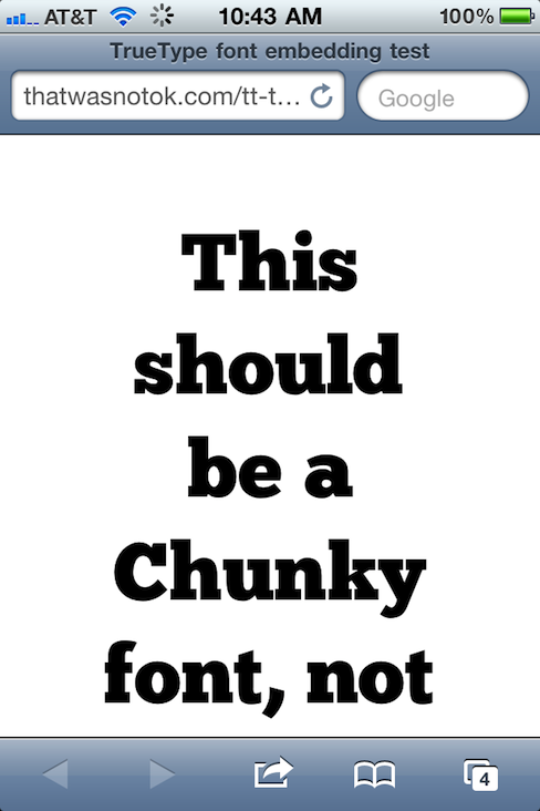
Web type news: iPhone and iPad now support TrueType font embedding. This is huge.

TrueType font embedding in iPhone, Hallelujah!

TrueType font embedding has come to iPhone and iPad, Hallelujah, brothers and sisters. That is to say, Mobile Safari now supports CSS embedding of lower-bandwidth, higher-quality, more ubiquitous TrueType fonts. This is huge. Test on your device(s), then read and rejoice:

The Typekit Blog: iOS 4.2 improves support for web fonts

iOS 4.2 is also the first version of Mobile Safari to support native web fonts (in TrueType format) instead of SVG. This is also exciting news, as TrueType fonts are superior to SVG fonts in two very important ways: the files sizes are dramatically smaller (an especially important factor on mobile devices), and the rendering quality is much higher.

Ryan N.: Confirmed: TrueType Font Support on Mobile Safari on iOS 4.2

Thanks to Matt Wiebe for mentioning the rumour that Mobile Safari on iOS 4.2 supports TrueType fonts and providing a handy link to test.

TrueType

TrueType is an outline font standard originally developed by Apple Computer in the late 1980s as a competitor to Adobe’s Type 1 fonts used in PostScript. TrueType has become the most common format for fonts on both the Mac OS and Microsoft Windows operating systems.

The primary strength of TrueType was originally that it offered font developers a high degree of control over precisely how their fonts are displayed, right down to particular pixels, at various font sizes. With widely varying rendering technologies in use today, pixel-level control is no longer certain in a TrueType font.

More about webfonts

If you’re coming late to the party, the following bits of required reading and listening will get you up to speed on the joys (and occasional frustrations) of “real type” on the web:

  1. Bulletproof @font-face syntax, Paul Irish, 4 September, 2009
  2. Web Fonts at the Crossing, Richard Fink, 8 June 2010, A List Apart
  3. Big Web Show Episode 1, Dan Benjamin and I discuss webtype with Ethan Dunham of Fontspring and Font Squirrel and Jeffrey Veen of Typekit
  4. Big Web Show Episode 18, Dan Benjamin and I discuss webtype, screen resolution, and more with Roger Black
  5. Thanks

    My thanks to David Berlow of Font Bureau for waking me from my Thanksgiving stupor and alerting me to this exciting slash overdue development.