Category: CSS
-

Web typography: a refresher and history
A refreshing dip into what we’ve learned about web typography over the past 20+ years.
-
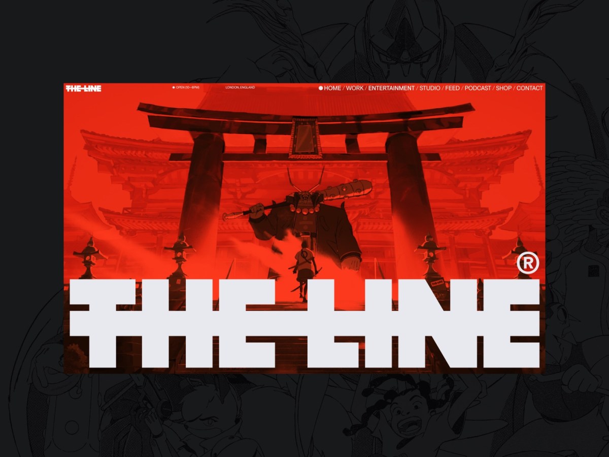
Web Design Inspiration
If you’re finding today a bit stressful for some reason, grab a respite by sinking into any of these web design inspiration websites.
-

This Web of Ours, Revisited
Why did leading designers in 2000 look down their nose at the web? And are things any better today?
-

The More Things Change… (or: What’s in a Job Title?)
I’m designing for the web. The infinitely flexible web.
-

“Where the people are”
Fortunately, on that day, I allowed a strong, simple idea to penetrate my big, beautiful wall of assumptions.
-

You got this.
I’M LEARNING new tech and it’s hard. Maybe you’re in the same boat. Through the rosy lens of memory, learning HTML and Photoshop back in the day was a breeze. It wasn’t, really. And CSS,…
-
The Cult of the Complex
“IN AN INDUSTRY that extols innovation over customer satisfaction, and prefers algorithm to human judgement (forgetting that every algorithm has human bias in its DNA), perhaps it should not surprise us that toolchains have replaced…
-
Kiss My Classname
SORRY. I disagree. Nonsemantic classnames that refer to visual styles will always be a bad idea. I’m sure you’re a good coder. Probably much better than I am these days. I know most of you…
-
Ten Years Ago on the Web
2006 DOESN’T seem forever ago until I remember that we were tracking IE7 bugs, worrying about the RSS feed validator, and viewing Drupal as an accessibility-and-web-standards-positive platform, at the time. Pundits were claiming bad design was good for the web…
-
Position Wanted: Front-End Director
WE have creative directors and design directors, but we don’t seem to have any front-end directors. And maybe we should. For years at big companies, people in different silos have written CSS with no information…
-
Grid Layout & Flexbox City
CSS GRID LAYOUT is nearly finalized. Which means it’s time for designers and front-end developers to set the flags enabling their browsers to support the new specification, put CSS Flexbox through its paces, and see…
-
CSS Grid Layout with Rachel Andrew: Big Web Show
RACHEL ANDREW—longtime web developer and web standards champion, co-founder of the Perch CMS, and author of Get Ready For CSS Grid Layout—is my guest on today’s Big Web Show. We discuss working with CSS Grid…
-
A Book Apart Briefs!
From those wonderful people who brought you Responsive Web Design, Design Is A Job, Mobile First, plus thirteen additional instant classics of web design and development, here come A Book Apart Briefs: a new series…
-
Of Patterns and Power: Web Standards Then & Now
Separating structure from style and behavior was the web standards movement’s core revelation, and each generation of web designers discovers it anew. This separation is what makes our content as backward-compatible as it is forward-compatible…
-
CSS & Design: Blending Modes Demystified
With a few lines of CSS, we can now flexibly add Photoshop-level blending effects to our designs. Justin McDowell (@revoltpuppy) leads the way in today’s A List Apart, for people who make websites.